Nonprofit Marketing Agency Cinematic Landing Page Template
Amplify is a bold, full-page landing page template built for nonprofit video marketing agencies. It opens with an interactive Before/After Slider, then walks visitors through a cinematic Creator Spotlight sequence. Every section stacks visual proof until booking a strategy call feels inevitable. The Obsidian and Gold color system makes the work look as serious as it is.
by Rocket studio
Quick summary
Amplify is a single-page, click-through landing page template designed for filmmakers and strategists who produce cinematic campaigns for nonprofits. It opens with a dramatic Before/After Slider, unfolds through a storybook Creator Spotlight scroll, and closes with a fixed gold call-to-action bar. The entire page is built to turn skeptical development directors into booked strategy calls.
Who this template is for
This template was built for a specific kind of agency: one that produces high-end video work for nonprofits and needs a page that earns trust before asking for a meeting. If your portfolio looks nothing like your competitors, this page lets that gap do the selling.
- Nonprofit video production agencies pitching development directors and foundation program officers
- Filmmakers and creative strategists who lead cause-driven campaigns and want to showcase individual contributor work
- Executive directors or agency founders ready to replace a generic portfolio site with a page that actually converts
What problem this template solves
Most creative agencies use portfolio grids. Nonprofit clients scrolling those grids feel nothing. The real problem is not that the work is weak; it is that the presentation fails to show the before-and-after transformation the client actually needs to see. Donors and funders respond to story, not thumbnails.
- Development directors need to feel the gap between their current content and what great video can do before they will book a call
- Foundation program officers reviewing grantee stories need compelling narrative proof, not a list of past clients
- Agencies lose deals because their own marketing does not match the cinematic standard they sell
What you get with this template
You get a complete, scroll-driven landing page that builds a cumulative case through visual evidence. Each section layers proof on top of proof until the call to action feels like the obvious next step.
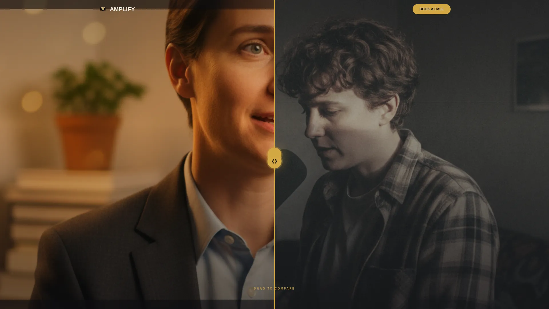
- A full-viewport Before/After Slider header with a gold drag handle and a reveal headline that only appears after interaction
- A multi-section Creator Spotlight layout where each scroll spread pairs a filmmaker portrait with campaign footage and a large-type client pull quote
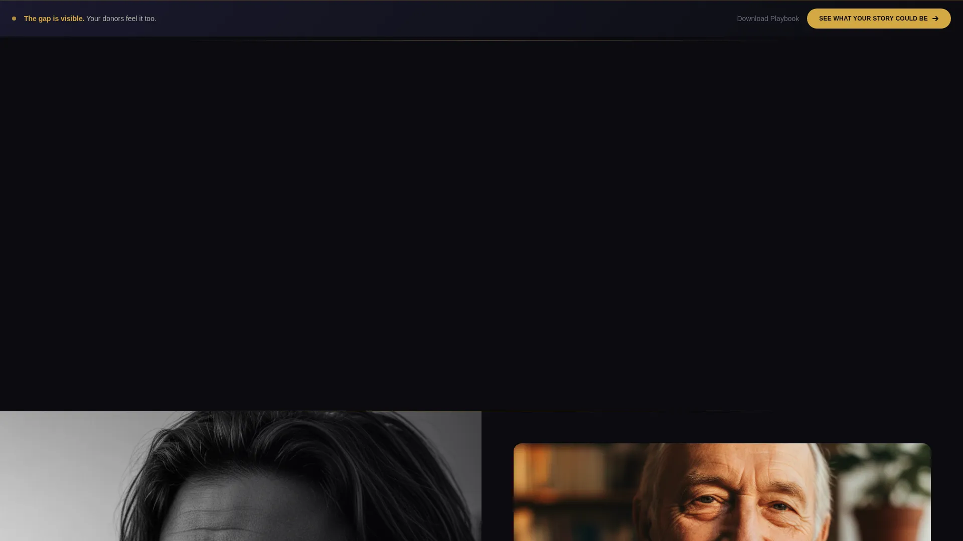
- Two conversion touchpoints: a primary "See What Your Story Could Be" button and a secondary "Download Our Nonprofit Video Playbook" text link
Feature list
This section covers the core built-in components and layout behaviors that define what Amplify delivers.
Interactive Before/After Slider Header
The header splits the full viewport into two states: a raw, poorly-lit interview clip on the left and the same footage reshot in cinematic 4K on the right. A gold drag handle sits at center screen. The reveal headline, "Same story. Completely different outcome," only appears after the visitor physically interacts with the slider.
Creator Spotlight Scroll Sections
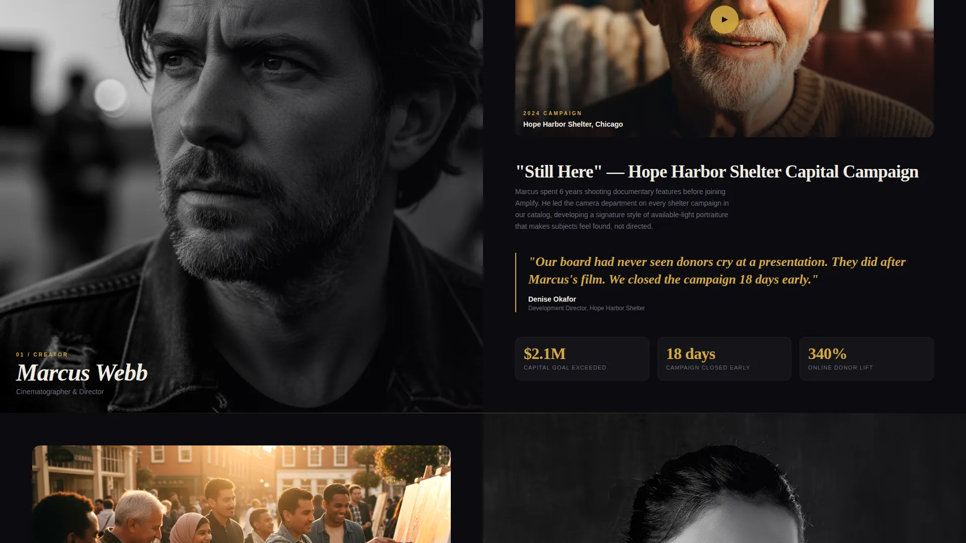
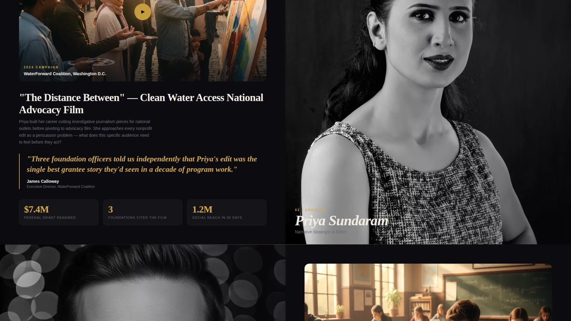
Each full-page section introduces one filmmaker or strategist. A black-and-white portrait fills one half of the spread. As the visitor scrolls deeper, campaign footage bleeds across the other half. This layout reads like turning pages in a documentary credits sequence, not browsing a portfolio grid.
Client Pull Quote Treatment
Quotes from nonprofit clients are set in oversized gold type. Each pull quote anchors the creator section it appears in, reinforcing that a specific person produced a specific transformation for a real organization.
Fixed Gold Conversion Bar
After the third Creator Spotlight section, a gold bar locks to the bottom of the viewport. It carries the primary call to action and stays visible as the visitor continues scrolling. The bar appears only after enough visual evidence has been stacked to make the ask feel earned.
Dual Call-to-Action Architecture
The page carries two conversion paths. The primary path drives visitors to a strategy call booking page. The secondary path, a text link for a downloadable Nonprofit Video Playbook, captures visitors who need more time before committing to a meeting.
Obsidian and Gold Visual System
The color system uses deep volcanic black and raw charcoal for every section background. Molten gold appears only on interactive elements, pull quotes, progress bars, and the fixed conversion bar. Bone white type sits heavy and oversized in brutalist stacks throughout.
Page sections overview
| Section | Purpose |
|---|---|
| Before/After Slider | Opens the page with visceral proof of the agency's transformation work |
| Primary call to action Block | Captures early intent with the "See What Your Story Could Be" button |
| Creator Spotlight One | Introduces the first filmmaker and a local shelter campaign |
| Creator Spotlight Two | Escalates the narrative with a regional advocacy campaign and pull quote |
| Creator Spotlight Three | Peaks the proof sequence with a national advocacy film and client quote |
| Fixed Gold Bar | Locks the primary call to action into view after the third spotlight |
| Secondary call to action Link | Offers the Nonprofit Video Playbook download for undecided visitors |
Design & branding system
The visual identity follows a Bold Brutalist theme. Black dominates every section background in massive slabs. Gold appears only where the eye must travel next. The effect is intentional: it mirrors the awards-ceremony aesthetic that signals serious creative work to the nonprofit funders and directors this agency is trying to reach.
- Color palette: deep volcanic black (#0B0B0F), raw charcoal (#1A1A2E), molten gold (#D4A843) for accents and interactive elements, and bone white (#F0ECE2) for body and headline type
- Typography: oversized, heavy brutalist stacks with no apology for scale; bone white type is sized to punch through dark backgrounds at every scroll depth
- Visual rhythm: black-and-white portrait photography transitions into warm amber color-graded campaign footage as the visitor scrolls, creating a visual escalation that mirrors the agency's transformation promise
Mobile & speed optimization
The storybook scroll layout is designed to reformat cleanly across screen sizes. The Before/After Slider and Creator Spotlight spreads are built to maintain their visual impact on narrower viewports without collapsing the narrative flow.
- The fixed gold conversion bar remains accessible on mobile so the primary call to action is never out of reach
- Portrait and campaign footage panels restack vertically on smaller screens, preserving the documentary-credits reading rhythm on touch devices
How this template helps you convert
The page is a click-through built to move visitors toward a strategy call booking page. It does not ask for anything before it has shown enough. The conversion logic is sequential and deliberate.
- The Before/After Slider creates an immediate, visceral gap between the visitor's current content reality and what the agency produces. By the time the headline appears, the emotional case is already open.
- Each Creator Spotlight section adds a named human, a real campaign, and a client quote in gold type. Three spreads in, the visitor has seen undeniable evidence that this agency operates at a level most nonprofits never access.
- The fixed gold bar appears at exactly the moment the proof has peaked. The dual call-to-action structure means no visitor leaves without a path forward, whether they are ready to book today or need one more piece of value first.
Other information about this template
Amplify belongs to the Portfolio and Agency category with a specific focus on nonprofit marketing. It is classified under the Nonprofit Video Marketing Agency niche, making it a strong fit for teams whose entire business model depends on showing rather than telling.
- The template style is Storybook and Full-Page, meaning the page functions as a single continuous narrative rather than a collection of disconnected sections
- The creative direction is Creator Spotlight, a format that humanizes the agency by centering individual contributors rather than the brand as a whole
- The header concept is a Before/After Slider, one of the most direct ways to demonstrate transformation work without a single word of explanation
- The landing page direction is Click-Through, so there is no form on this page; the only goal is earning the click to the strategy call booking page
- The theme is Bold Brutalist, a design language that signals confidence and creative authority to the development directors and program officers who are its primary audience
Theme
Bold Brutalist
Creative direction
Creator Spotlight
Color system
Obsidian & Gold
Style
Storybook/Full-Page
Direction
Click-Through
Page Sections
Interactive Before/after Slider Header
Creator Spotlight Scroll Layout
Oversized Gold Pull Quotes
Fixed Gold Conversion Bar
Dual Call-to-action Structure
Obsidian and Gold Design System
Related questions
Is Amplify a single-page landing page or a multi-page website?
Does the template include video content or campaign footage?
Can I adjust the number of Creator Spotlight sections?
What is the Nonprofit Video Playbook in the template?
Who is this landing page template designed to convert?



