Expert LinkedIn Visibility Landing Page Template
Signal is a bento grid landing page template built for tech professional LinkedIn profile optimization consultancies. It uses an Obsidian and Gold visual system, a collage-style hero, and a Creator Spotlight scroll structure to showcase before-and-after profile transformations. A sticky waitlist call to action and a Focus Score lead capture tool guide senior engineers, product managers, and CTOs toward signing up.
by Rocket studio
Quick summary
Signal is a single-page bento grid landing page template designed for a LinkedIn profile optimization consultancy targeting senior tech professionals. It pairs a Lens and Frame visual identity with a Creator Spotlight narrative structure, guiding visitors from a dramatic collage hero through transformation portraits and into a waitlist conversion flow. Every section is built to demonstrate profile precision and turn profile visits into committed leads.
Who this template is for
This template is purpose-built for consultants and agencies who help senior tech professionals sharpen their digital presence. It speaks directly to service providers whose clients struggle to translate deep expertise into a compelling LinkedIn profile.
- LinkedIn profile optimization consultancies that work with engineers, product managers, and CTOs on personal branding and career repositioning.
- Solo consultants and boutique firms offering profile rewrite services to job seekers or professionals targeting new job opportunities in competitive tech markets.
- Career coaches and personal branding specialists who need a high converting landing page to capture waitlist leads and demonstrate tangible proof of transformation.
What problem this template solves
Most landing pages built for career services look generic. They list features, show a stock photo, and ask visitors to book a discovery call. That approach rarely converts visitors who are skeptical and time-poor.
Senior tech professionals, in particular, are a demanding target audience. They have strong career histories but outdated profiles. A marketing manager or a CTO can have scaled systems used by millions, yet their LinkedIn profile still reads like a job description from 2016. The wrong people keep reaching out, and hiring managers never do.
This template solves that credibility gap. It gives the consultancy a landing page that feels as intentional and precise as the service itself.
- Stale profile syndrome: Engineers and product managers know their work matters, but their LinkedIn profile does not show it. The template's before-and-after bento layout makes the transformation visible and believable.
- Low conversion from profile visits: A beautiful service with no social proof fails to grab attention. This template bakes social proof into every scroll step, from character portraits to live waitlist counters.
- Weak lead capture: Most landing pages ask for too much too soon. This template's sequential three-field waitlist form and the Focus Score URL input give visitors two clear entry points to engage without friction.
What you get with this template
Signal delivers a fully structured bento grid landing page with five core sections, a defined visual system, and multiple interactive elements. You get just what a high converting landing page needs: clear hierarchy, strong calls to action, and lead capture that guides visitors toward signing up without confusion.
- Five purpose-built sections: Hero collage, before-and-after bento grid, character portrait tiles, waitlist call to action bar, and Focus Score lead capture, each designed to move visitors closer to conversion.
- Obsidian and Gold design system: Deep obsidian black primary canvas, burnished gold accents, warm graphite card surfaces, and pearl body text, all paired with Fraunces display serif and DM Sans body typography.
- Dual lead capture paths: A sticky three-field sequential waitlist form with a live position counter, plus a LinkedIn URL input that delivers an automated Focus Score to the visitor's inbox.
Feature list
Signal is built around six core capabilities that make it a genuinely high converting landing page for a profile optimization service.
Collage Hero with Scrapbook Composition
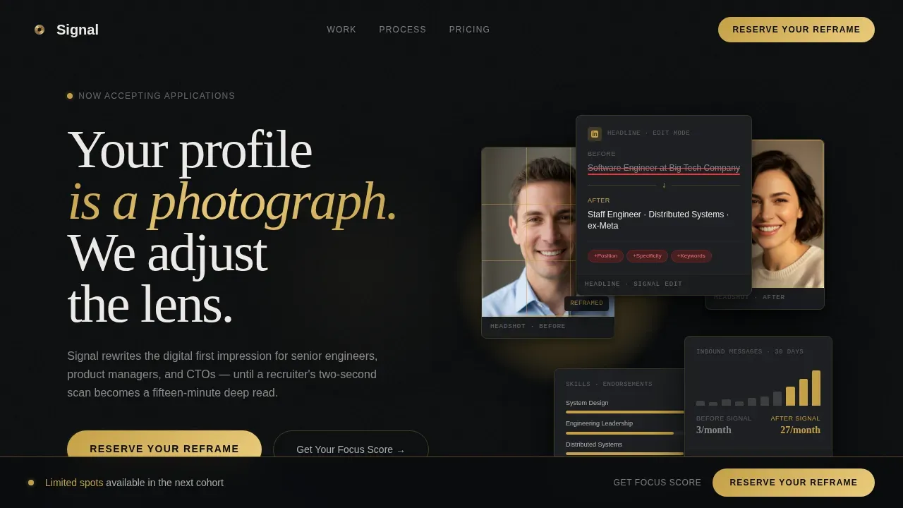
The hero section arranges overlapping LinkedIn profile fragments at slight angles, like Polaroids spread on a dark desk. A cropped profile photo with a golden rule-of-thirds grid overlay, a headline section showing red-line edits, a skills endorsement bar mid-animation, and a connection count climbing are all lit like specimens under a jeweler's loupe. A single pearl-white headline floats above: "Your profile is a photograph. We adjust the lens." This opening frame grabs attention instantly and communicates the service's core message before the visitor reads a single word of body copy.
Creator Spotlight Bento Grid
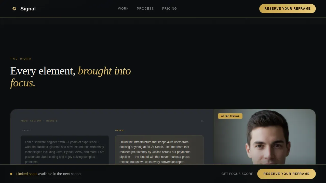
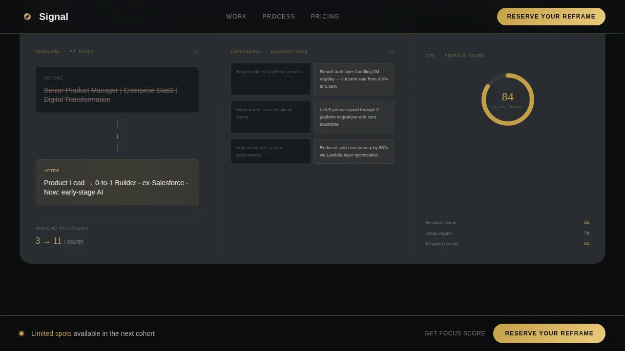
The scroll is driven by real transformation portraits, one bento tile at a time. One card shows an engineer's headline rewrite. The adjacent tile shows her inbound message count thirty days later. The grid alternates between tight detail crops and wide contextual frames, mimicking a photographer's contact sheet. This structure provides context for each profile element, from the profile picture and featured section to the About section and experience bullets, without listing them as abstract features. It turns social proof into personal stories that visitors engage with naturally.
Sticky Waitlist Call to Action Bar
A gold-bordered sticky bar appears after the third bento row and stays visible as visitors scroll. It guides visitors toward the primary call to action: "Reserve Your Reframe." The bar does not distract or interrupt. It waits until the visitor has seen enough transformation evidence, then makes a clear call to commit. This timing is deliberate and improves conversion optimization by anchoring the ask to demonstrated value.
Sequential Three-Field Waitlist Form
The form captures only three fields in sequence: current job title, years of experience via a dropdown (3 to 5, 6 to 10, 10 plus), and email address. Below the form, a live counter displays the visitor's waitlist position, such as "You'll be number 247," creating real scarcity without fabricating it. This keeps the lead generation flow honest and efficient. Fewer fields mean higher completion rates, and the position counter adds urgency that guides visitors to act now rather than later.
Focus Score Lead Capture
Visitors who are not ready to join the waitlist can paste their LinkedIn profile URL into a secondary input field. The template is structured to deliver an automated Focus Score, a rating from 0 to 100, to their inbox. This path captures qualified leads even before they are ready to commit. It also gives the consultancy a natural reason to follow up, making it an ideal entry point for a discovery call conversation.
Mosaic Closing Portrait Grid
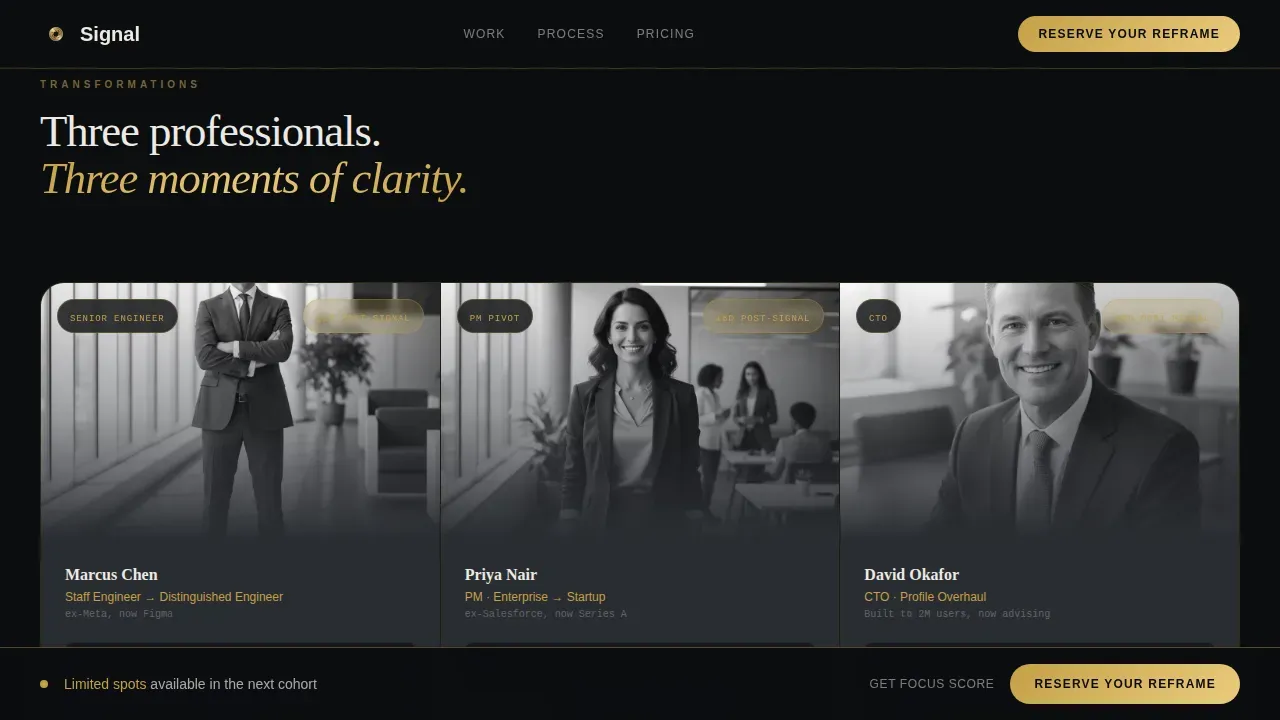
The page ends with a mosaic of gold-framed "after" portraits that assembles as the visitor reaches the bottom. Each portrait represents a completed transformation. The grid provides tangible proof at the moment when a visitor is deciding whether to sign up. It also reinforces personal branding as a visual discipline, not just a copywriting exercise, which aligns with what the service actually delivers.
Page sections overview
| Section | Purpose |
|---|---|
| Hero Collage | Opens with overlapping LinkedIn fragments and the core headline to establish the service premise immediately |
| Before/After Bento | Shows headline rewrites, headshot recropping, and About section edits side by side in an asymmetric grid |
| Character Portrait Tiles | Profiles three transformation stories with real metrics including inbound message counts and profile views |
| Waitlist call to action Bar | Sticky gold-bordered bar with a sequential three-field form and live waitlist position counter |
| Focus Score Capture | Secondary lead path where visitors paste their LinkedIn URL to receive an automated profile rating |
| Footer Row | Linear single-row footer with minimal navigation to keep attention on conversion |
Design & branding system
Signal uses a Lens and Frame theme built around a matte-black camera body aesthetic with brass dial accents. Every color and typography choice reinforces precision, authority, and craft. The palette feels tactile and considered, which builds credibility with a target audience that values quality signals over flashy design.
- Color system: Obsidian black (#0B0D0F) as the primary canvas, burnished gold (#C5A047) for highlights and interactive hover states, warm graphite (#2A2D32) for card surfaces, and crisp pearl (#EDEAE5) for body text. The visual consistency across all tiles and sections makes the page feel like a single curated object.
- Typography: Fraunces display serif for headings gives the page editorial weight. DM Sans body text keeps reading comfortable and clear. The pairing supports both visual appeal and information density without either competing with the other.
- Animation and interaction: Float keyframes, shimmer sweeps, fadeInUp stagger, scroll-triggered reveals, a counter animation on the waitlist position display, and bento tile hover states all use CSS transforms only. Intersection Observer handles scroll reveals, keeping load speed efficient and animations smooth. Interactive elements like the Focus Score URL input and the sticky call to action bar respond immediately on interaction.
Mobile & speed optimization
Signal is designed desktop-first, which reflects how senior tech professionals and hiring managers typically browse professional services. The layout is built with mobile responsiveness as a baseline requirement, so mobile users still experience a fully readable and functional page.
- Desktop-first layout with responsive scaling: The bento grid is structured for widescreen first, then collapses gracefully for mobile devices without breaking the visual hierarchy or losing the before-and-after impact.
- Performance-aware animation: All animations use CSS transforms only. Intersection Observer handles scroll-triggered reveals so the page does not load heavy scripts upfront. This supports a reasonable load speed even on large visual grids with high quality imagery.
- Minimal navigation by design: The page avoids navigation menus intentionally. Fewer distractions means visitors view each section in sequence, which is just what a high converting landing page requires to maintain focus through a long scroll.
How this template helps you convert
Signal is structured so that every section does one job: move the visitor one step closer to signing up. The page does not ask for commitment before demonstrating value. It earns trust first, then makes a clear call.
- Demonstrates value before asking for anything: The collage hero and bento transformation tiles establish the consultancy's expertise through visual social proof. Visitors see measurable results, including connection requests increasing and profile visits climbing, before they encounter a single form field. Trust builds naturally through evidence, not claims.
- Offers two low-friction conversion paths: The sequential waitlist form converts visitors ready to commit. The Focus Score URL input converts visitors who need more time. Both paths capture leads and both guides visitors into the consultancy's follow-up funnel, including the discovery call pathway, without pressure.
- Creates honest urgency: The live waitlist position counter shows a real number. It does not manufacture fake urgency. It reflects actual demand, which builds credibility with a sophisticated audience that would immediately distrust a countdown timer.
Other information about this template
Signal is categorized under Personal and Resume templates, specifically within the Tech Professional Career subcategory. It is built for the niche of tech professional LinkedIn profile optimization and sits at a high intersection match for consultancies combining personal branding, profile optimization, and a waitlist-led business model.
- Content strategy alignment: The template's narrative arc mirrors a strong content strategy for a profile optimization service. It moves from problem awareness through tangible proof to conversion, which is the same structure used in effective personal branding campaigns. Consistent posting and relevant content can extend the landing page's reach when paired with an active LinkedIn presence.
- Relevant skills for customization: Practitioners customizing this template should apply relevant keywords in the headline and featured section copy. An optimized profile for the consultancy itself should include a keyword-rich banner tagline and recognizable client logos in the featured section to reinforce social proof on the landing page. Using a background neutral headshot in the profile photo section of the consultancy's own LinkedIn profile keeps messaging align with the landing page's visual tone.
- Broader use cases: Creative professionals in adjacent niches, such as executive coaches, personal branding consultants, or career pivot specialists, can adapt Signal's structure. The template's personal landing page format supports lead generation for any service where before-and-after evidence and personal stories drive conversions. Even a marketing manager pivoting into consulting could use this format to build a personal landing page that converts potential clients.
- Tracking and iteration: Practitioners may connect the page to tools like Google Analytics to track which sections drive the most engagement and where visitors engage or drop off. Reviewing Google Analytics data alongside waitlist signups helps identify which call to action placements perform best. Running basic A/B tests on the call to action copy can further improve conversion optimization over time. Organic traffic from a consistent posting schedule on LinkedIn can be directed to this landing page as a permanent personal landing destination.
- Platform context: AI-assisted tools and dedicated landing page platforms such as Leadpages or ConvertFlow can be used alongside this template for teams who want to extend functionality. The template's design is compatible with workflows where the consultancy wants to maintain visual consistency between the landing page and the client's own optimized profile. Using the signal precision linkedin profile optimization landing page template as a starting point saves significant design and copywriting time compared to building from scratch.
- Profile optimization principles built in: The template's copy structure reflects core LinkedIn profile optimization principles. Every bento tile mirrors a section of the LinkedIn profile itself: the profile photo, the headline, the About section, the featured section, and the experience section. This parallel structure helps visitors understand just what profile optimization involves and why each element matters for job search outcomes, job opportunities, and career progression.
- Post ideas and ongoing engagement: Once the waitlist fills, the consultancy can use the page as a hub to quantify accomplishments from each cohort and publish transformation metrics. This supports consistent posting habits and gives the team fresh post ideas rooted in measurable results. Revenue growth for the consultancy scales when the landing page continues to attract qualified leads through search engines and LinkedIn shares over time.
Theme
Lens & Frame
Creative direction
Creator Spotlight
Color system
Obsidian & Gold
Style
Bento Grid
Direction
Waitlist/Coming Soon
Page Sections
Collage Hero with Profile Fragment Layout
Creator Spotlight Bento Grid Narrative
Sticky Waitlist Call to Action Bar
Sequential Three-field Waitlist Form
Focus Score Secondary Lead Capture
Mosaic Closing Portrait Grid
Related questions
Who is Signal designed for?
Can I use this template for a different niche?
Does the template include the waitlist form and Focus Score input?
Is this a one-page layout or a multi-page website?
What makes this different from a standard career services page?



