Eating Disorder Care Reviews Website Template
Anchor is a single-column landing page template built for eating disorder caregiver support services. It opens with an oversized anonymous testimonial card, guides visitors through a Problem-to-Solution emotional arc, and converts with a 7-question guided assessment. Every design choice, from the Soft Mist palette to the serif-led typography, earns the trust of someone searching for answers at 2 a.m.
by Rocket studio
Quick summary
Anchor is a confidential coaching landing page template designed for services that support caregivers of people with eating disorders. The layout follows a single-column scroll with a Problem-to-Solution arc, warm clinical visuals, and a built-in 7-question assessment that routes every visitor to a personalised next step.
Who this template is for
This template is built for practitioners, coaches, and services that sit beside the person with the eating disorder, not in front of them. If you support the people who are quietly falling apart while holding everything together, this page speaks their language.
- Specialist coaches who have lived experience supporting caregivers through an eating disorder crisis
- Mental health service founders building a first digital presence for a caregiver-focused coaching offer
- Practitioners expanding from clinical treatment into caregiver education and peer-led support
What problem this template solves
Most health and wellness templates are designed around the person who is ill. Caregivers, the mothers Googling at 2 a.m., the partners who do not know what to say, the parents navigating a public health waiting list, have no designed home on the web. This template gives them one.
- Caregivers land on pages built for patients and bounce before finding support that fits their role
- Generic coaching templates cannot hold the emotional weight of a crisis-level audience or guide them toward action without feeling clinical or cold
- Services supporting caregivers lack a structured conversion path that meets visitors at different readiness levels, from early concern to active crisis
What you get with this template
You get a complete, single-column landing page with five structured sections, a guided assessment component, and a secondary email-capture path. Every element is designed to earn trust before asking for anything.
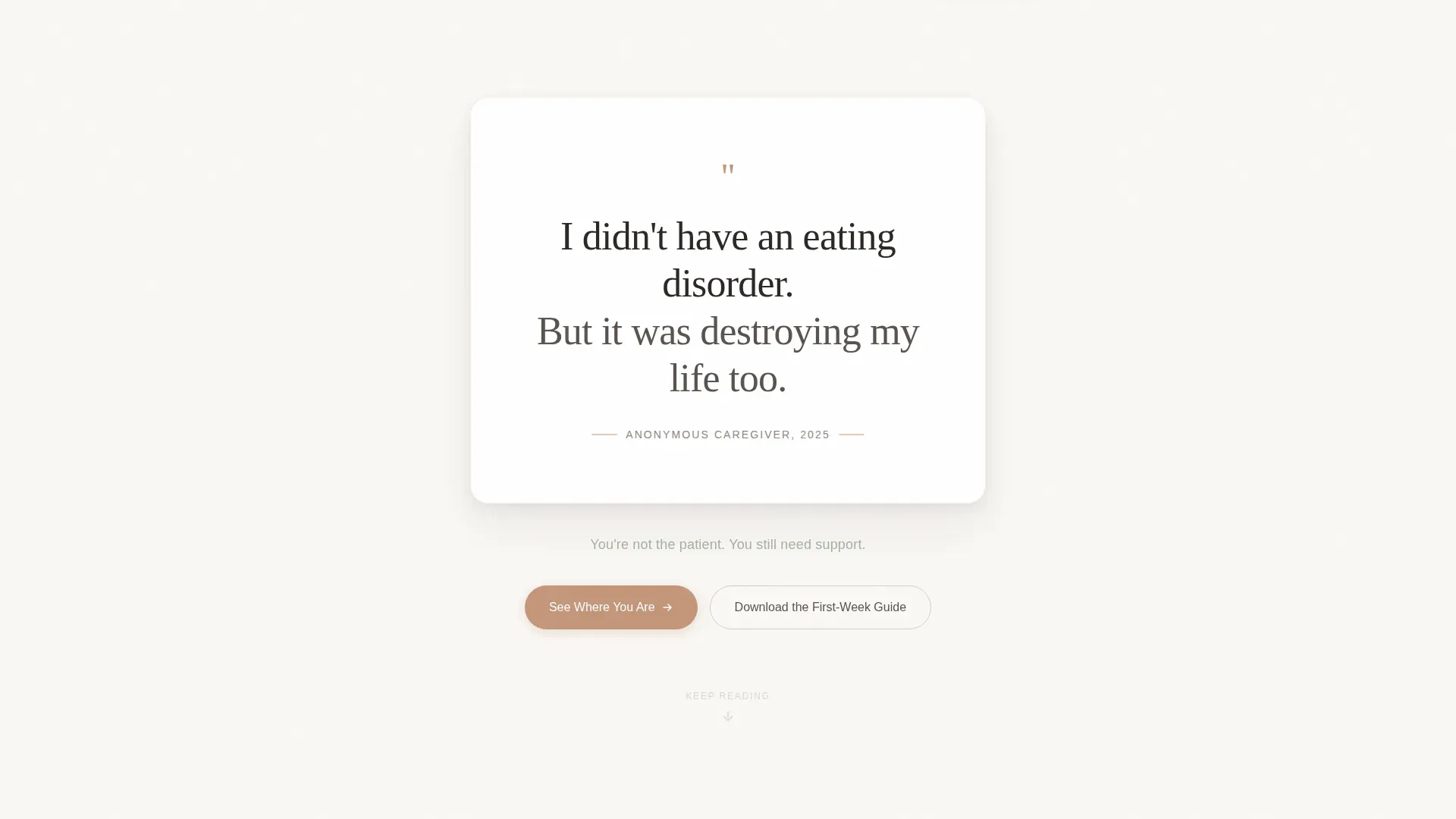
- A hero section built around one oversized anonymous testimonial card with no logo above the fold, using Fraunces serif typography on linen white
- A 7-question interactive assessment with a state machine, first-person phrasing, and personalised results that route each visitor to either a free orientation call booking or a downloadable crisis guide
- A secondary conversion path offering a downloadable Caregiver's First-Week Guide for visitors who are not yet ready to be assessed
Feature list
This template is built around a small set of carefully considered components. Each one earns its place.
Oversized Testimonial Hero Card
A single large card centered on linen white carries three lines of anonymous caregiver testimony in Fraunces serif, large enough to read from across a room. No image, no logo above the fold. The restraint creates the stop-scroll effect in a feed full of noise.
7-Question Guided Assessment
The assessment uses a state machine to track visitor answers across seven first-person questions. Agree or disagree toggles keep the experience frictionless. On completion, results identify the caregiver's current stage, early concern, active crisis, or recovery support, and their emotional state, then deliver a personalised one-page summary and a recommended next step.
Dual Conversion Paths
Every visitor is caught, regardless of readiness. Assessment completions route to a free 20-minute orientation call booking or a downloadable crisis guide. Visitors who skip the assessment reach a secondary path offering the Caregiver's First-Week Guide via a low-friction email capture.
Problem-to-Solution Scroll Arc
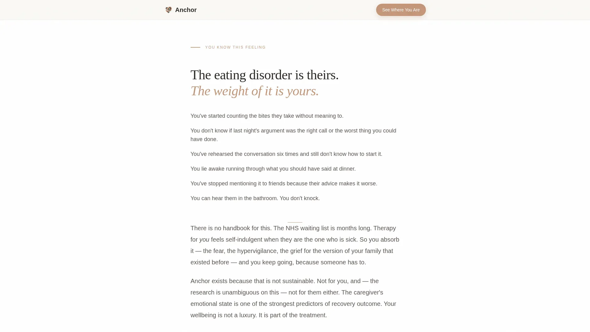
The page opens in crisis mode with short, breathless paragraphs naming exact caregiver behaviours. The pacing then slows deliberately, introducing the coaching model as a structured exhale. Each section resolves a specific fear with a concrete framework, not a platitude.
Outcomes and Evidence Section
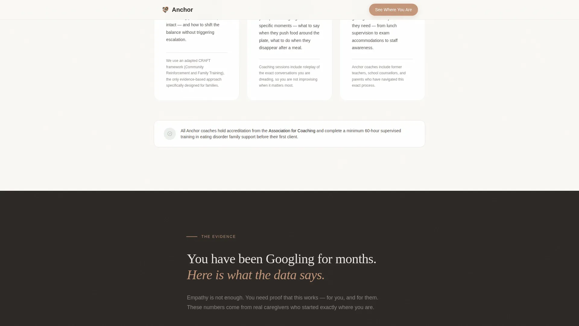
A dedicated section presents outcomes data in the same clean corporate precision used throughout the page. It is designed for caregivers who have been searching for months and need proof alongside empathy.
GSAP-Animated Scroll Reveals
Medium-intensity scroll animations use GSAP with staggered fade-ins and spring easing to pace the emotional arc of the page. Sections arrive when the reader is ready for them, not all at once.
Page sections overview
| Section | Purpose |
|---|---|
| Hero Testimonial Card | Opens with anonymous caregiver testimony to create immediate recognition and stop the scroll |
| Problem Recognition | Short paragraphs name exact caregiver behaviours, meeting visitors inside their own experience |
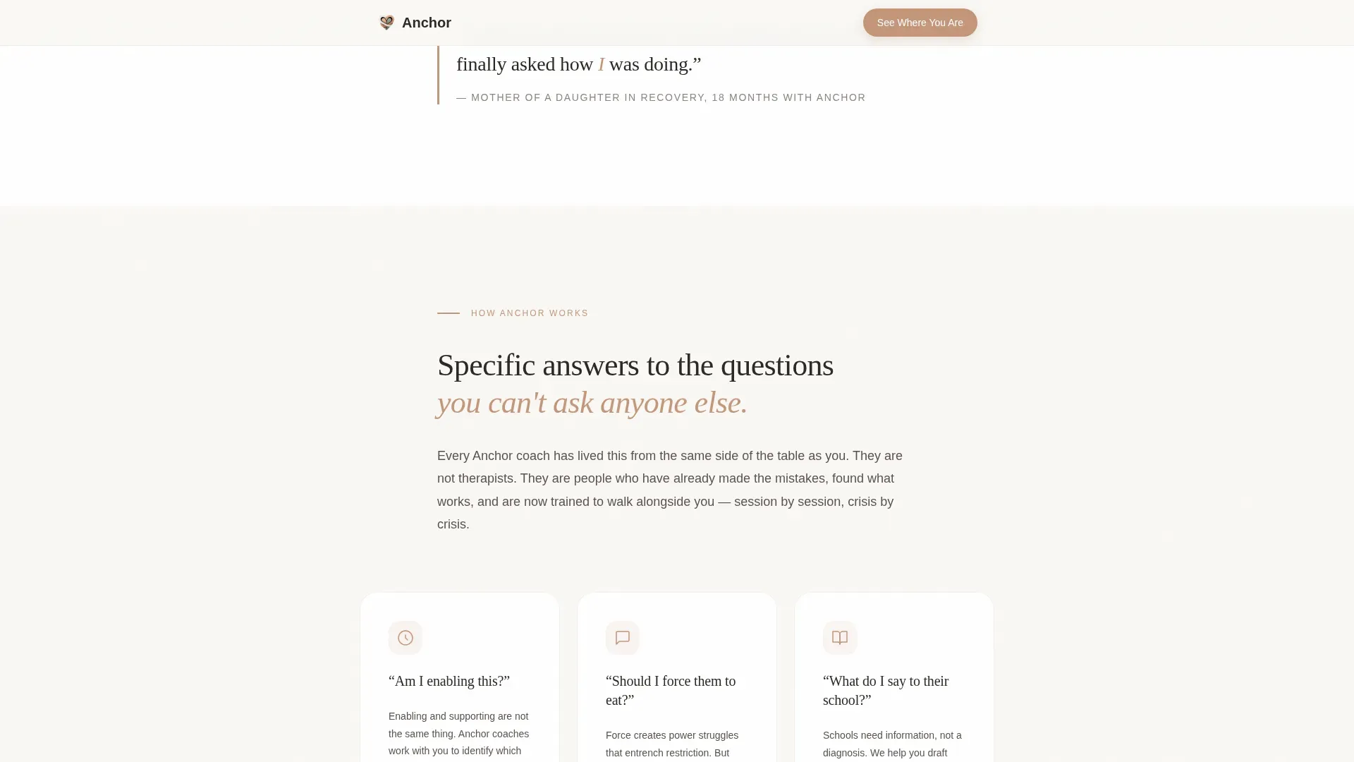
| Coaching Model | Structured frameworks answer specific fears with clear, practical responses |
| Evidence and Outcomes | Outcome data and coach credentials provide the proof caregivers need before committing |
| Assessment Call to Action | "See Where You Are" quiz routes each visitor to a personalised next step |
| Footer | Minimal horizontal footer pattern keeps the close clean and uncluttered |
Design & branding system
The visual identity follows a Corporate Precision theme with a Soft Mist colour system. The result feels like a private consulting room with diffused north light, clinical enough to trust and soft enough to cry in.
- Colour palette: linen white (#FAF8F5) as the base, morning fog grey (#E8E4E1) for surface contrast, muted sage (#A3B0A0) for supporting text and sublines, and warm clay (#C4967A) reserved exclusively for buttons and pull-quotes
- Typography pairing: Fraunces serif for headings and testimonial display text, DM Sans for all body copy and interface elements
- The warm clay accent is used sparingly so that every call-to-action button carries genuine visual weight without competing with the calm of the surrounding palette
Mobile & speed optimization
The template is built mobile-first because the target visitor is searching on a phone in the middle of the night. The layout, type scale, and interaction model are all designed for that context.
- Mobile-first single-column flow ensures the emotional arc reads correctly on a small screen without reordering sections
- Lazy image loading and server-rendered static sections keep the initial load light for low-bandwidth or tired late-night visitors
- The assessment component is touch-optimised with large toggle targets and a clear progress indicator so visitors can complete it with one thumb
How this template helps you convert
Anchor is built around the principle that every visitor who arrives in distress should leave with a clear next step, even if they are not ready to speak to anyone yet.
- The "See Where You Are" assessment converts every completion into either a call booking or a guide download, so no engaged visitor exits empty-handed regardless of their readiness stage.
- The secondary guide download path captures an email address with zero friction from visitors who are in the early-concern stage and not yet ready for a conversation.
Other information about this template
This template is part of a broader single-column flow category designed for high-empathy, high-stakes service pages. A few additional details worth knowing before you build.
- The footer follows a minimal horizontal pattern, keeping the close of the page clean and unobtrusive
- The assessment state machine supports three identified caregiver stages: early concern, active crisis, and recovery support, and four emotional states: isolated, angry, exhausted, and numb
- The English copy is written in a UK and US blend, making the template suitable for services operating in either market without localisation edits
- The page is deliberately logo-free above the fold, a deliberate creative choice that signals the page is about the visitor, not the brand
Theme
Corporate Precision
Creative direction
Problem→Solution Arc
Color system
Soft Mist
Style
Single Column Flow
Direction
Quiz/Assessment
Page Sections
Oversized Testimonial Hero Card
Question Guided Assessment
Dual Conversion Paths
Problem-to-solution Scroll Arc
Outcomes and Evidence Section
GSAP Scroll Reveal Animations
Related questions
Can I use this template without offering an assessment feature?
Is the testimonial hero section editable?
Does the template include the downloadable guide?
Can the colour palette be changed to match an existing brand?
Who provides the assessment questions and results copy?



