Internist Professional Website Template
A split-screen landing page built for a single-physician internal medicine practice. It opens with a five-step symptom assessment and unfolds through a Problem-to-Solution scroll arc, guiding adults with unresolved multi-system symptoms from confusion to clarity. The Arctic White and calm teal palette feels clinical yet warm, and every section builds toward one goal: the first real conversation with a physician who listens.
by Rocket studio
Quick summary
This is a single-page patient education hub for an internal medicine practice. It pairs a live five-question symptom assessment with a scroll-driven Problem-to-Solution Arc that connects fragmented symptoms into a coherent picture. The design is split-screen throughout, clinical without being cold, and built to convert a frustrated, self-researching adult into a booked patient.
Who this template is for
This template is designed for a single-physician internal medicine practice that focuses on adults with unresolved, multi-system health concerns. It works especially well when the physician's core value is explanation and holistic pattern recognition rather than quick referrals.
- Solo internists who explain rather than just prescribe
- Direct primary care or concierge internal medicine practices
- Physicians whose patients arrive frustrated after years of inconclusive specialist visits
What problem this template solves
Adults in their forties and fifties often carry years of "borderline" lab results and conflicting specialist opinions with no one to tie them together. This template addresses that specific frustration by building a digital experience that mirrors the physician's actual diagnostic approach.
- Patients feel unseen after multiple referrals that lead nowhere
- Confusing lab reports create anxiety and distrust of the medical system
- No existing page speaks directly to the experience of Googling your own bloodwork at midnight
What you get with this template
You get a fully structured, single-page layout that moves visitors from symptom recognition to appointment booking. Every section is purposefully sequenced, and the interactive quiz sits at the center of the experience.
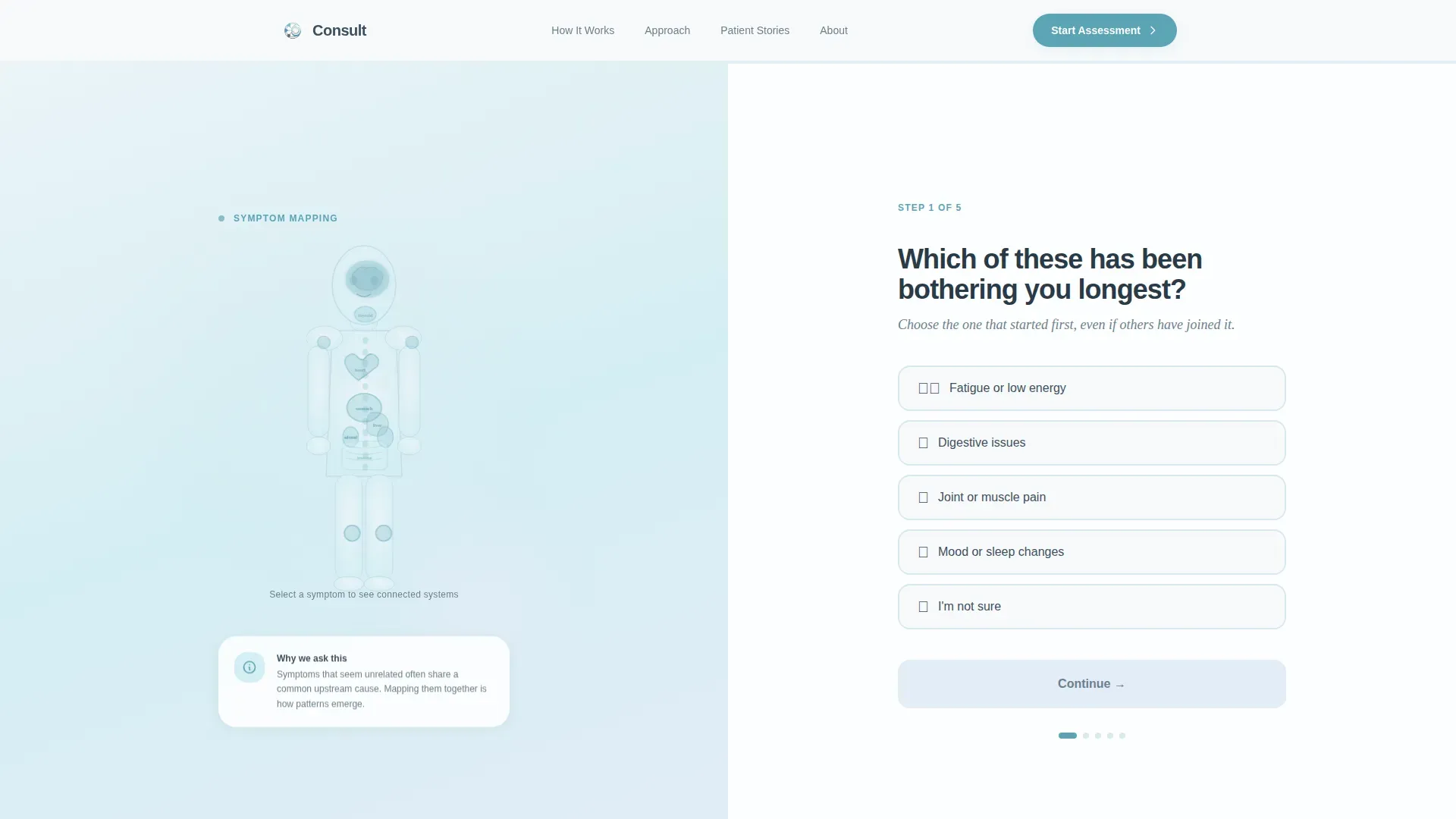
- A five-step interactive symptom assessment embedded in the hero section
- A scroll-linked Problem-to-Solution Arc with split-screen section pairs
- A sticky call-to-action bar that persists as visitors scroll past the hero
Feature list
This template includes six core features drawn directly from the project brief, each contributing to the page's educational and conversion flow.
Five-Step Symptom Assessment Quiz
The hero section opens with a multi-step form already in motion. Visitors answer five questions covering symptom type, duration, previous diagnoses, current medications, and preferred appointment format. The quiz delivers a personalized symptom-pattern summary before asking for any commitment.
Split-Screen Problem Arc Sections
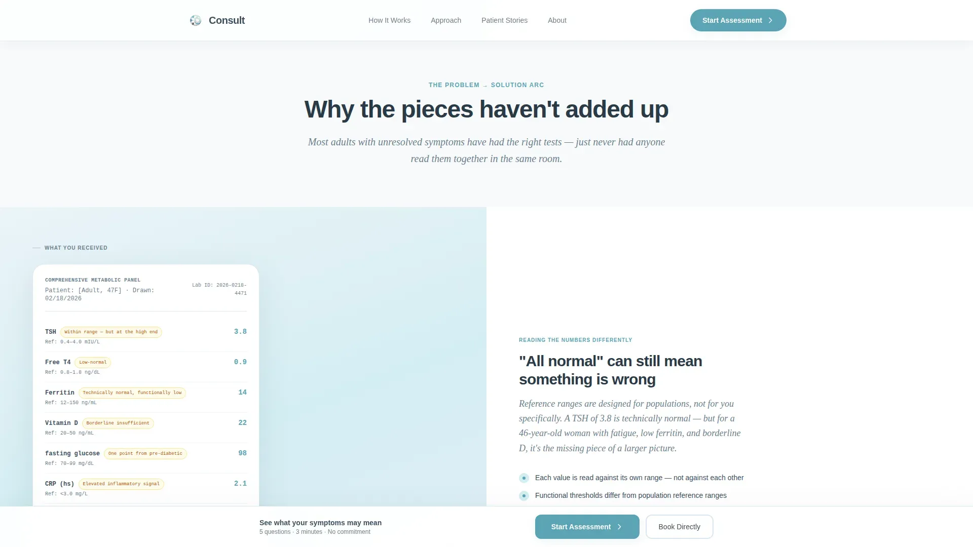
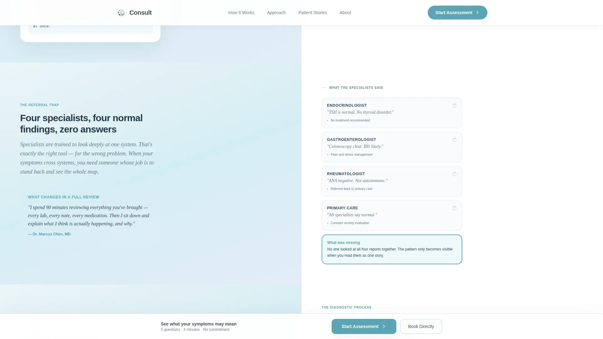
Below the hero, each scroll section pairs a patient frustration on the left with a plain-language reframe on the right. A confusing lab report becomes an annotated explanation. A list of conflicting specialist opinions becomes a connected pattern. The scroll itself mimics the diagnostic process.
Physician Whiteboard Video Clips
Short video clips of the physician drawing on a whiteboard appear in the right-side reframe panels. These clips prove the physician's explanatory approach before the first appointment, building trust through genuine educational content.
Animated Progress Indicator
A thin teal progress bar at the top of the quiz reads "Step 1 of 5" and advances with each answer. Scroll-linked transitions between split-screen sections reinforce the sense of a journey moving forward.
Unified Care Plan Panel
The final section merges both split-screen columns into a single full-width panel. This visual shift signals the moment complexity becomes clarity, and it carries the primary secondary call to action: "Book a Full Review."
Sticky Secondary Call-to-Action Bar
A persistent bottom bar repeats the primary call to action for visitors who scroll past the hero without completing the quiz. It stays visible throughout the scroll journey without interrupting the reading flow.
Page sections overview
| Section | Purpose |
|---|---|
| Hero Assessment Form | Opens quiz, sets immediate engagement |
| Problem Arc: Lab Reports | Contrasts confusion with plain-language clarity |
| Diagnostic Process Split | Shows fragmented versus connected thinking |
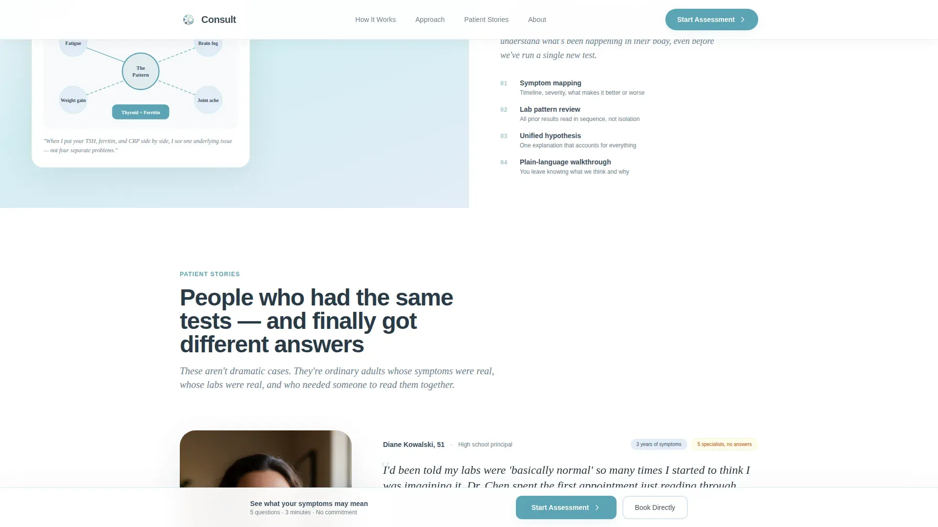
| Patient Testimonials | Builds trust with specific outcome stories |
| Unified Care Plan | Merges split screen, drives booking action |
| Footer Row | Provides single-row navigation and contact |
Design & branding system
The visual identity uses an Arctic White color system that reads as clinical white with room to breathe. Every color choice reinforces the feeling of a trustworthy, unhurried medical environment.
- Arctic White (#F8FAFB) for backgrounds, Glacier Blue (#E3EDF7) for section panels, and Soft Graphite (#3D4F5F) for body text
- Calm Teal (#5BA4B5) on buttons, progress indicators, and the sticky call-to-action bar
- DM Sans for headings to keep layouts clean and readable, Crimson Text for body and patient quotes to add warmth
Mobile & speed optimization
The template is built desktop-first, reflecting the browsing habits of the primary audience: adults in their forties and fifties who are more likely researching on a laptop or desktop screen. It is fully responsive for smaller screens.
- Scroll-linked split-screen transitions use medium animation weight to stay smooth without slowing the page
- Quiz logic runs as client-side components while static content uses server-side rendering for faster initial load
- The sticky bottom bar collapses gracefully on smaller screen sizes to avoid blocking content
How this template helps you convert
The page is structured so that every section earns the next click. Conversion is not demanded; it is demonstrated through genuine educational value before any commitment is asked.
- The five-step quiz gives visitors a personalized symptom-pattern summary, proving the physician's value before asking for a booking
- The Problem-to-Solution Arc builds emotional stakes with each scroll, so the "Book a Full Review" call to action arrives at the moment the visitor feels ready
Other information about this template
This template is built for the Health and Medical category, specifically the internist patient education hub niche. It uses a Soft Gradient theme with a Split Screen (50/50) layout throughout the main content sections.
- The header concept is a Multi-Step Form already in motion, so visitors feel the visit has started before they scroll
- The landing page direction is Quiz and Assessment, with conversion measured by quiz completion and subsequent booking clicks
- Patient testimonials include specific symptom journeys and outcome context, such as average diagnosis timelines and number of prior specialists seen
- Localization is set for English (United States), with USD currency format and MM/DD/YYYY date formatting
- The footer uses a linear single-row pattern to keep the close of the page clean and uncluttered
Theme
Soft Gradient
Creative direction
Problem→Solution Arc
Color system
Arctic White
Style
Split Screen (50/50)
Direction
Quiz/Assessment
Page Sections
Five-step Symptom Assessment Quiz
Split-screen Problem-to-solution Arc
Animated Quiz Progress Indicator
Unified Full-width Care Plan Panel
Sticky Secondary Call-to-action Bar
Patient Testimonials Section
Related questions
Who is the primary audience for this template?
Can I customize the five quiz questions for my practice?
Does the quiz deliver results directly to the visitor?
What appointment formats does the template support showing?
How does the sticky call-to-action bar behave on the page?



