Chronic Pain Care Professional Website Template
Anchor is a zigzag landing page template built for chronic pain caregiver support services. It combines an architectural Stacked Type Tower header, a transparent alternating-section layout, and a multi-step burnout quiz funnel. The Medical Clarity visual system keeps everything calm and organized so burned-out family caregivers feel seen the moment they arrive.
by Rocket studio
Quick summary
Anchor is a single-page landing page template designed for services that support unpaid family caregivers of chronic pain patients. It uses a zigzag alternating layout, a Stacked Type Tower hero, and a progressive burnout assessment quiz. Every section is built to earn trust through radical clarity, not vague promises.
Who this template is for
This template is built for healthcare and wellness service providers whose primary client is the caregiver, not the patient. It fits any B2C or referral-based offering in the chronic pain care space that needs to convert exhausted visitors into engaged users.
- Chronic pain caregiver support services and coaching practices
- Healthcare professionals who refer family caregivers to support resources
- Wellness SaaS products targeting unpaid caregivers aged 35 to 65
What problem this template solves
Most caregiver-facing pages borrow their structure from patient-facing health sites. They feel clinical in the wrong way: cold, impersonal, and full of information about the condition rather than the person managing it. Burned-out caregivers land on these pages and leave feeling invisible.
- Caregivers have no clear starting point, so they disengage before they convert
- Vague service descriptions build zero trust with an already skeptical audience
- Generic layouts fail to reflect the real emotional and logistical weight of caregiving
What you get with this template
You get a fully structured landing page with five distinct content sections, a multi-step quiz modal, and a persistent mobile call-to-action bar. Every section is pre-mapped to a specific stage of the caregiver's decision journey.
- A viewport-filling Stacked Type Tower hero with a primary burnout quiz call to action
- Two zigzag alternating sections covering the caregiver's reality and the service's tools
- A testimonials section, a full burnout assessment modal, and a linear single-row footer
Feature list
This section covers the core functional and design features built into the Anchor template.
Stacked Type Tower Hero
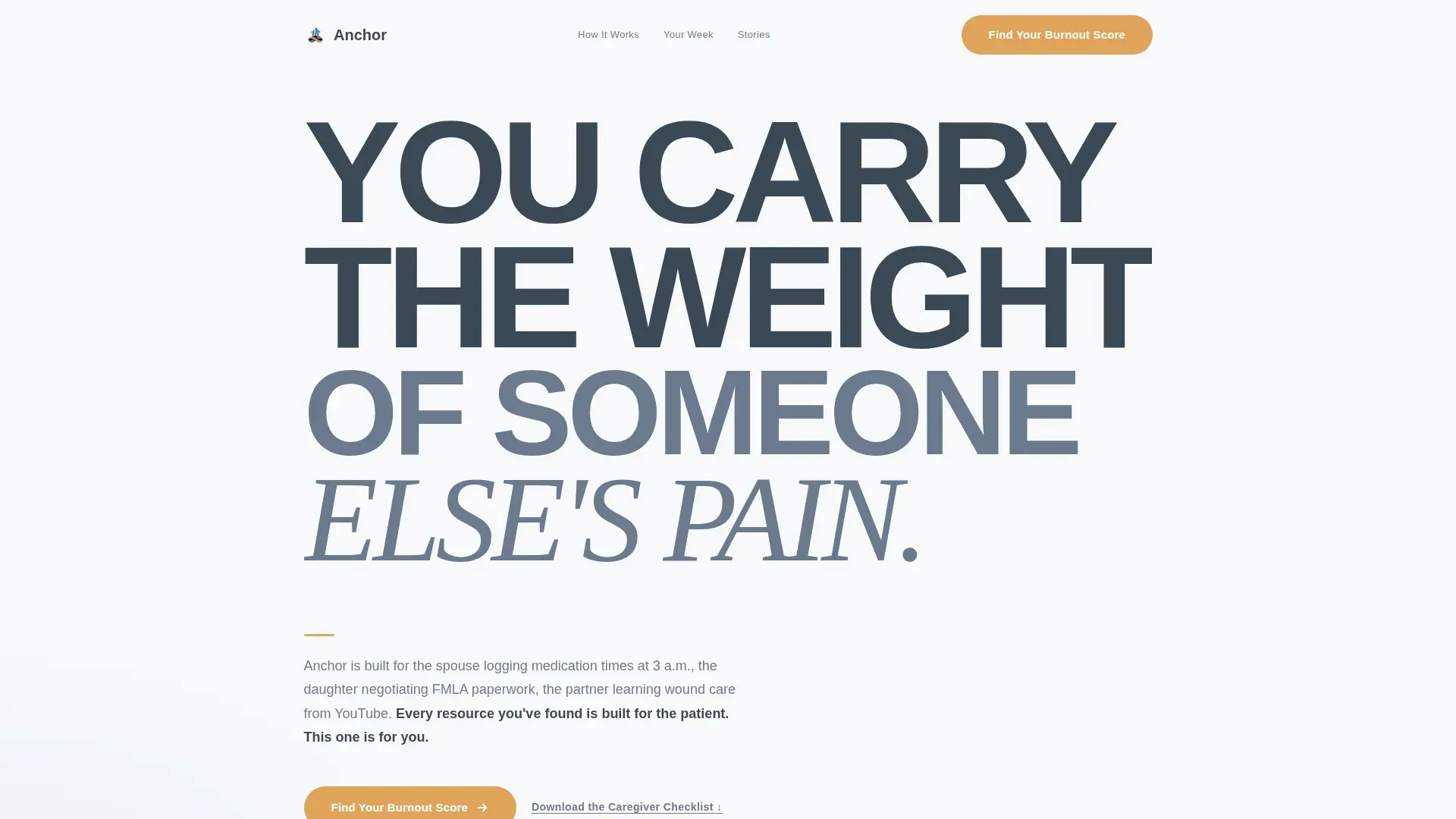
The hero fills the full viewport with architectural, load-bearing typography. The phrase "YOU CARRY / THE WEIGHT / OF SOMEONE ELSE'S / PAIN." steps down in weight and size across four lines. There is no imagery. The negative space is intentional, giving visitors a moment to breathe before they scroll.
Multi-Step Burnout Assessment Quiz
The primary conversion path is an eight-question burnout quiz that opens as a modal. It begins with a single low-friction question about weekly care hours, then progressively reveals questions covering sleep quality, emotional state, support network size, and financial strain. Each question appears on its own screen with a reassurance amber progress bar. Results are segmented into crisis, moderate, and early-stage categories, with a personalized resource plan gated behind name and email capture.
Zigzag Alternating Section Layout
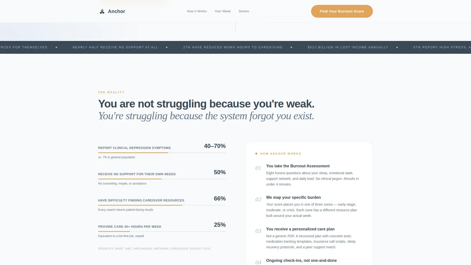
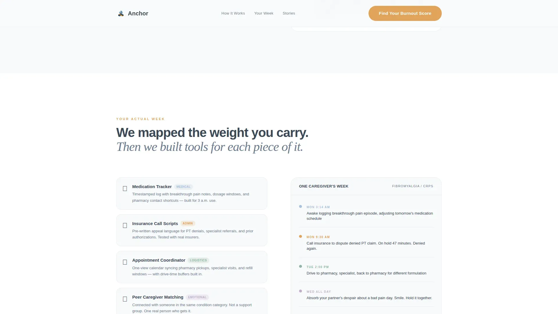
Two alternating content rows mirror the caregiver's lived experience against the service's specific response. The first pair shows burnout statistics alongside the intake process. The second pair shows a real caregiver week, including medication management, insurance calls, and emotional labor, mapped directly to the support tools that address each burden.
Persistent Mobile Call-to-Action Bar
On mobile, the "Find Your Burnout Score" call to action stays anchored to the bottom of the screen as a persistent bar. This keeps the primary conversion action reachable at any scroll depth, which matters when visitors are browsing on a phone in a waiting room.
Secondary Checklist Download Path
A secondary call to action, "Download the Caregiver Checklist," is available for visitors who are not yet ready to complete the quiz. It provides an alternative entry point into the service without requiring self-assessment, reducing drop-off among hesitant visitors.
Testimonials Section with Real Caregiver Voices
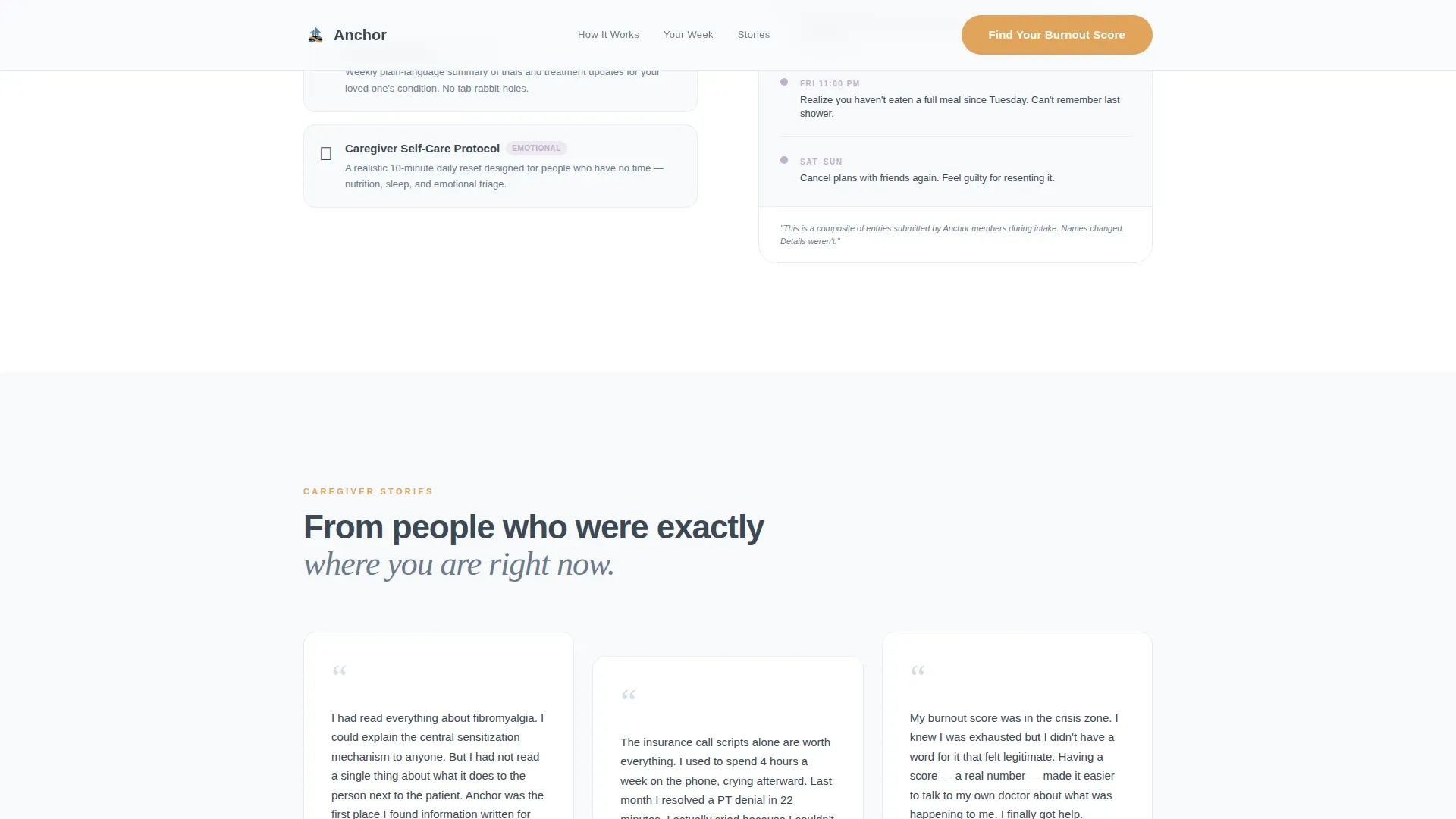
Three testimonial blocks feature specific caregiver names, conditions managed, and concrete outcomes. This section uses social proof grounded in real scenarios rather than generic quotes, reinforcing trust before the visitor reaches the quiz.
Page sections overview
| Section | Purpose |
|---|---|
| Hero Type Tower | Establishes emotional resonance and presents the primary burnout quiz call to action |
| Reality Zigzag Row | Pairs burnout statistics with the service's intake process |
| Your Week Row | Maps real caregiver tasks to specific support tools |
| Caregiver Testimonials | Builds trust through specific outcomes and named voices |
| Burnout Assessment Modal | Delivers the eight-step quiz with segmented results and lead capture |
| Linear Footer | Provides a clean single-row footer with essential links |
Design & branding system
The template uses a Medical Clarity visual theme. The palette feels like a freshly organized medical chart: no chaos, no clutter, every element with a clear reason to be there.
- Color system: clinical white (#F8F9FB) background, soft catheter-blue (#D0DFF0) for supporting panels, steady-pulse graphite (#3B4856) for body text and headlines, and reassurance amber (#E0A45C) reserved exclusively for calls to action and the quiz progress bar
- Typography: Plus Jakarta Sans handles all structural and body text while Fraunces provides serif emotional weight for moments that need warmth
- Visual direction: Transparent Process, meaning every section reveals exactly what the service does, with no vague "holistic journey" language anywhere on the page
Mobile & speed optimization
The template is built with a mobile-first priority because caregivers are frequently browsing on a phone, often in a hospital waiting room or between tasks at home.
- The persistent bottom bar keeps "Find Your Burnout Score" always reachable on small screens without interrupting the reading flow
- Scroll reveal animations are set to medium intensity so the page feels responsive without being distracting on lower-powered devices
- Static sections use server-rendered components for fast initial load, while the interactive quiz modal loads as a client component only when triggered
How this template helps you convert
The page is structured as a quiz funnel, which means every design and copy decision points toward a single measurable action.
- The hero creates immediate emotional recognition, so the visitor feels understood before they read a single service description, lowering resistance to the first click
- The zigzag sections build transparent trust by showing real caregiver scenarios next to specific service responses, eliminating the skepticism that vague wellness copy usually creates
- The progressive quiz disclosure, one question per screen with a visible amber progress bar, reduces abandonment by making the assessment feel manageable rather than overwhelming
Other information about this template
This template is part of the Health & Medical category under the Chronic Pain Care subcategory. It is localized for a United States audience using USD, 12-hour time format, and American English.
- The animation approach uses scroll reveals and a zigzag alternating entry pattern, set to medium intensity throughout
- The quiz modal is the high-interactivity component; all other sections are intentionally static and calm to contrast with it
- The footer uses Pattern 1, a linear single-row layout, keeping the page exit clean and uncluttered
- This template suits services with a B2C subscription model or a referral intake workflow from healthcare professionals
Theme
Medical Clarity
Creative direction
Transparent Process
Color system
Arctic White
Style
Zigzag/Alternating
Direction
Quiz/Assessment
Page Sections
Stacked Type Tower Hero
Multi-step Burnout Assessment Quiz
Zigzag Alternating Content Layout
Persistent Mobile Call-to-action Bar
Secondary Checklist Download Path
Named Caregiver Testimonials Section
Related questions
Who is the primary visitor this landing page is designed for?
Can the burnout quiz questions be adapted to match my service?
Is there a conversion path for visitors not ready to take the quiz?
What makes this template different from a general health and wellness page?
How does the mobile experience work on this template?



