Internist Booking Website Template
A zigzag landing page template built for internist provider directories. It pairs escalating patient testimonials with provider profile cards in an alternating layout, guiding patients, HR coordinators, and adult caregivers from a zip code search to a booked appointment. The design follows a clinical editorial style that feels authoritative and approachable at the same time.
by Rocket studio
Quick summary
This landing page template is a searchable directory for board-certified internists. It uses a zigzag testimonial-and-provider layout to build trust before asking for a click. Visitors arrive with a referral slip or a care gap to fill, and the page moves them steadily toward booking a full provider profile.
Who this template is for
This template serves directory owners, healthcare groups, and independent practice networks that want to connect patients with board-certified internists online. It works equally well for patient-facing directories and employer benefits portals.
- Patients holding referral slips or searching for a new primary care physician
- Human resources benefits coordinators building preferred provider networks
- Adult children helping an aging parent find a replacement internist after a retirement
What problem this template solves
Finding a qualified internist is rarely simple. Patients often face an undifferentiated list of names with no context, no social proof, and no clear path to booking. This template solves that friction directly.
- No social proof: escalating patient testimonials build credibility before any profile is clicked
- No easy filtering: a persistent zip code search bar lets visitors re-filter without scrolling back to the top
- No clear next step: every provider card carries a single focused call to action pointing to a full profile and scheduling flow
What you get with this template
You get a fully structured single-page layout ready to present an internist directory in a clinical, trustworthy visual style. Every section is purpose-built for the directory use case.
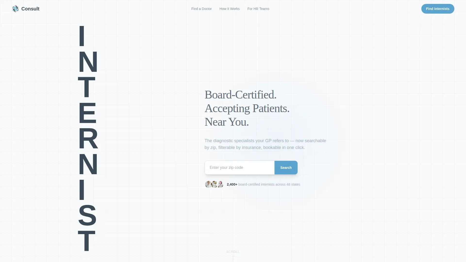
- A monumental stacked-type hero with a zip code input and sky-blue search button
- Three zigzag testimonial-and-provider-card row pairs with escalating emotional stakes
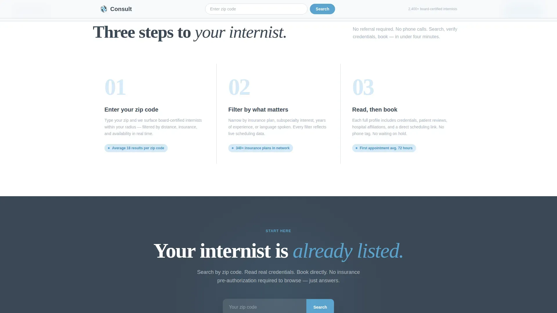
- A trust bar, a three-step how-it-works flow, and a final re-filter call-to-action section
Feature list
This template ships with a focused set of purpose-built components. Each one serves the directory conversion goal directly.
Stacked Type Tower Hero
The word "INTERNIST" is set in an ultra-bold condensed typeface and stacked vertically, filling the left third of the viewport. Three short descriptor lines and a zip code input field with a gently pulsing sky-blue search button sit to the right. No photography is needed; the typography itself signals authority.
Zigzag Testimonial and Provider Pairs
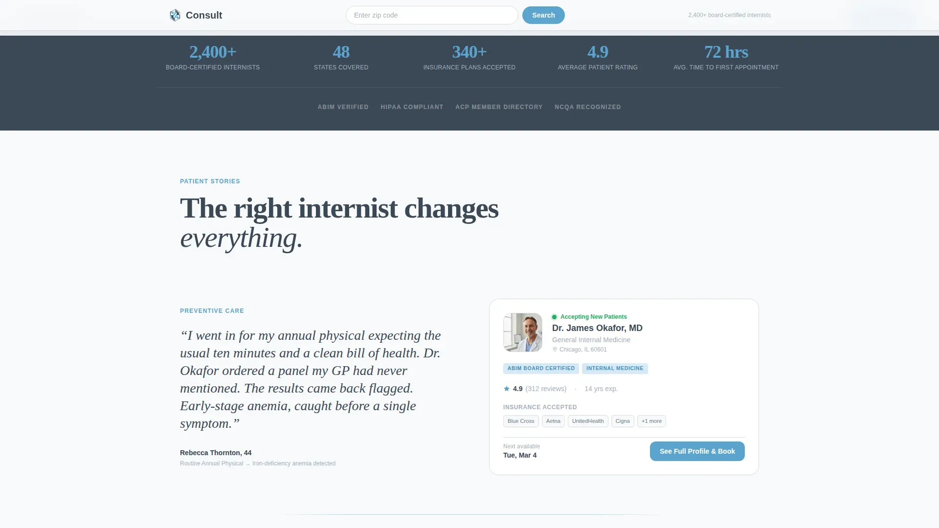
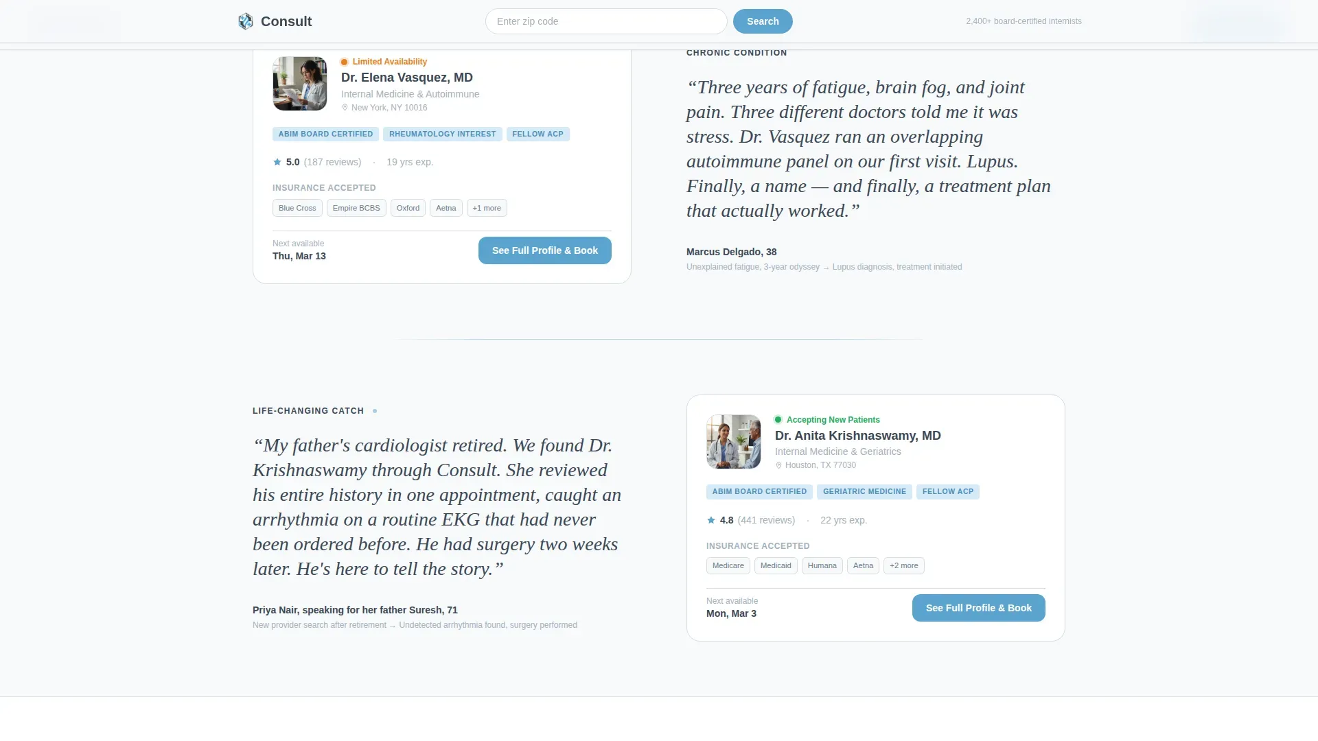
Three alternating rows pair a patient quote on one side with an internist profile card on the other. The layout flips each row. Testimonials escalate in stakes from a routine physical catch to a life-changing diagnosis, so trust builds progressively as the visitor scrolls.
Provider Profile Cards
Each card displays a headshot, credentials, accepted insurance networks, and a color-coded availability indicator. A green dot signals that the provider is accepting new patients. The primary call to action reads "See Full Profile and Book" and leads to a dedicated scheduling page.
Persistent Zip Code Search Bar
A top bar carries the zip code search field across the entire page. Visitors can re-filter results at any point without returning to the hero section. This is especially useful for desktop users comparing multiple providers.
Trust Bar with Aggregate Stats
A dedicated section displays board-certified provider counts, insurance network breadth, and aggregate ratings. These figures give first-time visitors an at-a-glance confidence signal before they engage with individual profiles.
Scroll Animation System
The layout uses GSAP-powered scroll reveals, staggered entrance animations, and subtle parallax effects. Provider cards and testimonials appear progressively as the visitor scrolls, keeping the page feel alive without distracting from the content.
Page sections overview
| Section | Purpose |
|---|---|
| Hero Type Tower | Zip code search entry point |
| Trust Stats Bar | Aggregate credibility signals |
| Zigzag Row One | Routine physical testimonial and provider card |
| Zigzag Row Two | Chronic condition testimonial and provider card |
| Zigzag Row Three | Life-saving catch testimonial and provider card |
| How It Works | Three-step asymmetric visual flow |
| Final Search call to action | Re-filter prompt with persistent search |
| Footer | Linear single-row site links |
Design & branding system
The visual identity follows a Medical Clarity theme. The palette feels like a freshly pressed lab coat against a clear morning window: sterile without being cold, trustworthy without trying too hard.
- Clinical charcoal (#3B4856) for body text and section anchors; examination-room white (#F7F9FB) on alternating section backgrounds; diagnostic sky (#5BA4CF) on buttons and active states
- Calm steel (#A3B1BF) used for borders, dividers, and secondary type throughout
- Fraunces serif display type for testimonial quotes and hero text; DM Sans for all interface labels, card details, and body copy
Mobile & speed optimization
The template is designed desktop-first to serve HR coordinators working in a browser, with full responsive support for mobile patients searching on their phones.
- Server Components power the static sections, keeping the interactive footprint small and the page load lean
- Client Components are used only where interactivity is required, such as the zip input, provider card hover states, and filter tabs
- The zigzag grid reflows cleanly to a single-column stacked layout on smaller viewports without losing the testimonial-provider pairing logic
How this template helps you convert
The page is structured as a click-through funnel. Every design and copy decision points toward one outcome: the visitor clicks "See Full Profile and Book."
- The hero captures search intent immediately with a zip code field, so visitors feel the directory is personalized to them from the first second.
- Escalating testimonials do the persuasion work before any provider card asks for a click. By the third zigzag pair, the visitor is choosing a provider, not browsing a list.
- The persistent search bar and repeated call-to-action placement mean there is never a moment when the next step is unclear, regardless of where the visitor is on the page.
Other information about this template
This template is part of the Consult collection, a set of healthcare directory templates designed around clinical editorial aesthetics. A few additional details worth noting:
- The template uses US-formatted zip codes, USD pricing where applicable, and US date formats throughout
- Localization is set to English by default, making it ready for US-based directory deployments out of the box
- The zigzag alternating layout style adapts well to any number of provider-testimonial pairs beyond the three included by default
- The footer follows a linear single-row pattern, keeping the bottom of the page clean and uncluttered
Theme
Medical Clarity
Creative direction
Testimonial Mosaic
Color system
Slate & Sky
Style
Zigzag/Alternating
Direction
Click-Through
Page Sections
Stacked Type Tower Hero
Zigzag Testimonial and Provider Layout
Provider Cards with Availability Indicators
Persistent Zip Code Search Bar
Trust Bar with Aggregate Statistics
GSAP Scroll Animation System
Related questions
Can I add more provider-testimonial pairs beyond the three included?
Does the template include a scheduling integration?
Who manages the provider data shown on the cards?
Is this template suitable for a single practice or only large directories?
Can the color palette be changed to match an existing brand?



