Internist Reviews Website Template
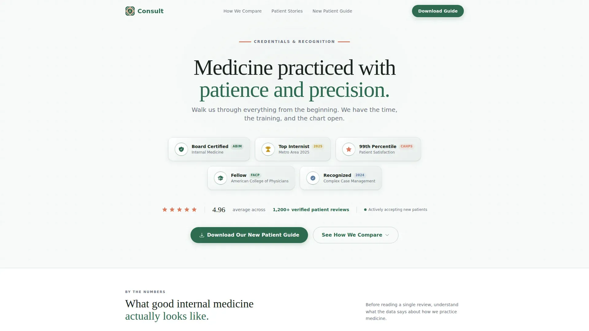
This internist testimonial and review landing page is built for internal medicine clinics that earn patient trust through credentials and data. It opens with credential badges and a 4.96-star aggregate rating, flows into diagnostic stats, then delivers side-by-side comparison tables with woven testimonials. The primary call to action is a free New Patient Guide download.
by Rocket studio
Quick summary
A single-page, data-led testimonial landing page for an internal medicine clinic. It leads with board certification badges and a verified 4.96-star rating across 1,200-plus patient reviews. Comparison tables contrast this practice against a typical internist experience. Condition-tagged testimonials appear between data rows, and a downloadable New Patient Guide anchors the primary conversion.
Who this template is for
This template is designed for internal medicine clinics that want to convert cautious, research-minded patients. It fits practices that have measurable outcomes, strong review data, and a story worth telling at length.
- Internal medicine and primary care physicians building a direct-to-patient web presence
- Clinic marketing teams who want a structured, trust-first page instead of a generic brochure site
- Practices targeting mid-career professionals and retirees who research thoroughly before booking
What problem this template solves
Most internist practice pages bury credentials in a footer and skip straight to a booking button. Patients with complex, unresolved symptoms need more than that before they commit. They want proof that this practice is different from the five offices that already shrugged them off.
- No clear way to communicate diagnostic depth compared to urgent care or rushed primary care
- Credentials and patient satisfaction scores exist but have no visual home that earns attention
- Prospective patients leave without understanding what a comprehensive internal medicine visit actually involves
What you get with this template
You get a fully structured, single-page layout that moves visitors from credential recognition through comparative evidence to a low-friction conversion. Every section is purposeful and sequenced to reduce objection at each scroll step.
- Award Badges header with credential shields, metro recognition marks, and a live-fade review stat
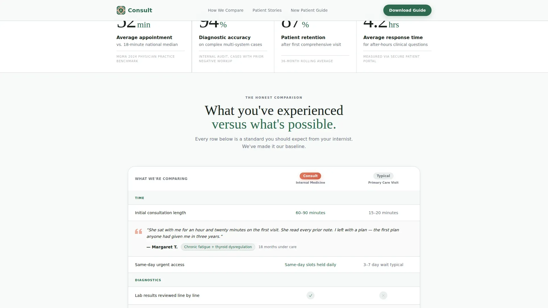
- Stats Impact section displaying diagnostic and appointment data in large, confident typography
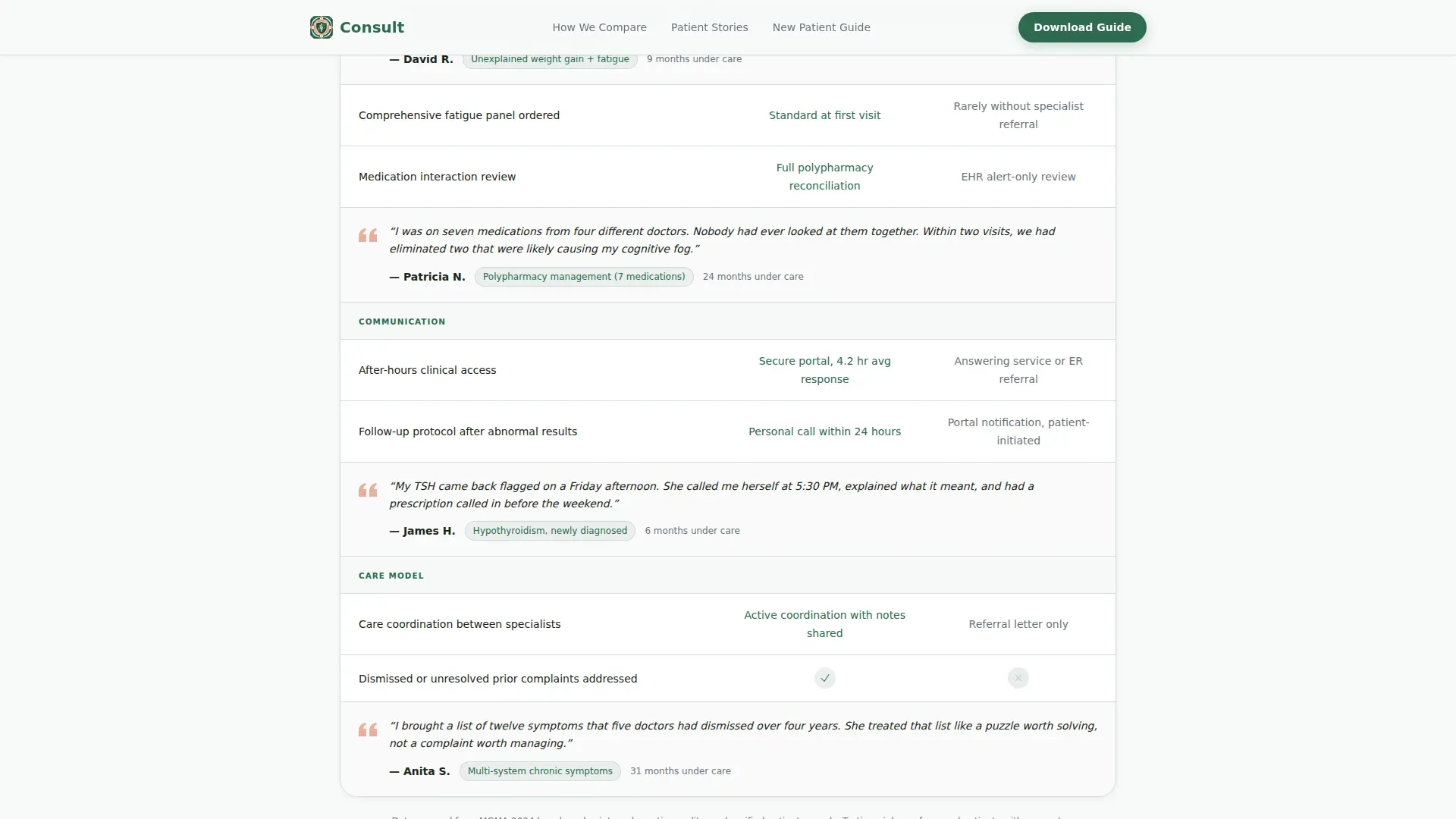
- Side-by-side comparison table contrasting this practice against the typical internist experience
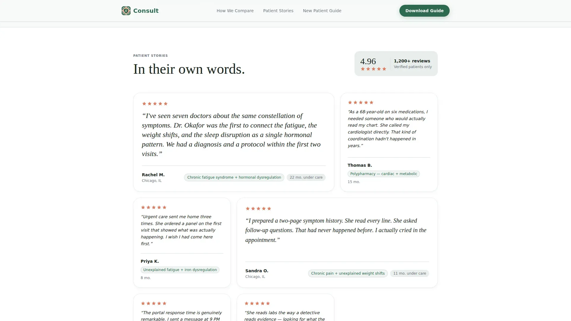
- Condition-tagged testimonial mosaic with months-under-care metadata woven between data rows
- New Patient Guide download form collecting first name and email only
- Secondary anchor call to action labeled "See How We Compare" for visitors not ready to submit
Feature list
A paragraph introduces each feature block below. The template is built around verifiable proof points and purposeful visual hierarchy.
Award Badges Header Array
A horizontal row of credential shields, board certification seals, "Top Internist" metro-area award marks, and patient satisfaction percentile badges opens the page. Each badge uses subtle embossing and metallic detailing against a glacial white background. No hero photo. No stock imagery. Credentials lead.
Stats-First Impact Section
Aggregate numbers arrive before any testimonial copy. Diagnostic accuracy rates, average appointment length compared to the national median, and patient retention percentages display in large serif typography. Scroll-triggered counter animations bring each number to life as the visitor reaches that section.
Side-by-Side Comparison Table
A structured table contrasts this clinic against the typical internist experience across dimensions including wait times, visit duration, follow-up protocol, and after-hours access. Hover states on each row draw attention to individual data points. Testimonial quotes appear between rows as inline proof of each comparison claim.
Condition-Tagged Testimonial Mosaic
Each patient quote carries two metadata tags: the condition managed and the number of months under care. This structure turns a testimonial section into a searchable evidence board rather than a vague praise wall.
New Patient Guide Download Form
A minimal two-field form (first name and email) triggers delivery of a PDF guide covering what to expect at a first comprehensive visit, how to prepare a medication list, and which lab panels to request. The form is positioned after the comparison section, when visitor trust is highest.
Anchor Navigation and Secondary Path
A secondary call-to-action button labeled "See How We Compare" scrolls directly to the comparison tables. Visitors who are not ready to download the guide can still move through the evidence without dead-ending. This dual-path approach keeps both ready and skeptical visitors engaged.
Page sections overview
| Section | Purpose |
|---|---|
| Award Badges Header | Display credentials and aggregate review rating |
| Stats Impact Block | Present diagnostic and appointment data numerically |
| Comparison Table | Contrast practice versus. typical internist side by side |
| Testimonial Mosaic | Show condition-tagged patient quotes with care duration |
| New Patient Guide call to action | Capture first name and email for guide delivery |
| Footer (Linear) | Provide single-row navigation and contact anchors |
Design & branding system
The visual system follows an Educational Guide theme. It uses the Alpine Fresh color palette, which pairs clinical credibility with just enough warmth to feel human. Typography is set in Fraunces for headings and DM Sans for body copy and interface elements.
- Crisp evergreen (#2D6A4F) for primary backgrounds, section dividers, and heading text
- Glacial white (#F8FAF9) as the dominant surface color behind badges and content cards
- River stone gray (#6B7280) for supporting body text and secondary labels
- Alpine wildflower (#E07A5F) reserved for star ratings, badge highlights, and interactive call-to-action elements
Mobile & speed optimization
The page is designed desktop-first, reflecting how mid-career professionals typically research healthcare providers. Full mobile support is included so the experience holds across all screen sizes without losing hierarchy or readability.
- Staggered badge entrance animations and scroll-reveal transitions are built with minimal JavaScript to keep load behavior smooth
- Server Components handle static content sections, reducing client-side rendering demands
- Comparison tables reflow cleanly on smaller screens so data rows remain readable without horizontal scrolling
How this template helps you convert
The page is structured around a trust-before-transaction philosophy. Each section earns permission for the next. The result is a conversion path that feels educational rather than promotional.
- The Award Badges header and aggregate rating establish authority immediately, so visitors know within seconds that this clinic has verifiable proof behind its claims.
- The comparison table gives hesitant prospects a concrete reason to choose this practice over alternatives, with testimonials reinforcing each data point in plain language.
- The New Patient Guide positions the clinic as an educator first, making the download feel like a useful resource rather than a lead capture form.
Other information about this template
This template is purpose-built for the internist testimonial and review page use case, which requires a different structural approach than a standard appointment-booking page. It teaches the visitor what thorough internal medicine care looks like before it asks them to act.
- The linear single-row footer pattern keeps the page clean and avoids distracting link clusters at the bottom
- Animation settings are set to medium intensity: counter animations, fade-ins, and staggered entrances that add motion without overwhelming clinical tone
- The desktop-first build reflects the research behavior of the primary audience, while the mobile layout ensures retirees and mobile users have a fully usable experience
- All date, currency, and language formatting follows United States English conventions
Theme
Educational Guide
Creative direction
Stats-First Impact
Color system
Alpine Fresh
Style
Comparison Table
Direction
Content/Resource
Page Sections
Award Badges Credential Header
Stats-first Impact Display
Side-by-side Comparison Table
Condition-tagged Testimonial Mosaic
New Patient Guide Download Form
Dual-path Anchor Navigation
Related questions
What type of medical practice is this landing page designed for?
Can I customize the comparison table categories?
What does the New Patient Guide download form collect?
How are testimonials displayed in this template?
Does this template work for practices with fewer than 1,200 reviews?



