Layered Consultant Landing Page Template
Aperture is a layered, cinematic landing page template built for solo marketing strategists and consultants. It uses a Monochrome Steel color system, overlapping scroll sections, and a single click-through path toward a booking page. The design mirrors a photographer's darkroom, turning brand clarity into a visual metaphor visitors feel before they ever book a call.
by Rocket studio
Quick summary
Aperture is a single-page consultant template built around one goal: getting a qualified visitor to book a strategy call. The design uses overlapping scroll cards, floating header photos, and a cinematic frame-by-frame sequence to build trust and momentum. Every section resolves a blurry problem into a sharp outcome, earning the click by the time the final call-to-action appears.
Who this template is for
This template is designed for independent marketing strategists who work directly with founders and senior marketing leaders. It suits a one-person practice with a clear point of view and a proven method to sell.
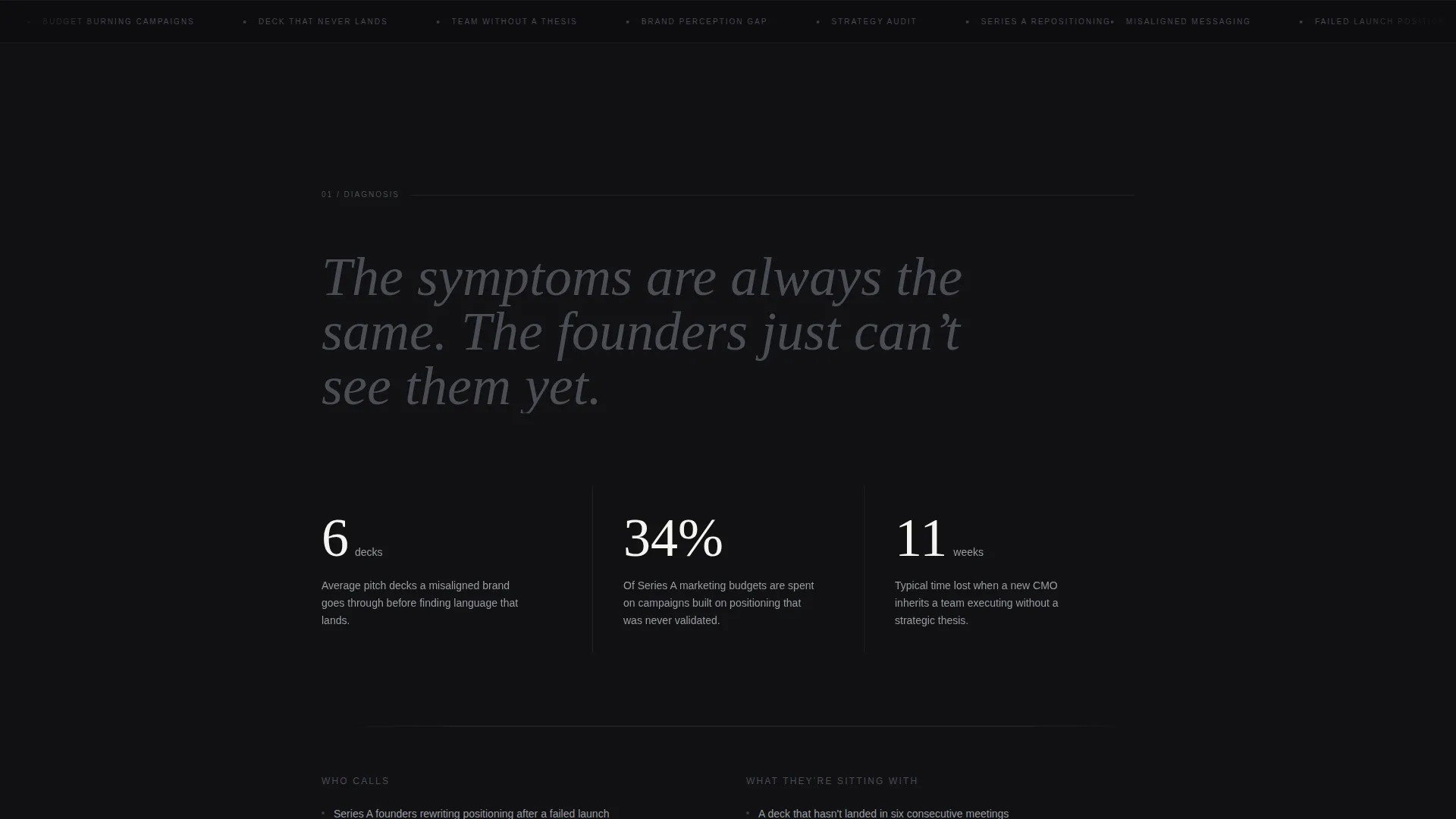
- Series A founders who are rewriting their positioning after a failed launch or stalled campaign
- Chief Marketing Officers who have inherited a team executing without a clear strategic thesis
- Agency owners who need an outside perspective to audit their own messaging and approach
What problem this template solves
Many consultants struggle to communicate their value on a page that feels generic. A personal strategy practice needs a landing page that projects authority without sounding like a brochure. This template solves the gap between what a strategist does and what a potential client can quickly feel and believe.
- Visitors arrive skeptical and leave without understanding what working with you actually looks like
- Most consultant pages list services without showing a method, leaving founders with no reason to trust the process
- Generic portfolio layouts bury the transformation story under credentials that do not land
What you get with this template
You get a fully structured, single-page layout that moves a visitor from problem recognition through proof and into a booking action. The design system is production-ready and thematically cohesive from the first frame to the final call-to-action card.
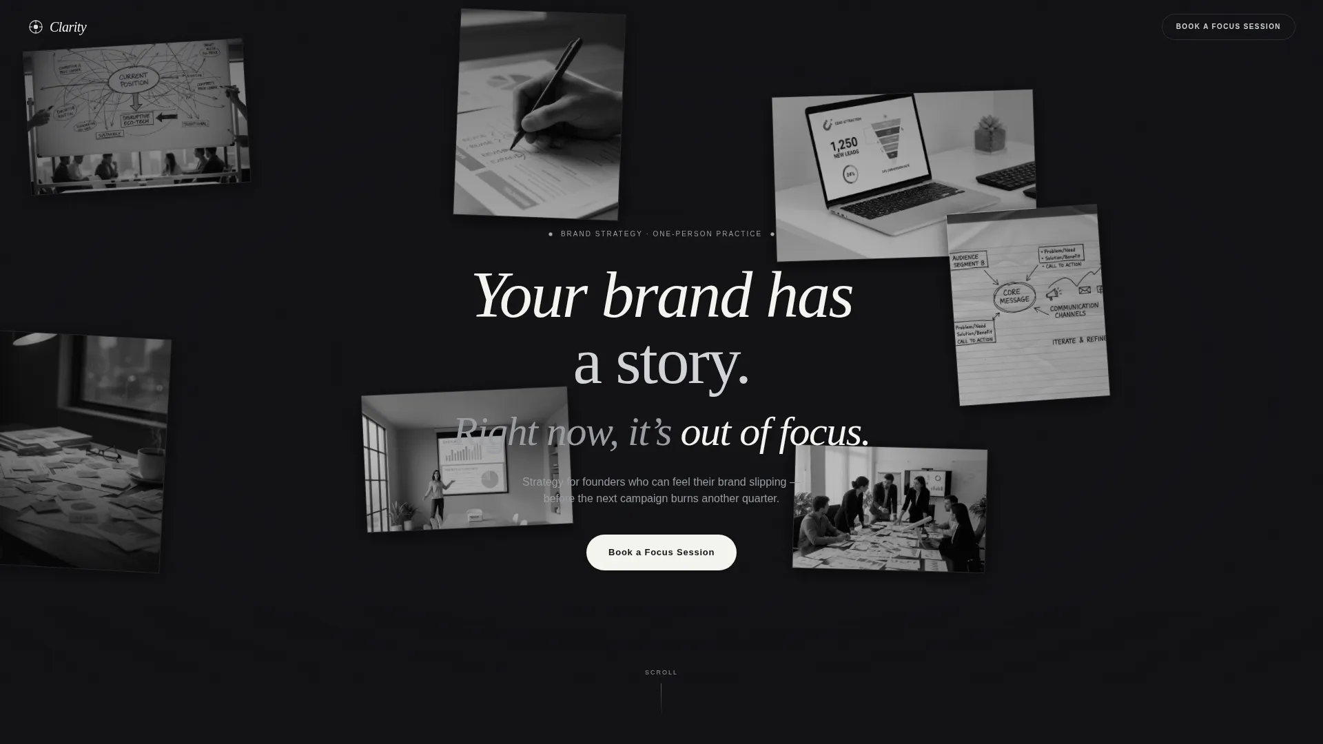
- A darkroom-themed header with six or seven floating black-and-white photo frames and a parallax cursor effect
- A cinematic scroll sequence with overlapping layered cards, a five-frame audit framework visualized as a film strip, and case study stills that sharpen as the visitor scrolls
- A click-through path that leads to an embedded booking page with a single pre-filled qualifying question
Feature list
Aperture includes a tightly scoped set of built-in components, each chosen to serve a solo consultant selling a premium engagement.
Floating Parallax Header
Six or seven black-and-white photo frames drift at different depths and slight rotations against a darkroom-black background. The frames respond to cursor movement with subtle parallax, creating a sense of depth without any grid or forced alignment.
Cinematic Scroll Sequence
Each section slides in as a layered card that overlaps the previous one. The pacing is deliberate: early sections breathe with whitespace, and later sections stack closer together to build momentum toward the booking call-to-action.
Film Strip Method Visualization
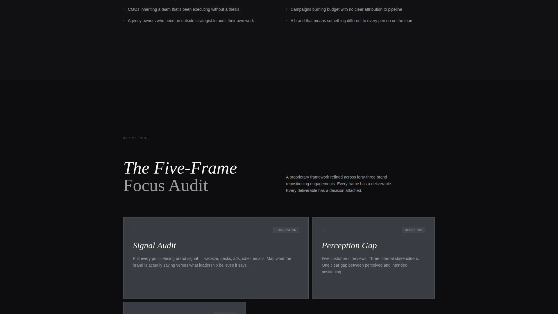
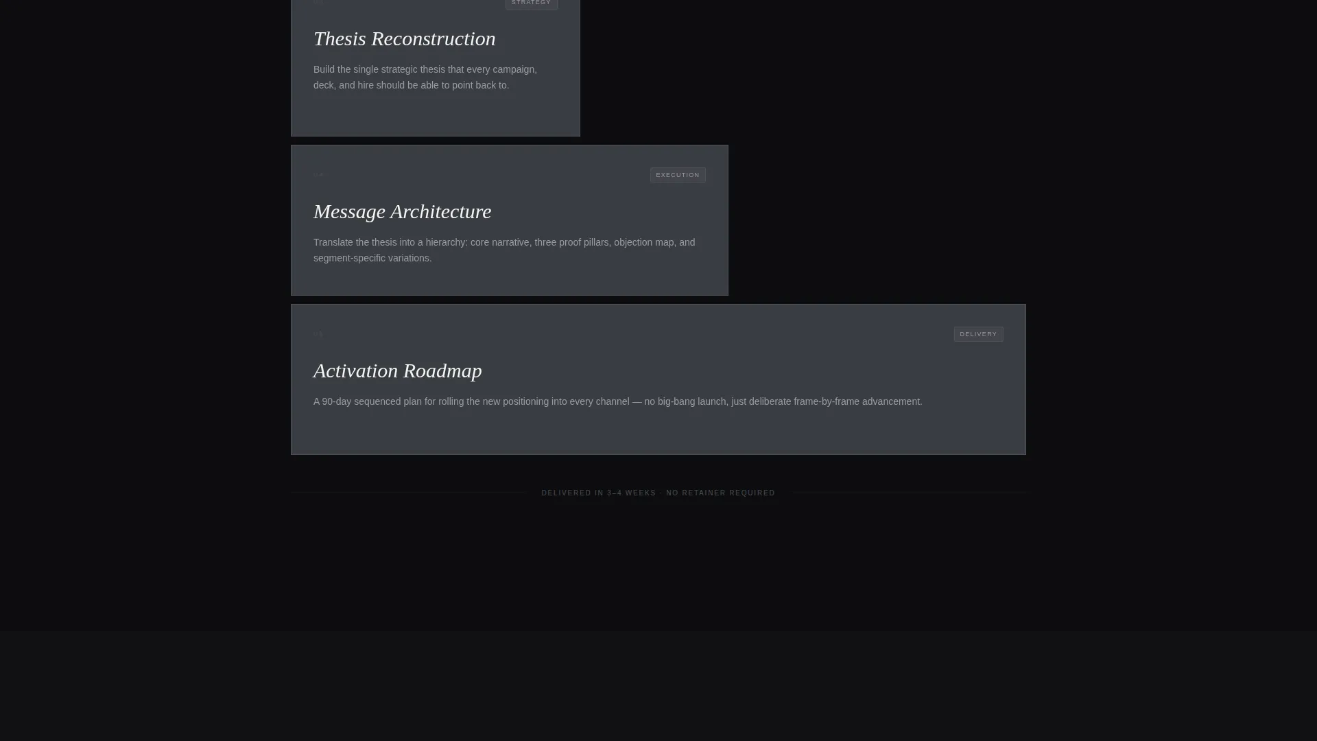
The proprietary audit framework is displayed as a five-frame film strip. Each numbered frame represents one stage of the method, giving visitors a tangible sense of structure and process before they commit to a call.
Scroll-Triggered Case Study Stills
Case study images begin blurred and sharpen as the visitor scrolls into view. Each still is paired with a single revenue or conversion metric, making proof feel earned rather than declared.
Fixed and Full-Width call to action System
The primary call-to-action, "Book a Focus Session", appears in three positions: a subtle fixed button in the top-right corner, a full-width placement after the case studies, and a final closing card with the headline "One call. One hour. Total clarity." and the button centered beneath it.
Zero-Friction Click-Through Path
No form fields appear on the landing page itself. The click carries the visitor directly to an embedded booking page with a single pre-filled qualifying question: "What's the one marketing problem keeping you up?" The friction between interest and commitment is kept as low as possible.
Page sections overview
| Section | Purpose |
|---|---|
| Floating Photo Header | Establishes atmosphere and opens with the core brand headline |
| Diagnosis Section | Shows what misalignment looks like in real, measurable terms |
| Method Film Strip | Visualizes the five-stage audit framework as a numbered sequence |
| Case Study Stills | Delivers social proof with scroll-triggered sharpening and single stats |
| Full-Width call to action Block | Converts momentum into a booking action after proof is established |
| Closing Focus Card | Ends the page with a calm, confident final push to book a session |
Design & branding system
The visual identity follows a Lens and Frame theme built on a Monochrome Steel color system. Every color and surface decision references a photographer's steel developing tank: industrial, purposeful, and stripped of decoration.
- Core palette: deep darkroom black (#111114), brushed gunmetal (#3A3D44), silver halide highlight (#D2D4D8), and projection-white (#F5F5F0) reserved for headlines and the primary call-to-action
- Backgrounds stack in overlapping planes of black and gunmetal, with silver type floating above like light leaking through a negative
- Interactive hover states bloom in projection-white, making every clickable element feel like an aperture opening against the dark field
Mobile & speed optimization
The template is designed to carry its cinematic weight without sacrificing usability on smaller screens. The layered card system and floating photo header are built to reflow cleanly across device sizes.
- The floating photo constellation adapts to mobile viewports while preserving the darkroom atmosphere and depth effect
- Layered scroll cards and the film strip sequence maintain their visual hierarchy on narrower screens without collapsing into a flat list
How this template helps you convert
Every design and copy decision in this template points toward a single outcome: a qualified founder or marketing leader clicking through to book a strategy call.
- The scroll sequence moves visitors from recognizing their problem to seeing a clear method and verified proof, so they arrive at the call-to-action already sold on the value of the conversation.
- The fixed call-to-action button keeps the booking path visible at every scroll depth, and the zero-friction click-through removes any form-based hesitation between interest and commitment.
Other information about this template
This template is part of the Aperture series and sits within the Portfolio and Agency category, specifically designed for the Freelancer and Consultant subcategory. It is built for a marketing consultant running a one-person practice at a premium positioning level.
- The template style is Overlap and Layered, meaning sections visually stack rather than sitting in a flat, sequential layout
- The creative direction is a Cinematic Sequence, and the header concept is built around Floating Photos as the primary visual anchor
- The landing page direction is Click-Through, meaning the page does not capture leads directly but routes visitors to a separate booking destination
- This template supports a Calendly embed on the destination booking page, with a pre-filled qualifying question already built into the link structure
Theme
Lens & Frame
Creative direction
Cinematic Sequence
Color system
Monochrome Steel
Style
Overlap/Layered
Direction
Click-Through
Page Sections
Floating Parallax Photo Header
Cinematic Layered Scroll Sequence
Five-frame Audit Method Strip
Scroll-triggered Case Study Proof
Three-position Call to Action Architecture
Zero-friction Click-through Booking Path
Related questions
Does this template include any form fields on the landing page?
Can I replace the header photos with my own images?
Is this template designed for consultants who offer more than one service?
How does the scroll-blur effect on the case study images work?
Can a consultant outside the startup space use this template?



