A-Frame House Real Estate Professional Website Template
Apex is a single-page landing page built for a buyer's agent who specializes in A-frame cabins and chalets. It uses a zigzag section layout, a dark emerald and polished brass color system, and a photo grid mosaic header to create an immersive, architectural browsing experience that moves visitors from first impression to intake form without friction.
by Rocket studio
Quick summary
Apex is a direct-sales landing page for an A-frame property buyer's agent. The design feels like moving through a mountain lodge, room by room. A nine-image mosaic header sets the scene. Zigzag sections walk visitors through the buying journey. A brass-on-emerald call to action and a streamlined intake form close the deal.
Who this template is for
This template is built for a buyer's agent who focuses on A-frame cabins, chalets, and mountain properties. It suits professionals who need a polished, conversion-ready page without building from scratch.
- Remote workers and second-home buyers looking for A-frame properties in mountain or lake regions
- Couples and short-term rental investors who need a trustworthy agent to locate hard-to-find listings
- A-frame specialist agents who want a landing page that reflects the character of the properties they sell
What problem this template solves
Most real estate landing pages feel generic. They do not reflect the specific niche, the type of buyer, or the emotional pull of the property type. Apex fixes that by building every section around the geometry and atmosphere of A-frame architecture.
- Generic pages fail to qualify buyers early, wasting the agent's time on vague inquiries
- Visitors leave before converting because there is no clear path from browsing to booking a consultation
- Agents with a specialized niche have no way to signal expertise visually or through page structure
What you get with this template
Apex delivers a complete, single-page layout designed around the A-frame buying journey. Every section has a clear role, and the visual system does the selling before a visitor reads a single word.
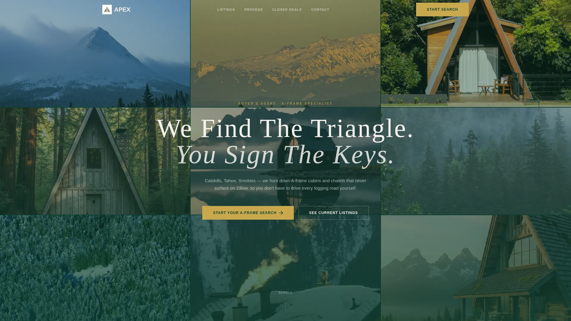
- A nine-image asymmetric photo grid mosaic header with parallax scroll and a single tracked-out headline
- Alternating zigzag content sections that pair property visuals with agent-led copy, testimonials, and closed deal proof
- A polished brass call-to-action system with a primary intake form and a secondary gallery path for self-qualifying browsers
Feature list
Apex is built around a set of deliberate, interconnected design decisions. Each feature serves the goal of turning a curious visitor into a qualified lead.
Nine-Image Parallax Mosaic Header
The header arranges nine A-frame photographs in an asymmetric grid that bleeds to the viewport edges. Images drift at different speeds on scroll, creating a layered depth effect. A single line of tracked-out white text overlays the grid: "We Find The Triangle. You Sign The Keys."
Zigzag Alternating Section Layout
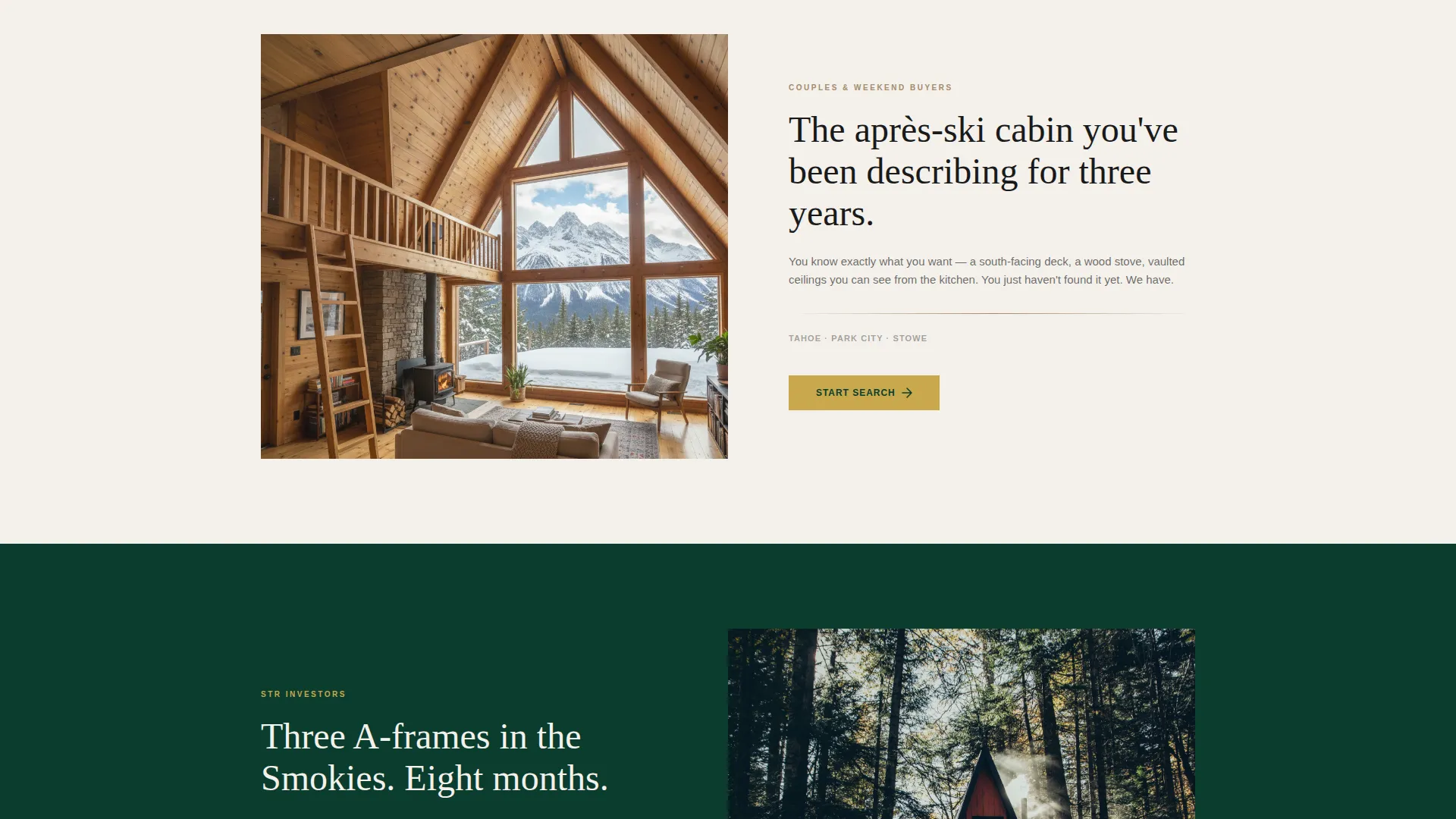
Each content section flips orientation, placing visuals on one side and copy on the other. Section backgrounds alternate between deep emerald and snow-fog white, creating a rhythm of dark and light that mimics moving through rooms. Diagonal dividers echo the roof-pitch geometry of A-frame structures.
Streamlined Buyer Intake Form
The primary call-to-action opens a focused intake with a location preference dropdown, a budget range slider from $250,000 to $2 million and above, a timeline selector, and an email field. The form collects only what the agent needs to take the next step.
Closed Deals Proof Section
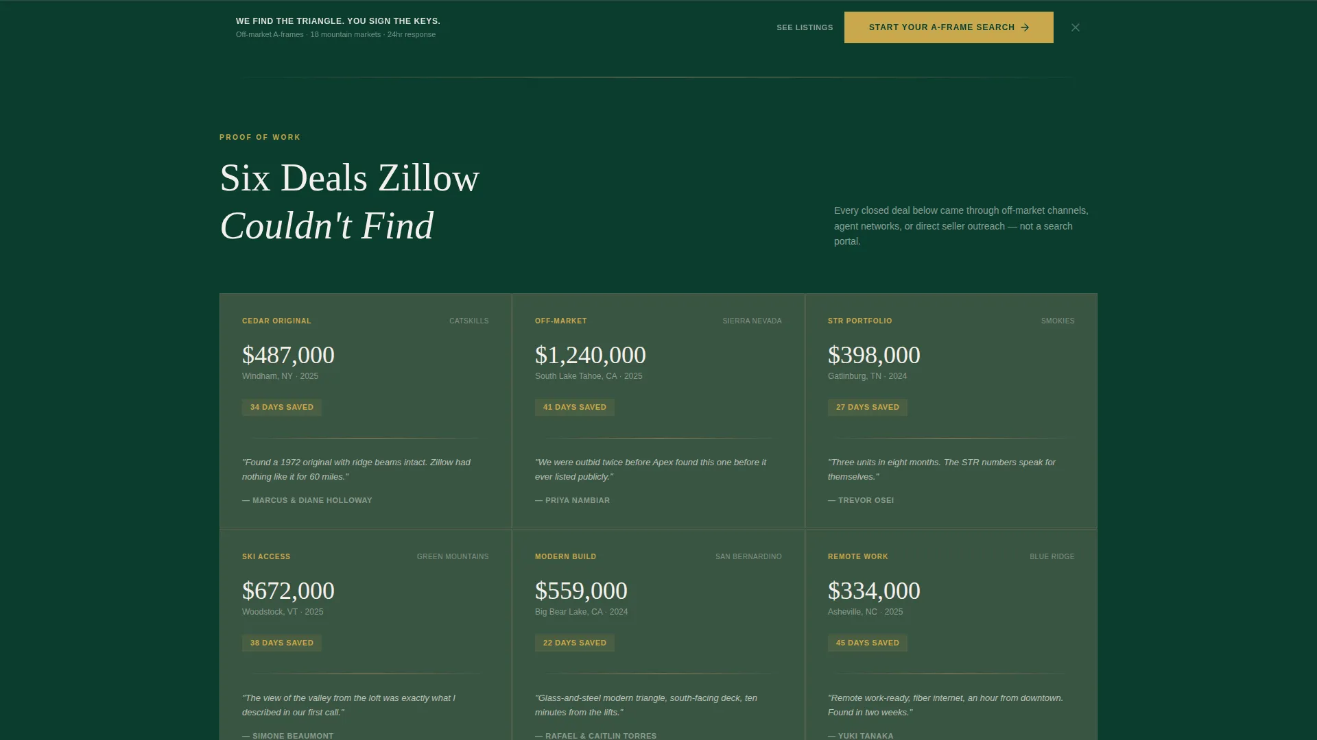
Six closed transactions are displayed with purchase price, days-on-market saved, and a single client quote each. This section builds credibility by showing concrete outcomes rather than general promises.
Sticky Call-to-Action Bar
After the third section, a sticky bar appears with the primary "Start Your A-Frame Search" button in polished brass. It stays visible as the visitor scrolls, keeping the conversion path accessible at all times.
Secondary Gallery Browse Path
A "See Current Listings" link leads browsers to a curated property gallery lower on the page. This secondary path lets visitors self-qualify before committing to the intake form, reducing drop-off from buyers who are not yet ready to engage directly.
Page sections overview
| Section | Purpose |
|---|---|
| Photo Grid Header | Sets visual tone and displays the headline |
| Primary call to action Block | Introduces "Start Your A-Frame Search" button |
| Property Search Map | Shows search reach with exposed ridge beam detail shot |
| Client Testimonial Row | Pairs written testimonials with vaulted interior imagery |
| Closed Deals Proof | Displays six transactions with price, speed, and client quotes |
| Curated Listings Gallery | Lets browsers explore current properties before committing |
| Sticky call to action Bar | Keeps the primary intake action visible after scroll |
Design & branding system
The visual identity follows a Luxe Minimal theme built on four precisely defined colors. The palette is inspired by a boutique lodge lobby at night: dark surfaces, warm brass hardware, and clean white light.
- Deep forest black-green (#0B3D2E) serves as the dominant background across dark sections, giving the page its grounded, after-hours atmosphere
- Weathered timber (#A68B6B) appears on secondary surfaces and dividers, adding warmth without breaking the dark-emerald dominance
- Snow-fog white (#F4F1EC) handles all body text and open space in light sections, keeping readability high against both dark and warm backgrounds
- Polished brass (#C9A84C) is reserved strictly for call-to-action buttons and hover states, ensuring every conversion element stands out immediately
Mobile & speed optimization
The layout is structured to adapt cleanly to smaller screens. The zigzag sections stack vertically on mobile, keeping the visual and copy pairing intact without crowding the viewport.
- The photo grid mosaic scales responsively, maintaining the asymmetric composition on tablet and mobile viewports
- The sticky call-to-action bar and intake form remain accessible at all screen sizes, so the conversion path is never buried on a small device
How this template helps you convert
Apex is designed to move a visitor through three clear phases: capture attention, build trust, and earn the click. Every layout decision supports that path.
- The mosaic header and headline create an immediate emotional hook, communicating the agent's niche before the visitor scrolls
- Zigzag sections with alternating proof elements, testimonials, and closed deal data build trust progressively as the visitor moves down the page
- The sticky call-to-action bar and dual conversion paths (intake form and gallery browse) ensure that both ready buyers and early browsers have a clear next step
Other information about this template
Apex is part of a collection of niche real estate landing page templates designed for agents who operate in a specific property category. The template is fully customizable, so agents can swap in their own photography, adjust copy, and update the closed deal figures to reflect their actual transaction history.
- The color system, typography, and section structure are all editable to match an individual agent's brand preferences
- The intake form fields (location dropdown, budget slider, timeline selector, and email) can be adjusted to reflect the agent's specific service regions and price tiers
- The template suits agents working in mountain towns, lake districts, and forested regions across the United States, including areas like the Catskills, Lake Tahoe, and the Smoky Mountains

Theme
Corporate Precision
Creative direction
Interactive Explorer
Color system
Dark Emerald
Style
Card Grid (Modular)
Direction
Direct Sales
Page Sections
Nine-image Parallax Mosaic Header
Zigzag Alternating Section Layout
Streamlined Buyer Intake Form
Closed Deals Proof Section
Sticky Call-to-action Bar
Secondary Gallery Browse Path
Related questions
Who is this landing page template designed for?
What does the intake form collect from potential clients?
Can I use my own photography in the header grid?
What is the purpose of the secondary gallery browse path?
How does the page demonstrate the agent's track record?



