Fitness Studio Specialist Booking Website Template
Grind is a scroll-reveal fitness landing page template built for boutique studios that want to prove they run a real system, not just a class schedule. It uses a void-black and electric-violet Dashboard Pro aesthetic, a Problem-to-Solution narrative arc, a sticky eight-row comparison table, a micro-quiz call to action, and a mobile-first layout designed to convert gym-frustrated professionals into committed members.
by Rocket studio
Quick summary
Grind is a high-converting fitness landing page template for boutique studios that coach with structure. The page opens on a full-width member-dashboard hero image, then walks visitors through a Problem-to-Solution Arc that shifts muted gray sections into sharp violet as they scroll. Every layout decision is built to guide visitors toward a single decision: join or book a trial class.
Who this template is for
This template was built for a specific kind of studio owner, one who has a real training methodology and needs a landing page that communicates that depth at first glance. It is equally useful for a fitness business launching its first dedicated landing page and for an established gym website looking to replace a generic homepage with something that actually converts.
- Boutique studio owners running structured programming cycles, heart-rate-zone conditioning, or periodized class sequencing under one roof
- Personal trainer groups or coaching teams offering personalized training to professionals, postpartum athletes, and amateur triathletes
- Any gym owner who wants a good gym landing page that goes beyond photos and lists a concrete, data-backed case for membership
What problem this template solves
Most gym landing page designs fail for the same reasons. They rely on stock photography, vague benefit statements, and a weak call to action buried beneath too much navigation. A visitor with real fitness goals lands on the page, sees nothing that speaks to them specifically, and leaves. The fitness world is competitive, and relying solely on a generic layout will not convert the visitors who are already comparing you to three other studios.
- Visitors cannot tell the difference between your studio and a typical gym, so they default to price or convenience instead of value
- There is no clear user journey from curiosity to commitment, leaving potential clients without a reason to act
- Social proof is either missing or too vague, so website visitors cannot picture what real progress looks like inside your system
What you get with this template
You get a complete, single-page layout designed from the ground up for a boutique fitness studio services page. Every section has a specific job. The hero image section establishes authority immediately. The Problem-to-Solution Arc builds tension and releases it through progressive scroll reveals. The sticky comparison table handles the most common objection a visitor brings: "Is this actually better than my current gym?" You get engaging content blocks, interactive features, and a frictionless booking form, all in one dedicated landing page.
- A five-section scroll-reveal layout including a dashboard hero, problem-solution arc, system pillars bento grid, sticky comparison table, and client stories section with real metrics
- A micro-quiz call to action that outputs a personalized gym comparison based on three visitor inputs, plus a secondary "Book a Free Trial Class" form with a date-picker and email field
- A complete Void and Violet design system using void black, electric violet, and phantom gray, with Plus Jakarta Sans headings and JetBrains Mono for data and metrics display
Feature list
This template ships with purpose-built components that support a high-converting fitness landing page without requiring you to assemble pieces from scratch. Each feature below maps directly to a section or interaction in the brief.
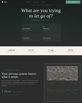
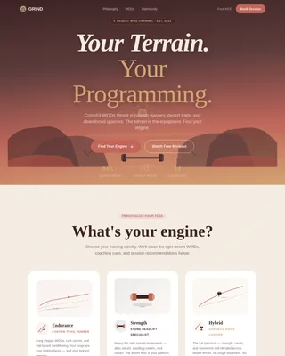
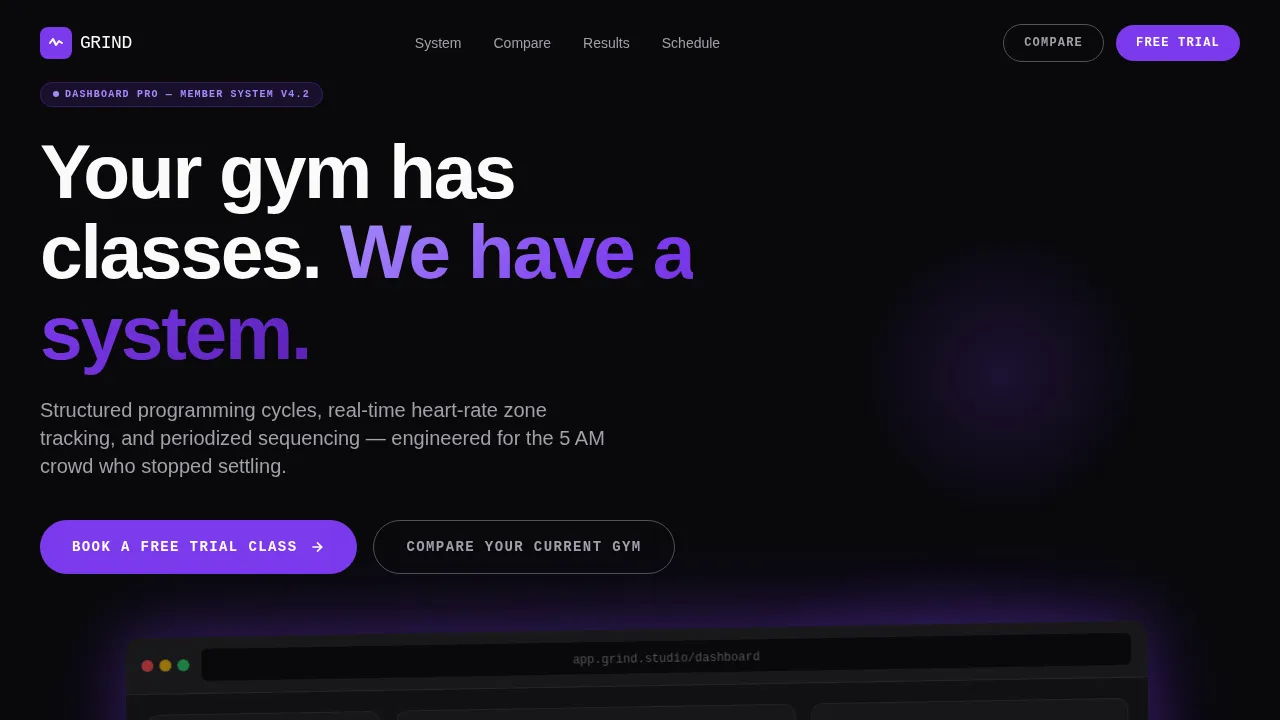
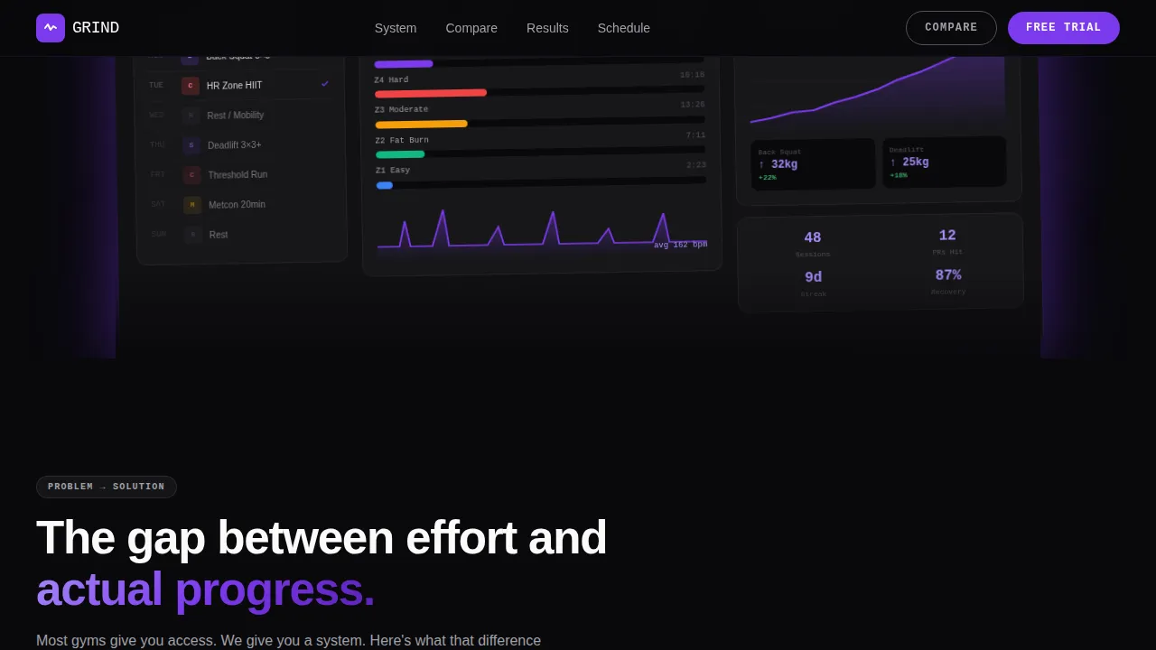
Dashboard-Style Hero Section
The header opens with a full-width product screenshot floating on a void-black background. The screenshot shows a real weekly class schedule, a heart-rate zone breakdown from a recent HIIT session, and a twelve-week personal progress graph trending upward. A subtle violet glow sits beneath the image as if the screen is the light source. The headline fades in above: "Your gym has classes. We have a system." This is a strong hero image moment that communicates the unique value proposition before a visitor reads a single word of body copy.
Scroll-Triggered Problem-to-Solution Arc
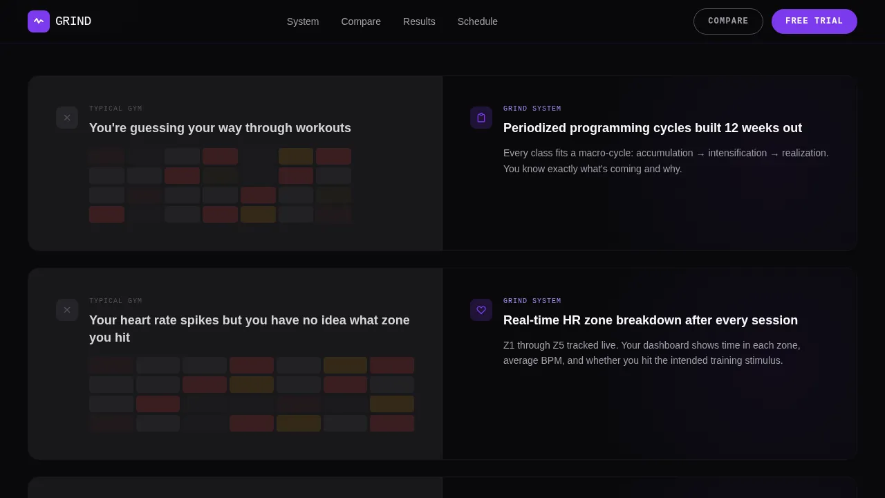
The page uses a progressive reveal system where each section starts muted gray and transitions to sharp electric violet as the visitor scrolls. The first reveal shows a chaotic calendar under the headline "You're guessing your way through workouts." Subsequent sections answer that pain point with structured programming cycles, real-time performance tracking, and periodized class sequencing. This scroll animation technique makes the user journey feel intentional and builds emotional momentum from confusion to clarity.
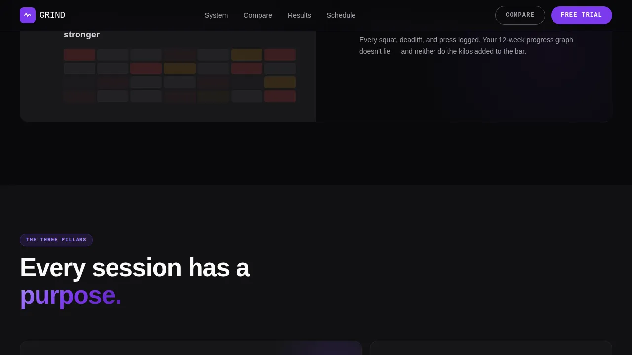
Sticky Eight-Row Comparison Table
The center of the landing page is anchored by a side-by-side table contrasting "Typical Gym" against the "Grind System" across eight specific rows: programming structure, progress tracking, coach-to-member ratio, heart-rate integration, recovery protocols, nutrition guidance, schedule flexibility, and monthly cost transparency. The table is sticky, meaning it stays visible as visitors scroll through surrounding content. This is one of the most effective interactive features for a comparison-led fitness landing page because it handles objections passively.
Three-Question Micro-Quiz call to action
The primary call to action is "Compare Your Current Gym," which triggers a three-question micro-quiz asking about current gym type, training goal, and sessions per week. The quiz outputs a personalized comparison result. This approach reduces friction because it turns a passive visit into an active conversation. It is a great example of how a fitness landing page can drive sign ups by making the visitor feel that the offer is built for them specifically.
Client Stories with Real Metrics
The social proof section features three named client archetypes, each paired with real personal record numbers and twelve-week progress data. These are not generic testimonials. They reflect specific, named profiles: the professional who left a globo-gym, the postpartum mother rebuilding her deadlift, and the amateur triathlete seeking structured speed work. Including before and after photos alongside specific results gives potential clients the tangible evidence they need to trust the system.
Mobile-First Scroll Animation Engine
Every animation, scroll reveal, hover state, and interactive feature is built mobile-first. Static server components handle non-interactive sections for fast initial load. Client components power the micro-quiz and comparison table interactions. The layout reflows cleanly from widescreen to phone without losing the data-visualization aesthetic that makes this fitness website feel distinct.
Page sections overview
| Section | Purpose |
|---|---|
| Dashboard Hero | Establish authority with a full-width member dashboard screenshot, floating violet glow, and bold headline |
| Problem Arc Reveal | Show a chaotic calendar with grayed styling, then progressively reveal the studio's structured answer as the visitor scrolls |
| System Pillars Grid | Present three core pillars, strength cycles, heart-rate zone tracking, and periodized sequencing, inside a bento-style grid |
| Sticky Comparison Table | Anchor the middle of the page with an eight-row side-by-side table and micro-quiz call to action |
| Client Stories Metrics | Display three client archetypes with named profiles, personal record numbers, and twelve-week progress data |
| Footer Row | Linear single-row footer with studio links and contact details |
Design & branding system
The visual identity follows a Dashboard Pro theme built around a Void and Violet color system. Every color choice was made to feel like a heart-rate monitor glowing in a dark studio at 6 AM. The palette lets everything recede except the data that matters, which pulses in violet against black. High quality images and strong visual elements are used deliberately, not decoratively.
- Color palette: absolute void black (#09090B) for backgrounds, deep ultraviolet (#2D1B69) for depth layers, electric violet (#7C3AED) for active states and data highlights, and cool phantom gray (#A1A1AA) for secondary text
- Typography: Plus Jakarta Sans for all headings and body copy, JetBrains Mono for data labels, metric readouts, and performance numbers, creating a clear visual hierarchy between narrative copy and performance data
- Motion and visual appeal: scroll-triggered gray-to-violet reveals, floating hero element with violet glow, staggered data animations, and comparison table hover states all contribute to a high-energy, data-forward aesthetic
Mobile & speed optimization
Mobile optimization is not an afterthought in this template. The brief specifies that the target audience checks their progress on their phone immediately after workouts, so every layout decision treats the mobile screen as the primary viewport. A large share of fitness traffic comes from mobile users, and this template is built to serve them first without compromising the desktop experience.
- Server components handle all static sections, including the hero, problem-arc panels, system pillars, and footer, so those sections load quickly without client-side JavaScript overhead
- Client components are scoped only to the micro-quiz, comparison table hover states, and the date-picker booking form, keeping interactivity targeted and fast
- The scroll-reveal animation engine, staggered data reveals, and floating elements are all implemented with mobile-first breakpoints to ensure the visual experience holds on small screens
How this template helps you convert
A high-converting fitness landing page must do more than look good. It must guide visitors from skepticism to action through a sequence of well-placed proof points, objection handlers, and low-friction entry points. This template builds that sequence deliberately.
- The Problem-to-Solution Arc makes visitors feel understood before it asks them to do anything, which increases emotional investment and reduces bounce behavior. The page literally wakes up section by section, mirroring the visitor's shift from doubt to confidence.
- The sticky comparison table and micro-quiz work together as a clear call to action system. The table handles passive objections visually, while the quiz converts active interest into a personalized result that makes the offer feel tailored. The secondary "Book a Free Trial Class" form reduces sign-up friction to two fields for visitors already convinced.
Other information about this template
This template is a great example of what a dedicated landing page can do when it is designed around a specific conversion goal rather than built as a general fitness website. It covers several key elements that separate a professional landing page from a basic gym website: a clear unique value proposition in the hero, detailed information in the comparison table, and social proof that includes real metrics rather than vague praise. The design also supports fitness brands that want to stand out in a crowded fitness world without relying on expensive custom builds.
- Fitness landing page examples built with this structure are well-suited to marketing campaigns targeting gym-frustrated professionals, where the comparison table directly addresses the decision a potential client is already making
- The page is a standalone web page with a single conversion goal, which means it does not use multiple pages or a standard navigation menu, keeping all website visitors focused on the primary call to action
- Good gym landing page practice includes transparent pricing and schedule details; this template dedicates one of the eight comparison rows specifically to monthly cost transparency, which reduces friction for prospective gym members
- A landing page builder approach works well here: the template is structured so each section can be customized in a compatible builder environment, saving time for any gym owner who wants a professional landing page without starting from scratch
- The template supports fitness programs that span multiple modalities, including barbell strength, heart-rate-zone conditioning, and triathlete speed work, making it flexible for studios with layered service offerings
- Creating fitness landing pages at this level of detail, including scroll animation, a micro-quiz, and a sticky comparison table, typically requires significant development time; this template packages those interactive features into a ready-to-use layout
- A dedicated landing page like this one also performs better in search engines than a buried service page because all content is focused, structured around a single offer, and free of competing navigation links
- Platforms like Landingi offer customizable fitness landing page templates tailored to fitness businesses, and Moosend provides a drag-and-drop landing page builder with ready-to-use templates for fitness marketing; Unbounce and Leadpages also offer landing page templates for the fitness industry, making it worthwhile to compare options before choosing where to host or build
- This template's data visualization aesthetic is particularly effective for studios that use tracking tools to measure member progress, since it frames performance data as a selling point rather than an operational detail
- Fitness enthusiasts who are already data-aware, such as amateur triathletes tracking heart-rate zones or professionals monitoring muscle gain over time, will recognize the dashboard aesthetic immediately and respond to it as a trust signal
- Membership management details and gym membership transparency are addressed directly in the comparison table, which is one of the strongest conversion tools a fitness site can include on a dedicated landing
Theme
Dashboard Pro
Creative direction
Problem→Solution Arc
Color system
Void & Violet
Style
Scroll Reveal (Progressive)
Direction
Comparison/Versus
Page Sections
Dashboard Hero with Floating Screenshot
Scroll-triggered Problem-to-solution Arc
Sticky Eight-row Comparison Table
Three-question Micro-quiz Call to Action
Named Client Stories with Real Metrics
Mobile-first Scroll Animation Engine
Related questions
Can I customize the color system and typography?
Is the micro-quiz and comparison table included and ready to use?
Does this template work well as a fitness landing page for paid campaigns?
How does the social proof section work?
Is this template suitable for a personal trainer or small coaching team?