Racing Driver Academy Landing Page Template
Apex is a scroll-reveal landing page template built for racing driver academies. It uses an Industrial Raw visual identity, a Comparison Journey scroll structure, and a Ruby & Chrome color system to make visitors feel the gap between their current skill and their potential. A single call-to-action drives every click toward a booking page.
by Rocket studio
Quick summary
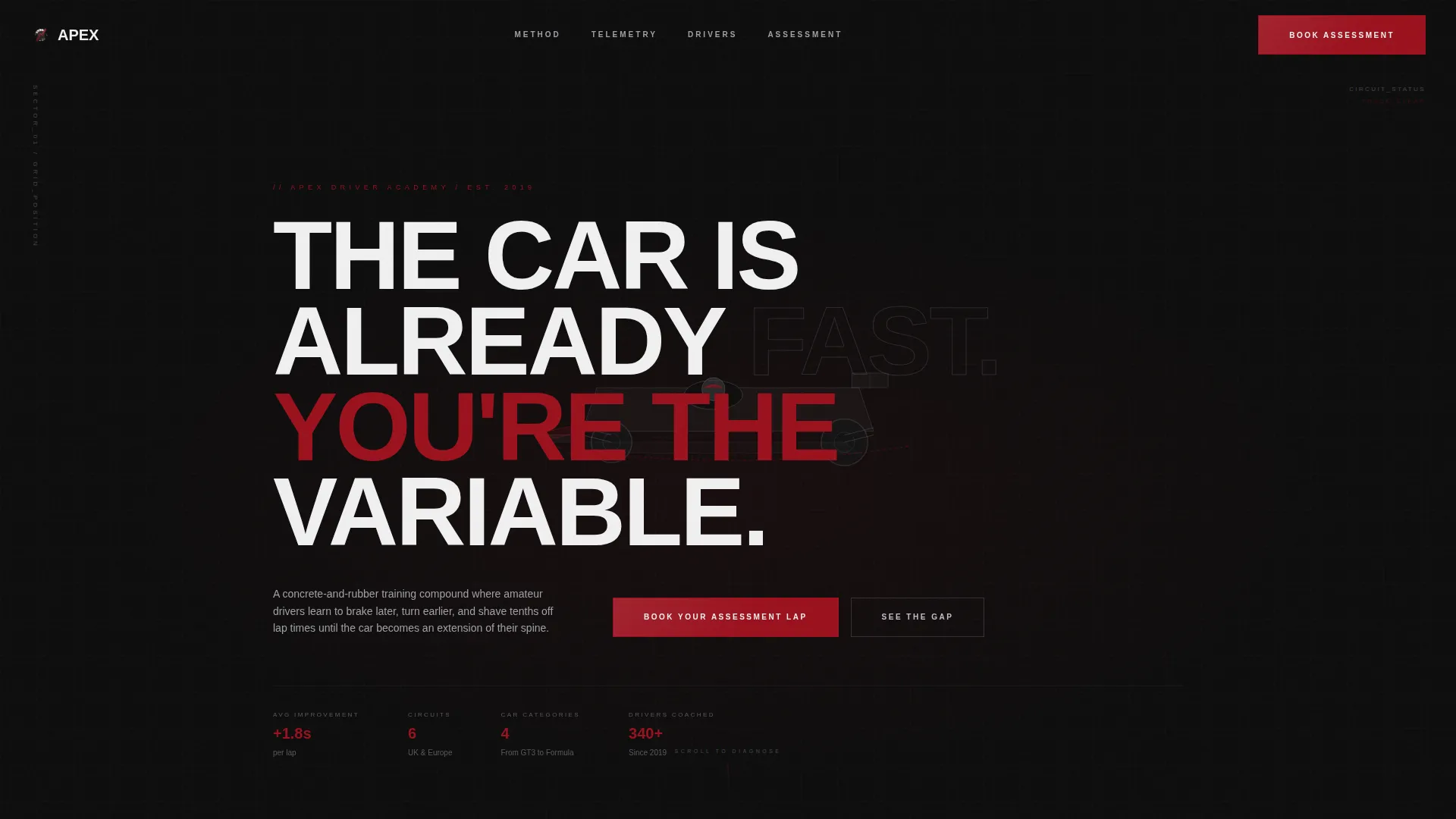
Apex is a single-page, scroll-reveal template for a racing driver academy. It opens with an exploded-view car animation that reassembles on scroll, then guides visitors through side-by-side telemetry comparisons. Every section builds the case for professional training. Three strategically placed calls-to-action funnel visitors toward one destination: booking an assessment lap.
Who this template is for
This template is designed for racing driver academies that train real people on real circuits. It speaks directly to an audience that already has seat time and wants to go faster with proper coaching.
- Track-day drivers who have hit a performance plateau and want structured coaching
- Karting graduates stepping into formula or GT cars for the first time
- Experienced drivers who own high-performance cars but want to use their full capability
What problem this template solves
Most motorsport training providers present their offer the way a brochure would: a list of courses, some photos, and a contact form. That approach asks visitors to imagine the value rather than feel it. Apex solves this by replacing passive description with active evidence.
- Visitors compare untrained versus trained driver data in the same corner, filmed from the same angle
- Telemetry overlays animate in real time, making the skill gap impossible to ignore
- The page removes every distraction and routes all momentum toward one frictionless next step
What you get with this template
You get a fully structured, single-page layout built around the Comparison Journey scroll format. Each section is pre-designed to handle specific persuasion work, so you are not assembling a page from scratch.
- A scroll-reveal progressive layout with animated telemetry comparison sections
- An exploded-view header animation that reassembles around a silhouetted driver on first scroll
- Three call to action placements including a fixed bottom bar that activates after sixty percent scroll depth
Feature list
This template ships with purpose-built components that reflect the specific demands of a high-performance racing academy landing page.
Exploded View Header Animation
The header opens with a racing car deconstructed into its layered components: chassis, suspension geometry, brake assembly, steering column, and the driver's seat with harness. Each layer floats in space against pure black. On the first scroll pixel, all pieces collapse inward and reassemble around a silhouetted driver. The headline lands on impact.
Animated Telemetry Comparison Sections
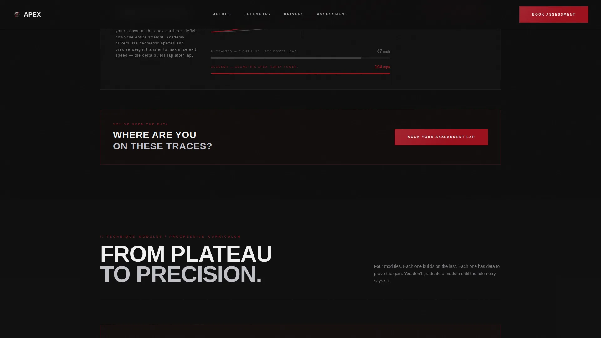
Each comparison section pairs an untrained driver against an academy graduate using the same corner filmed from the same camera angle. Braking point, steering input count, and exit speed are shown side by side. Telemetry traces animate as they enter the viewport, one in concrete gray and one in ruby red, with the gap widening like a verdict.
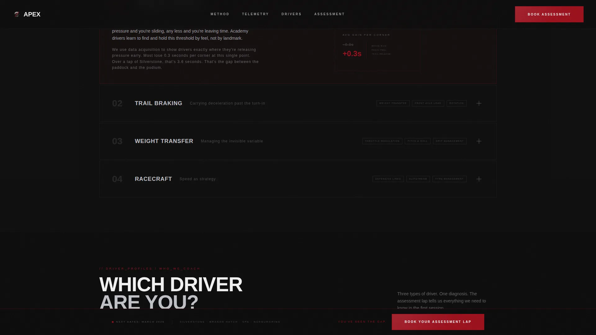
Progressive Technique Reveal Structure
The scroll sequence moves from foundational to advanced. Threshold braking, trail braking, weight transfer, and racecraft are each introduced in sequence. Every section becomes more granular and more technical, building diagnostic pressure rather than sales pressure.
Three-Point call to action System
The primary call-to-action, "Book Your Assessment Lap," appears three times. Once after the header reassembly, once at the widest point of the telemetry gap mid-scroll, and once as a fixed bottom bar. No form appears on this page. Each click routes visitors directly to a scheduling page.
Ruby & Chrome Color System
The color palette uses deep asphalt black, brushed chromium, and pit-lane concrete as the base. Ruby red is reserved strictly for calls-to-action, data highlights, and the racing line in track diagrams. The result is a high-contrast, purposeful visual system where red always signals action.
Industrial Raw Visual Theme
Every design choice reflects the interior of a race team's garage at dawn: cold metal textures, an oil-stained floor aesthetic, and restrained typography. Nothing decorative competes with the data. The visual identity reinforces the academy's credibility before a single word is read.
Page sections overview
| Section | Purpose |
|---|---|
| Header Assembly | Opens with exploded car view, reassembles on scroll, delivers headline |
| First call to action Block | Prompts assessment lap booking immediately after the header impact |
| Braking Point Comparison | Shows 80-meter versus 45-meter braking data side by side |
| Steering Input Comparison | Contrasts three corrections versus one clean steering input |
| Exit Speed Comparison | Highlights 87 mph versus 104 mph exit speed with animated traces |
| Advanced Techniques Reveal | Progressively introduces threshold braking, trail braking, weight transfer |
| Racecraft Section | Final technique comparison; visitor is diagnosed, not sold |
| Mid-Scroll call to action Block | Appears at widest telemetry gap to capture high-intent visitors |
| Fixed Bottom Bar | Activates at sixty percent scroll depth; always visible from that point |
Design & branding system
The visual identity follows an Industrial Raw theme. Every color and texture choice is intentional, referencing the physicality of a professional race environment rather than generic motorsport graphics.
- Color palette: deep asphalt black (#0D0D0D), brushed chromium (#C0C0C8), pit-lane concrete (#3A3A3C), and ruby red (#9B111E)
- Ruby red is used exclusively for calls-to-action, telemetry highlights, and the racing line in track diagrams
- Typography and layout reflect cold-metal restraint: nothing decorative, nothing that competes with the data on screen
Mobile & speed optimization
The scroll-reveal interactions and telemetry animations are designed to work within the visual hierarchy of a single-page layout. The template is built to present clearly across screen sizes.
- Progressive scroll reveals are structured so key comparison data remains readable on smaller viewports
- The fixed bottom call to action bar is designed to stay visible and usable without overlapping core content on mobile screens
- Section sizing and spacing are calibrated so telemetry overlays do not lose impact on narrower displays
How this template helps you convert
Apex does not rely on persuasive writing alone. The page architecture is structured so the evidence builds pressure organically, and the booking step feels like the obvious next move.
- The Comparison Journey structure means visitors arrive at the call to action already convinced by data, not by claims, which removes the most common barrier to clicking
- The three-point call to action placement ensures high-intent visitors are never more than one visible section away from the booking action, regardless of where they stop scrolling
- The no-form design eliminates friction on this page entirely, routing all commitment to a dedicated scheduling page where the visitor chooses their circuit, car category, and date
Other information about this template
This template sits at the intersection of motorsport and high-performance lifestyle marketing. It is built for academies that serve serious drivers, not casual enthusiasts, and the design language reflects that positioning throughout.
- The template uses a Click-Through landing page direction, meaning the only conversion goal is getting the visitor to click through to a separate scheduling page
- The scroll reveal, or progressive reveal, format means content sections appear as the visitor scrolls, keeping focus narrow and reducing cognitive load
- This template is well suited for academies operating across multiple circuit venues, since the booking flow branches by circuit, car category, and date on the destination page

Theme
Industrial Raw
Creative direction
Comparison Journey
Color system
Ruby & Chrome
Style
Scroll Reveal (Progressive)
Direction
Click-Through
Page Sections
Exploded View Header Animation
Animated Telemetry Comparisons
Progressive Technique Reveal
Three-point Call to Action Placement
Ruby & Chrome Color System
Industrial Raw Visual Theme
Related questions
Does this template include a booking form?
Can I update the telemetry comparison numbers with my own data?
Who is the target visitor for this landing page?
How many times does the primary call-to-action appear?
Is this template suited to academies running multiple circuit venues?


