Premium Wealth Umbrella Landing Page Template
Shield is a single-page landing page template built for pre-retiree umbrella insurance brokerages. It uses three progressive comparison tables to expose the liability gap in plain terms, then drives visitors to a partner quoting engine. The Corporate Precision design system, deep charcoal backgrounds, and teal interactive elements create focused authority that moves high-net-worth professionals toward action.
by Rocket studio
Quick summary
Shield is a bridge clear coverage gap landing page template designed for umbrella insurance brokerages that serve high-net-worth professionals aged 50 to 65. Three structured comparison tables walk visitors through the exact gap between what existing policies cover and what they leave exposed. The page earns each click before it asks for one, then routes visitors to a partner quoting engine through a persistent teal call-to-action bar.
Who this template is for
This template is built for insurance brokerages and independent agents who serve pre-retiree clients with meaningful assets to protect. If your customer has crossed the seven-figure net worth threshold and still relies only on homeowners and auto policies, this landing page speaks directly to their situation. It also works well for brokerages that want to create a focused conversion tool without building a multi-page site from scratch.
- Umbrella insurance brokerages targeting professionals aged 50 to 65
- Independent agents serving clients with rental properties, lake houses, boats, or pools
- Brokerage teams that want a clear, single-page tool to bridge the gap between prospect awareness and a quoting conversation
What problem this template solves
Most high-net-worth professionals in their final working decade carry homeowners, auto, and professional liability policies. They assume those policies are enough. The gap analysis built into this template reveals exactly where those policies stop and where personal liability exposure begins. Visiting this landing page, a prospective client sees their current state mapped against the future state they are actually risking, scenario by scenario.
The problem is not just financial. It is psychological. People who have spent thirty years building wealth rarely stop to assess the gap between their coverage and their assets. This template does that assessment for them, visually and progressively, before asking for any commitment.
- Exposes the hidden gap between standard policy limits and real-world judgment amounts
- Reframes umbrella coverage cost against the asset value at stake, making the gap viscerally clear
- Removes friction by routing visitors to a quoting engine rather than holding them on a long intake form
What you get with this template
You get a fully structured, single-page layout that moves visitors through a deliberate comparison journey. Every section is designed to bridge the gap between confusion and confidence, making the case for coverage before the visitor reaches the call to action. The template is easily editable, allowing your team to update figures, coverage tiers, and client profile details without redesigning from the ground up.
- A hero section with a charcoal full-bleed background, a centered teal glow effect, and a bold headline that states the outcome visitors are currently missing
- Three distinct comparison tables covering coverage gaps, umbrella tier pricing, and anonymized client profile architectures
- A persistent fixed bottom bar with a teal call-to-action button and inline asset-range and household-size selectors embedded in the second table section
Feature list
This template is built around a clear set of components. Each one serves a specific role in the conversion plan. Together they create a well structured gap analysis experience that keeps the audience engaged from the first scroll to the final click.
Pain-Driven Hero Section
The hero opens on a dark charcoal full-bleed field with a soft teal glow radiating from the center. A bold sans-serif headline fades in on load, stating the outcome the visitor is currently missing. A parchment subline confirms the coverage range available, and a teal pill button pulses gently to draw the eye. The section creates immediate authority without a single photograph, relying on typographic weight and light to establish tone.
Coverage Gap Comparison Table
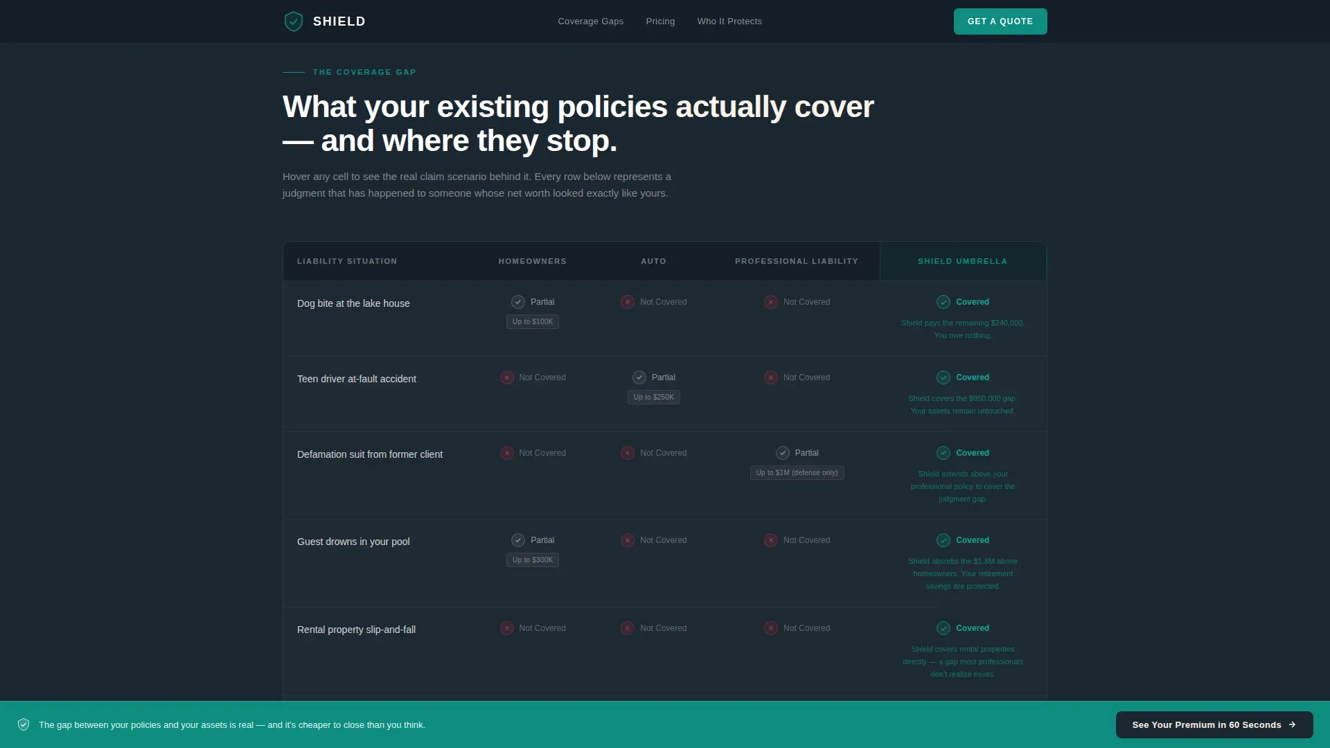
The first comparison table is the core gap analysis tool on the page. It maps homeowners, auto, and professional liability policies against the real scenarios those policies fail to cover. Cells glow teal on hover, revealing actual claim examples: a dog bite at a lake house, a teen driver at-fault accident, a defamation suit from a former client. This is the moment the gap becomes undeniable. Visitors assess their current situation against a concrete desired state before they have scrolled halfway down the page.
Umbrella Tier Comparison Table
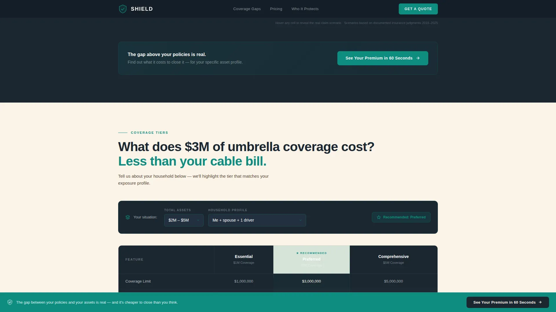
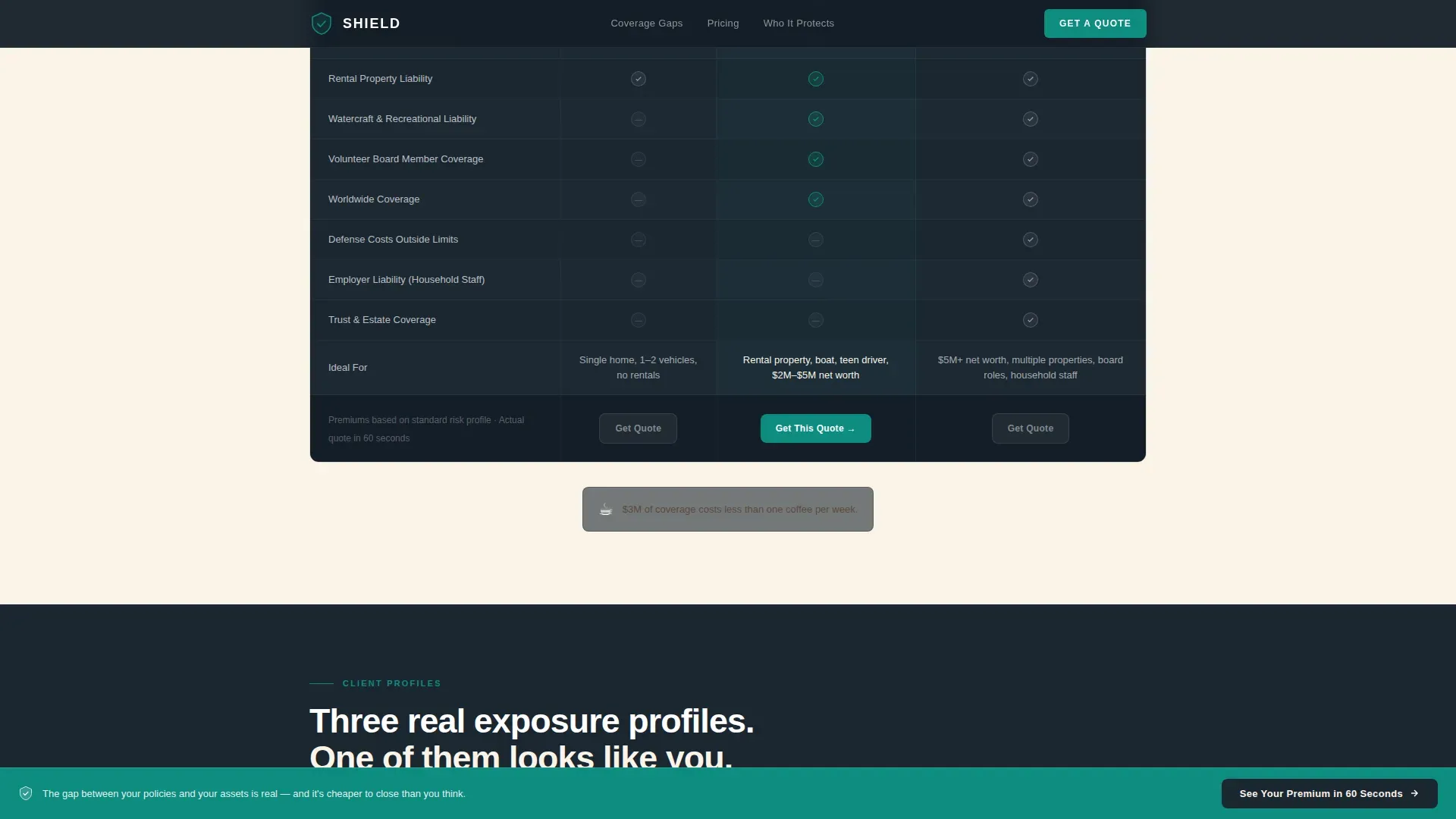
The second table compares three umbrella coverage tiers side by side: one million dollars, three million dollars, and five million dollars. Annual premiums appear alongside each tier, making the cost-to-protection ratio immediately legible. Two inline selectors, one for asset range and one for household size, are embedded naturally in this section. Visitors can orient themselves to the right tier without leaving the page, keeping the team-and-client conversation grounded in specifics.
Client Profile Architecture Table
The third table presents three anonymized client profiles, each showing exact coverage architecture. The dentist with four properties. The retired chief financial officer serving on two nonprofit boards. The couple with a pool and a boat. Each profile shows what gap exists in the current state, what the desired future state looks like with umbrella coverage in place, and what the annual cost difference amounts to. This section is the most powerful tool for helping prospects identify their own situation.
Persistent Call-to-Action Bar
A slim teal bar anchors to the bottom of the screen as the visitor scrolls. It carries a single button that reads "See Your Premium in 60 Seconds." The bar becomes visible after the visitor passes the first comparison table, ensuring the call to action appears only after the gap is already clear. The bar does not compete with the content. It waits for the right moment, then stays in place until the visitor is ready to act.
Interactive Hover-Reveal Claim Scenarios
Each table cell in the coverage gap section contains a hover-reveal layer showing a real claim scenario and the dollar amount that fell through the policy gap. This interactivity is not decorative. It keeps the audience engaged and delivers specific detail that a static table cannot. The hover states use teal fills and white typography to maintain brand consistency while adding a moment of discovery that makes the gap feel personal rather than theoretical.
Page sections overview
| Section | Purpose |
|---|---|
| Hero: Headline + Glow | States the missing outcome and introduces the coverage range with a pulsing call-to-action button |
| Gap Analysis Table | Compares existing policy limits against real claim scenarios using hover-reveal teal cells |
| Mid-Page Call to Action | Prompts the first click to the quoting engine after the gap has been established |
| Tier Pricing Table | Compares one million, three million, and five million dollar umbrella tiers with premiums and inline selectors |
| Client Profile Table | Shows three anonymized coverage architectures to help visitors identify their own gap |
| Persistent Bottom Bar | Fixed teal bar with the "See Your Premium in 60 Seconds" button that follows the visitor throughout the scroll |
| Minimal Footer | Single-row footer with essential links and legal text |
Design & branding system
The design language is Corporate Precision: authoritative, focused, and precise without being cold. The Teal Catalyst color system creates a unique blend of warmth and decisiveness that feels appropriate for a high-stakes financial services conversation. The palette evokes a corner-office desk at dusk: dark walnut surfaces, a single banker's lamp casting focused light on the document that matters most.
- Deep boardroom charcoal (#1B2631) anchors all backgrounds and primary typography, providing the authority the audience expects
- Decisive teal (#0E8C7F) drives every interactive element, hover state, and call-to-action moment, signaling exactly where to act
- Warm parchment (#FAF3E8) softens long-read sections, reducing eye fatigue without breaking the overall tone; signal white (#FFFFFF) gives table cells and breathing space their clarity
Mobile & speed optimization
The template is designed desktop-first, reflecting the boardroom and home-office context in which pre-retiree professionals typically research financial decisions. Complex comparison tables benefit from the wider viewport that desktop provides, and the interactive hover states are most legible on non-touch screens. The layout is structured to load efficiently, using static server components for the comparison tables and client components only for the interactive elements that require them.
- Static server rendering for all three comparison tables keeps initial page load lean and responsive
- Client-side components handle hover-reveal scenarios, inline selectors, and the scroll-linked persistent bar without affecting the static content
- The layout stack adapts for tablet and mobile viewports, preserving table readability at smaller sizes through horizontal scroll and collapsed column formatting
How this template helps you convert
This template is engineered around a single conversion goal: move the visitor from gap awareness to quoting-engine click. Every section is a stage in the analysis process, and every stage builds pressure toward the moment of action. The page earns the click rather than demanding it, which is especially important when the customer is a skeptical, high-net-worth professional who has seen every insurance pitch before.
- The hero creates immediate emotional urgency by naming the exact risk the visitor has not yet quantified, establishing the current state problem before offering any solution
- The three progressive comparison tables identify gaps at increasing levels of personal specificity, moving from generic policy limits to real claim scenarios to a client profile that mirrors the visitor's own situation, so the desired state becomes obvious
- The persistent call-to-action bar captures the visitor at peak readiness, routing them to the quoting engine with asset-range and household-size parameters already collected, so the first interaction with the broker feels relevant and prepared
Other information about this template
This template is a great starting point for any brokerage team that needs to create a high-stakes financial services landing page quickly. The editable features allow project managers and business analysts on the brokerage team to update coverage figures, client profiles, and tier pricing as market conditions change. The layout supports strategic planning across multiple business cycles, making it reusable beyond a single campaign.
- The gap analysis process built into the page structure mirrors the same logic used in formal gap analysis frameworks: define the current state, identify the desired state, surface the root causes of the gap, and present a clear action plan
- Business performance context matters here. The financial risk of not having adequate coverage is significant for high-net-worth households, and this template makes that risk legible without requiring the visitor to do any independent research
- The template's ppt design sensibility, borrowed from well-structured presentation formats, makes it easy to repurpose comparison table data for upcoming presentations, annual reports, or stakeholder briefings
- Teams can simply download the template and begin adapting the copy and figures immediately. The immediate download process means no waiting for a design handoff before work begins
- The gap analysis template structure used here follows the same principles that business analysts apply when conducting a skills gap analysis or swot analysis for an organization: assess current state, identify desired outcomes, surface root causes, and create an action plan
- For teams familiar with powerpoint templates or ppt templates, the visual logic of this landing page will feel immediately familiar. The three-table comparison journey mirrors a one stage process of gap analysis process thinking: current situation, gap identification, and resolution path
- The color system and typography choices make high resolution images unnecessary. The design creates engaging visuals through color contrast and typographic hierarchy alone, keeping the page focused and fast
- For organizations that also need to communicate this strategy internally, the same gap analysis framework used here can inform google slides decks or other presentation templates used in team briefings
- The structure of this template is also useful as a powerful tool for business performance conversations with prospective clients, providing insights that help the customer understand their own exposure before a single sales call takes place
- Simply download, adapt the three comparison tables to your brokerage's specific tier pricing and coverage details, and you have an easily editable, well structured conversion asset that keeps multiple people on the same page about the gap

Theme
Corporate Precision
Creative direction
Comparison Journey
Color system
Teal Catalyst
Style
Comparison Table
Direction
Click-Through
Page Sections
Pain-driven Hero with Teal Glow Effect
Three-stage Coverage Gap Analysis Tables
Hover-reveal Claim Scenario Interactivity
Inline Asset and Household Selectors
Persistent Scroll-linked Call-to-action Bar
Anonymized Client Profile Architecture Table
Related questions
What type of brokerage is this template designed for?
Can I update the coverage tiers and premium figures in the tables?
Does this template include a lead capture form?
How does the page keep visitors engaged through three full comparison tables?
Is this template suitable for both desktop and mobile use?



