Heritage Home Investment Landing Page Template
The Provenance historic home investment advisory landing page template is built for firms that quantify hidden value in pre-war properties. A dark immersive, Charcoal and Amber design pairs a nine-tile parallax mosaic header with zigzag alternating sections, a segmented property assessment call to action, and an email-gated downloadable guide, built to convert high-net-worth buyers, estate attorneys, and fund operators into qualified leads.
by Rocket studio
Quick summary
Provenance is a single-page, click-through landing page template designed for historic home investment advisory firms. It walks visitors deeper into a property story, section by section, combining atmospheric architecture photography with tax credit frameworks and rehabilitation cost analysis. The page earns each click by showing real numbers before asking for anything in return.
Who this template is for
This landing page template serves a specific audience in the historic property market. High-net-worth buyers, estate attorneys, and small fund operators all have different questions, but the same underlying need: someone who can read an old house and turn what they find into a defensible investment figure.
- High-net-worth (HNW) buyers evaluating pre-war Victorians and neglected Colonials priced above $500,000
- Estate attorneys managing the selling process for inherited properties and needing fast, credible valuations
- Small fund operators assembling portfolios of tax-credit-eligible landmark buildings across a city or region
What problem this template solves
Most real estate landing page designs treat every property the same. A historic home investment advisory firm cannot afford that. The properties are complex, the buyers are skeptical, and the numbers, federal rehabilitation credits, state preservation incentives, comparable sale overlays, take expertise to calculate. A generic home page or a crowded website sends those buyers elsewhere.
- Visitors leave before engaging because the landing page fails to signal the firm's specialized expertise quickly enough
- Lead capture forms on general real estate pages attract unqualified inquiries that waste the advisor's time
- There is no dedicated web page that segments buyers by deal size or property type before they reach intake
What you get with this template
This landing page template gives advisory firms a complete, conversion-focused structure built around one primary action: requesting a property assessment. The layout keeps visitors moving through escalating stakes, from a single property reading to portfolio-level strategy, before a clear call to action closes the journey.
- A nine-tile parallax photo grid mosaic header, five zigzag alternating content sections, a segmented final call to action panel, and a linear single-row footer
- An email-gated downloadable guide as a secondary conversion path for earlier-stage visitors who need more context before they sign up
- Lead capture forms with a brief qualification question that segments visitors by deal size before passing them to a detailed intake page
Feature list
This landing page template is built around six core capabilities drawn directly from the project brief. Each one serves a specific conversion or trust function.
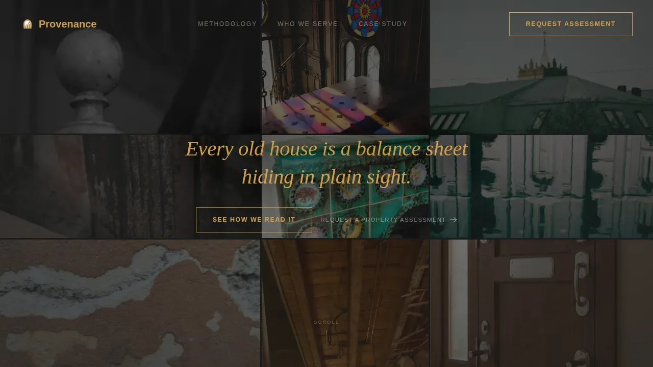
Nine-Tile Parallax Mosaic Header
The header fills the full viewport with nine unevenly weighted image tiles. Each tile shows a tightly cropped detail of historic architecture, a carved newel post, a slate mansard edge, a hand-painted tile surround, a cast-iron radiator fin, a leaded glass fanlight. No complete house is shown. The fragments force the eye to move and assemble a feeling of age and craft. A single line of amber overlay text reads: "Every old house is a balance sheet hiding in plain sight." Tiles shift subtly on scroll parallax, giving the mosaic a breathing, dimensional weight that professional photos alone cannot achieve.
Zigzag Alternating Section Layout
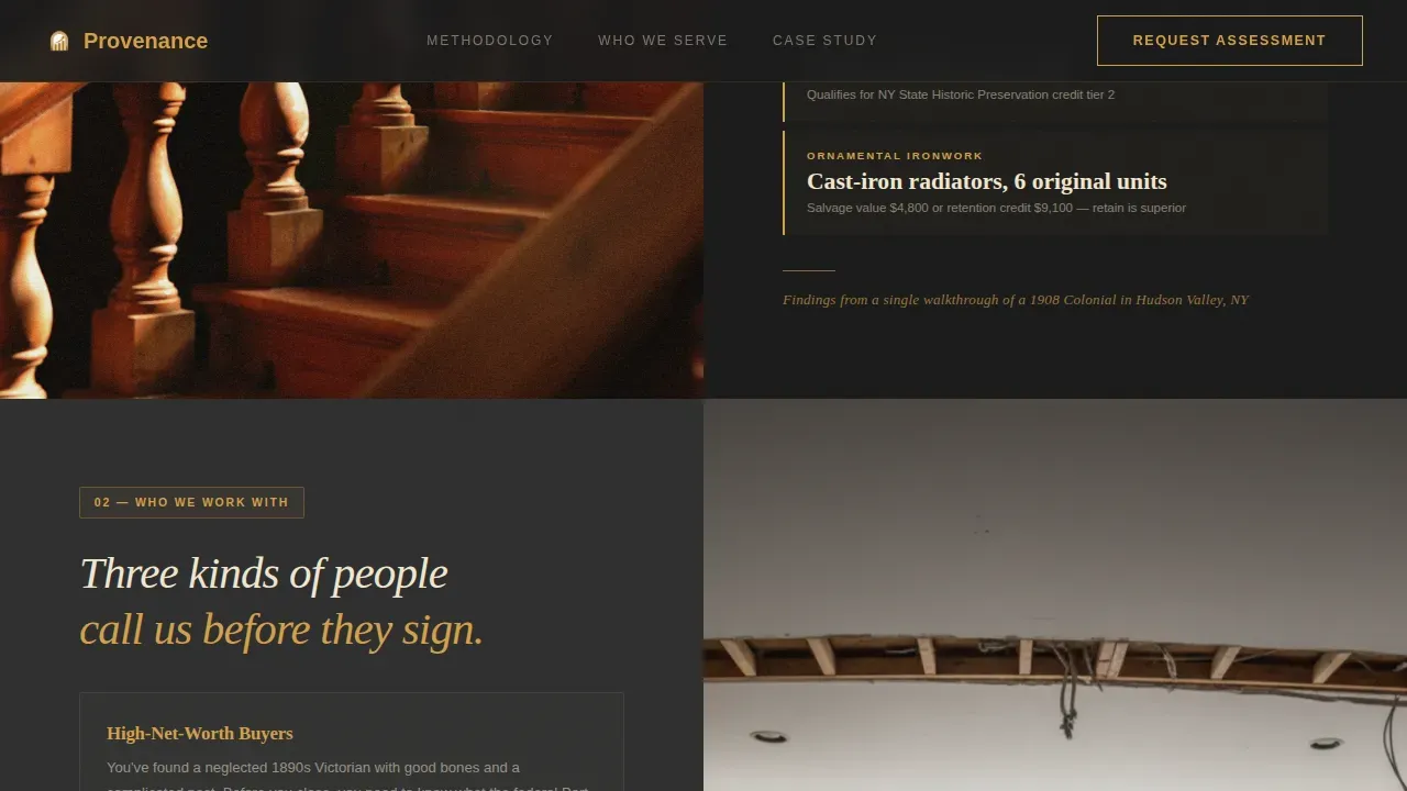
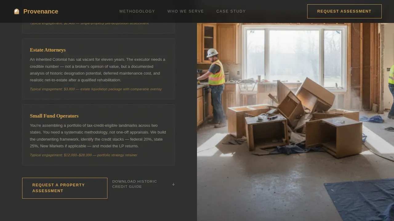
Five content sections alternate a large atmospheric photograph on one side with analytical content on the other. Images include a wide staircase, a gutted kitchen mid-renovation, and a restored ballroom. The opposing panels present methodology content, client profiles, tax credit calculations, comparable sale overlays, and rehabilitation cost frameworks. This spatial and architectural creative direction mimics the experience of touring a property with an advisor who keeps pointing at details most buyers would miss. Each section reveals more, building trust progressively as visitors scroll.
Segmented Click-Through Call to Action
The main call to action, "Request a Property Assessment", appears first as a ghost-outlined amber button after the second zigzag section. It then solidifies into a full amber fill button at the final section. A brief qualification question ("Considering a property under or over $500,000?") segments the visitor before passing them to a detailed intake page. This two-stage approach respects the visitor's pace and focuses the page on one primary action without overwhelming them early.
Email-Gated Downloadable Guide
A secondary conversion path captures visitors who are not ready to request an assessment. The "Download Our Historic Credit Guide" capture form gates the resource behind an email field, allowing visitors to self-select based on their readiness. This form field adds a practical lead generation layer without competing with the main call to action. Earlier-stage home buyers and prospective buyers researching the market can engage without committing to a full consultation.
Case Study with Specific Return Data
The fourth zigzag section presents a documented case study: a neglected 1890s rowhouse that returned 3.2 times the initial investment after federal and state rehabilitation credits were applied. The section shows before-and-after framing with real numbers. This social proof gives visitors a clear idea of what the firm's analysis actually produces. It answers the question most potential clients carry into the page, "can this firm actually calculate this for my property?", before they have to ask.
GSAP ScrollTrigger Reveal Animations
The template uses GSAP ScrollTrigger for animated section entries, counter animations on key figures, and staggered zigzag reveals. Parallax motion on the mosaic tiles uses GPU-accelerated transforms. Native cascading style sheet smooth scroll handles the rest of the page navigation. These motion layers give the dark immersive theme its dimensional quality without relying on video, keeping the page structured and purposeful for desktop-first users.
Page sections overview
| Section | Purpose |
|---|---|
| Photo Grid Mosaic | Establishes historical atmosphere and unique value proposition above the fold |
| What We Read | Introduces the firm's methodology using left photo and right analytical content |
| Who We Work With | Presents three client profiles with a ghost call to action button |
| Case Study Panel | Delivers 3.2x return data with before-and-after rehabilitation framing |
| Final Call to Action | Segments visitors by deal size and captures leads through assessment form |
| Footer Pattern | Provides contact info, navigation links, and brand close |
Design & branding system
The visual identity follows a Dark Immersive theme built on a Charcoal and Amber color system. Every color decision serves a functional role, the amber does not decorate, it reveals, the way a flashlight sweeps through a vacant estate during a walkthrough.
- Color palette: deep soot black (#1A1A1A) for full-bleed backgrounds, aged plaster charcoal (#2E2E2E) for card surfaces and section dividers, warm gaslight amber (#D4A04A) for headlines and hover states, and faded parchment (#F0E6D0) for body text
- Typography: Fraunces serif for headlines, creating a period-appropriate gravitas; DM Sans for body copy, keeping analytical content readable and clean
- Motion and interactivity: hover states on mosaic tiles, staggered zigzag section entries, GSAP counter animations on case study figures, and a two-state call to action button that shifts from ghost outline to solid amber fill
Mobile & speed optimization
The template is built desktop-first, reflecting the behavior of its primary audience, high-net-worth buyers and estate attorneys who review investment material on larger screens. However, the layout remains fully responsive for mobile visitors who may arrive through email links or referrals. The page is structured to load essential details above the fold quickly, keeping bounce rates low across all devices.
- GPU-accelerated transforms power the parallax mosaic and scroll animations, keeping motion smooth without degrading performance
- Native cascading style sheet smooth scroll handles page navigation without adding JavaScript overhead, so the page loads quickly for all visitors
- The lead capture form uses a minimal form field count, name, email, and the single qualifying question, reducing friction and supporting higher conversion rates on both desktop and mobile
How this template helps you convert
This landing page is designed around one conversion goal: turning a qualified visitor into a property assessment request or a guide download lead. Every structural and visual decision serves that purpose. A well-designed landing page transforms casual visitors into serious leads, and this template builds that trust methodically.
- The above-the-fold mosaic header and amber headline immediately communicate specialized expertise, giving visitors a clear idea of what the firm does before they scroll. Social proof in the case study section reinforces that the numbers are real and the outcomes are documented, which drives conversions among skeptical high-net-worth buyers. The segmented call to action then routes each visitor to the right next steps based on their deal size, improving the quality of leads that reach the intake page.
- The secondary email capture form offers a downloadable guide as a trust-building resource for visitors who are not yet ready to book. This keeps earlier-stage buyers and agents in the funnel without requiring them to commit to a consultation. It also gives the firm a structured way to generate more leads from the same landing page traffic, whether that traffic comes from direct outreach, referrals, or targeted campaigns.
Other information about this template
This template is part of a broader library of real estate landing page templates built for niche advisory and investment use cases. It is well-suited for advisory firms looking to create landing pages that serve a specific audience segment rather than general home buyers or sellers. Understanding how this template fits into the wider context of real estate marketing can help you get the most from it.
- The Provenance historic home investment advisory landing page template is specifically designed for the historic home real estate niche, where buyers and sellers face compliance questions, preservation zoning rules, and tax credit calculations that generic real estate pages cannot address
- This template fits naturally alongside other targeted landing page examples in the historic property and investment advisory space, including pages built for agents specializing in landmark listings, estate sales, or tax-credit portfolio assembly
- The landing page can be paired with Google Ads campaigns targeting popular searches around historic home investment, rehabilitation tax credits, and pre-war property acquisition, matching the page's messaging to the specific audience already searching for these services
- Neighborhood highlights, square footage details, and relevant listings for comparable historic properties can be added to the analytical zigzag sections to give potential buyers the essential details they need to evaluate a specific property or market
- The page is also suited to support virtual tours of historic properties, allowing visitors to experience architectural details, original millwork, period-appropriate finishes, structural features, before committing to an in-person walkthrough, which is particularly useful for out-of-city buyers reviewing properties remotely
- Social proof elements such as client testimonials, video testimonials, and documented case study results function as trust signals throughout the page, reassuring prospective buyers that the firm's methodology produces outcomes grounded in real data
- The email-gated guide can serve as a resource for agents, attorneys, and fund operators who want a working reference on federal and state rehabilitation credit structures before entering a formal advisory engagement
- Because this is a dedicated web page built around one conversion goal, it avoids the distraction problem that affects a general website or a crowded home page, keeping every element in service of one clear call to action and helping the entire real estate advisory firm present a focused, credible front to high-value buyers
- High converting landing pages in the investment advisory space, including this one, balance the visual allure of unique real estate with high-trust elements: documented returns, clear next steps, minimal capture forms, and a segmented call to action that routes each visitor appropriately, whether they are first-time inquirers or returning clients ready to sign
- Sellers and agents working with inherited or undervalued historic properties can also use this template to showcase properties to qualified buyers, giving the listing context and credibility that standard multiple listing service formats cannot provide
- The template supports a selling process that starts with education and ends with a segmented intake, making it practical for firms that need to qualify leads before investing advisory time, a priority for any real estate business operating in the high-value historic property market

Theme
Dark Immersive
Creative direction
Spatial & Architectural
Color system
Charcoal & Amber
Style
Zigzag/Alternating
Direction
Click-Through
Page Sections
Nine-tile Parallax Mosaic Header
Zigzag Alternating Content Sections
Segmented Click-through Call to Action
Email-gated Downloadable Guide
Case Study with Documented Return Data
GSAP Scrolltrigger Reveal Animations
Related questions
Who is this landing page template built for?
Can I adapt the zigzag sections to feature different property types or markets?
How does the two-stage call to action work?
Does this template include the email gate for the downloadable guide?
Is this template suitable for Google Ads campaigns?


