Clean Water Nonprofit Privacy Policy & Terms Website Template
Aquifer is an editorial-style clean water research and policy landing page built for institutes that translate hydrology data into neighborhood-level action. It guides municipal water directors, community organizers, and foundation program officers from a stunning full-bleed river hero through watershed maps, infrastructure explainers, and block-level case studies, all driving toward a single teal call-to-action.
by Rocket studio
Quick summary
Aquifer is a single-page editorial template for a clean water research and policy institute. It tells the story of water's journey from watershed to kitchen tap using magazine-style layouts, data infographic panels, and researcher pull quotes. Every section builds trust and curiosity, leading visitors to check their own neighborhood's water quality.
Who this template is for
This template is built for organizations that sit at the intersection of environmental research, civic data, and public advocacy. If your work involves turning complex water science into decisions that real communities can act on, Aquifer fits your mission.
- Municipal water directors managing aging infrastructure and lead service line decisions
- Community organizers who need peer-reviewed data formatted as usable testimony
- Foundation program officers evaluating where to direct clean water funding
What problem this template solves
Water quality research is often locked inside dense policy briefs and hydrology papers that most people cannot read or act on. The gap between a peer-reviewed finding and a neighborhood water test result is where public trust erodes. This template closes that gap.
- It structures complex research into a visual narrative that non-specialist audiences can follow
- It builds credibility layer by layer, so visitors trust the data before they are ever asked to click
- It gives funders, officials, and organizers a single page that speaks directly to each of their needs
What you get with this template
You get a fully designed, single-page editorial layout with a clear scroll path from national-scope data down to block-level outcomes. Every section serves a specific audience and advances the story one step closer to the visitor's own neighborhood.
- A full-bleed dawn river hero with a fade-in serif headline and floating teal call-to-action button
- A watershed overview section with animated data cards and a national map with hover states
- Block-level before-and-after contaminant infographic panels styled as magazine feature spreads
- A research team and municipal outcomes section with named researchers and real city results
- A sticky bottom call-to-action bar and a secondary email-capture path for policy brief downloads
Feature list
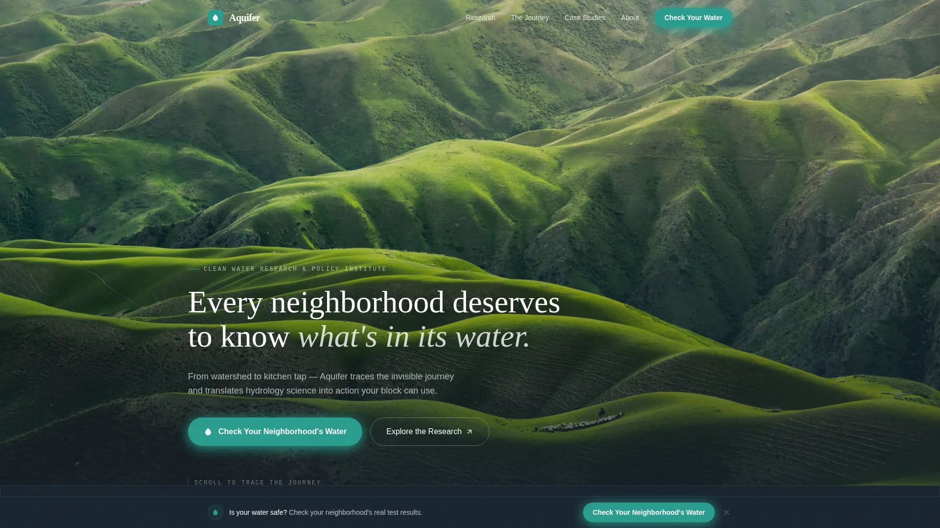
Full-Bleed Hero with Fade-In Headline
The header opens on a wide, still river photographed at dawn from a low bridge. A water treatment plant sits small on the far bank, and a neighborhood roofline traces the horizon behind the trees. After a breath, a single serif sentence fades in at the lower third: "Every neighborhood deserves to know what's in its water." A teal call-to-action button floats in naturally after the headline settles.
Scroll-Linked Watershed Map
The watershed overview section includes an animated national map with clickable and hoverable regions. Animated data cards surface key statistics as the visitor scrolls into view. The map grounds the institute's scope in geography before the story zooms inward toward the city and then the block.
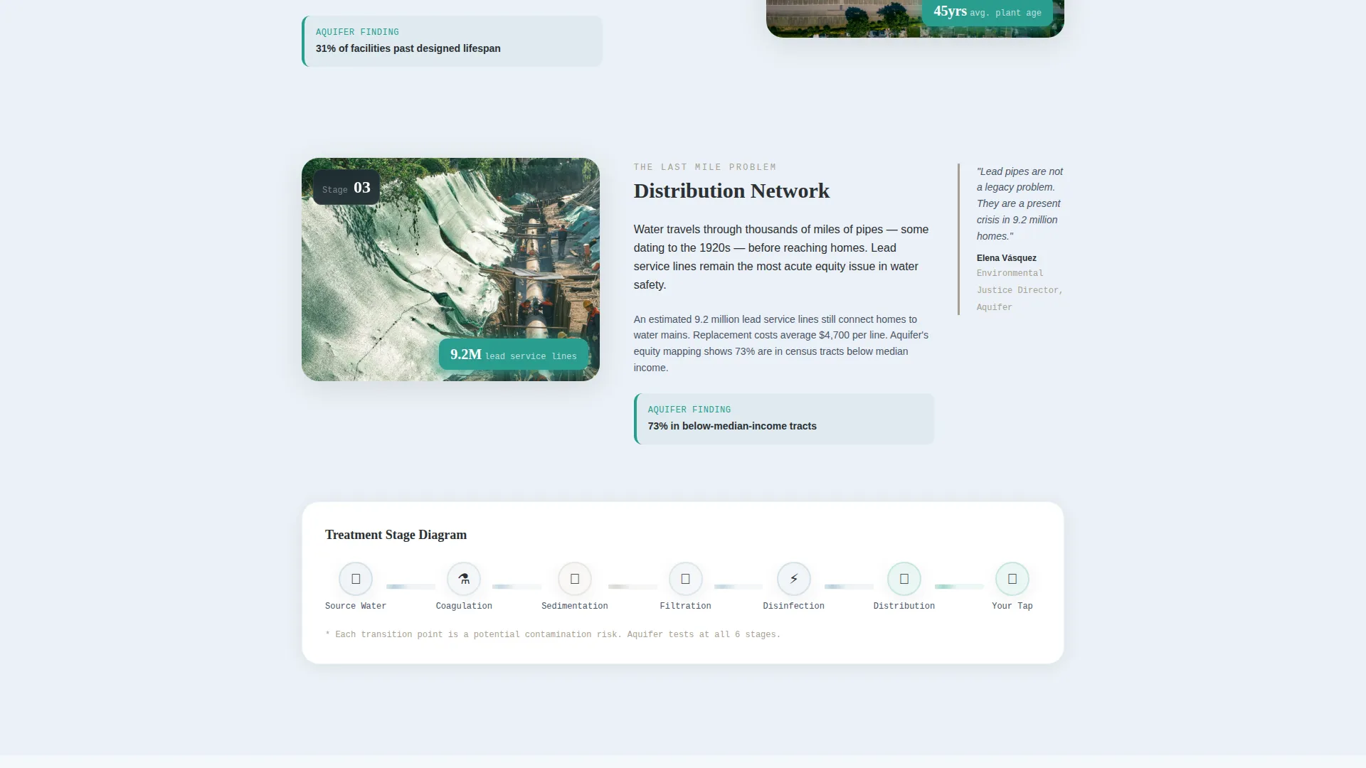
Magazine-Style Case Study Panels
The case study section presents block-level before-and-after contaminant data in editorial infographic panels. The layout alternates between full-bleed data visuals and tight editorial columns so the page feels like a beautifully designed feature article. Researcher pull quotes sit in the margins with a sediment-gray left-border rule.
Sticky Call-to-Action Bar
A teal "Check Your Neighborhood's Water" button first appears after the case study section. It then follows the visitor as a sticky bottom bar on scroll. This keeps the primary conversion path visible without interrupting the reading experience.
Email Capture for Policy Brief Download
A secondary conversion path offers a policy brief download behind a single-field email capture. This gives foundation program officers and researchers a low-friction way to go deeper while the primary call-to-action remains uncluttered.
Research Team and Municipal Outcomes Section
Named researchers and real municipal case study results anchor the page's credibility. This section pairs peer-reviewed citations with city-level outcomes so that every claim on the page has a visible source behind it.
Page sections overview
| Section | Purpose |
|---|---|
| Full-Bleed Hero | Open with the river, infrastructure, and neighborhood in one frame; fade in the institute's core statement |
| Watershed Overview | Show national scope with animated data cards and a hoverable watershed map |
| The Water Journey | Walk through pipes, treatment stages, and testing points with editorial columns and researcher pull quotes |
| Case Study Panels | Display block-level before-and-after contaminant data in magazine-style infographic panels |
| Research Team and Outcomes | Name the researchers, cite the peer-reviewed work, and present real municipal results |
| Footer | Minimal horizontal flow with navigation and institute contact links |
Design & branding system
The visual identity follows an Educational Guide theme built on a Cloud Canvas color system. Every color has a functional role, and nothing competes for attention without earning it first.
- Soft atmospheric white (#F4F7FA) and faint watershed blue (#5B8FA8) alternate as section backgrounds; deep charcoal (#2C3033) carries all body text with generous leading
- Policy-alert teal (#2A9D8F) appears only on interactive elements and call-to-action buttons; sediment warm gray (#A8A092) marks pull quote borders
- Typography pairs Fraunces serif for headlines, DM Sans for body copy, and JetBrains Mono for data labels in the infographic panels
Mobile & speed optimization
Aquifer is designed desktop-first to match the working context of municipal directors and researchers, with full mobile support built into the layout. Animations use GSAP ScrollTrigger reveals and scroll-linked parallax, and interactive components are separated from static server-rendered content to keep loading lightweight.
- Sticky call-to-action bar and FAQ accordion adapt cleanly to smaller viewports
- Watershed map hover states translate to touch-friendly interactions on mobile
- Static content uses server components while animations and map interactivity load only on the client side
How this template helps you convert
The page is optimized for click-through, specifically driving visitors to the institute's interactive Water Quality Explorer tool. Trust is built before the ask is ever made, so the click feels earned rather than forced.
- The scroll narrative moves from national watershed data to city infrastructure to a real block-level case study, making the Water Quality Explorer feel like the natural next step rather than a sales push
- The sticky teal call-to-action bar keeps "Check Your Neighborhood's Water" visible at all times without interrupting the editorial reading experience, reducing friction at the moment a visitor is ready to act
Other information about this template
This template is suited for organizations operating in environmental justice corridors where community trust is hard-won and data transparency is non-negotiable. The design language, typography choices, and section sequencing all reinforce the institute's authority without ever feeling cold or bureaucratic.
- The template is built under the Local and Neighborhood creative direction, meaning each section zooms in one level closer to the visitor's own street
- The footer follows a Vercel Horizontal Flow pattern with minimal links, keeping the exit experience clean
- The page supports both primary and secondary audience paths without creating separate sections for each, so a municipal water director and a community organizer read the same page and both feel addressed


Theme
Educational Guide
Creative direction
Local & Neighborhood
Color system
Cloud Canvas
Style
Editorial/Magazine
Direction
Click-Through
Page Sections
Full-bleed Dawn River Hero
Animated Watershed Map
Magazine-style Infographic Panels
Sticky Call-to-action Bar
Single-field Email Capture
Research Team Credibility Section
Related questions
Who is the primary audience for this template?
What is the main call-to-action this template supports?
Does this template support a secondary conversion goal?
What design style does this template use?
Does this template include social proof elements?


