IT Consultant Landing Page Template | Electric Indigo
Architect is a full-width immersive landing page for IT and technology consultancies. Built on an Atelier Studio theme with an Electric Indigo color system, it guides visitors through a cinematic scroll experience, from a full-screen video header to self-drawing network diagrams and expanding case study panels, before directing them to a dedicated consultation intake page.
by Rocket studio
Quick summary
Architect is a single-page, scroll-driven landing page designed for IT and technology consultants. It combines a full-screen video background, a self-animating network topology diagram, and full-viewport case study panels to communicate expertise before ever asking for a click. The page ends with a clear call to action that routes visitors to a separate diagnostic consultation page.
Who this template is for
This template is built for consultancies that work at the intersection of technical depth and business strategy. It suits practices where credibility must be established visually before any conversation begins.
- IT and technology consultants who advise on infrastructure, legacy modernization, or enterprise migration
- Independent consultants and boutique firms serving CTOs, operations directors, and founders with complex architecture challenges
- Portfolio and agency practices that need a high-trust, immersive first impression rather than a simple credentials page
What problem this template solves
Most consultant landing pages fail to show how the firm actually thinks. They list services and add a contact form, but never demonstrate methodology. Architect solves this by turning the scroll itself into a proof of process.
- Visitors arrive skeptical and leave with a clear sense of how the consultancy approaches complex infrastructure decisions
- The page removes friction from the first ask by routing to a dedicated intake page instead of embedding a form that feels premature
- The layered scroll narrative builds trust progressively, so the call to action lands after credibility is already established
What you get with this template
You get a complete, production-ready landing page layout that communicates depth without requiring lengthy copy. Every section is purposeful and sequenced to move a technically sophisticated visitor toward one action.
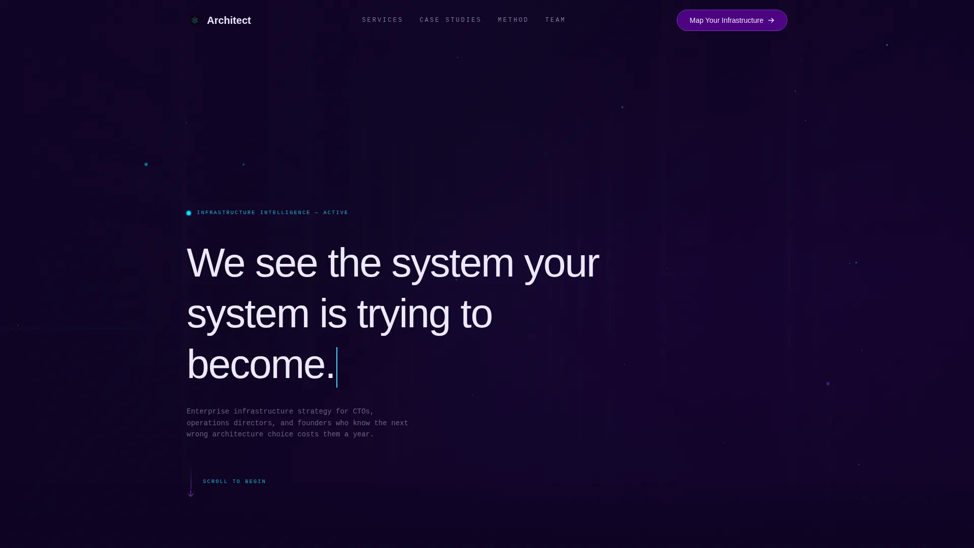
- A full-screen video background header with typewriter-style headline reveal
- A scroll-triggered network topology diagram, expanding case study panels, and an atelier-style team section
- A persistent bottom bar call-to-action and a primary glowing indigo button, both directing visitors to an external consultation intake page
Feature list
This template includes a focused set of purpose-built features. Each one supports the consultancy positioning described in the brief.
Full-Screen Video Background Header
The header plays a slow macro-lens tracking shot through a stylized server environment. Fiber optic filaments pulse in indigo and cyan, rack LEDs blink in rhythm, and cable bundles curve like architectural elements. After four seconds, a single headline materializes letter by letter in signal white: "We see the system your system is trying to become." No call to action interrupts the opening sequence.
Scroll-Triggered Network Topology Diagram
The first scroll section features a network diagram that draws itself in real time as the visitor moves down the page. Nodes light up progressively to reveal service categories, making the consultancy's scope visible through interaction rather than a static list.
Full-Viewport Case Study Panels
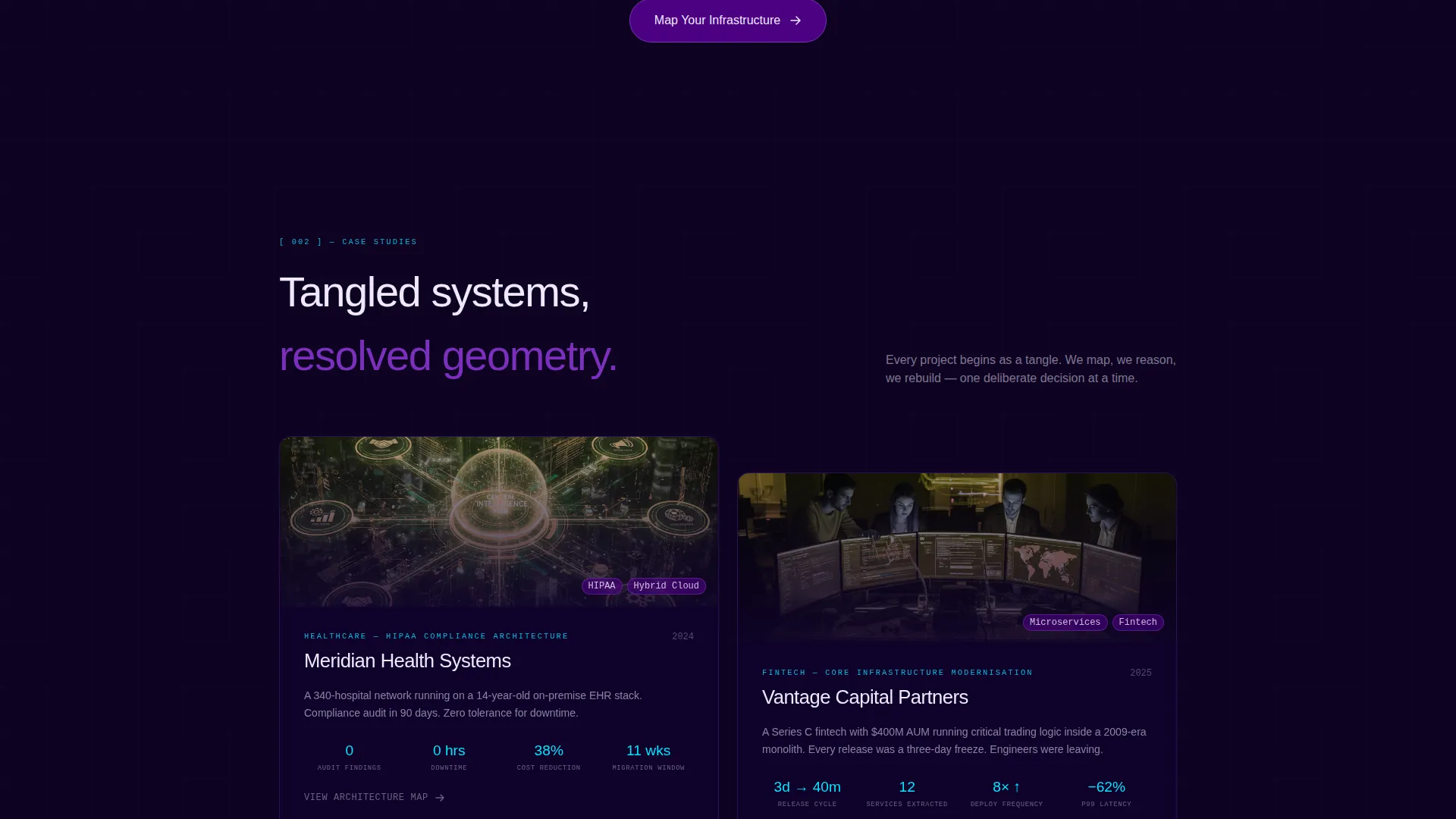
Case study panels expand to fill the full viewport on click. Each panel shows a before-and-after architecture map, with tangled legacy structures resolving into clean, ordered geometry. This gives prospective clients a concrete visual sense of the transformation the consultancy delivers.
Atelier-Style Team Section
The team section is designed for photography that shows consultants among whiteboards covered in real diagrams. The layout reinforces that the people behind the firm are practitioners, not presenters. Each scroll transition uses a depth-of-field shift to move focus from background infrastructure to foreground human decisions.
Dual Call-to-Action Placement
The primary call to action, labeled "Map Your Infrastructure," appears first after the network topology section as a glowing indigo button with a cyan border pulse. It reappears as a persistent bottom bar after the second case study, ensuring the action is always reachable without being intrusive.
Electric Indigo Color System
The entire page is built on a precise four-tone palette: deep workspace black, charged indigo, live-wire violet, and signal white. Electric cyan activates on hover states and interactive nodes. The system is consistent and intentional across every section, giving the page a unified identity.
Page sections overview
| Section | Purpose |
|---|---|
| Video Background Header | Opens with cinematic credibility and a typewriter headline |
| Network Topology Diagram | Visualizes service scope through scroll-triggered interaction |
| Case Study Panels | Demonstrates transformation outcomes via before-and-after maps |
| Team Atelier Section | Establishes practitioner credibility through real-environment photography |
| Persistent call to action Bar | Keeps the consultation action accessible after the second case study |
Design & branding system
The visual identity is built on an Atelier Studio theme using the Electric Indigo color system. The palette draws from circuit board aesthetics, where every color has a functional role and nothing is purely decorative.
- Four core tones: deep workspace black (#0D0221), charged indigo (#4B0082), live-wire violet (#7B2FBE), and signal white (#EDEAFF) for type and interface elements
- Electric cyan (#00E5FF) activates on hover states and interactive nodes, adding a live-wire pulse to the otherwise precise palette
- Scroll transitions use subtle depth-of-field shifts that pull focus from background infrastructure to foreground human decision-making, reinforcing that technology serves strategy
Mobile & speed optimization
The template is designed for full-width immersive delivery. Its layout structure supports responsive scaling across screen sizes so the scroll experience remains coherent on smaller viewports.
- Full-width sections and the persistent bottom bar adapt to mobile screen widths without losing visual hierarchy
- The depth-of-field scroll transitions and node-lighting interactions are built into the page structure to scale gracefully across devices
- Typography in signal white remains legible against the dark Electric Indigo palette at all viewport sizes
How this template helps you convert
This landing page is a click-through template with a single conversion goal: move the right visitor to a dedicated diagnostic consultation intake page. Every design and content decision supports that path.
- The scroll narrative builds trust before presenting any ask, so visitors arrive at the call to action already convinced of the consultancy's thinking style and depth
- The "Map Your Infrastructure" button appears at the moment credibility peaks, just after the network diagram section, and persists as a bottom bar so it is never out of reach
- The absence of a form on this page removes the friction of committing to contact too early, making the click to the intake page feel like a natural next step rather than a commitment
Other information about this template
Architect is a strong fit for technology consultancy practices that compete on depth of thinking rather than volume of services. It is built to attract the kind of client who reads between the lines of a page layout.
- The template is categorized under Portfolio and Agency, Freelancer and Consultant, with a niche focus on IT and technology consultant positioning
- The Atelier Studio theme and full-width immersive template style make it well-suited for practices in infrastructure advisory, legacy system modernization, and enterprise migration consulting
- The click-through landing page direction means this template works as the top of a two-page journey, with the intake or assessment page serving as the second step
- The template is designed for direct customization: swap the video background with your own server environment footage, replace case study diagrams with real client architecture maps, and update team photography to match your atelier aesthetic

Theme
Atelier Studio
Creative direction
Immersive Visual
Color system
Electric Indigo
Style
Full-Width Immersive
Direction
Click-Through
Page Sections
Full-screen Video Background Header
Scroll-triggered Network Topology Diagram
Full-viewport Case Study Panels
Atelier-style Team Section
Dual Call-to-action Placement
Electric Indigo Color System
Related questions
Does this template include a contact form?
Can I replace the video header with my own footage?
How many calls to action does the template include?
Is this template suitable for a solo IT consultant or only for larger firms?
What conversion goal is this landing page designed for?



