Premium Blog Landing Page Template
Monolith is a bold brutalist architect blog landing page built for a single design voice. It presents case study narratives, raw process photography, and written opinion in a full-page scroll experience that feels like cracking open a printed monograph. The template guides visitors through three escalating projects before delivering a clear call to action toward the full archive.
by Rocket studio
Quick summary
Monolith is a single-page architect blog landing page designed around a case study narrative scroll. Each section reads like a chapter in a printed monograph, moving from giant typographic headlines through black-and-white project photography, structural detail spreads, and opinionated blog interludes. The page closes with a primary archive call to action earned through genuine depth of content.
Who this template is for
This template is built for a practicing architect who wants their online presence to carry the same weight as their built work. It is ideal for someone who thinks in writing as much as in drawings.
- Junior architects and design editors looking for a real-world portfolio voice will find exactly the kind of raw, process-driven content this layout is structured to showcase.
- Independent architects and sole practitioners who want to attract developer clients or private homeowners through demonstrated thinking rather than polished brochure copy.
- Emerging architecture voices seeking a platform that positions their blog writing and portfolio work as one continuous argument.
What problem this template solves
Most architect portfolio pages separate writing from projects. The result is a portfolio that shows outcomes but hides the reasoning, and a blog that floats unanchored beside it. Visitors leave without understanding how an architect actually thinks.
- Architects lose potential clients and editorial opportunities because their process and conviction never come across in a typical grid-based portfolio layout.
- Junior professionals and design editors scanning for emerging voices cannot quickly assess depth of thinking when projects and words live in disconnected sections.
- There is no natural reading rhythm that guides a visitor from curiosity to commitment when content is fragmented across tabs and menus.
What you get with this template
This template delivers a fully structured, single-page scrolling landing page that functions as both a portfolio and a live blog. Every layout decision supports the narrative arc from first impression to call to action.
- A full-page storybook scroll layout with three escalating case study chapters, each built from a site photograph spread, a body text page, a construction detail, and a finished space image.
- Interstitial blog excerpt pages between projects, formatted as personal notebook entries with space for a paragraph of opinion, a sketch, and a reference image.
- Two distinct conversion paths: a primary "Open the Archive" call-to-action button and a secondary "Read the Latest Entry" text link embedded in each interstitial.
Feature list
This template is built around a focused set of design and layout features drawn directly from the Monolith brief. Each feature serves the core goal of turning a scroll into a readable argument.
Giant Headline Header
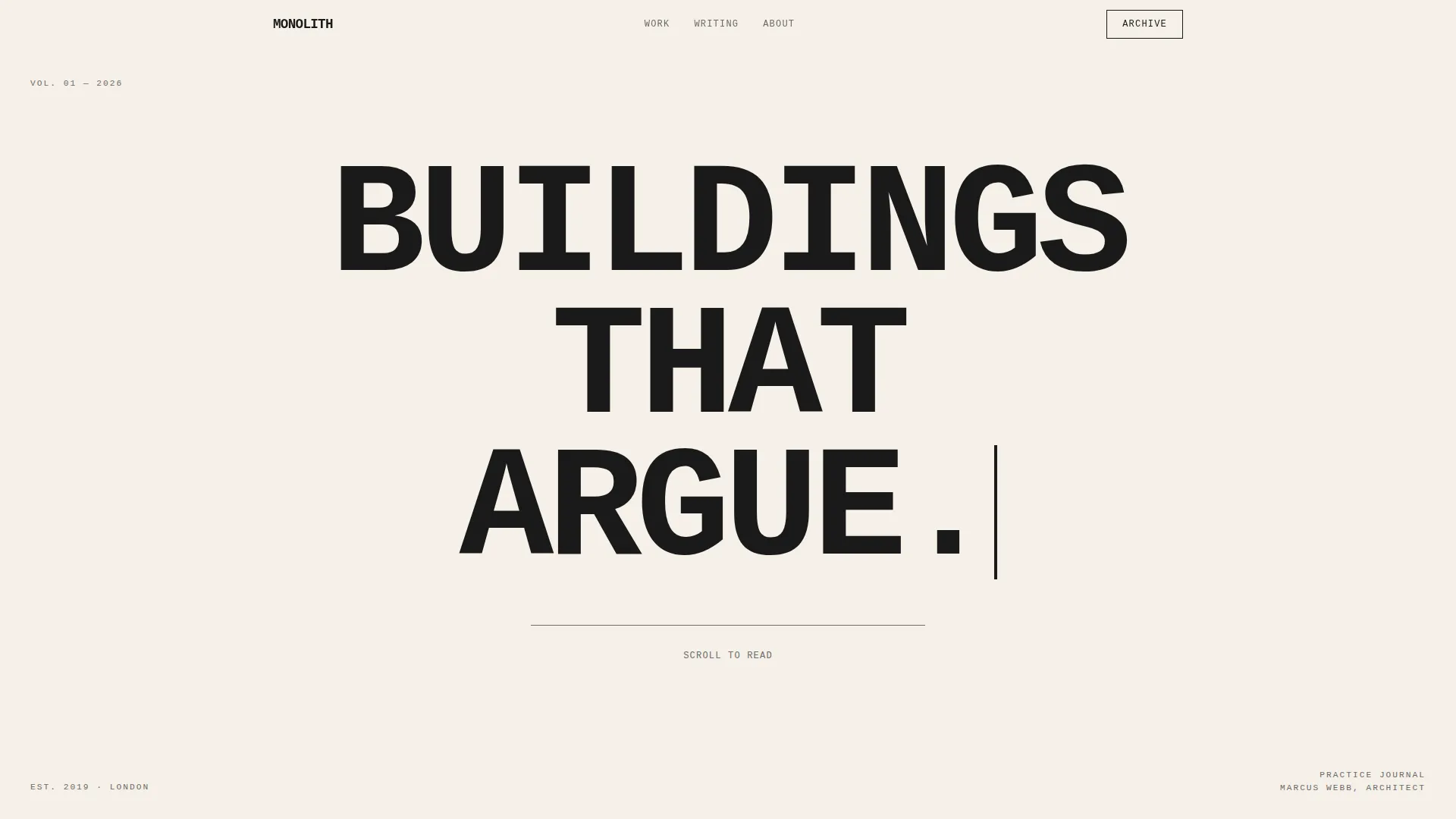
The header is a single oversized centered headline set in a massive, unapologetic typeface that fills the viewport edge to edge. No image, no subheadline. Just pure typographic weight that sets the tone before the reader scrolls a single pixel.
Full-Bleed Case Study Spreads
Each project opens with a black-and-white site photograph bleeding to all four edges of the screen. The following pages layer in body text, a construction detail, and the finished space, building each project like a chapter with its own internal pace.
Escalating Project Arc
The three case studies are ordered by scale and ambition: a bathroom renovation, then a house, then a public library. The scroll itself becomes a career arc, giving the reader a sense of growing stakes and confidence with every project turn.
Notebook Interstitial Pages
Short blog excerpts appear between the case study chapters as interstitial pages. Each one holds a paragraph of opinion, a sketch, and a reference image, giving the page the texture of a personal notebook tucked between polished spreads.
Dual Conversion Path
The primary call-to-action, "Open the Archive," appears first as ghost text after the second case study and solidifies into a full accent-color button after the third. A secondary "Read the Latest Entry" text link sits inside each interstitial for readers driven by writing rather than buildings.
Page-Turn Rhythm via Alternating Backgrounds
Backgrounds alternate between unbleached stock-white and full-bleed black across sections. This creates a physical page-turn rhythm on screen, reinforcing the monograph reading experience without any decorative imagery.
Page sections overview
| Section | Purpose |
|---|---|
| Giant Headline Header | Sets tone with oversized centered type before any scroll |
| First Case Study | Opens with full-bleed black-and-white site photograph |
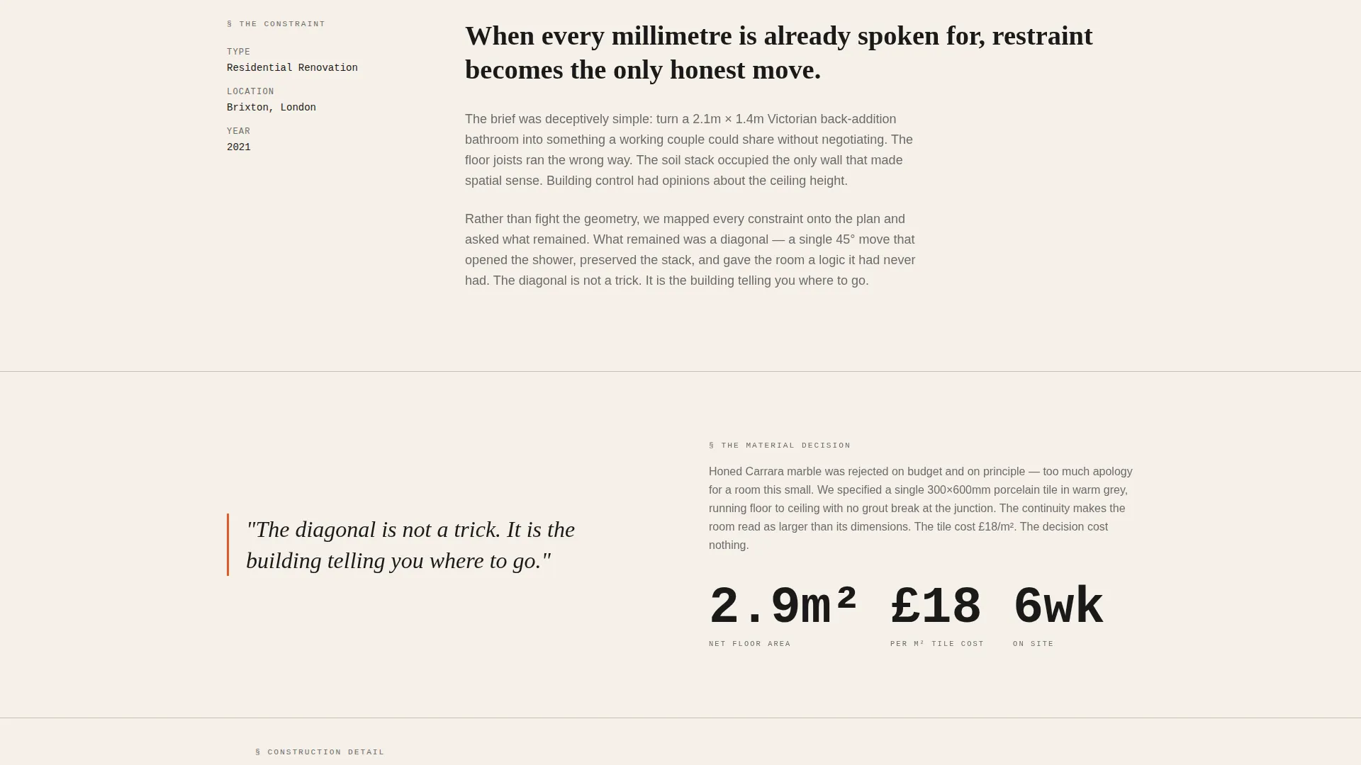
| Project Body Text | Presents the constraint, argument, and material decision |
| Construction Detail Spread | Shows the unglamorous structural decision in close-up |
| Finished Space View | Closes the first chapter with the completed result |
| First Blog Interstitial | Paragraph of opinion plus sketch between projects |
| Second Case Study | Repeats chapter structure at larger residential scale |
| Second Interstitial | Personal notebook entry with reference image |
| Third Case Study | Public library project at maximum scale and ambition |
| Ghost call to action Appearance | "Open the Archive" surfaces as ghost text here |
| Final call to action Block | Accent-color archive button after the third project |
Design & branding system
The visual identity follows a Bold Brutalist theme built entirely on an Ink and Paper color system. The palette feels like a freshly printed architectural zine, with no gradients, no color photography, and no decorative flourishes.
- Colors: unbleached stock (#F5F0E8) for warm backgrounds, pure typographic black (#1A1A1A) for primary text and full-bleed sections, pencil graphite (#6B6B6B) for secondary text and ruled lines, and construction orange (#E05A2B) reserved exclusively for interactive states and the call-to-action button.
- Typography is oversized monospaced or heavy grotesque, set with brutal leading so each word occupies space the way a building occupies a site. Ruled graphite lines and a blinking cursor in the header reinforce the zine-printed aesthetic.
- Visual composition draws from hardcover monograph design: heavy typographic hierarchy, black-and-white photography only, and alternating stock-white and full-bleed black backgrounds that create the rhythm of turning physical pages.
Mobile & speed optimization
The full-page scroll format is designed to translate naturally to vertical mobile reading. The storybook structure and single-column layout mean the reading experience remains coherent on any screen width.
- Full-bleed photographic spreads and oversized headline type are structured to reflow and scale without breaking the visual weight of each section.
- The single-page architecture reduces navigation complexity, keeping the reading path linear and uninterrupted on touch-screen devices.
How this template helps you convert
The template earns its calls to action rather than placing them early. By the time a visitor reaches the button, they have already read one complete project narrative and glimpsed two more.
- The escalating case study arc builds trust progressively. Each chapter adds a layer of proof: the constraint, the decision, the result. Visitors arrive at the call to action having already experienced real thinking, not a pitch.
- The dual conversion path catches two different reader types. The "Open the Archive" button serves clients and editors ready to explore the full body of work. The "Read the Latest Entry" link inside each interstitial serves junior architects and writing-driven readers, keeping them moving deeper into the content rather than dropping off.
Other information about this template
This template sits within the Portfolio and Agency category, specifically the Architect Portfolio and Architect Blog plus Portfolio niche. It is built as a storybook full-page layout under the Bold Brutalist theme with a Case Study Narrative creative direction.
- The template style is classified as Storybook and Full-Page, meaning the entire experience is contained within a single continuous scroll rather than a multi-page site with separate navigation.
- The landing page direction is Click-Through, designed to move visitors toward an external or linked full archive and blog rather than capturing a lead form on the page itself.
- The header concept is Giant Headline Centered, a deliberate editorial choice that prioritizes immediate typographic impact over imagery or subheadline copy.
Theme
Bold Brutalist
Creative direction
Case Study Narrative
Color system
Ink & Paper
Style
Storybook/Full-Page
Direction
Click-Through
Page Sections
Giant Centered Headline Header
Full-bleed Case Study Chapter Layout
Escalating Three-project Arc
Personal Notebook Interstitials
Staged Dual Call-to-action
Alternating Background Page Rhythm
Related questions
Is this a single page or a multi-page website?
Who is this landing page template designed for?
How does the dual call-to-action path work?
Can I adjust the number of case study chapters?
What visual style does this template use?



