Neo-Classical Architecture Blog Website Template
The Colonnade Editorial Neo-Classical Architect landing page template is built for practices that treat proportion as a moral position. An asymmetric 60/40 grid, a cross-hatched Palladian elevation hero, and a Monochrome Steel palette combine to create a content-destination page that turns visitors into invested subscribers, and future clients.
by Rocket studio
Quick summary
Colonnade is a single-page, content-destination template for a neo-classical architecture practice. It uses an asymmetric 60/40 editorial grid, atmospheric section photography, and a monograph-style layout to immerse visitors before inviting them to receive a quarterly Folio. The page feels less like a website and more like a publication left open on a reading table.
Who this template is for
This template is built for practices whose work begins with hand-drafted elevation drawings and ends with buildings that will still be discussed a century from now. It suits anyone who needs a page that reflects the weight and authority of classical architecture, not a generic portfolio grid.
- Neo-classical and classical revival architecture firms seeking a content-led presence
- Practitioners whose clients include private estate owners, heritage trusts, and boutique hoteliers
- Architects who want to position themselves as thought leaders through essays, marginalia, and restoration case notes
What problem this template solves
Most architecture templates default to a clean portfolio grid and a consultation button. That format works for contemporary practices. It fails completely for a firm whose entire value is rooted in tradition, proportion, and conviction. Visitors who commission a country house or restore a Georgian facade need to feel the practice before they inquire.
- Generic portfolio layouts strip away atmosphere, leaving only images without context
- High-value clients, those restoring a palace wing or commissioning a new mansion, need to sense intellectual depth before they reach out
- Practices without a content strategy lose potential clients to firms with a stronger editorial voice
What you get with this template
You get a fully structured, immersive landing page that functions as both a showcase and a content destination. Every section is designed to deepen engagement rather than simply display services.
- A cross-hatched SVG Palladian villa hero with parallax layers, a tracked serif headline, and a parchment-to-graphite color system
- Five distinct scroll-sections featuring atmospheric photography, editorial text columns with drop caps and pull quotes, and a "Receive the Folio" inline form
- A restoration bento grid of completed project images and a minimal footer on a parchment background
Feature list
This page is built around six carefully considered design and content features. Each one earns its place in the layout the same way a cornice earns its place on a facade.
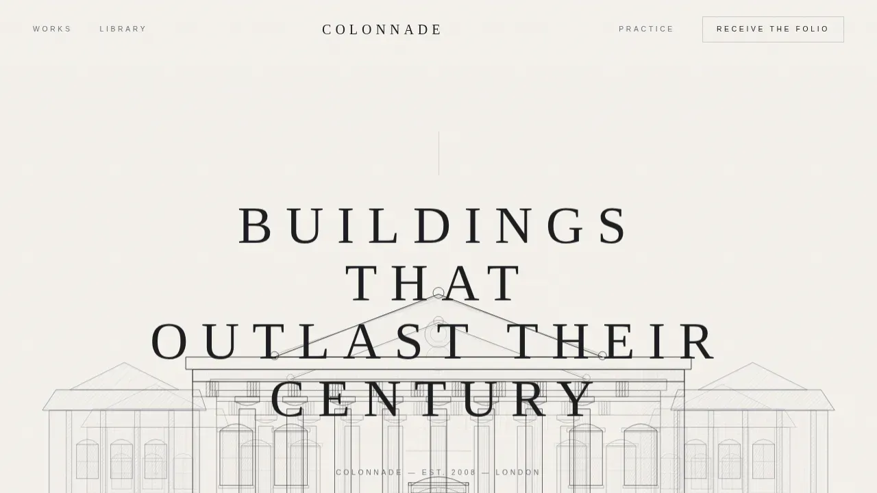
Cross-Hatched Elevation Hero
The full-viewport header is a custom SVG illustration, a meticulously rendered Palladian villa elevation in graphite and pewter. A parallax effect separates the foreground colonnade from the receding wings, giving the page immediate depth. A tracked serif headline in capitals fades up beneath the roofline.
Asymmetric 60/40 Editorial Grid
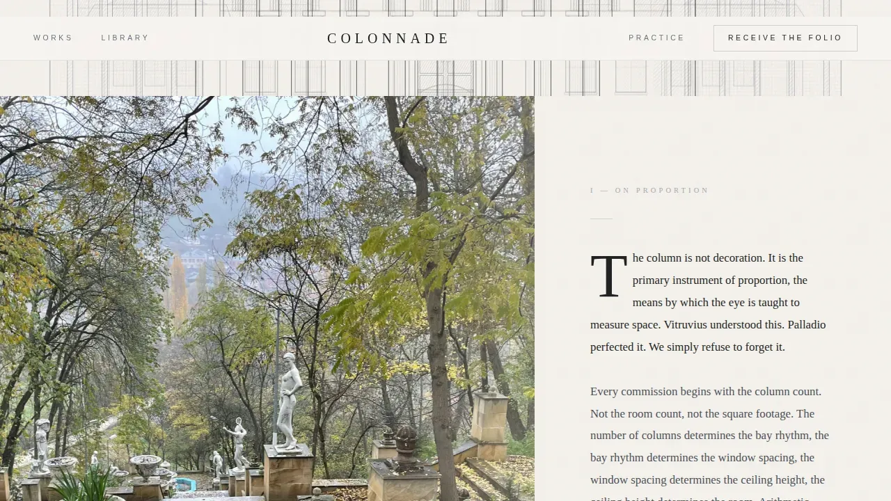
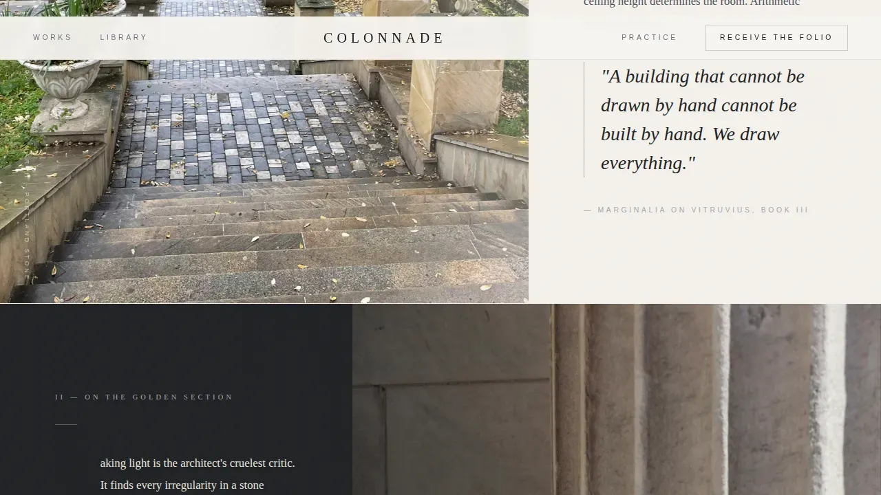
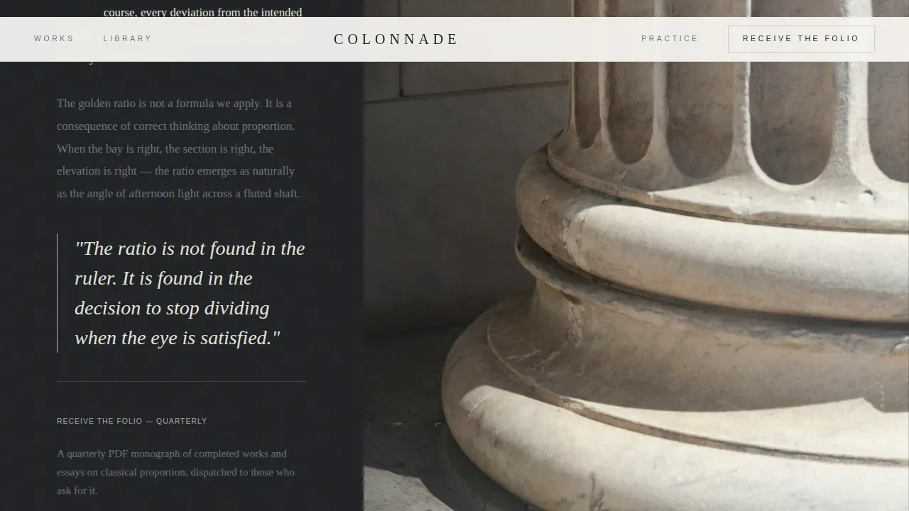
The wider 60-column carries full-bleed atmospheric photography: fog around a limestone portico, raking light across fluted columns, rain on a Portland stone terrace. The narrower 40-column holds editorial text typeset as magazine columns. Functional symmetry guides the eye from imagery toward the primary call to action without announcing itself.
Atmosphere-Led Scroll Sections
Each scroll section shifts time of day and season. There are no section headings, the mood change itself signals the transition. This approach immerses visitors in a world rather than presenting a list of services, keeping them on the page long enough to feel invested.
Folio Subscription Form
The inline "Receive the Folio" form appears after the third editorial section, once the visitor has absorbed enough atmosphere to feel committed. It asks only for a name and email, styled as a single quiet field. This builds a subscriber list of clients who are genuinely interested in classical proportion.
Curated Essay Library Path
A secondary call to action, "Explore the Library," links to a gated archive of essays, drawing studies, and restoration case notes. Each piece uses the same light email capture, turning a content-resource page into a continuous subscriber-building engine for the practice.
Restoration Project Grid
A bento-style image reveal grid showcases completed works. High-resolution images emphasize pediments, stone balconies, and column details, the kind of visual evidence that turns an interested reader into a prospective client.
Page sections overview
| Section | Purpose |
|---|---|
| Hero Elevation | SVG Palladian frontispiece with parallax headline |
| Morning Portico | 60/40 grid, atmospheric photography, proportion essay |
| Afternoon Column | Pull quotes, marginalia, Folio subscription form |
| Rain Terrace | Portland stone imagery, Library call to action |
| Restoration Grid | Bento image reveal of completed projects |
| Minimal Footer | Parchment background, horizontal flow pattern |
Design & branding system
The visual identity follows an Editorial Magazine theme with a Monochrome Steel color system. The palette feels like a steel-nib pen drawn across cotton stock, precise, cool, and authoritative. Cormorant Garamond handles headlines, drop caps, and pull quotes. DM Sans handles navigation and body captions.
- Deep graphite (#1C1E21) and parchment white (#F5F2ED) form the primary high-contrast text pairs; tarnished silver (#A8A9AD) is reserved for ruling lines, pull-quote borders, and hover states
- Generous white space acts as architecture itself, framing content the way a plinth frames a sculpture
- Backgrounds alternate between parchment and graphite sections, creating a rhythm that mirrors the turning of pages in an oversized monograph
Mobile & speed optimization
The template is designed desktop-first to honor the monograph aesthetic, with a fully responsive layout that adapts gracefully to smaller screens. Scroll-linked animations use client components while static sections use server components, keeping the page load efficient.
- Parallax scrub, image reveal overlays, and scroll-linked opacity effects are scoped to client components only
- The inline Folio form and hover states are handled interactively without blocking the initial page render
- Images are sized for full-bleed impact on large viewports and scale proportionally on tablet and mobile
How this template helps you convert
This page does not push visitors toward a decision. It earns their trust gradually, the way a building earns admiration by standing long enough for people to notice its details. Conversion happens because the visitor arrives already invested.
- The atmospheric scroll sequence builds emotional commitment before any call to action appears, so visitors who reach the Folio form are already engaged prospects rather than casual browsers.
- The "Explore the Library" path captures visitors who are not yet ready to commission a building but want to stay connected, turning them into long-term subscribers who will eventually reach out.
Other information about this template
The Colonnade Editorial Neo-Classical Architect landing page template sits at the intersection of architecture practice marketing and editorial publishing. It draws on the rich tradition of neoclassicism, the architectural style that began in the mid-18th century as a reaction to the Rococo style, derived from Classical Greece and given monumental form in the Pantheon in Rome.
Neoclassical buildings organized around a central portico, flanked by columns including Doric columns, Ionic columns, and Corinthian columns, defined civic and domestic architecture across Europe for generations. The peristyle colonnades of Athens, the grand palace facades of Berlin, the church porticoes of Paris, the country villa traditions of Italy, the institutional buildings of Dublin and Germany, the academy halls of France and Spain, the terraced mansions of England, all of these drew from the same vocabulary of pillars, entablatures, and proportion that this template places at its center.
The template's structural design reflects Neo-Classical design principles directly: balance around a central axis, white space as a framing device, and images featuring architectural columns for a grand, structured look. Elegant Cormorant Garamond serif typography conveys the sophistication expected of a practice working at this level.
This template can be customized using AI-powered tools that assist in generating layout adjustments and design element variations aligned with neoclassical style. Vibe coding allows users to describe changes in natural language prompts and turn those descriptions into functional page updates without traditional programming skills. AI-powered platforms can enhance this process by automating repetitive tasks and suggesting design refinements based on user input, enabling non-technical users to adapt the template to their specific practice context. Users can also combine their own project photography with the existing layout to create a page that feels entirely their own.
- The template is built on a modern framework to facilitate easy customization of color schemes and typography
- No-code tools and AI-powered platforms can assist in adapting the template without extensive coding knowledge
- The york stone and Portland stone references in the photography direction reflect a specifically English sensibility, connecting the page to the country-house tradition of England
- Neoclassicism, as expressed in landmarks from naples to york, from berlin to paris, remains the reference vocabulary for this template's visual and editorial language
Theme
Editorial Magazine
Creative direction
Atmosphere & Mood
Color system
Monochrome Steel
Style
Asymmetric Grid (60/40)
Direction
Content/Resource
Page Sections
Cross-hatched Elevation Hero
Asymmetric 60/40 Editorial Grid
Atmosphere-led Scroll Sections
Folio Subscription Form
Curated Essay Library Path
Restoration Project Bento Grid
Related questions
Who is this landing page template designed for?
What makes this template different from a standard architecture portfolio template?
Can I adapt this template without coding experience?
What conversion paths does this template include?
Does the template include a portfolio or project showcase section?


