Immigrant Checking Account Landing Page Template
Arrive is a single-column landing page template built for immigrant checking account products. It pairs a bold Stacked Type Tower header with an FAQ-driven scroll flow and a five-step eligibility quiz. The template speaks directly to first-generation arrivals who need a full U.S. checking account without an SSN or credit history, turning anxiety into action in under two minutes.
by Rocket studio
Quick summary
Arrive is a single-column landing page template for fintech products serving new arrivals and underbanked immigrants. It leads with a typographic hero, moves through real-question FAQ sections, and closes with a personalized five-step eligibility quiz. The design is clean, mobile-first, and deliberately unbureaucratic, built to convert cautious first-time visitors into account applicants.
Who this template is for
This template is designed for fintech founders, immigrant banking products, and neobank teams targeting first-generation arrivals. It works especially well when your product removes the traditional SSN requirement and needs to communicate that clearly and quickly.
- Fintech brands offering checking accounts to immigrants, visa holders, or DACA recipients
- Neobanks and credit unions targeting gig workers who need direct deposit before a work permit clears
- Finance startups serving parents opening a first U.S. account for everyday school or household payments
What problem this template solves
New arrivals face a frustrating loop: they need a bank account to function, but most banks require documents they do not yet have. Distrust runs high. Questions pile up at 1 a.m. on a phone screen. This template solves that by answering the exact questions immigrants actually search for, then delivering the product feature as the proof.
- Visitors arrive skeptical; the FAQ-driven layout meets them with honest, plain-language answers before asking for anything
- The five-step quiz replaces a blank application form with a guided, low-pressure experience that ends with a real result
- Every section builds on the last, moving the reader from basic eligibility fears to full-feature confidence
What you get with this template
This is a fully structured, single-column landing page ready for a checking account product targeting new arrivals. Every section and interaction is defined in the template, from the animated hero to the personalized quiz result screen.
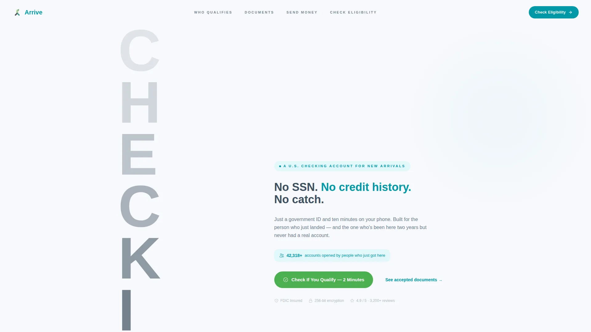
- A Stacked Type Tower hero with an animated account counter and two clear calls to action
- Four FAQ-anchored content sections covering SSN eligibility, accepted documents, remittance features, and the quiz flow
- A five-step eligibility quiz with large tap targets, plain language, and three personalized result states
Feature list
This template ships with purpose-built components that address the specific conversion needs of an immigrant checking account landing page.
Stacked Type Tower Hero
The hero section uses the word "CHECKING" rendered in massive ultra-bold sans-serif, with each letter stepping from 15 percent opacity at the top to 100 percent at the bottom. The effect makes the word appear to materialize, communicating openness and arrival without a single image. A graphite tagline and an animated account counter sit beside the tower.
Five-Step Eligibility Quiz
The primary call to action leads into a guided five-step quiz covering document type, visa or immigration status, primary account use, employment type, and preferred support language. Each step presents one question with large tap targets and zero jargon. On completion, the quiz instantly returns one of three personalized results: approved, conditionally approved, or a human callback.
FAQ-Driven Section Flow
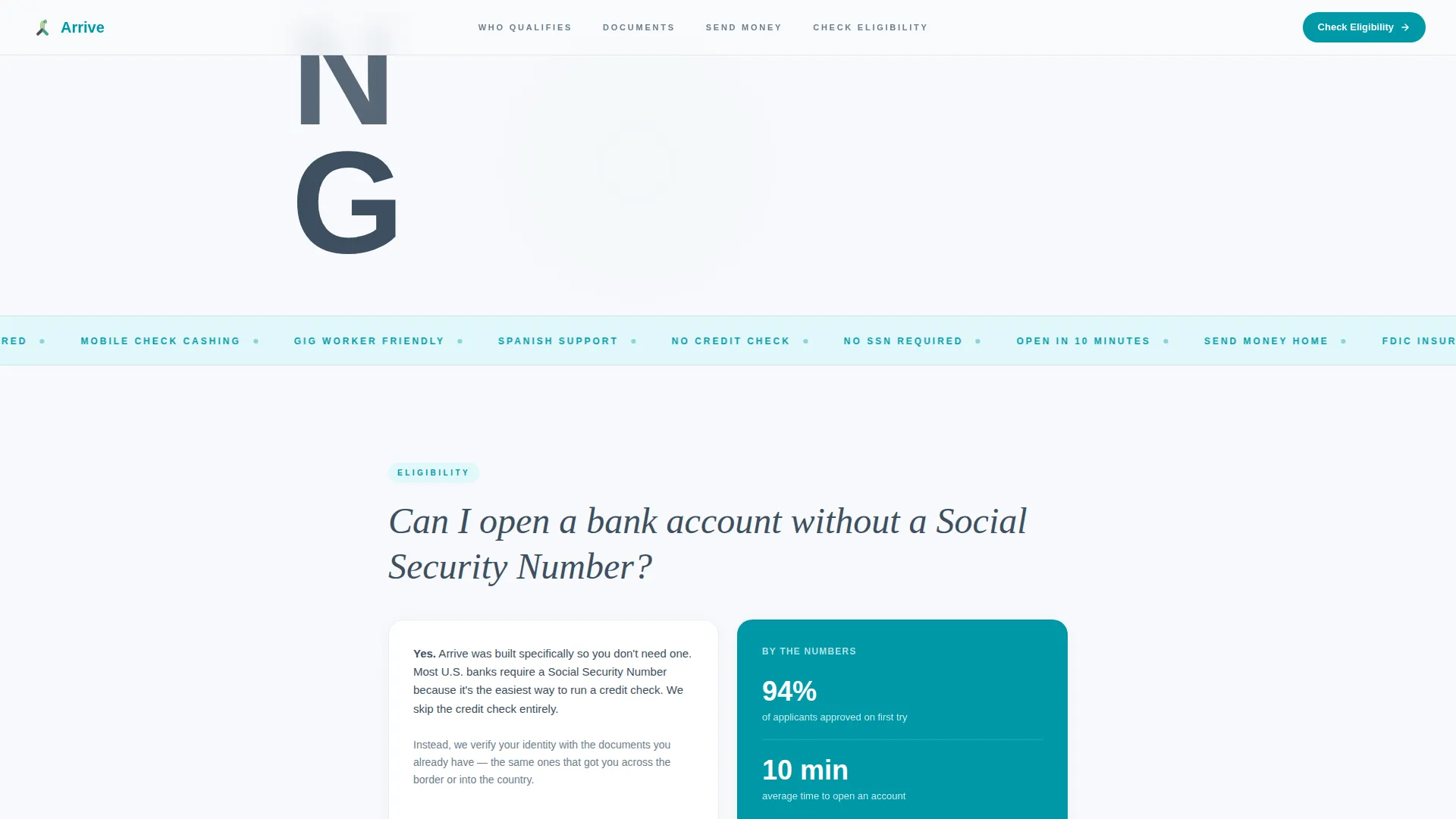
Every major content section is structured around a question a real immigrant actually searches at night, such as whether an account can be opened without a Social Security Number. Each question anchors a section that answers in plain language first, then reveals the product feature as evidence. The scroll feels responsive and reassuring rather than promotional.
Animated Social Proof Counter
A live-style counter ticks upward to display the number of accounts opened by people who just arrived. This component builds trust without requiring testimonial photography. It signals scale and momentum at the exact moment a first-time visitor needs reassurance.
Accepted Documents Showcase
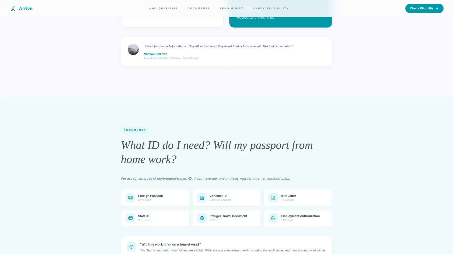
A dedicated section displays which forms of identification the product accepts, including a passport, consular identification card, and Individual Taxpayer Identification Number (ITIN) letter. This removes ambiguity for visitors who are not sure whether their documents qualify, and it surfaces this proof before the quiz begins.
Secondary Navigation Path
A floating text link reading "See accepted documents" sits beneath the primary quiz call to action. This gives visitors who are not yet ready to start the quiz a low-commitment path to proof. It keeps hesitant users on the page rather than losing them to a search engine.
Page sections overview
| Section | Purpose |
|---|---|
| Hero: Type Tower | Introduce the product with a bold typographic statement, animated counter, and primary quiz call to action |
| FAQ: SSN Eligibility | Answer the top immigrant banking search question and present eligibility proof |
| FAQ: Accepted Documents | Display which government IDs are accepted, removing document uncertainty |
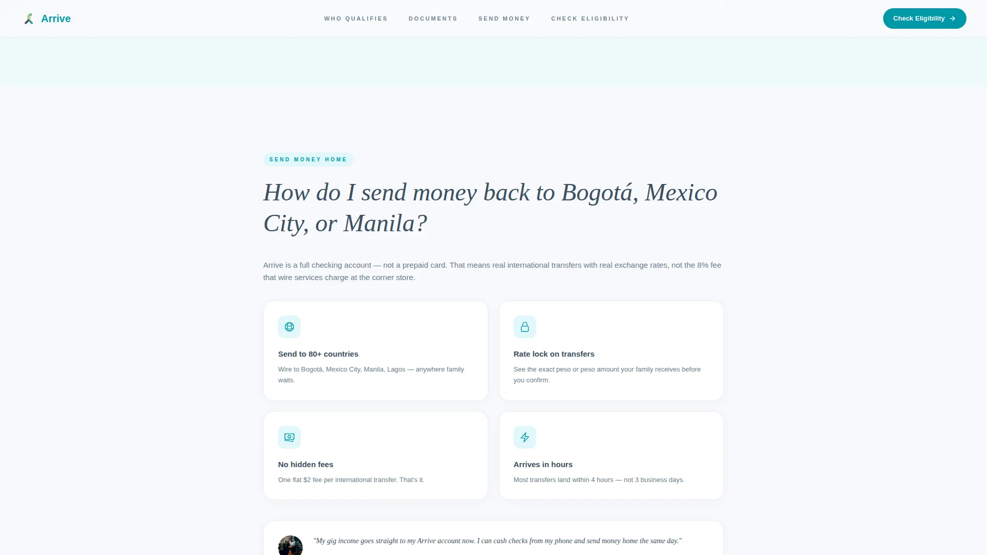
| FAQ: Remittances | Explain how to send money home and reveal the transfer feature |
| Quiz Call to Action | Present the full five-step eligibility assessment with personalized result output |
| Footer | Single-row linear footer with supporting links |
Design & branding system
The template uses a Cloud Canvas color system built to feel clean, optimistic, and unbureaucratic. Every color choice has a defined role, so the interface never feels cluttered or arbitrary.
- Open-sky white (#F7F9FC) dominates the background, giving the page breathing room and signaling transparency
- Soft graphite (#3D4F5F) carries all body text with quiet authority; passport-stamp teal (#0097A7) marks every interactive element and link
- Confirmation green (#4CAF50) appears exclusively on success states and call-to-action buttons, so completion always feels rewarding
Mobile & speed optimization
This template is built mobile-first. The target visitor is on a phone, often in transit, filling out forms in short bursts of attention. Every layout decision reflects that reality.
- Single-column flow eliminates horizontal scrolling and keeps content readable on small screens without pinching or zooming
- Quiz steps use large tap targets and single-question screens so users can progress quickly without frustration
- Static server components handle all fixed content; interactive elements like the quiz and counter run as client components to keep the page responsive
How this template helps you convert
The conversion strategy is baked into the structure. Instead of leading with a form, the template earns trust through answers before asking for commitment.
- The FAQ-driven scroll anticipates real objections in the order a cautious visitor actually thinks through them, so by the time the quiz appears, the reader already feels understood
- The five-step quiz replaces a cold application with a personalized experience; every visitor gets a specific result rather than submitting into silence, which dramatically reduces drop-off at the decision point
Other information about this template
This template is part of the Startup Velocity theme family and is styled with the Cloud Canvas color system. It is built in a Single Column Flow layout using DM Sans for body text and Fraunces for serif contrast on FAQ question headings. Animations use GSAP scroll reveals, step transitions inside the quiz, and the counter tick effect on the hero. The footer follows a Linear Single-Row pattern. The template is localized for English (United States), with currency in USD and culturally grounded copy referencing documents like a consular ID and ITIN letter.
- Typography pairing: DM Sans for body copy, Fraunces serif for FAQ question headings
- Animation stack: GSAP scroll reveals, quiz step transitions, and hero counter tick
- Footer pattern: Linear Single-Row layout with supporting navigation links
Theme
Startup Velocity
Creative direction
FAQ-Driven
Color system
Cloud Canvas
Style
Single Column Flow
Direction
Quiz/Assessment
Page Sections
Stacked Type Tower Hero
Five-step Eligibility Quiz
Faq-driven Content Sections
Animated Social Proof Counter
Accepted Documents Showcase
Secondary Low-commitment Path
Related questions
Can this template be used for products other than checking accounts?
What does the five-step eligibility quiz include?
Does the template include the hero animation out of the box?
Is this template designed for mobile users?
What are the three outcomes a visitor can receive from the quiz?



