Orthopedic Surgeon Reviews Website Template
Articulate is a patient education landing page built for orthopedic practices. It replaces surgical anxiety with structured understanding through a procedure comparison table, an accordion pre-op to recovery timeline, and an email-gated anatomical animation. The primary call to action is a downloadable procedure guide, supported by a sticky bottom bar and a named patient testimonial hero.
by Rocket studio
Quick summary
Articulate is a single-page orthopedic patient education hub that guides visitors from fear to informed decision. It opens with a named testimonial card, moves through a procedure comparison table with expandable rows, and flows into a pre-op to full-recovery accordion timeline. Every section earns trust by giving information freely before asking for an email.
Who this template is for
This template is built for orthopedic surgeons and orthopedic practices that want to educate patients before the consultation room conversation even begins. It suits any practice offering elective joint or spine procedures to adults who research independently before committing.
- Orthopedic surgeons offering hip replacement, knee replacement, rotator cuff repair, or spinal stenosis treatment
- Practice marketers who need a high-trust content hub to convert anxious researchers into booked consultations
- Patient education coordinators who want a downloadable guide delivery system built into the page
What problem this template solves
Patients facing orthopedic surgery often arrive overwhelmed. They have read fragments of information from unreliable sources and still do not understand what recovery actually looks like week by week. That gap between fear and fluency is exactly what this template closes.
- Patients leave without a guide they can share at home, so decisions stall and consultations drop off
- Practices lack a structured way to present procedure differences side by side in plain language
- The emotional weight of surgery is rarely addressed before the first appointment, creating unnecessary anxiety that slows the decision journey
What you get with this template
This template delivers a fully structured, single-page patient education experience with every section pre-built and ready to populate with your practice's procedure content.
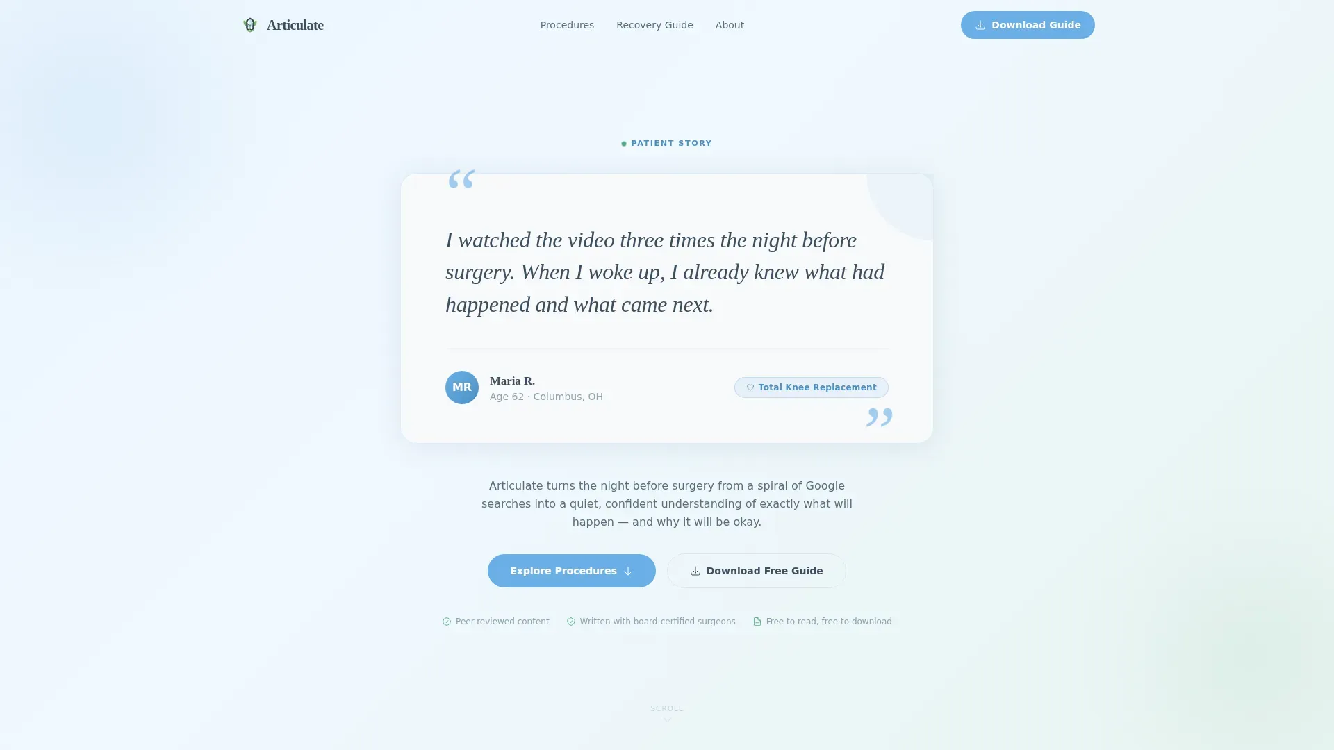
- A testimonial hero card with a named patient quote, age, and procedure tag on a sky-tinted background with a subtle pulse animation on the quotation marks
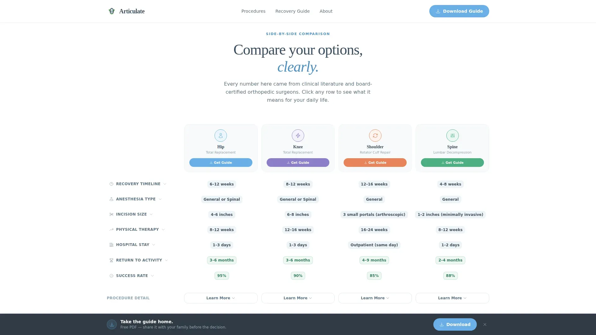
- A procedure comparison table covering hip replacement, knee replacement, rotator cuff repair, and spine, with expandable rows that reveal an anatomical animation and a downloadable PDF guide per procedure
- A numbered pre-op to full-recovery accordion timeline, a credibility strip, an email-gated animation call to action, and a sticky download bar that activates after the visitor scrolls past the table
Feature list
This template packages five distinct interactive components into one coherent patient education flow. Each component is designed to reduce friction and build confidence at a different stage of the visitor's research journey.
Procedure Comparison Table
The comparison table places hip replacement, knee replacement, rotator cuff repair, and spinal stenosis treatment side by side. Columns cover recovery weeks, anesthesia type, incision size, physical therapy duration, and return-to-activity benchmarks. Each row expands to reveal a thirty-second anatomical animation and a downloadable PDF guide.
Accordion Pre-Op to Recovery Timeline
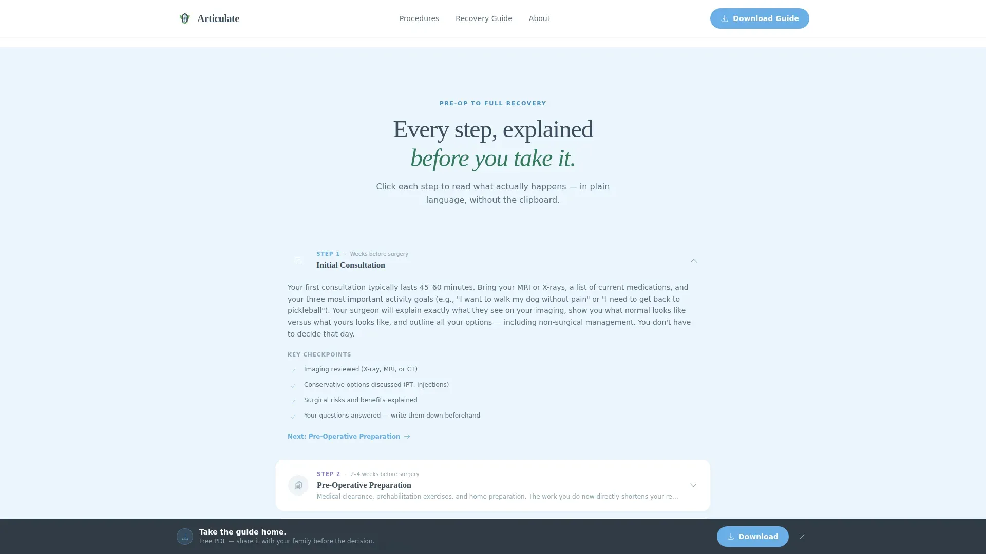
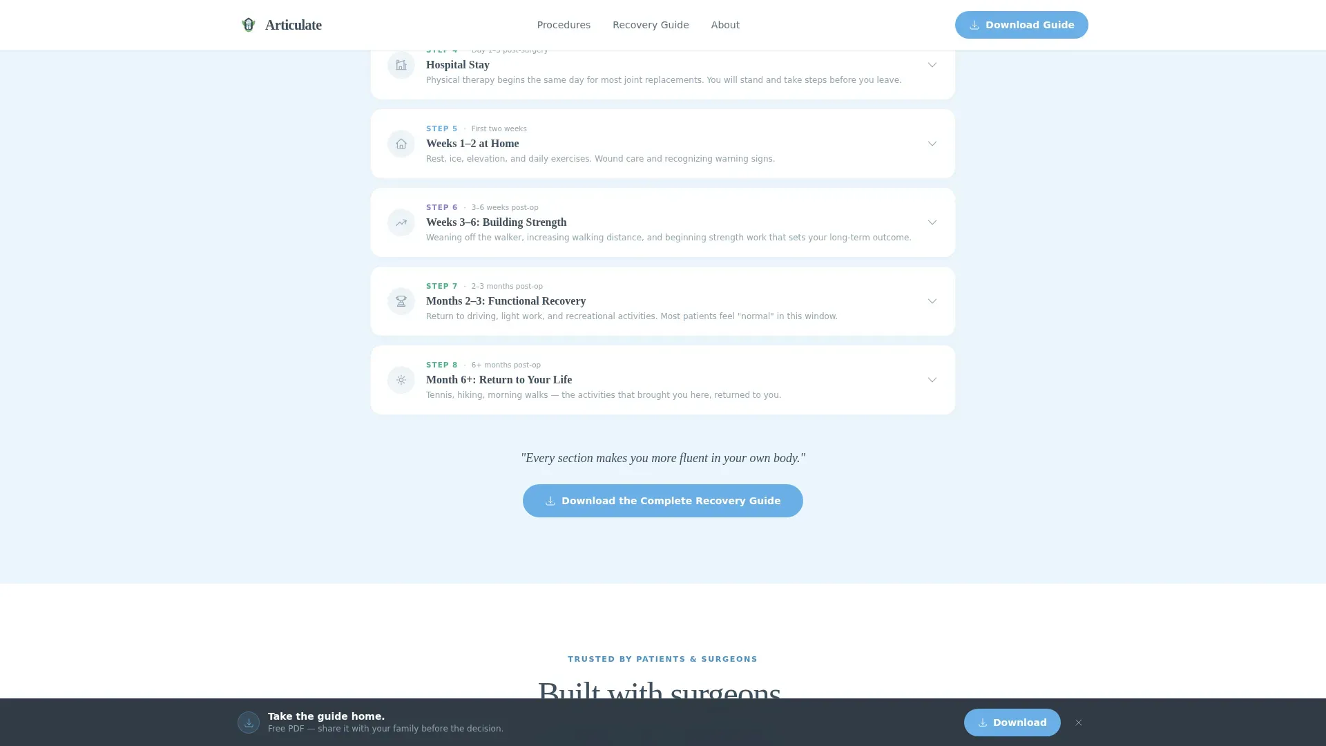
A numbered accordion timeline walks visitors through every stage from initial consultation to return-to-activity. Each step clicks open to reveal detail, so the page feels progressive rather than overwhelming. The structure mirrors the actual patient journey in chronological order.
Testimonial Hero Card
The hero opens with a large, softly shadowed patient testimonial card centered on a sky-tinted background. The quote is set in oversized serif type with a pulse animation on the quotation marks. A name, age, and procedure tag ground the story in real specificity.
Sticky Download Bar
A sticky bottom bar appears after the visitor scrolls past the comparison table. It repeats the primary call to action, "Download Your Procedure Guide," keeping the conversion path visible without interrupting the reading flow.
Email-Gated Animation Access
A secondary conversion path offers access to the full surgery animation behind a single email field. This gate is lightweight by design, asking for only one piece of information so the barrier to entry stays low.
Page sections overview
| Section | Purpose |
|---|---|
| Testimonial Hero Card | Opens with a named patient quote to establish emotional trust immediately |
| Procedure Comparison Table | Lets visitors compare four procedures across five clinical dimensions |
| Expandable Table Rows | Reveal per-procedure animations and downloadable PDF guides on demand |
| Pre-Op Recovery Timeline | Accordion steps guide visitors from consultation through full recovery |
| Credibility Strip | Displays surgeon credentials, patient count, and a peer-reviewed content badge |
| Animation Gate | Email-gated modal delivers the full surgery animation to engaged visitors |
| Sticky Download Bar | Persists the primary call to action after the visitor scrolls past the table |
| Footer | Linear single-row footer with essential practice links |
Design & branding system
The visual identity follows a Medical Clarity theme. The palette feels clinical without being cold and precise without being intimidating. Typography pairs Fraunces serif headlines with DM Sans for body text and interface elements, creating a warm but authoritative reading experience.
- Surgical slate (#3D4F5F) anchors all body text and headers; sterile white (#F7F9FB) breathes across section backgrounds; reassurance sky (#6AAFE6) marks every interactive element and linked resource
- Recovery green (#4CAF82) appears only where healing is referenced, including post-op milestones, success rates, and return-to-activity timelines, keeping its meaning specific and trustworthy
Mobile & speed optimization
The template is designed desktop-first for patients researching at home on a laptop, with full mobile responsiveness built into every section. Interactive components use a Client Components pattern for the comparison table, accordion timeline, email gate modal, and sticky bar, while static content sections use a Server Components approach.
- Staggered fade-in animations, accordion expand and collapse transitions, and scroll-triggered sticky bar activation are all handled without layout shift
- The comparison table, accordion steps, and email gate modal each reflow cleanly on smaller screens so the full education journey is accessible on any device
How this template helps you convert
The page is structured as a content-first funnel. It gives away roughly eighty percent of its knowledge freely and then packages the rest into a take-home format that patients can share with family before making a decision.
- The procedure comparison table and accordion timeline build fluency early, so by the time the visitor reaches the download call to action they already feel informed and trust the source
- The sticky download bar keeps "Download Your Procedure Guide" visible after the table scroll, removing the need to hunt for the next step, while the email-gated animation offers a lighter secondary conversion for visitors who are not yet ready to download
Other information about this template
This template is part of the Articulate design system, built specifically for the orthopedic surgeon patient education niche within the Health and Medical category. It is designed as a single landing page and not a multi-page site.
- Localization is set to English (United States) with imperial measurements and MM/DD/YYYY date formatting throughout
- The lead capture form asks for first name, email address, and procedure of interest, with the procedure dropdown populated from the comparison table columns
- Animation intensity is high across the template, including a pulse effect on the hero quote marks, staggered fade-ins on scroll, and smooth accordion transitions
- The footer uses a linear single-row pattern to keep the page focused on the education content rather than navigation
Theme
Medical Clarity
Creative direction
Step-by-Step Guide
Color system
Slate & Sky
Style
Comparison Table
Direction
Content/Resource
Page Sections
Expandable Procedure Comparison Table
Accordion Pre-op to Recovery Timeline
Named Patient Testimonial Hero
Sticky Procedure Guide Download Bar
Email-gated Surgery Animation
Credibility Strip
Related questions
Who is this landing page template designed for?
What procedures does the comparison table cover?
How does the lead capture work on this page?
Can I use this template without video or animation content?
Is this a single page or a multi-page site?



