Orthopedic & Sports Medicine Booking Website Template
Mend is a hub-and-spoke orthopedic surgery center landing page built around a recovery estimator, a six-phase surgical journey timeline, and a seven-question progressive assessment. It guides pain-affected adults from first click to consultation booking with low friction. The Forest Trust color system and step-by-step structure turn surgical anxiety into quiet confidence before a patient ever walks through the door.
by Rocket studio
Quick summary
Mend is a single-page orthopedic surgery center landing page that opens with an interactive recovery estimator and flows through a six-phase surgical journey. An anchor navigation timeline tracks the visitor's progress with scroll-linked moss-green indicators. The page closes with a seven-question assessment modal that delivers a personalized summary and pre-fills a consultation booking.
Who this template is for
This template is built for orthopedic surgery centers that need to convert anxious, research-mode patients into booked consultations. It works especially well for practices serving adults who have been managing chronic joint pain for months and are finally ready to take action.
- Orthopedic surgery centers serving adults with knee, hip, or shoulder conditions
- Practice marketers who want a low-friction, mobile-first patient intake experience
- Care teams replacing outdated contact forms with a guided, trust-building patient journey
What problem this template solves
Most orthopedic practice pages list services and phone numbers. They do nothing to reduce the anxiety that keeps a person from booking. Patients arrive on a page mid-fear and leave without acting because nothing speaks to their specific situation.
- Visitors feel addressed as individuals, not as a general audience
- The surgical journey is mapped in plain language so nothing feels unknown or alarming
- The path to a consultation is short, personal, and free of unnecessary friction
What you get with this template
You get a fully structured, interaction-rich landing page organized around a patient's actual journey from first concern to scheduled appointment. Every section is purposeful, every call to action is contextual, and the design reinforces calm and trust at every scroll step.
- A header recovery estimator with a joint selector and pain-duration slider
- A six-phase anchor navigation timeline with scroll-linked progress indicators
- A seven-question progressive assessment modal with a personalized outcome summary
Feature list
This template includes several purpose-built features that work together to move a visitor from uncertain to scheduled.
Interactive Recovery Estimator
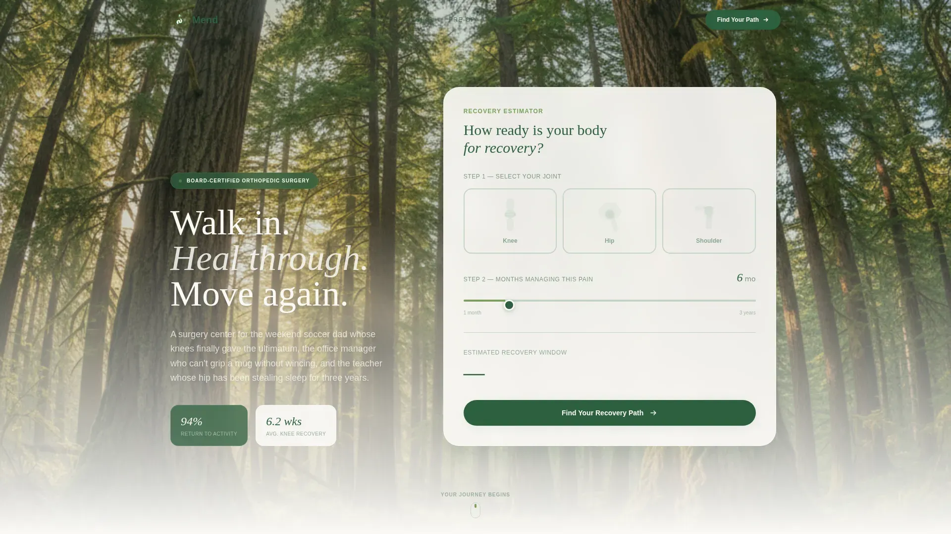
The header opens with a panel titled "How Ready Is Your Body for Recovery?" Visitors tap one of three illustrated bone-and-joint silhouettes to select their affected area. A single slider then asks how many months they have been managing pain. The tool reflects a personalized recovery window estimate back in real time, making the page feel immediately relevant.
Six-Phase Surgical Journey Timeline
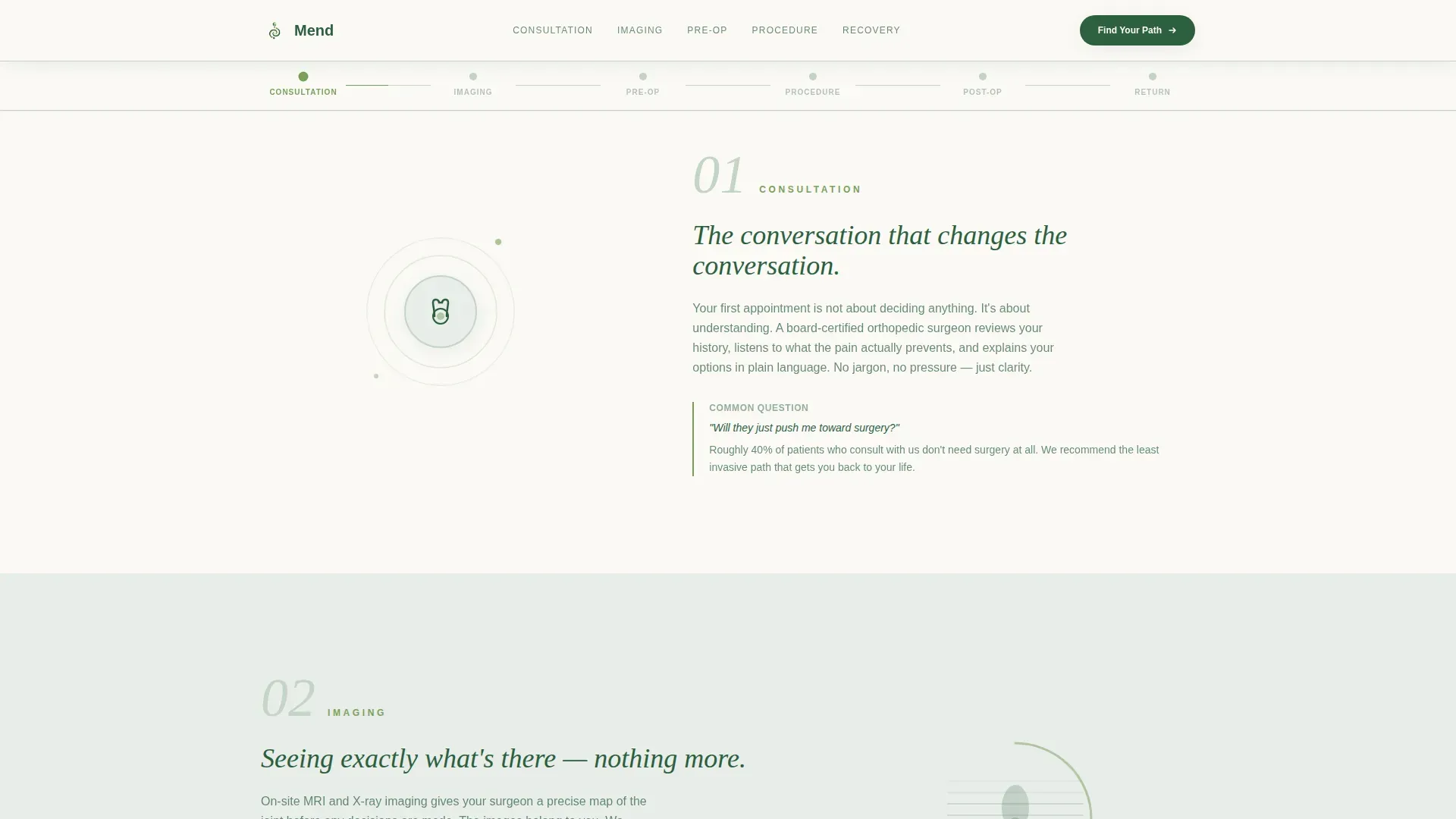
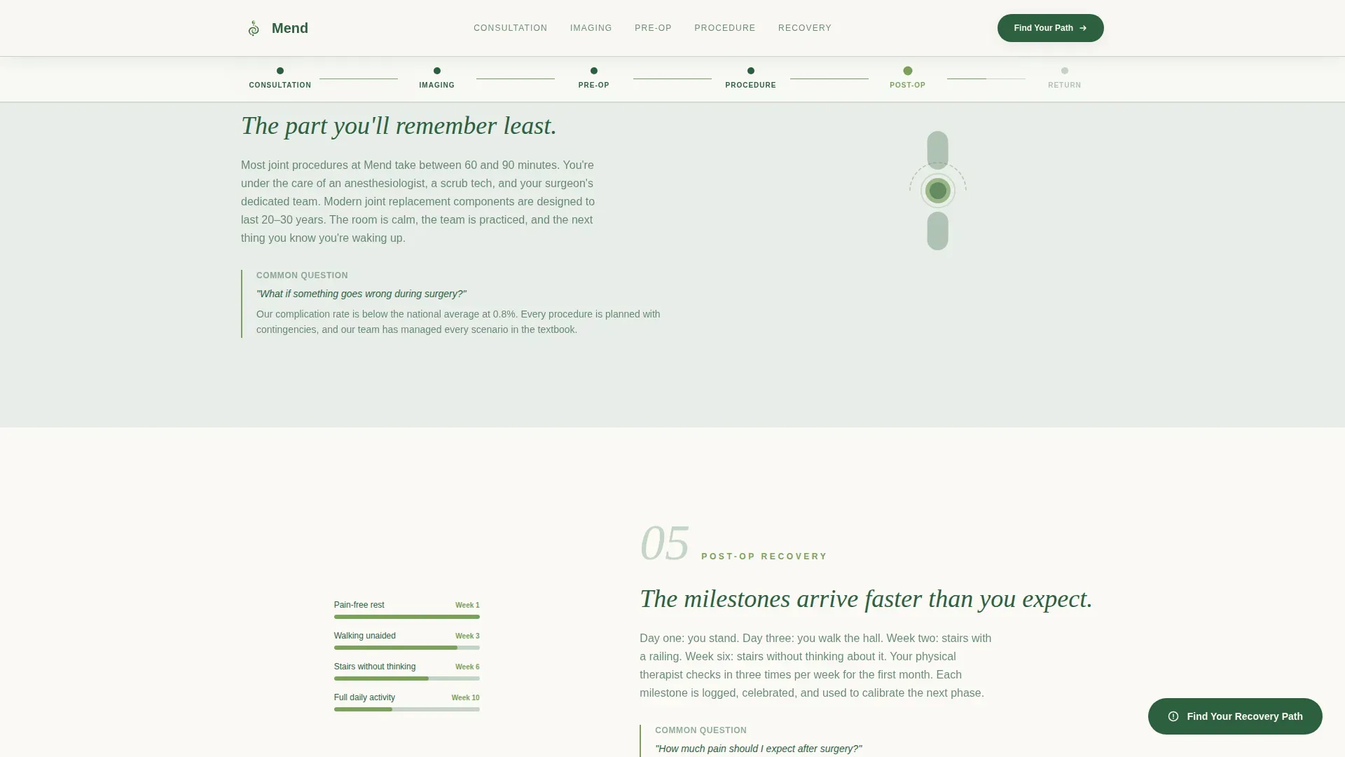
An anchor navigation bar pins to the top of the page as a horizontal timeline. Six moss-green progress dots represent consultation, imaging, pre-operative preparation, the procedure, post-operative milestones, and return to activity. Each dot fills as the visitor scrolls, turning the page into a walkable corridor through their upcoming experience.
Plain-Language Phase Sections
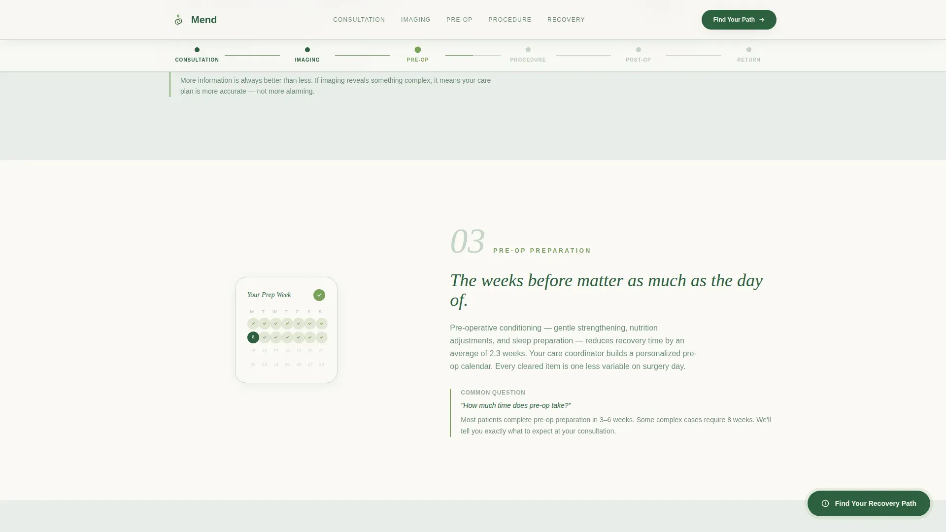
Each of the six journey phases pairs a short, clear paragraph with a single looping micro-animation. Examples include an MRI graphic rotating, a joint moving through its restored range of motion, and a calendar showing cleared recovery weeks. The tone is steady and reassuring. Each section answers the question the previous one raised.
Seven-Question Progressive Assessment Modal
The primary call to action opens a full-screen modal quiz. Each of the seven questions occupies its own screen with a moss-green progress bar. Questions cover pain location, duration, mobility limitations, previous treatments, insurance type, preferred consultation format, and best contact window. The final screen delivers a personalized recovery category, a recommended appointment type, and a pre-filled booking button.
Patient Outcome Story Cards
A dedicated outcomes section presents specific patient stories with names, procedure types, and weeks-to-recovery figures. These are not generic testimonials. They are structured result cards that give prospective patients a realistic picture of what recovery can look like.
Floating Contextual Call-to-Action Button
After the third spoke section, a floating "Find Your Recovery Path" button appears and stays visible as the visitor continues scrolling. This keeps the assessment entry point accessible without interrupting the reading flow.
Page sections overview
| Section | Purpose |
|---|---|
| Hero + Estimator | Joint selector, pain slider, and personalized recovery window output |
| Journey Timeline Nav | Horizontal anchor bar with six scroll-linked moss-dot phase indicators |
| Consultation Phase | Explains what the first appointment involves in plain language |
| Imaging Phase | Describes diagnostic imaging steps and what to expect |
| Pre-Op Preparation | Outlines steps the patient takes before the procedure |
| The Procedure | Plain-language walkthrough of the surgical experience |
| Post-Op Milestones | Maps early recovery checkpoints and progress markers |
| Return to Activity | Shows what life looks like after full recovery |
| Outcomes Cards | Named patient stories with procedure type and recovery duration |
| Assessment Modal call to action | Seven-question quiz leading to personalized summary and booking |
| Footer | Horizontal flow footer with practice contact and navigation links |
Design & branding system
The visual identity uses an Organic Flow style with soft curves, living textures, and a filtered-light atmosphere that evokes a Pacific Northwest recovery walk. Every color choice and typographic decision supports a feeling of calm, trust, and quiet momentum.
- Color palette: canopy green (#2D5F3E) for primary text and structure, morning fog gray (#E8EDE9) and birch bark white (#FAF9F6) for alternating section backgrounds, and living moss (#7BA05B) for progress indicators and active navigation states
- Typography: Fraunces serif display for headings paired with DM Sans for body text, creating warmth without sacrificing readability
- Animation style: GSAP ScrollTrigger powers scroll-linked progress dots, joint SVG micro-animations, and smooth modal transitions throughout
Mobile & speed optimization
This template is built mobile-first, recognizing that patients often research orthopedic options on their phones during late-night pain episodes. The layout and interactions are sized and sequenced for small screens before desktop.
- The joint selector, pain slider, and assessment modal are all touch-optimized for one-handed phone use
- Static sections use server-side rendering while interactive components such as the calculator and modal load as client components, keeping the initial page load lean
- Scroll-linked animations and progress indicators are tuned to perform smoothly on mobile without jarring transitions
How this template helps you convert
Every design and content decision in this template points toward one outcome: getting the right patient to book a consultation with as little friction as possible.
- The recovery estimator creates immediate personal relevance in the first few seconds, replacing generic clinic messaging with the visitor's own pain profile and a projected recovery window.
- The six-phase journey timeline reduces the fear of the unknown by showing exactly what the surgical process looks like, answering questions before the patient has to ask them.
- The seven-question assessment modal captures enough detail to pre-fill a booking request without ever asking for a phone number upfront, earning the conversion through trust rather than pressure.
Other information about this template
This template is designed for United States-based orthopedic practices with a Pacific Northwest regional context. Dates follow the MM/DD/YYYY format and all references are localized to USD pricing structures. The page is structured as a single hub-and-spoke landing page, not a multi-page website, so all patient journey content lives in one scrollable, anchor-navigated experience. Secondary audiences include caregivers and spouses who research options on behalf of a partner managing chronic joint pain. The assessment modal is designed so that email address and preferred time slot are the only required contact fields, reducing the barrier to submission. The footer follows a horizontal flow pattern suited to clean, minimal practice branding.
- Localization: United States, USD, MM/DD/YYYY date format, Pacific Northwest regional context
- Secondary audience: caregivers and spouses researching orthopedic options for a partner
- Footer style: horizontal flow layout suited to orthopedic practice branding
Theme
Organic Flow
Creative direction
Step-by-Step Guide
Color system
Forest Trust
Style
Hub & Spoke (Anchor Nav)
Direction
Quiz/Assessment
Page Sections
Interactive Recovery Estimator
Six-phase Journey Timeline
Looping Phase Micro-animations
Seven-question Assessment Modal
Patient Outcome Story Cards
Floating Contextual Call to Action Button
Related questions
Can I customize the joint types shown in the recovery estimator?
Does the seven-question assessment require a phone number from the patient?
How does the anchor navigation timeline work on mobile?
Can the patient outcome story cards be updated with real practice data?
Is this template suitable for a practice that focuses on only one joint type?



