Yoga Studio Portfolio Website Template
Asana is a dashboard-style yoga studio case study landing page built around real growth metrics, interactive chapter navigation, and a command-center visual identity. It guides SaaS founders, fitness marketers, and studio owners through a proven eleven-month turnaround story, then converts curious visitors into app downloads with a personalized diagnostic flow.
by Rocket studio
Quick summary
Asana transforms a yoga studio growth story into a navigable data experience. Visitors explore live-styled charts, before-and-after metric comparisons, and chapter-by-chapter breakdowns of acquisition, retention, and revenue. The page earns trust through real numbers first, then drives action through a pinned download bar and a lightweight studio diagnostic.
Who this template is for
This template is built for people who understand that numbers tell better stories than copy alone. It speaks directly to growth-minded professionals in the wellness and technology space.
- SaaS founders building wellness-tech platforms who need a proof-of-concept showcase
- Growth marketers at boutique fitness franchises looking for a data-led case study format
- Independent studio owners ready to move beyond manual attendance tracking
What problem this template solves
Most case study pages present a wall of text and a single testimonial quote. Visitors skim, miss the proof, and leave before the call to action appears. This template solves that by restructuring the case study as an interactive, chapter-driven data journey.
- Readers disengage when metrics are buried inside long-form paragraphs
- Studios struggle to show credibility without a visual, dashboard-style proof format
- Generic page layouts fail to segment skimmers from deep-dive operators
What you get with this template
You get a fully structured, single-page landing experience centered on a real studio growth story. Every section is designed to surface the right depth of information at the right moment.
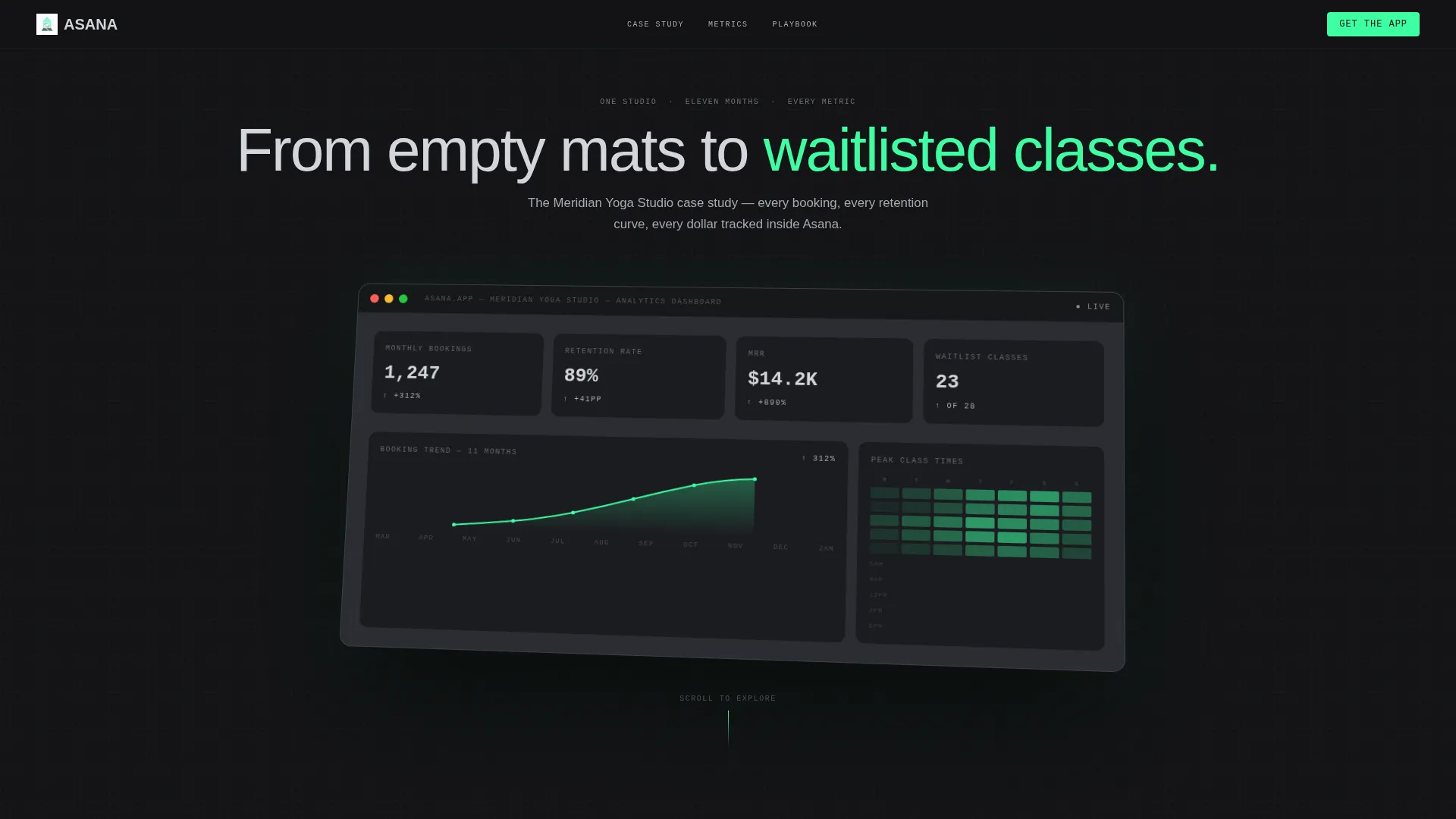
- A full-viewport product screenshot header showing live KPI callouts: 1,247 monthly bookings, 89% retention rate, and $14,200 monthly recurring revenue
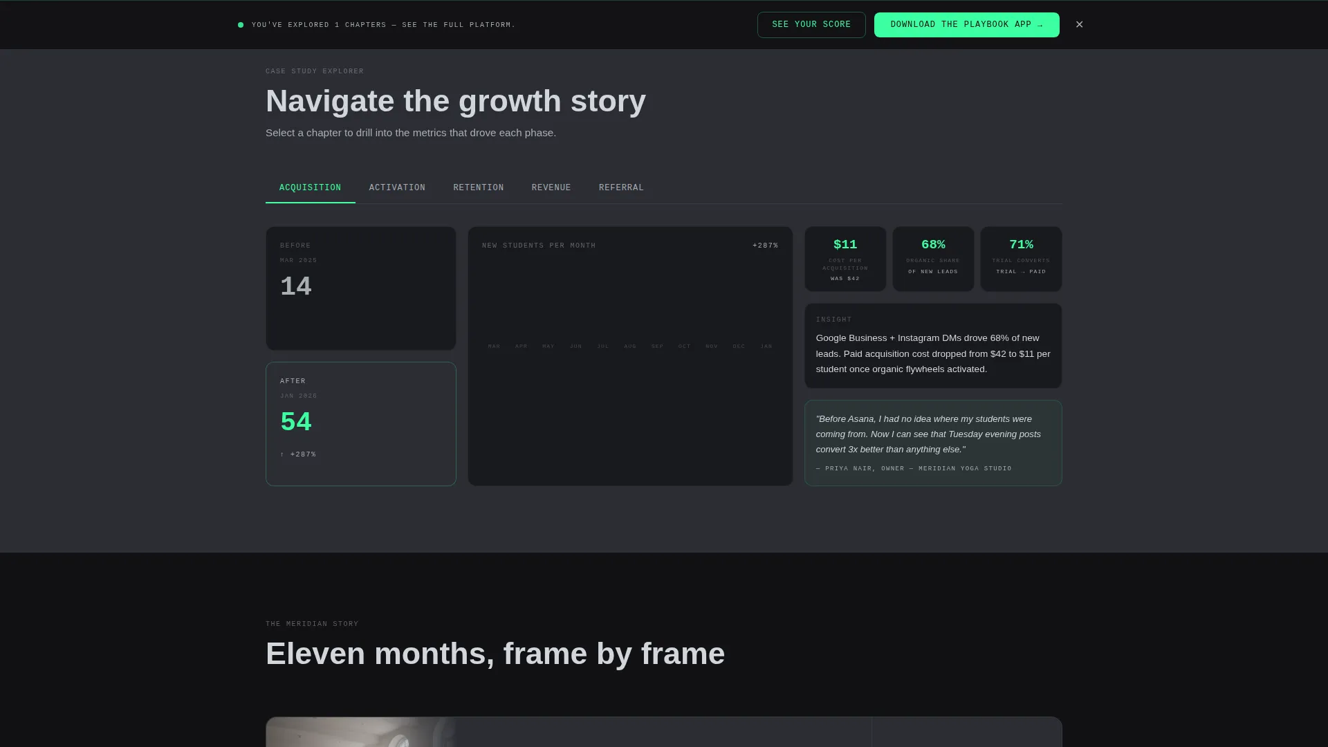
- A horizontal tab bar navigating five growth chapters: Acquisition, Activation, Retention, Revenue, and Referral
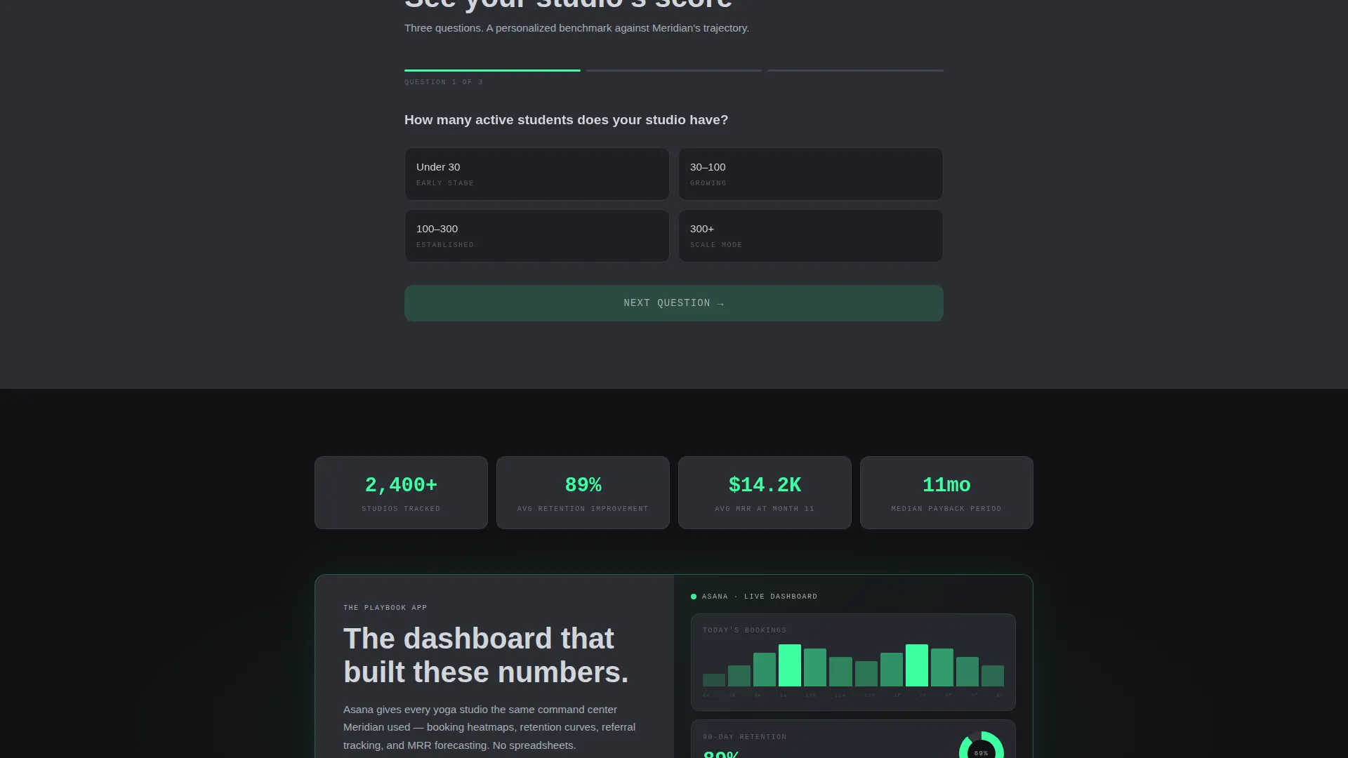
- A pinned bottom bar carrying the primary call to action, plus a three-question studio diagnostic that personalizes the benchmark before surfacing the download link
Feature list
This template delivers a focused set of purpose-built components. Each one serves a specific role in moving the visitor from curious to convinced.
Full-Viewport KPI Header
The header renders a pixel-perfect product screenshot at full viewport width. It is slightly rotated on a Z-axis and casts a soft shadow onto a terminal black background. A single headline above it reads: "One studio. Eleven months. Every metric." Key figures are displayed directly inside the dashboard render: 1,247 monthly bookings, 89% retention rate, $14,200 monthly recurring revenue, and a peak-time heatmap glowing in electric mint.
Interactive Chapter Tab Bar
A horizontal tab bar sits below the header and lets visitors jump between five growth chapters based on the pirate metrics framework: Acquisition, Activation, Retention, Revenue, and Referral. Each chapter opens its own grid of data cards, pull quotes, and before-and-after metric comparisons. The structure rewards both skimmers and operators at their own pace.
Scroll-Animated Data Cards
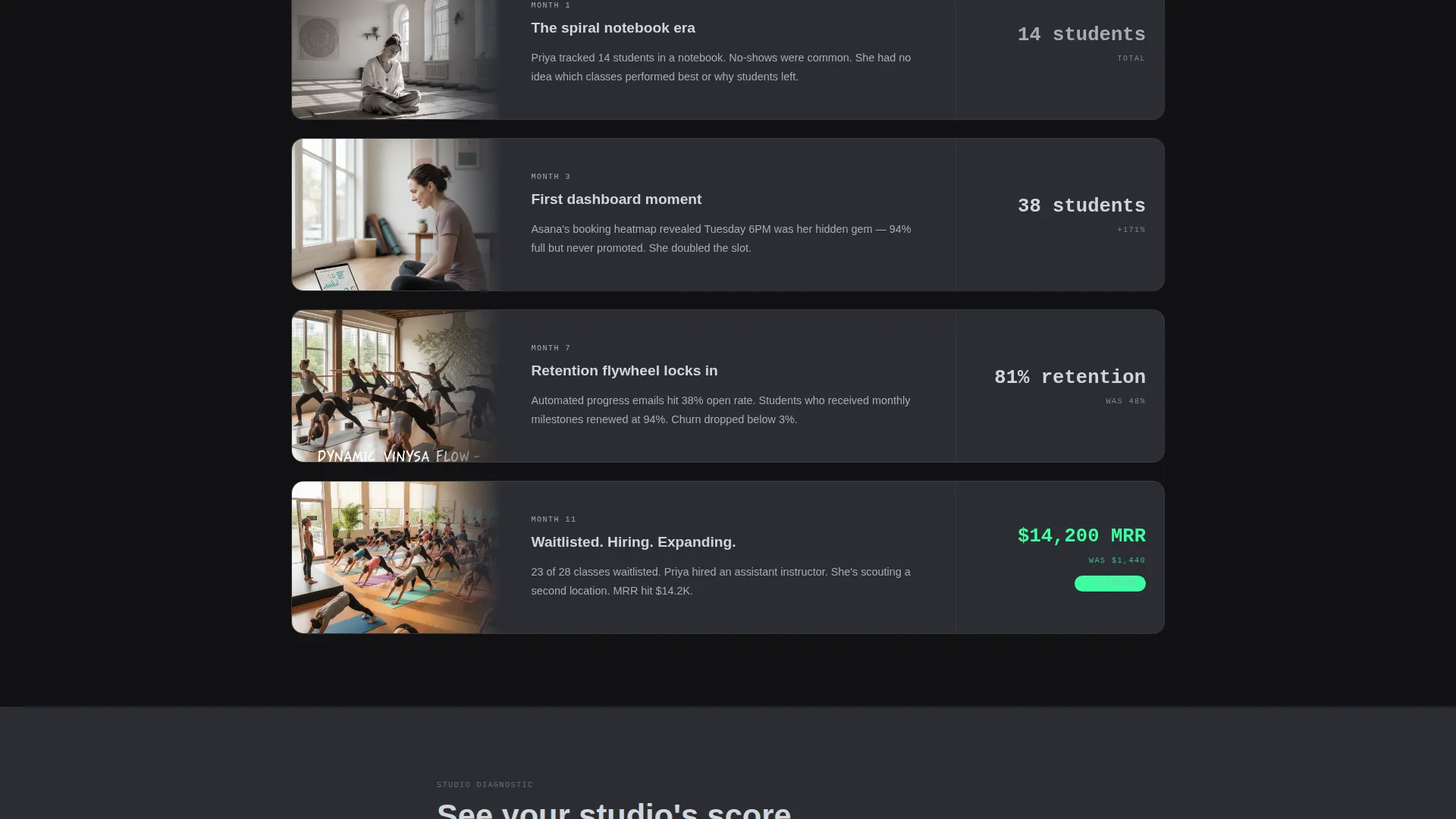
Each chapter grid contains live-styled charts and metric comparisons that animate on scroll. The animations are directional: numbers climb, graphs tilt upward, and retention curves arc toward the right. The visual language communicates momentum before the visitor reads a single word.
Personalized Studio Diagnostic
A secondary call to action labeled "See Your Studio's Score" triggers a three-question diagnostic. Visitors answer prompts about studio size, current booking method, and monthly class count. The diagnostic returns a personalized benchmark score, then surfaces the primary app download link as the next natural step.
Pinned App Download Bar
After the visitor has explored at least two metric chapters, a slim bottom bar appears. It carries the primary call to action: "Download the Playbook App," styled in electric mint text on a terminal black background. The bar stays pinned as the visitor continues scrolling, keeping the conversion point always within reach.
Pull Quote Integration
Each chapter includes pull quotes sourced from the studio owner. These quotes are embedded directly inside the data card grid, not isolated in a separate testimonial section. This placement keeps the human voice close to the numbers it is describing.
Page sections overview
| Section | Purpose |
|---|---|
| KPI Header | Establish credibility with real studio metrics at a glance |
| Tagline Text | Frame the eleven-month turnaround story immediately |
| Chapter Tab Bar | Let visitors navigate to the growth stage most relevant to them |
| Acquisition Chapter | Show how the studio filled its first classes |
| Activation Chapter | Detail the moment new bookings became committed members |
| Retention Chapter | Display the retention curves and the tactics behind them |
| Revenue Chapter | Break down monthly recurring revenue growth over time |
| Referral Chapter | Reveal the word-of-mouth loop that accelerated waitlist growth |
| Studio Diagnostic | Deliver a personalized benchmark before the download prompt |
| Pinned Download Bar | Convert engaged visitors with a persistent, low-friction call to action |
Design & branding system
The visual identity follows a Startup Velocity theme rendered in a Monochrome Steel color system. The palette is precise, cold, and intentional, built to make data legible and momentum visible.
- Base colors: gunmetal (#2B2D33) and terminal black (#111114) alternate as section backgrounds; brushed chrome (#A8ADB3) defines borders and secondary user interface elements; cool gray (#D1D5DB) carries body text
- Accent usage: electric mint (#3DFFA2) appears exclusively on positive-trend indicators, active tab states, and the download call to action, making every upward signal immediately recognizable
- Visual atmosphere: data cards float on 1px chrome borders; the header screenshot is Z-axis rotated with a soft shadow; the overall feel is a spacecraft cockpit, all signal and no decoration
Mobile & speed optimization
The template is structured with mobile viewing in mind. The dashboard-style layout adapts so key metrics remain readable at smaller screen sizes.
- Data card grids reflow into single-column stacks on narrow viewports, keeping chart content legible without horizontal scrolling
- The pinned bottom bar maintains its position and tap target on touch devices, preserving the conversion path on mobile
How this template helps you convert
The template is designed to earn the conversion before it asks for it. Every structural decision serves the goal of building trust through evidence, then guiding the visitor to act.
- The full-viewport KPI header front-loads the most persuasive numbers, so credibility is established before the visitor reads a paragraph
- The interactive chapter structure lets visitors self-select their depth of engagement, making the page useful to both a two-minute skimmer and a thirty-minute operator
- The personalized diagnostic creates a moment of relevance just before the download prompt, so the call to action feels earned rather than imposed
Other information about this template
This template was designed to function as both a standalone case study and a platform showcase. It is equally suited to product-led growth pages, investor proof decks adapted for web, and fitness-tech demo environments.
- The template style is Dashboard and Data Grid, which makes it a strong fit for any data-heavy narrative that needs visual credibility fast
- The interactive explorer direction means the page rewards curiosity: the deeper a visitor scrolls, the sharper the insight they receive
- This template pairs naturally with wellness-tech landing page suites and can be extended to cover additional studio case studies by duplicating the chapter tab structure
Theme
Startup Velocity
Creative direction
Interactive Explorer
Color system
Monochrome Steel
Style
Dashboard/Data Grid
Direction
App Download
Page Sections
Full-viewport KPI Header
Interactive Chapter Tab Navigation
Scroll-animated Data Cards
Personalized Studio Diagnostic
Pinned App Download Bar
Embedded Pull Quote Blocks
Related questions
Who is this landing page template built for?
Can I replace the demo metrics with my own studio's data?
What is the studio diagnostic feature?
Does the template include all five growth chapter tabs?
When does the pinned download bar appear?