Yoga Studio Specialist Booking Website Template
The Asana Luminous Yoga landing page template is a single-page FAQ experience designed for yoga studios. Built on a Dashboard Pro theme with a Monochrome Steel palette, it organizes common studio questions into structured comparison tables, guides visitors through calm, data-rich panels, and drives bookings through a sticky lead-generation bar and a secondary PDF download path.
by Rocket studio
Quick summary
This is a single-page yoga studio FAQ landing page template. It turns the questions new students carry through the door into a confident, scannable experience. Structured comparison tables, oversized amber data points, and a sticky booking bar work together to inform visitors and move them toward their first class.
Who this template is for
This template is built for yoga studio owners who want their website to do the heavy lifting before a student ever walks in. It suits studios that serve a mixed clientele and field the same questions every week.
- Independent yoga studios serving beginners, postpartum clients, and older adults
- Studio owners who want a polished, FAQ-driven landing page that also captures leads
- Instructors or small teams without a dedicated web designer
What problem this template solves
Most yoga studio pages bury answers in walls of text or scattered blog posts. Prospective students arrive with real, specific concerns and leave without finding them. This template solves that directly.
- Visitors cannot quickly cross-reference pricing tiers, class types, or modification options in one view
- Studios lose warm leads because their contact form appears before trust is established
- New students feel too self-conscious to ask questions, so they never book
What you get with this template
You get a fully structured, single-page landing page built around six FAQ categories. Each category is presented as a comparison table panel, so visitors can scan answers across class levels and membership tiers without hunting.
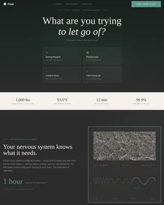
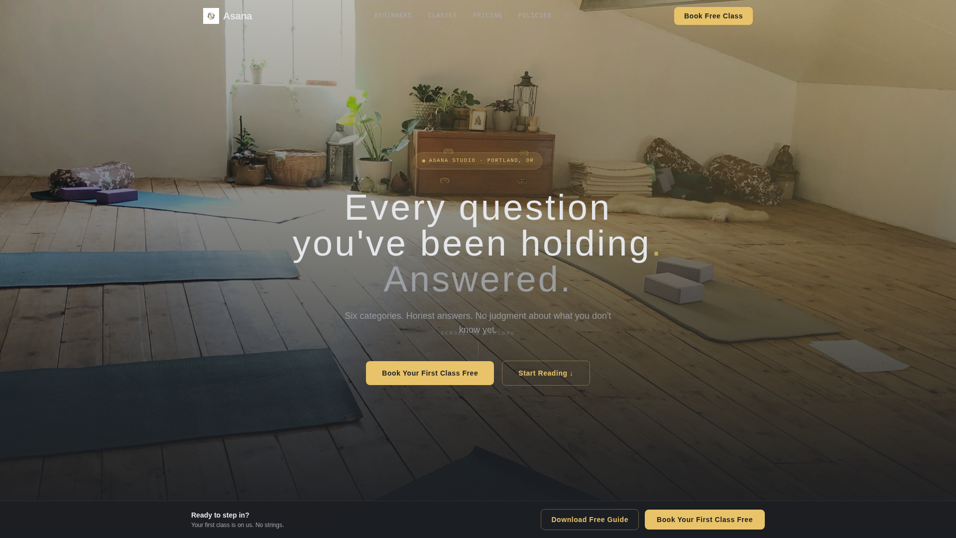
- A dark full-bleed hero header with a golden-hour studio image and a glow-effect headline
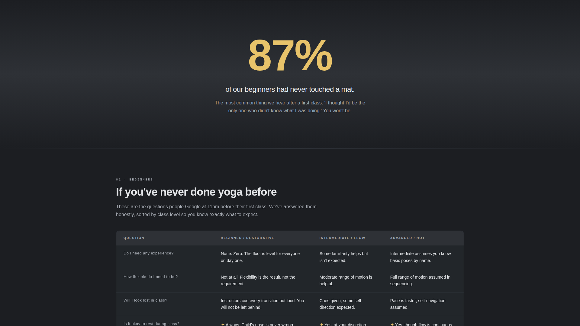
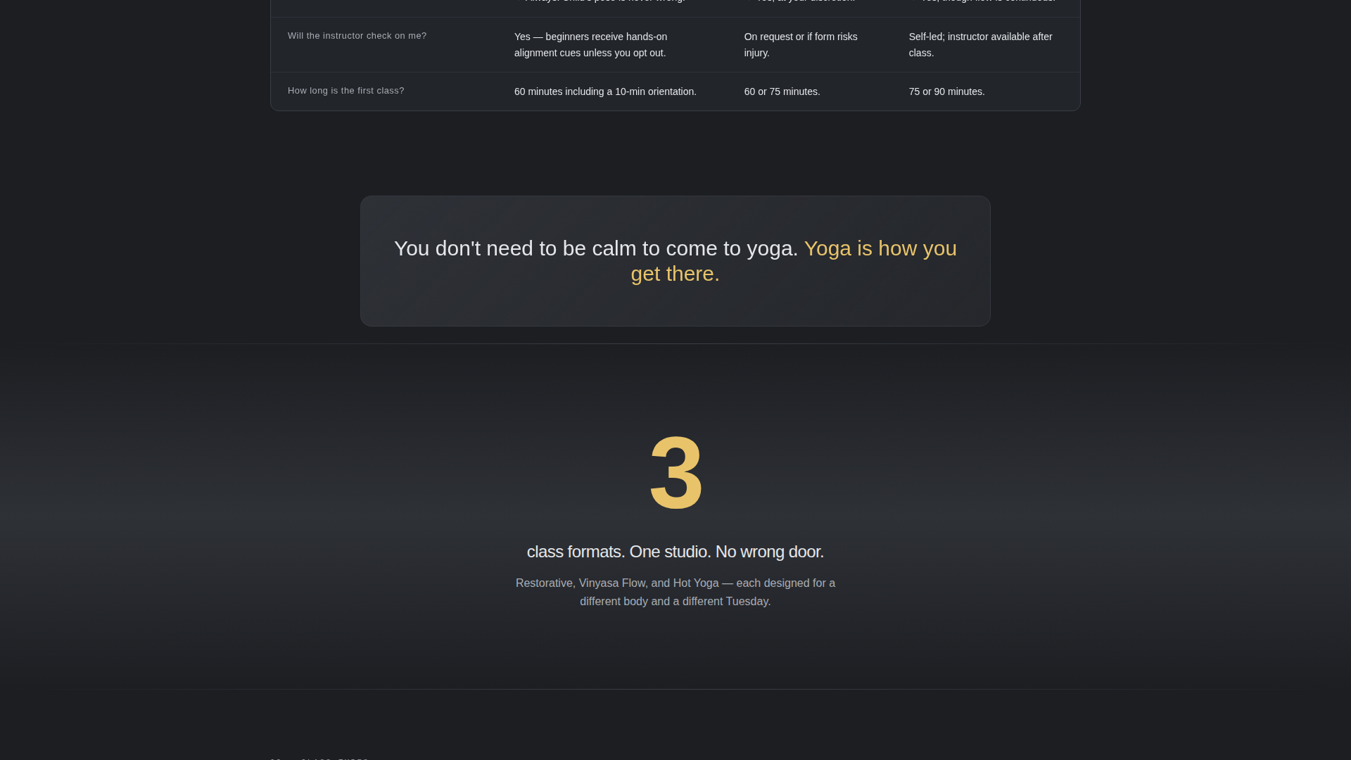
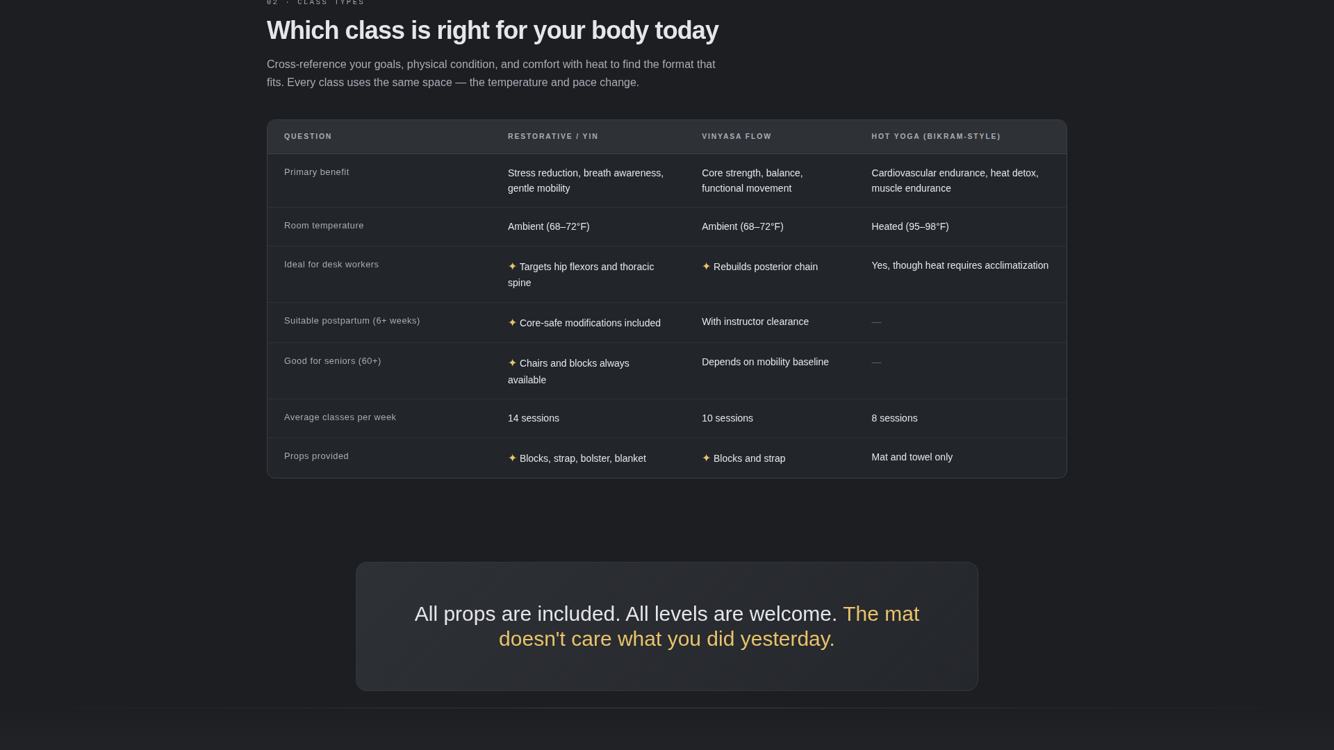
- Six structured FAQ comparison table sections covering Beginners, Pricing and Packs, Class Types, What to Bring, Injuries and Modifications, and Studio Policies
- A sticky bottom booking bar, a three-field lead capture form, and a secondary PDF download gate
Feature list
This template is built around a specific set of design and structural decisions. Every feature listed here comes directly from the brief.
Comparison Table FAQ Layout
Each of the six FAQ categories is presented as a structured comparison table. Visitors can cross-reference answers across class levels or membership tiers in a single glance, rather than reading through a long accordion list.
Sticky Lead-Generation Bar
A sticky bottom bar carrying the primary call to action appears only after the visitor scrolls past the third FAQ category. This pacing earns the ask after value has already been delivered.
Three-Field Lead Capture Form
The booking form asks for a first name, an email address, and a single-select question: "What brings you to yoga?" Response options include stress relief, flexibility, recovery, curiosity, and community. Short and focused.
Secondary PDF Download Path
Visitors who are not ready to book can download a New Student Guide using an email-only gate. This secondary conversion path captures interest at an earlier stage of the decision process.
Oversized Amber Data Points
Each FAQ category is introduced by a single statistic in large amber typography, such as "87% of our beginners had never touched a mat." These data points add authority and signal that the content below is worth reading.
Dark Full-Bleed Hero Header
The header is a golden-hour studio photograph with afternoon light cutting through tall windows. A subtle amber lens flare and a glow-effect headline reading "Every question you've been holding. Answered." set the tone immediately.
Page sections overview
| Section | Purpose |
|---|---|
| Hero Header | Establish tone and headline |
| Beginners FAQ Table | Answer first-timer questions |
| Pricing and Packs Table | Compare membership and drop-in costs |
| Class Types Table | Differentiate session formats |
| What to Bring Table | Remove logistical anxiety |
| Injuries and Modifications Table | Address physical concerns |
| Studio Policies Table | Set clear expectations |
| Breathing Room Panels | Provide visual pause between tables |
| Sticky Booking Bar | Capture primary lead conversions |
| PDF Download Gate | Capture early-stage email leads |
Design & branding system
The visual identity follows a Dashboard Pro theme using a Monochrome Steel color system. The overall feel is clinical enough to trust and warm enough to feel inviting, like a high-end fitness tracker display lit by a single candle.
- Core palette: deep graphite (#1C1E22), brushed aluminum (#A8ADB5), warm matte charcoal (#2E3136), and silver-white body text (#E4E6E9)
- Soft amber glow (#E8C36A) is reserved exclusively for hover states, active toggles, call-to-action pulses, and oversized data point numerals
- Typography uses thin, tracked-out sans-serif type for headlines; the amber accent appears on the hero period with a subtle pulse animation
Mobile & speed optimization
The layout is designed to stay readable and functional across screen sizes. Comparison tables adapt to narrower viewports without losing their scannability.
- Full-bleed dark backgrounds and silver-white text maintain legibility on small screens
- The sticky booking bar sits at the bottom of the viewport on mobile, keeping the call to action accessible without interrupting the reading flow
- Breathing room panels between table sections reduce visual fatigue on any device
How this template helps you convert
The conversion strategy is built into the page structure itself. Visitors are given value before they are asked for anything.
- The comparison table layout answers objections upfront, so visitors arrive at the booking bar already informed and reassured rather than hesitant.
- The sticky bar appears only after the third FAQ category, timing the ask to a moment when trust has already been earned through content.
- The PDF download gate offers a low-commitment second path, capturing email addresses from visitors who need more time before booking.
Other information about this template
This template was designed specifically for the yoga studio FAQ page use case, where the gap between curiosity and commitment is often just one unanswered question.
- The template style is a Comparison Table layout, which makes it equally useful for studios that want to display class schedules, membership tier breakdowns, or instructor specialties side by side
- The Industry Report creative direction gives the page an authoritative, structured feel that stands apart from typical wellness site aesthetics
- The header concept uses a Dark Full-Bleed with Glow treatment, a design choice that works especially well for studios with strong photography assets
- This template is built within the Asana framework, suited for yoga studio website templates in the broader yoga studio FAQ page niche
Theme
Dashboard Pro
Creative direction
Industry Report
Color system
Monochrome Steel
Style
Comparison Table
Direction
Lead Generation
Page Sections
Comparison Table FAQ Layout
Sticky Lead-generation Bar
Three-field Lead Capture Form
Secondary PDF Download Gate
Oversized Amber Data Points
Dark Full-bleed Hero Header
Related questions
Can I edit the FAQ categories to match my studio's real questions?
Does the sticky booking bar appear as soon as the page loads?
What does the PDF download gate require from a visitor?
Is the amber accent color used throughout the whole design?
What does the lead capture form actually collect?