Subscription Box Services Pre-Launch & Coming Soon Website Template
The Asana Radiant Wellness landing page is a scroll-reveal, single-page template built for yoga and wellness subscription brands. It pairs a Neo-Retro Citrus Burst visual identity with seasonal storytelling, a live countdown timer, and a clear upsell path. Every section unfolds progressively as visitors scroll, guiding free-tier members toward an annual All-Seasons upgrade with minimal friction.
by Rocket studio
Quick summary
The Asana Radiant Wellness template is a scroll-reveal landing page for yoga and wellness subscription services. It opens with a countdown timer, unfolds seasonal content as visitors scroll, and guides free-tier members toward a full upgrade. The Neo-Retro Citrus Burst palette feels warm, grounded, and purposeful from the first second on screen.
Who this template is for
This template is built for wellness brands that deliver yoga flows, breathwork sequences, and guided meditations on a subscription basis. It suits founders who want a visually distinctive page that converts curious visitors and upgrades existing free members without a complicated funnel.
- Yoga instructors and wellness coaches launching or growing a digital subscription
- Subscription box service brands in the activewear and wellness niche looking to reduce free-tier churn
- Solo creators or small teams who need a polished, ready-to-launch landing page with a strong visual identity
What problem this template solves
Wellness subscription pages often feel either too clinical or too generic. They fail to communicate seasonal relevance, emotional resonance, or a clear reason to upgrade right now. This template solves that by making each scroll reveal feel intentional and connected to a specific moment in the year.
- Free-tier members often need a compelling nudge to commit to an annual plan, and this page builds that case section by section
- Generic wellness pages lose visitors because they offer no urgency and no personal connection; the countdown timer and seasonal storytelling fix both problems
- Upgrade flows with too many steps create drop-off; the one-tap payment path reduces that friction directly
What you get with this template
You get a fully structured, single-page scroll-reveal layout that handles both first-time visitor acquisition and free-to-paid member upgrades. Every section has a defined role, and the design system is consistent from top to bottom.
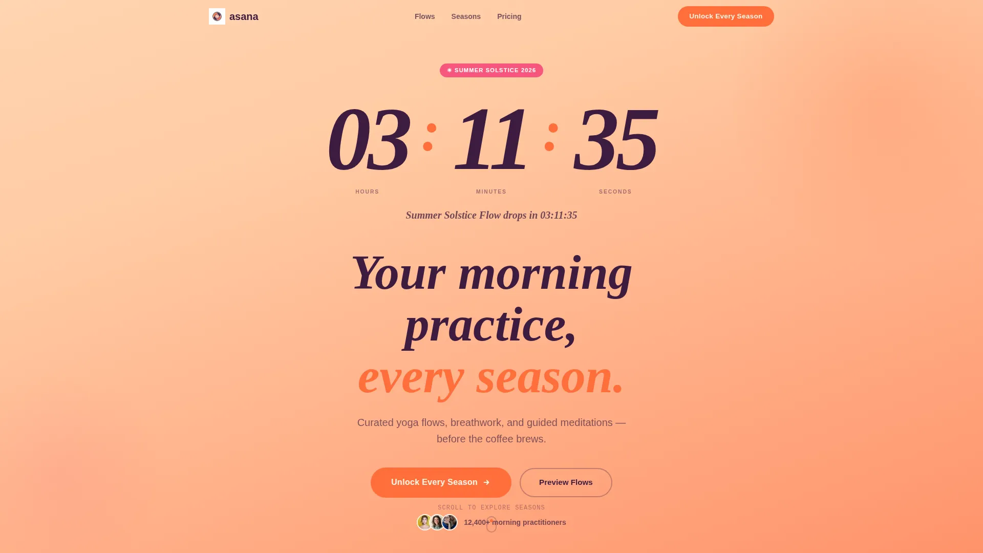
- A countdown timer header section with a sunrise tangerine gradient and hand-drawn numeral styling
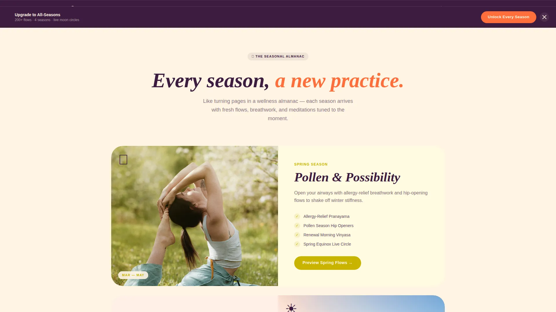
- Four seasonal content sections that progressively reveal spring, summer, autumn, and winter offerings with parallax layering
- A free-versus-paid comparison strip, a mid-page season toggle priced at a reduced commitment, and a sticky upgrade bar that appears after the second scroll reveal
Feature list
This template is built around a set of intentional, prompt-defined features that work together to move a visitor from curious to committed.
Scroll Reveal Progressive Layout
Each section animates into view as the visitor scrolls down the page. The reveal sequence is intentional: the countdown builds anticipation, seasonal sections deepen engagement, and the upgrade offer appears only after the visitor has absorbed the value.
Countdown Timer Header
The header opens with a large countdown rendered in hand-drawn plum numerals on an oat milk background. A slow tangerine gradient drifts across the field like a sunrise. A single retro serif line below the clock names the upcoming seasonal class drop, making the timer feel like an event rather than a pressure tactic.
Seasonal Storytelling Sections
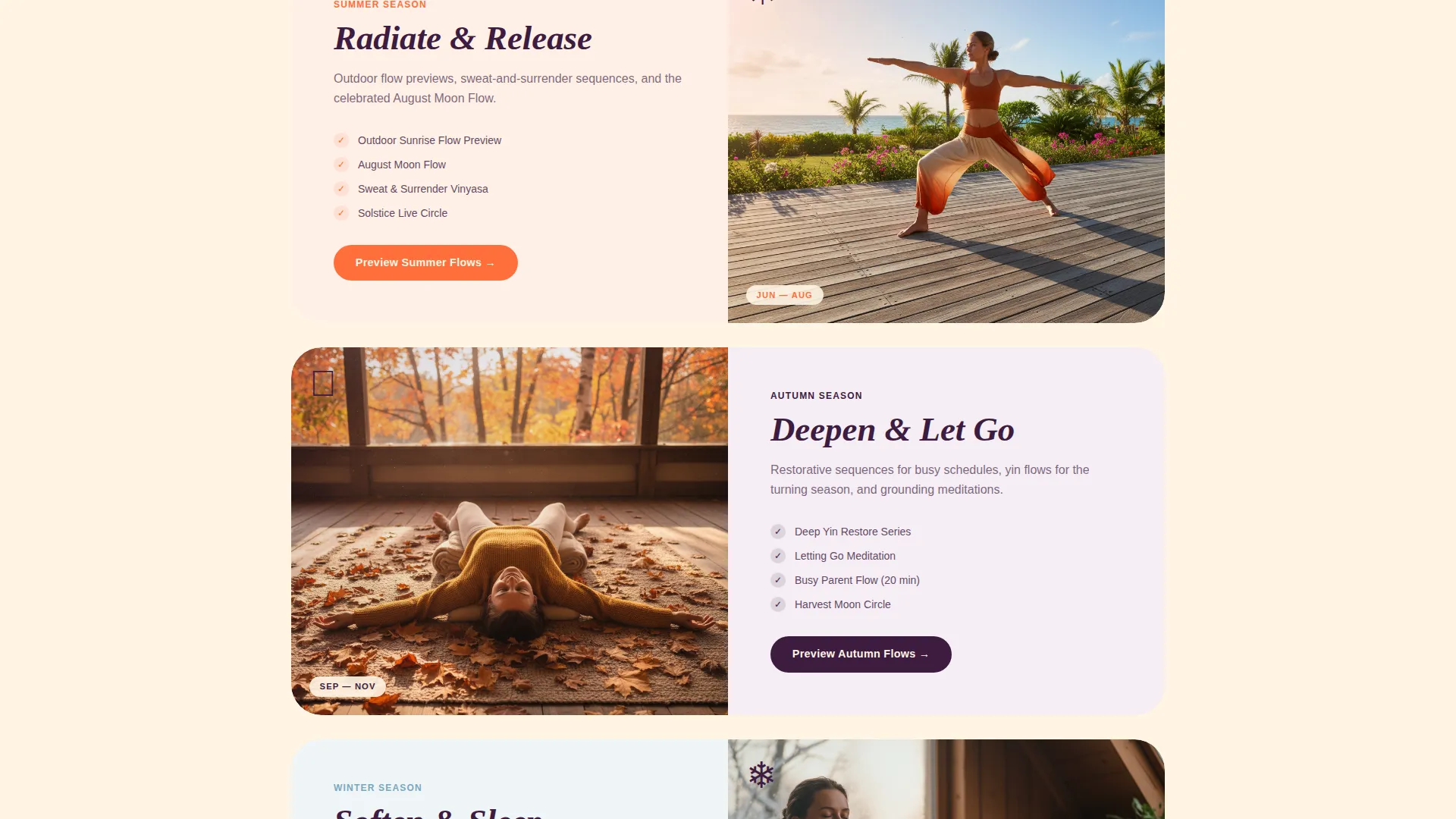
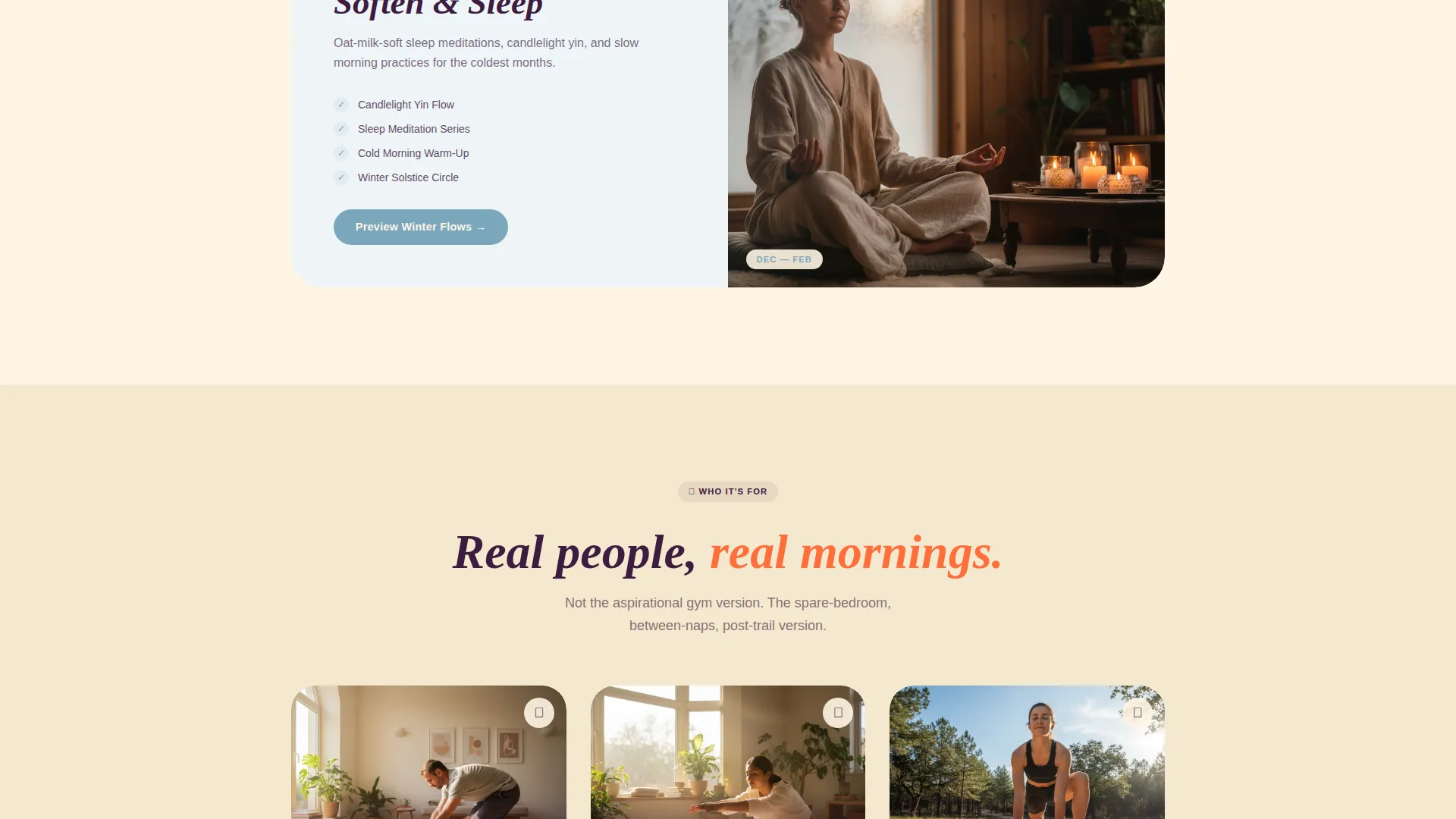
The page moves through all four seasons as the visitor scrolls, each with its own accent color and content focus. Spring introduces breathwork clips, summer shows outdoor flow previews, autumn brings restorative sequences, and winter centers on sleep meditations. Parallax layers separate foreground text from background texture.
Free versus. Paid Comparison Strip
A progressive disclosure strip clearly shows what free-tier members currently access versus what the annual All-Seasons pass includes. The comparison covers downloadable flows, live monthly moon circles, and the seasonal toolkit, making the upgrade case concrete and visual.
Low-Friction Upgrade Path
The primary call to action reads "Unlock Every Season" and appears beneath the countdown and again in a sticky bottom bar after the second scroll reveal. A mid-page toggle offers a single-season option at a reduced price, lowering commitment before the annual ask. The upgrade form pre-fills email and payment details from the existing account, reducing completion to a single tap.
Testimonials Pinned to Seasons
Real subscriber quotes are anchored to specific seasonal moments rather than displayed in a generic row. This grounds the social proof in lived experience and reinforces the seasonal narrative throughout the page.
Page sections overview
| Section | Purpose |
|---|---|
| Countdown Timer Header | Builds anticipation for the next seasonal class drop |
| Primary Upgrade call to action | Directs free members to unlock the full subscription |
| Spring Season Reveal | Introduces breathwork and pollen-season wellness content |
| Summer Season Reveal | Showcases tangerine-toned outdoor flow previews |
| Autumn Season Reveal | Presents restorative plum-accented sequences |
| Winter Season Reveal | Highlights oat milk-styled sleep meditations |
| Free versus. Paid Strip | Compares free tier against the All-Seasons annual pass |
| Mid-Page Season Toggle | Offers a lower-commitment single-season entry point |
| Seasonal Testimonials | Pins real subscriber quotes to specific seasonal moments |
| Sticky Upgrade Bar | Persists the upgrade call to action after the second scroll reveal |
Design & branding system
The visual identity follows a Neo-Retro theme that feels like a 1970s wellness poster screen-printed on handmade paper. The Citrus Burst color system is warm, analog, and slightly psychedelic without losing its sense of calm. Every color has a specific role, and the system is consistent across every section.
- Oat milk (#FFF5E4) dominates backgrounds, tangerine (#FF6F3C) fires every button and progress indicator, grapefruit pink (#F7567C) highlights seasonal badges, and deep vintage plum (#3D1C3F) anchors headlines like ink pressed into soft stock
- Typography uses a rounded retro serif for headlines and display text, reinforcing the analog warmth of the overall aesthetic
- Parallax layering, slow gradient drifts, and scroll-triggered reveals give the page a sense of physical depth and seasonal movement
Mobile & speed optimization
The template is structured with a mobile-first scroll experience in mind. The progressive reveal sequence works vertically, which suits the natural thumb-scroll behavior of smartphone users accessing the page before their morning practice.
- The sticky upgrade bar is designed to persist cleanly at the bottom of a mobile viewport without obscuring content
- The one-tap upgrade form flow, with pre-filled account details, is particularly effective on small screens where long forms create the most friction
- Seasonal section transitions are built to feel smooth and intentional at mobile scroll speeds, not jarring or abrupt
How this template helps you convert
The entire page structure is a conversion sequence in disguise. Each section earns the next call to action rather than forcing it.
- The countdown timer and seasonal storytelling create genuine desire before any offer appears, so the "Unlock Every Season" call to action lands on a warmed-up visitor rather than a cold one.
- The comparison strip and mid-page toggle work together as a two-step upgrade path: the toggle captures members who are not ready for an annual commitment, while the sticky bar keeps the full upgrade visible for those who are.
Other information about this template
This template is a strong fit for wellness subscription brands operating in the activewear and mindfulness space. It is built as a single landing page with a defined scroll flow, making it easy to publish and maintain without a multi-page site structure.
- The Neo-Retro theme and Citrus Burst color system are distinctive enough to stand apart from the minimalist white-and-sage aesthetic common in the wellness category
- The seasonal content structure means the page stays relevant year-round with relatively small content updates per quarter
- This template was designed with the Asana wellness brand concept in mind, reflecting a digital sanctuary tone that balances energy with ease
Theme
Neo-Retro
Creative direction
Curated Collection
Color system
Lavender Dream
Style
Overlap/Layered
Direction
Marketplace/Multi
Page Sections
Scroll Reveal Progressive Layout
Countdown Timer Header
Seasonal Storytelling Sections
Free Versus. Paid Comparison Strip
Low-friction One-tap Upgrade Flow
Season-pinned Testimonials
Related questions
Who is this landing page template designed for?
Can I adapt the seasonal sections for my own content calendar?
Does the countdown timer work with any seasonal event I choose?
What upgrade path components are included in this template?
Does this template work for a brand new subscription launch, not just free-tier upgrades?



