Yoga Studio Class Finder & Membership Comparison Website Template
A dashboard-style yoga studio landing page built for comparison-driven visitors. The Class Fit Calculator matches each visitor to a recommended class type, weekly schedule, and estimated pricing in seconds. Stark KPI rows surface the problem. Versus grid cards highlight this studio against competitors. Every section converts through data, not persuasion.
by Rocket studio
Quick summary
This landing page template puts a personalized Class Fit Calculator at the top and builds a structured comparison journey from there. Visitors select their experience level, goal, and preferred time slots, then receive a live dashboard card with class recommendations, suggested weekly frequency, estimated monthly pricing, and a side by side comparison against two nearby studios. The design is precise, violet, and calm.
Who this template is for
This template is built for anyone who wants to convert comparison-minded visitors without writing a single sales paragraph. It works especially well for studios and wellness businesses that compete on measurable quality rather than vague promises.
- Boutique yoga studios that want to highlight teacher certification hours, class size caps, and recovery outcome scores against local competitors
- Wellness agencies and studio teams launching a new location or rebranding an existing page with a data-led design strategy
- Freelance developers and design agencies building professional landing page templates for fitness or health-focused clients
What problem this template solves
Potential customers often spend their lunch break searching and comparing studios across multiple tabs. Most studio pages force visitors to read paragraphs and trust marketing copy blindly. That friction costs conversions.
- Visitors cannot easily compare pricing, class quality, or schedule fit without leaving the page and opening a search engine
- Studios lose leads because their pages do not surface the right detail at the right moment in the decision journey
- Comparison-ready visitors bounce when they cannot evaluate the studio versus competitors in a single scroll
What you get with this template
This template gives you a fully designed, data-grid landing page with interactive features built into the structure. Every section follows the Problem to Solution arc so visitors move naturally from recognizing a problem to choosing your studio.
- A multi-step Class Fit Calculator with a visual weekly grid selector and live dashboard output for class type, frequency, and estimated cost
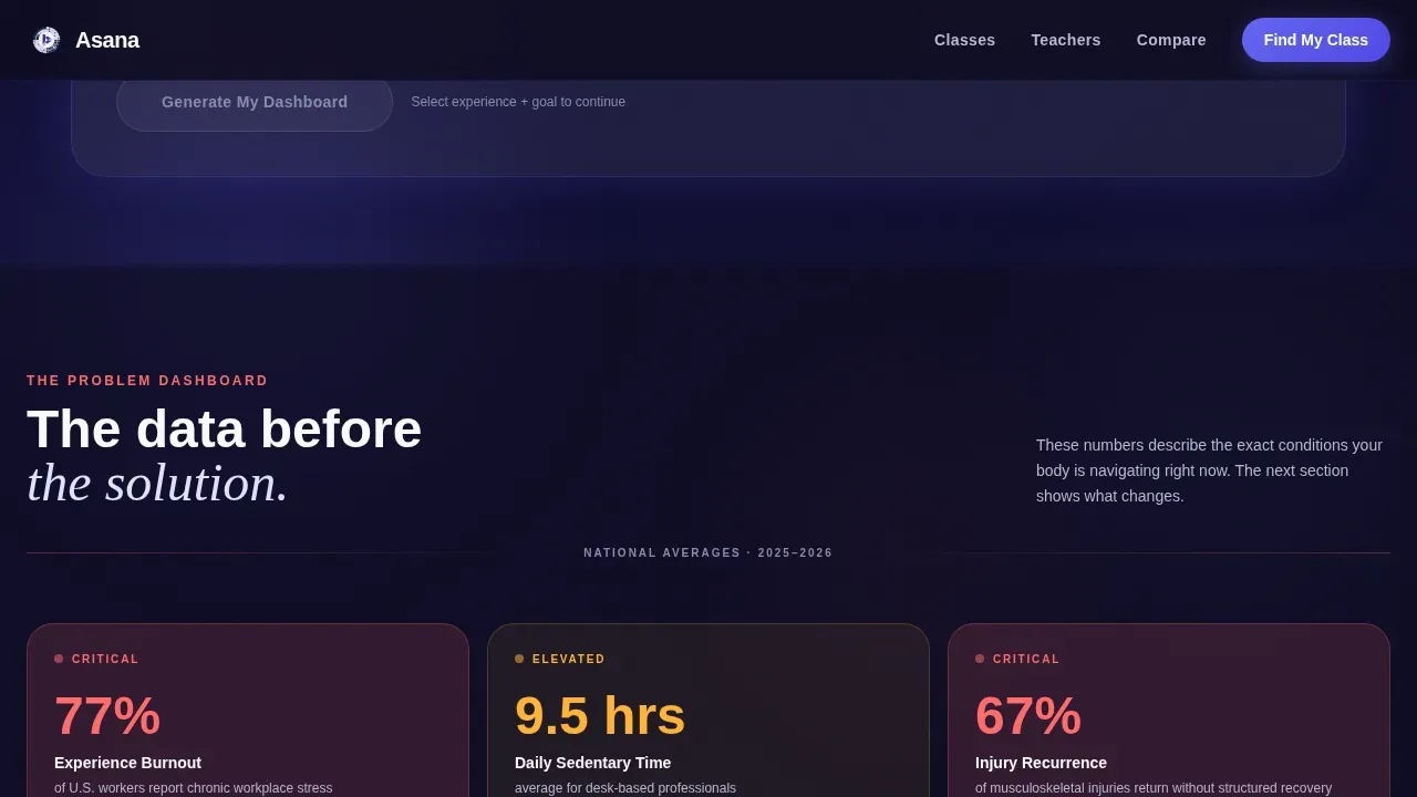
- A Problem Row of lavender dashboard KPI cards displaying national stress statistics, sedentary hour averages, and injury recurrence data
- A Versus Grid with side by side comparison cards in electric indigo versus neutral gray, covering teacher certification, class size caps, six-month retention, and physiotherapist recovery scores
Feature list
This template's features are grounded in the source brief. Each one is designed to build trust with visitors and guide them toward booking a first free class.
Class Fit Calculator Widget
The header widget lets visitors select experience level, primary goal, and preferred time slots from a visual weekly grid. On submit, it renders a personalized dashboard card with recommended class types, suggested weekly frequency, and estimated monthly pricing. The tile layout rearranges in real time to reflect each visitor's answers.
Problem Row KPI Dashboard
Below the calculator, a row of stark lavender dashboard cards displays national stress statistics, average sedentary hours per day, and injury recurrence rates. These figures create context for why the studio's approach matters. Each KPI is displayed as a clear metric, not buried in paragraph text.
Versus Grid Comparison Cards
The Versus Grid uses a side by side comparison format throughout. This studio's metrics appear on the left in electric indigo; competitor figures appear on the right in neutral gray. Categories include teacher certification hours versus industry average, class size caps, student retention at six months, and recovery outcome scores from physiotherapist partners. The structure makes the comparison felt visually, not argued rhetorically.
Persistent Call to Action Bar
After the calculator interaction, a persistent bottom bar appears with the primary call to action: Book Your First Free Class. It pre-fills with the visitor's selected time preference. A secondary path, Download Studio Comparison PDF, captures an email address for visitors who need more detail before committing.
Testimonials and Social Proof Row
A dedicated Recovery Outcomes section displays physiotherapist partner quotes alongside student testimonials. These trust signals help build trust with visitors who arrive skeptical, particularly former athletes referred by a physiotherapist and new mothers evaluating postnatal services.
Footer with Horizontal Flow
The footer follows a horizontal flow layout that provides quick navigation links, contact details, and secondary calls to action. It keeps the page tidy and helps visitors navigate to the information they need without disrupting the comparison flow above.
Page sections overview
| Section | Purpose |
|---|---|
| Class Fit Calculator | Match visitor to class recommendations and pricing via interactive dashboard output |
| Problem Row KPIs | Display national health statistics as lavender dashboard cards to frame the studio's value |
| Versus Grid | Compare studio metrics against competitors using side by side indigo and gray cards |
| Teacher and Class Quality | Highlight certification hours, class size caps, and six-month student retention rates |
| Recovery Outcomes | Display physiotherapist partnership scores and student testimonials for credibility |
| Footer Flow | Provide navigation links, contact details, and secondary conversion paths |
Design & branding system
The visual design follows a Dashboard Pro theme that blends meditation app calm with fintech dashboard precision. The result is a page that feels trustworthy and breathable at the same time.
- Color palette: deep screen-dark navy (#0D0B1E) for backgrounds, vivid electric indigo (#6366F1) for active states and data highlights, soft lavender mist (#E0E0FF) for card surfaces, warm breath-white (#FAF9FE) for open space, and coral (#FF6B6B) for comparison winners and call to action pulses
- Typography: Plus Jakarta Sans for body and user interface text, Fraunces in serif italic for accent headings, creating contrast between the data-grid structure and the warmth of the studio brand
- Animation and interactivity: GSAP ScrollTrigger drives staggered KPI reveals, calculator tile rearrangements, and a line-reveal hero so every scroll moment feels intentional rather than static
Mobile & speed optimization
The template is designed desktop-first to serve visitors comparing studios on a lunch break. Mobile parity is built into the layout so the experience holds on smaller screens without losing the comparison structure.
- The calculator widget and Versus Grid cards adapt to single-column layouts on mobile while keeping the side by side comparison logic intact within each card pair
- Server Components handle static sections such as the Problem Row, Versus Grid, and footer, while a Client Component powers the interactive calculator for efficient rendering
- The page uses a structured layout that keeps the heaviest interactive features isolated so static content loads quickly and visitors do not wait long before seeing the first KPI row
How this template helps you convert
This template is engineered around a Comparison and Versus conversion strategy. Every design and content decision is aimed at reducing friction for a visitor who has already decided to compare studios but has not yet chosen one.
- The Class Fit Calculator creates a personalized stake immediately. Visitors who see their own data displayed on screen are more likely to focus on completing the journey than bouncing to a competitor page. The pre-filled call to action bar removes the final decision barrier by connecting their selected time slot directly to the booking step.
- The Problem to Solution arc across the scroll means visitors do not read persuasion; they read dashboards. Each problem KPI displayed above creates demand for the solution metric that follows it. This structure lets the comparison do the convincing, which is more effective for analytical visitors such as project managers and physiotherapist-referred athletes who evaluate evidence before committing.
- The secondary Download Studio Comparison PDF path captures emails from visitors still in research mode. This two-path conversion plan serves both the visitor ready to book and the visitor who needs more detail before taking action, so no qualified lead leaves the page empty-handed.
Other information about this template
This template is part of a broader ecosystem of dashboard-style landing page templates suited to businesses that compete on measurable quality. It draws on principles used by SaaS companies and agencies that build comparison pages to capture leads at the decision moment.
- The Asana Smart Studio Comparison Landing Page template is inspired by how SaaS products use structured comparison pages to highlight advantages over competitors and convert visitors who are already in evaluation mode
- Comparison chart templates in this style help teams evaluate options using consistent criteria, and this page applies that same logic to a wellness studio context so customers can compare pricing, features, and services without leaving
- AI-driven tools like those found in Asana Smart Projects can automatically suggest descriptions, sections, and custom fields tailored to specific projects, and the modular structure of this template supports that kind of customization workflow for teams managing multiple client builds
- Agencies and studio teams can edit any section, modify color tokens, and adapt the content strategy to match a different brand or business niche without rebuilding from scratch
- The template supports custom fields and role assignments so a development team can assign tasks, set automated date adjustments, and launch the page efficiently using project management workflows
- Visitors who want to learn how to create a comparison page that drives conversion will find this template a practical starting point, whether they are developing a single studio page or building a library of templates for a content marketing agency
- The design and functionality position this template for teams that focus on conversion rate optimization principles drawn from SaaS landing page best practices, applied here to a wellness and fitness audience


Theme
Dashboard Pro
Creative direction
Problem→Solution Arc
Color system
Electric Indigo
Style
Dashboard/Data Grid
Direction
Comparison/Versus
Page Sections
Class Fit Calculator with Live Dashboard Output
Problem Row KPI Cards
Versus Grid Comparison Cards
Persistent Call to Action Bar
Recovery Outcomes and Testimonials Section
Footer with Horizontal Navigation Flow
Related questions
Can I edit the calculator questions and output fields?
Does the template include competitor data, or do I supply it?
Is this template suitable for a non-yoga wellness studio?
How does the persistent call to action bar work?
What subscription is needed to access full AI-powered features when building this in a project management tool?


