Adaptive Bodyweight Fitness App Landing Page Template
Flow is a hero-dominant fitness app landing page template built for calisthenics progression. It walks visitors through a five-question movement quiz, delivers a personalized skill-tree preview, and captures their email as a natural last step. The Alpine Fresh color system and Healing Space visual identity make every scroll feel calm, intentional, and ready to convert.
by Rocket studio
Quick summary
Flow is a single-page fitness app landing page template designed for a bodyweight training tracker. It uses a hero-dominant layout, a step-by-step scroll guide, and a built-in quiz modal to turn curious visitors into committed sign-ups. The landing page template prioritizes mobile users, breathable design, and a conversion path that feels like a gift rather than a gate.
Who this template is for
This landing page template speaks directly to founders, indie developers, and fitness coaches who are launching a calisthenics fitness app and need a focused, high-quality page fast. It suits anyone who wants a fitness landing page that guides visitors toward one clear action without requiring a team of designers.
- Developers or solopreneurs launching a bodyweight fitness app or tracker
- Fitness coaches offering a structured fitness program without gym equipment
- Physio graduates or wellness practitioners bridging rehabilitation into progressive strength training
What problem this template solves
Most fitness landing page templates feel either too clinical or too loud. They throw too many options at potential customers, bury the call to action, and treat mobile users as an afterthought. A good fitness landing page must guide visitors toward a single goal, set expectations clearly, and earn trust before asking for anything. Flow solves all of this from the first scroll.
- Visitors arrive unsure of their level and leave without engaging, because the page never meets them where they are
- Generic layouts fail to highlight key benefits of bodyweight training, making the fitness program feel no different from a gym membership app
- Mobile users bounce when pages load cluttered layouts on smaller screens, raising the bounce rate before the message lands
What you get with this template
Flow delivers a complete, ready-to-customize fitness app landing page with every section pre-built and purposeful. The layout is a hero-dominant structure at roughly ninety percent hero and ten percent supporting content, with scroll-reveal sections that build competence before asking for commitment. You get a modern landing page that is as easy to adapt as it is to ship.
- A cinematic half-page hero with a bold headline and a birchwood call to action button that pulses once on load
- A four-step asymmetric scroll walkthrough showing assessment, skill tree, session, and progress ring sections
- A five-question quiz modal with smooth transitions, a skill-tree preview result, and an email capture framed as a program delivery
Feature list
This landing page template ships with purposeful components drawn directly from the Flow brief. Each one is designed to engage visitors, motivate people to take action, and convert visitors into app users without clutter or confusion.
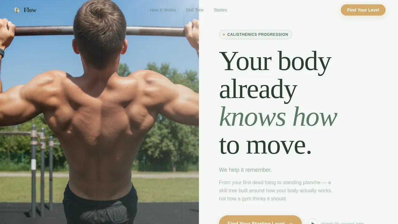
Half-Page Cinematic Hero
The hero image occupies the left half of the layout: a real human mid-skin-the-cat on an outdoor pull-up bar, shot from below against an overcast sky. The right half carries a bold headline in large pine-green serif type and a birchwood button that pulses once. Strong visuals here set the emotional tone and reduce the bounce rate before a single word of copy is read. Eye catching visuals in the opening section are one of the key factors in keeping potential clients engaged.
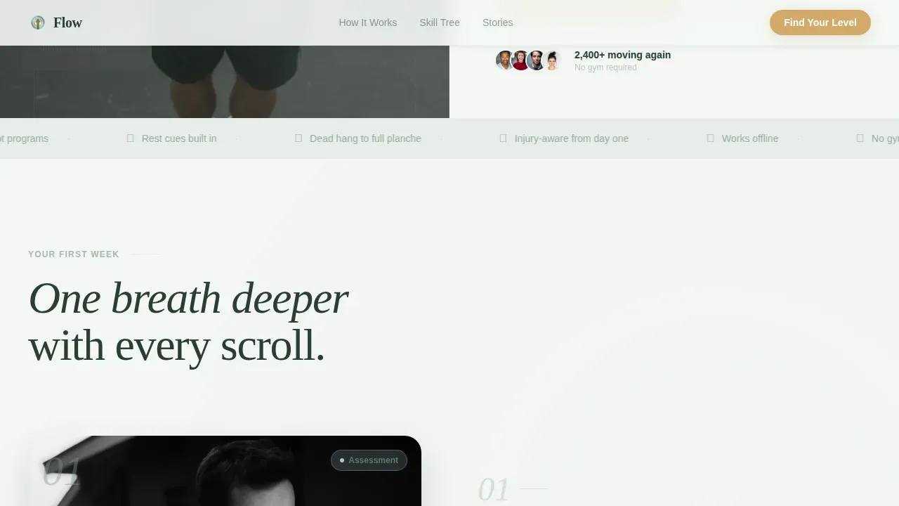
Four-Step First-Week Walkthrough
Scrolling through the page reveals four asymmetric sections that each represent one breath deeper into the product. Step one shows the in-app assessment screen. Step two reveals the personalized skill tree. Step three animates a single workout session with rest cues and form overlays. Step four shows the weekly progress ring filling. This step-by-step guide structure lets potential customers build confidence before you ask for commitment, which is one of the most effective ways to highlight key benefits naturally.
Five-Question Quiz Modal
The primary call to action reads "Find Your Starting Level" and opens an inline quiz modal. Visitors answer five questions: current pull-up count, push-up hold comfort, active injuries (multi-select), training frequency, and primary fitness goal. Results show a personalized skill-tree preview and recommended program tier. A simple form then invites them to send their program to their inbox, making email capture feel like a benefit rather than a barrier. This is one of the clearest fitness landing page examples of value-first lead capture in the fitness industry.
Skill Tree Bento Grid Preview
Below the walkthrough, an asymmetric bento grid displays the progression paths available inside the fitness app. Hover states on each node reveal the next unlock, from dead hang to full planche. This section helps potential clients visualize their level and understand the depth of the fitness program before they ever sign up. It is a great example of using layout to communicate product depth without overwhelming body text.
Social Proof Spotlight Cards
Testimonial spotlight cards carry specific transformation milestones, for example "first muscle-up at thirty-eight." Before and after photos or progress ring comparisons sit alongside the story. Client testimonials like these build credibility fast and reassure hesitant visitors that the fitness program works for real people, not just elite athletes. Incorporating success stories from users who found their starting level is one of the key elements that separates a high-converting fitness landing from a forgettable one.
Ultra-Minimal Footer
The footer follows a horizontal flow pattern with minimal links. It keeps the page clean and makes sure the final scroll ends on calm ground rather than a wall of navigation. White space here is intentional, letting the last call to action breathe before the visitor leaves.
Page sections overview
| Section | Purpose |
|---|---|
| Hero image block | Opens with bold headline and pulsing call to action |
| Assessment step one | Shows in-app movement assessment screen |
| Skill tree step two | Reveals personalized progression paths |
| Session step three | Animates a single live workout session |
| Progress ring step four | Displays weekly progress ring filling |
| Skill tree grid | Bento layout previewing beginner to advanced unlocks |
| Social proof cards | Spotlight client testimonials and milestone stories |
| Quiz modal call to action | Five-question assessment with skill-tree result preview |
| Email capture form | Collects email as final step, framed as program delivery |
| Minimal footer | Horizontal flow links, clean close |
Design & branding system
The Alpine Fresh color system gives this fitness landing page a visual identity that feels like a mountain meadow after rain. Every color choice is intentional and serves a specific role in guiding visitor attention. The typography pairing of DM Sans for body text and Fraunces for display headlines creates warmth without losing clarity.
- Morning fog white (#F4F7F5) fills backgrounds for maximum breathability and readability
- Soft pine (#5B7B65) anchors all navigation, body text, and structural headings, keeping the page calm and easy to read
- Glacial stream blue (#A8C5D6) marks completed sets and rest timers inside the walkthrough sections, and birchwood (#D4A96A) appears only on buttons and progress indicators, so every call to action stands out without competing with other elements
Mobile & speed optimization
Flow is built mobile-first, which matters deeply for a fitness app whose users are training outdoors or in bedrooms with a phone in hand. The landing page must be optimized for mobile as most users will access it via phone. Mobile responsiveness is a core design requirement, not an afterthought. Mobile friendliness is baked into the layout structure, with large clickable elements and short paragraphs that stay readable on smaller screens.
- Native CSS smooth scroll and IntersectionObserver-driven reveal animations keep transitions fluid without heavy JavaScript overhead
- The quiz modal is designed for thumb-friendly interaction, with large tap targets and simplified navigation between steps
- The layout uses a mobile-first responsive design approach so content reads cleanly on every display size, reducing bounce rate on phones and tablets
How this template helps you convert
A good landing page does not just look attractive. It moves people. Flow is structured as a high-converting landing page that earns trust at every scroll position before it ever asks for an email. The page design guides visitors toward one clear action, with no competing elements or visual clutter. This makes it a strong model among fitness landing page examples that actually drive sign-ups.
- The five-question quiz gives visitors a personalized skill-tree preview before requesting any personal information, which means potential customers arrive at the email form already invested in their result. This approach is one of the most reliable ways to capture leads and boost sign-ups without friction.
- Social proof spotlight cards with specific milestones, client testimonials, and before and after photos build credibility at exactly the moment visitors are deciding whether to trust the fitness program. Combined with media mentions or video testimonials, these elements motivate people who might otherwise leave.
- The birchwood call to action button is the only warm-toned element on the page, making it visually unmistakable. Strategic use of color means visitors always know where to act next, which is a key benefit of a well-designed landing page template and one reason Flow achieves more conversions than generic gym landing layouts.
Other information about this template
Flow is the Flow Find Your Starting Level Calisthenics App Landing Page Template, built specifically for the calisthenics fitness niche within the broader wellness and fitness category. It is a professionally designed template that fits naturally into the modern fitness world, where potential clients expect more than a brochure and less than a full web app on first visit.
- The landing page template is suited for any fitness business that sells a fitness app, digital fitness program, or online fitness services without requiring a physical gym membership
- Fitness landing page examples from the fitness industry, including well-known brands like Orangetheory Fitness, show that a compelling headline, clear call to action, and strong social proof are the non-negotiable key elements of high converting pages. Flow applies all three within its section structure
- Good fitness landing page design lets you engage visitors, set expectations early, and guide visitors through a narrative before they encounter any commitment. Flow does this across six numbered scroll sections, giving you real-life examples of how to turn visitors into users at every depth of the page
- You can connect the email capture form to your preferred delivery tool and use Google Analytics or another tracking platform to monitor form completions, guide visitors through funnel stages, and fine tune the quiz flow based on real user behavior. Tracking bounce rate and sign ups over time lets you run A/B tests and drive sign ups higher with each iteration
- The free version of this page template is available to preview before purchase, making it easy to assess fit for your fitness business before committing
- Search engines reward focused, mobile-optimized landing pages with fast load paths. Because Flow avoids unnecessary scripts and keeps the layout clean, it gives your fitness app landing a stronger foundation for discoverability
- Good landing page structure also means more visitors who find the page via search engines stay long enough to engage. Flow reduces early exits by leading with a bold headline, a clear visual hierarchy, and a quiz that makes visitors interact with the page rather than just read it


Theme
Healing Space
Creative direction
Step-by-Step Guide
Color system
Alpine Fresh
Style
Hero-Dominant (90/10)
Direction
Quiz/Assessment
Page Sections
Cinematic Half-page Hero with Bold Headline
Four-step Scroll Walkthrough Guide
Five-question Quiz Modal with Result Preview
Skill Tree Bento Grid with Hover States
Social Proof Spotlight Cards
Alpine Fresh Color System and Healing Space Typography
Related questions
Does this template work for a fitness program that does not require gym equipment?
Can I customize the quiz questions and skill tree content in this landing page template?
Is the landing page template suitable for mobile users?
What social proof elements are included in this fitness app landing page?
How does the email capture work inside the quiz modal?


