Elevator Installer Service Area Landing Page Template
Ascend is a single-page landing page template built for professional elevator installation companies. It uses a zigzag alternating layout to walk visitors through each phase of an elevator project, from shaft assessment to certificate of occupancy. A gated PDF offer and an inline lead form capture qualified contacts from general contractors, property managers, and facility directors.
by Rocket studio
Quick summary
Ascend is a precision-crafted landing page template for elevator installation businesses. It uses a chronological zigzag layout to walk prospects through every project phase. The page closes with a gated "Installation Timeline Guide" download and a secondary "Request a Shaft Assessment" call to action, turning expertise into qualified leads.
Who this template is for
This template is built for elevator installation companies serving commercial and institutional clients. It speaks directly to the professionals who manage complex vertical transportation projects and need a vendor they can trust with tight schedules and occupied buildings.
- General contractors managing ground-up construction timelines who need a reliable installation partner
- Property managers retrofitting aging elevator shafts in postwar buildings seeking zero-disruption modernization
- Facility directors at hospitals and universities coordinating zero-downtime upgrades on occupied floors
What problem this template solves
Most elevator installer websites look like every other trade contractor page: a phone number, a logo, and a vague promise of quality. That approach loses the sophisticated buyer who arrives with real project questions and a short list to narrow.
- Visitors leave without understanding your process, creating doubt that kills the lead
- Competitors who explain their methodology win the shortlist before your phone ever rings
- Complex projects demand proof of competence, and a generic page provides none
What you get with this template
You get a fully structured, single-page layout that reads like a project specification document rather than a sales brochure. Every section is intentional, every phase is named, and the visual system reinforces authority from the first scroll.
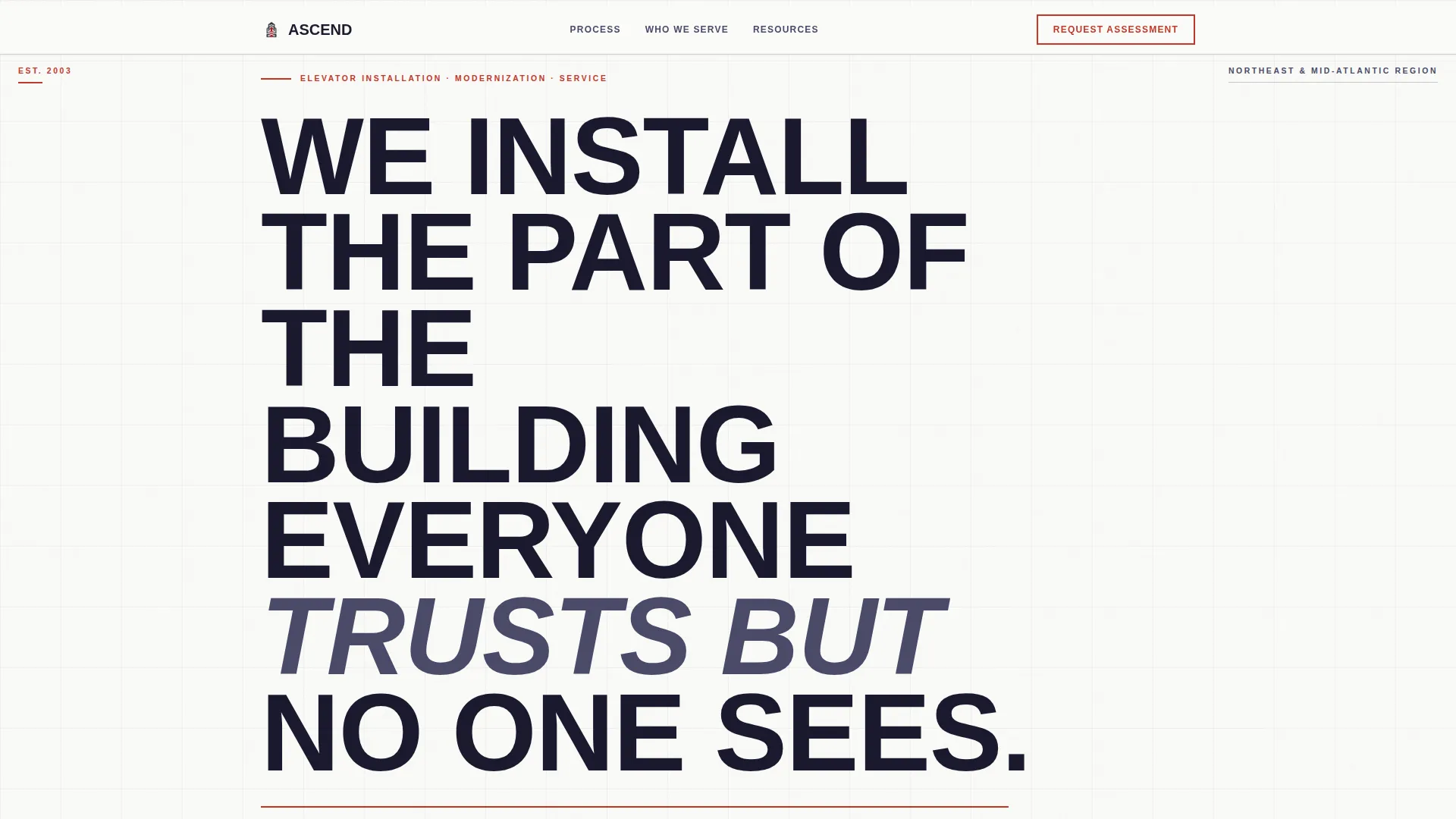
- A giant headline hero section with a thin red rule and service-region subline
- A chronological zigzag content flow covering site survey through certificate of occupancy
- A gated PDF lead-capture form and a secondary shaft assessment request path
Feature list
This template is organized around one core idea: the crew that explains their process wins the job. Every feature below serves that premise.
Chronological Zigzag Phase Layout
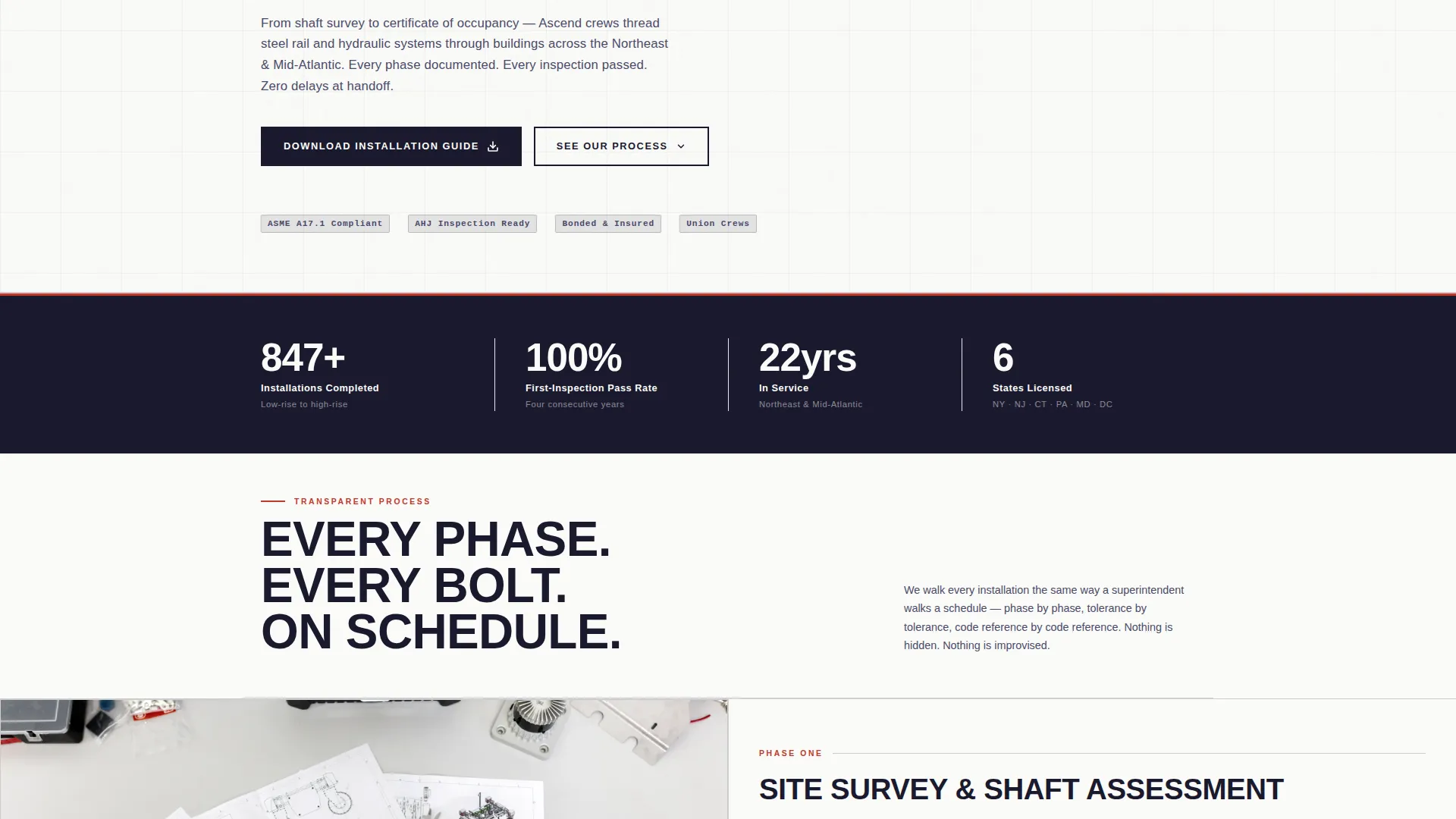
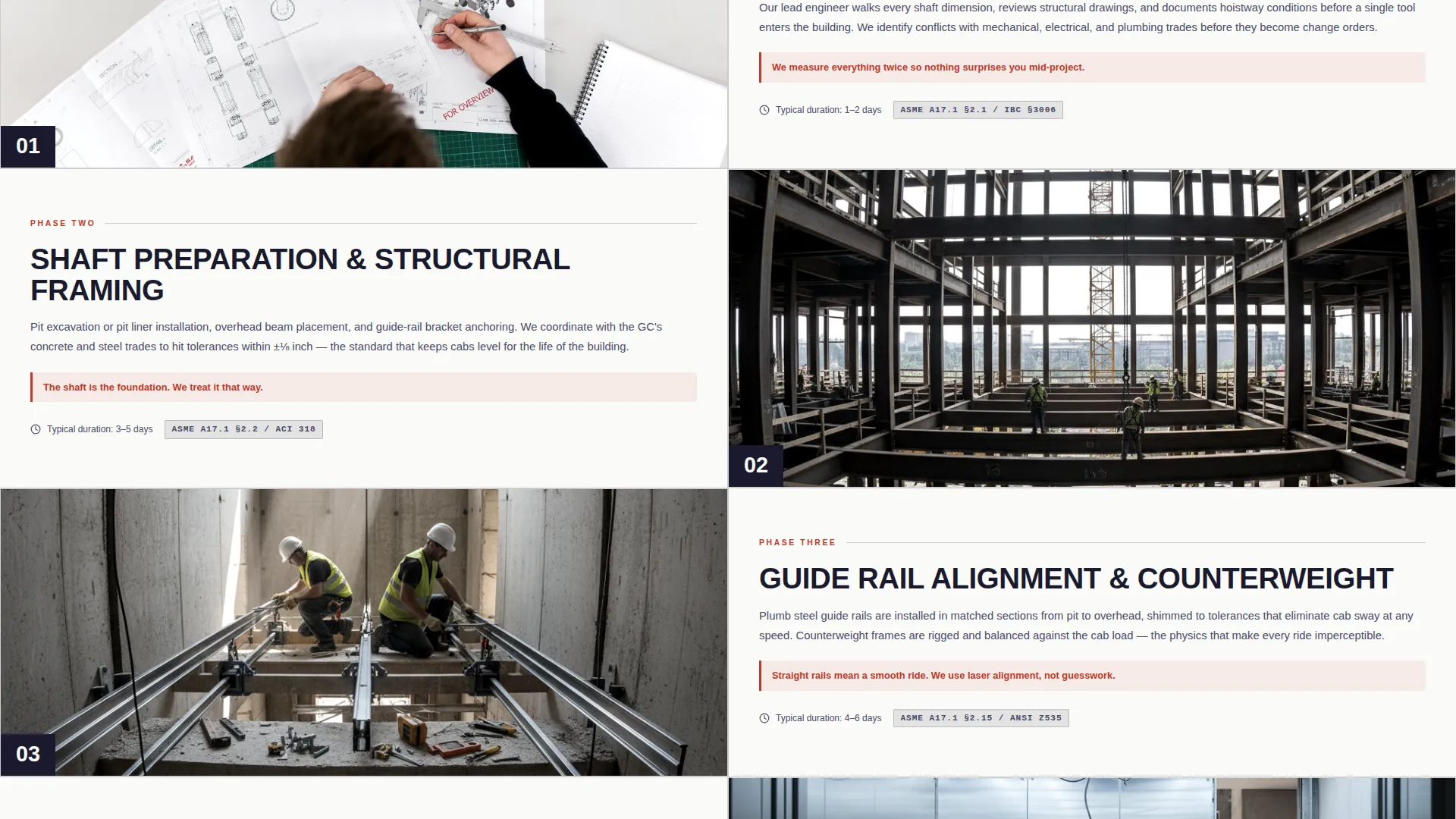
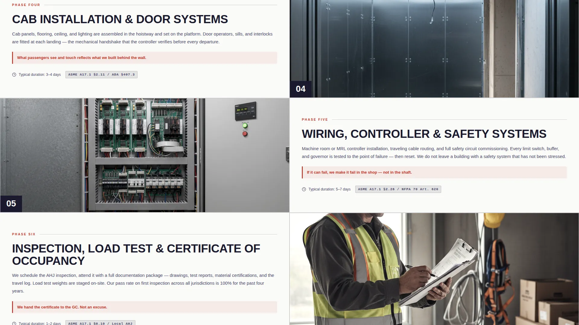
Each installation phase gets its own alternating section. Left-image/right-text and right-image/left-text panels move the reader from site survey and shaft preparation through rail alignment, cab installation, wiring, inspection, and certificate of occupancy. The rhythm builds credibility one phase at a time.
Real Timeline Callouts Per Phase
Every zigzag panel includes a plain-language timeline callout such as "Typical duration: 3 to 5 days." These callouts demystify the trade and set realistic expectations, which is exactly what a general contractor or facility director needs before committing to a vendor.
Gated PDF Lead Capture Form
The primary call to action is a downloadable Installation Timeline Guide. A short inline form collects building type (low-rise, mid-rise, or high-rise), project stage (new construction, modernization, or repair), and work email. This segmented capture qualifies the lead before a single conversation takes place.
Giant Headline Centered Hero
The header fills eighty percent of the viewport width with a single line of oversized condensed type. A thin red rule sits below it, followed by a subline naming the service region. No image competes with the message. The typography carries the authority on its own.
Secondary Shaft Assessment Path
Visitors who are further along in their decision process can bypass the guide download and go straight to a "Request a Shaft Assessment" call to action. This second conversion path catches buyers who are ready to act now and do not need an educational document first.
Corporate Precision Visual System
The Ink and Paper color palette uses deep document black, technical graphite, clean bond-paper white, and a red-line markup accent. Every color choice references the visual language of construction documents, reinforcing the sense that this company is precise, prepared, and professional.
Page sections overview
| Section | Purpose |
|---|---|
| Hero Headline | Establishes authority with oversized type, red rule, and service-region subline |
| Site Survey Phase | Opens the chronological process walk with left-image/right-text panel |
| Shaft Prep Phase | Describes shaft preparation work with alternating right-image/left-text layout |
| Rail Alignment Phase | Covers steel rail installation with timeline callout and plain-language explanation |
| Cab Installation Phase | Details cab placement with visual panel and duration note |
| Wiring and Controls | Explains electrical and control system work in alternating panel format |
| Inspection Milestone | Shows code-reference citations and inspection readiness steps |
| Certificate of Occupancy | Closes the process walk with final approval and handover context |
| PDF Download Form | Captures lead with building type, project stage, and work email inputs |
| Shaft Assessment call to action | Provides a secondary path for visitors ready to book a consultation |
Design & branding system
The visual identity follows a Corporate Precision theme built entirely around the Ink and Paper color system. The palette references the look of freshly printed construction documents on a jobsite trailer table. Every color is functional: black for structure, graphite for supporting content, white for negative space, and red for callouts and active states only.
- Deep document black (#1A1A2E) and technical graphite (#4A4A68) handle all body type and structural elements
- Clean bond-paper white (#FAFAF8) provides the base, keeping the page legible and uncluttered
- Red-line markup accent (#C0392B) appears only on callout borders, call to action borders, and active navigation states, never as decoration
Mobile & speed optimization
The zigzag alternating layout is designed to reflow cleanly on smaller screens. Phase panels that sit side by side on desktop stack vertically on mobile without losing their chronological logic. Timeline callouts and inline forms remain readable and usable at every viewport size.
- Alternating panels convert to a single-column vertical stack on mobile devices
- The inline lead form fields remain full-width and tappable on touch screens
- Typography scales proportionally so the oversized headline remains impactful on smaller displays
How this template helps you convert
The page earns trust before asking for anything. By the time a visitor reaches the lead form, they have already absorbed a complete picture of your installation process, your timeline standards, and your code awareness. That context transforms a cold click into a warm, qualified lead.
- The chronological process walk proves competence phase by phase, reducing the friction that causes sophisticated buyers to leave without contacting you
- The segmented PDF form collects building type and project stage data, so your follow-up conversation starts with context rather than cold qualification questions
- The secondary shaft assessment path gives action-ready visitors a direct route to booking, capturing high-intent leads who would otherwise bounce looking for a contact form
Other information about this template
This template is purpose-built for the elevator installer service area page use case. It is not a general construction template adapted to fit a niche. Every structural decision, from the phase-by-phase scroll to the segmented form fields, reflects the real buying journey of the clients described in the brief.
- The template style is Zigzag/Alternating, suited to service businesses that need to demonstrate a multi-step process
- The landing page direction is Content and Resource, meaning the page leads with education and uses the guide download as the primary conversion mechanism
- The header concept is Giant Headline Centered, a deliberate choice that positions the service through language rather than photography
- This template works for elevator installation companies serving markets that range from three-story medical offices to twenty-floor downtown towers
Theme
Corporate Precision
Creative direction
Transparent Process
Color system
Ink & Paper
Style
Zigzag/Alternating
Direction
Content/Resource
Page Sections
Chronological Zigzag Phase Layout
Real Timeline Callouts Per Phase
Gated PDF Lead Capture Form
Giant Headline Centered Hero
Secondary Shaft Assessment Path
Corporate Precision Visual System
Related questions
Who is the intended audience for this template?
What is the primary conversion goal of this landing page?
Can this template serve both new construction and modernization projects?
Does the template include a secondary contact path for ready-to-buy visitors?
Why does the template use a zigzag alternating layout instead of a standard service page?



