Escalator Technician Portfolio Landing Page Template
Ascend is a split-screen editorial landing page built for independent escalator technicians who serve commercial and transit clients. It pairs striking black-and-white portfolio photography with a scrolling logo wall, two distinct conversion paths, and bold typographic headlines, all designed to communicate specialist authority and attract B2B maintenance partnerships.
by Rocket studio
Quick summary
Ascend is a single-page portfolio and gallery landing page for a solo escalator technician. It uses a 50/50 split-screen layout, editorial magazine styling, and two conversion paths to turn facilities managers and transit authority contacts into qualified maintenance partners. The design feels precise and deliberate, like the work it represents.
Who this template is for
This template is built for independent vertical transportation specialists who need a credible, client-facing presence. It speaks directly to the world of commercial real estate maintenance and transit infrastructure.
- Freelance or sole-operator escalator technicians seeking B2B contracts
- Vertical transportation specialists targeting facilities managers and transit authority maintenance directors
- Escalator service professionals who want to present portfolio work and attract general contractors bidding maintenance packages
What problem this template solves
Most skilled technicians lose work not because of what they can do, but because their web presence does not match their real-world track record. Potential clients in commercial real estate and transit cannot evaluate capability from a generic service page.
- There is no way to communicate specialist depth and scale of completed projects quickly
- Facilities managers and transit directors need proof, not promises, before calling a technician at 2 AM
- Without a structured contact path, serious B2B leads have no clear way to start a maintenance conversation
What you get with this template
This template delivers a complete, publication-quality landing page that works as both a portfolio and a lead-qualification tool. Every section is designed with a specific job to do.
- A giant editorial headline section that occupies the full viewport and immediately establishes authority
- A scroll-driven split-screen gallery pairing client and partner logo clusters with full-bleed black-and-white project photographs
- Two conversion paths: a detailed B2B maintenance request form and a low-friction downloadable case study gated behind an email field
Feature list
This template brings together editorial design and practical B2B conversion structure. Each component was chosen because it solves a specific problem for a specialist service business.
Giant Headline Viewport Section
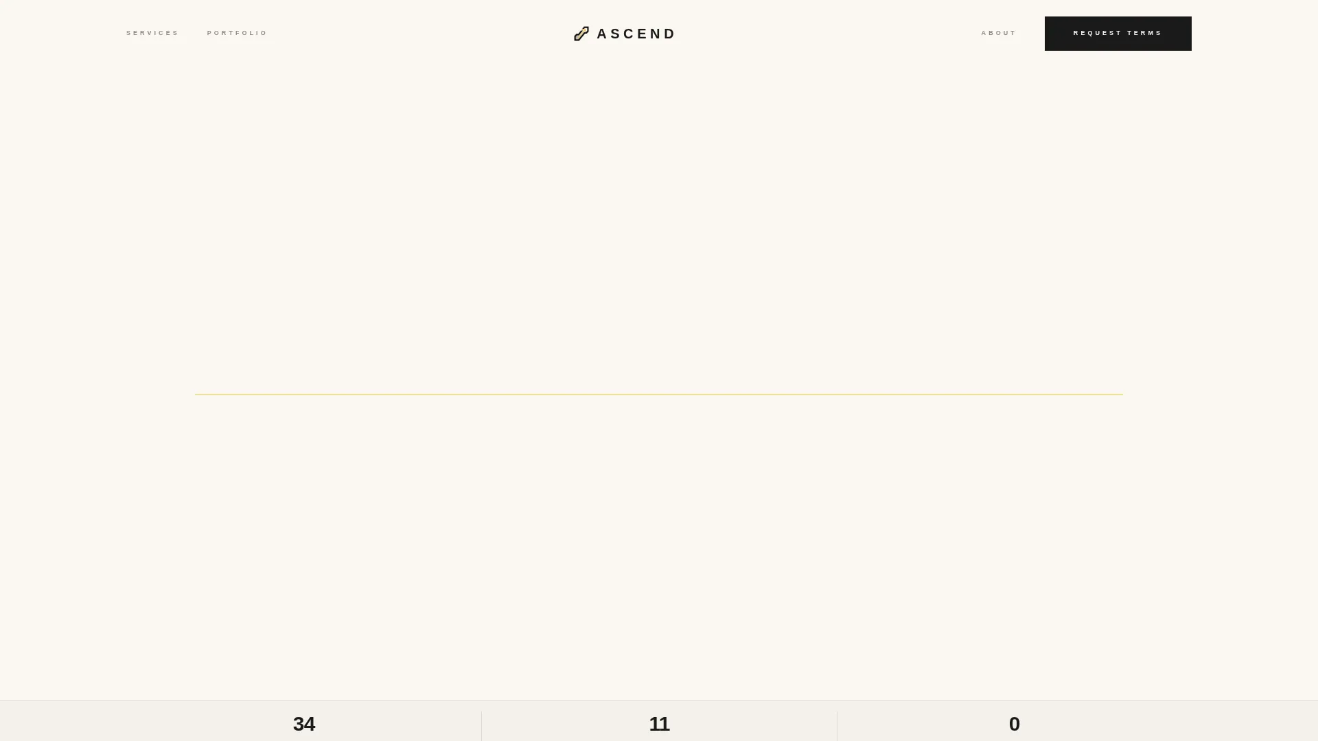
The opening section fills roughly eighty percent of the viewport with condensed sans-serif type. A single yellow rule sits beneath the headline. No competing imagery appears here. The typography carries the full weight of the first impression.
Scroll-Driven Split-Screen Layout
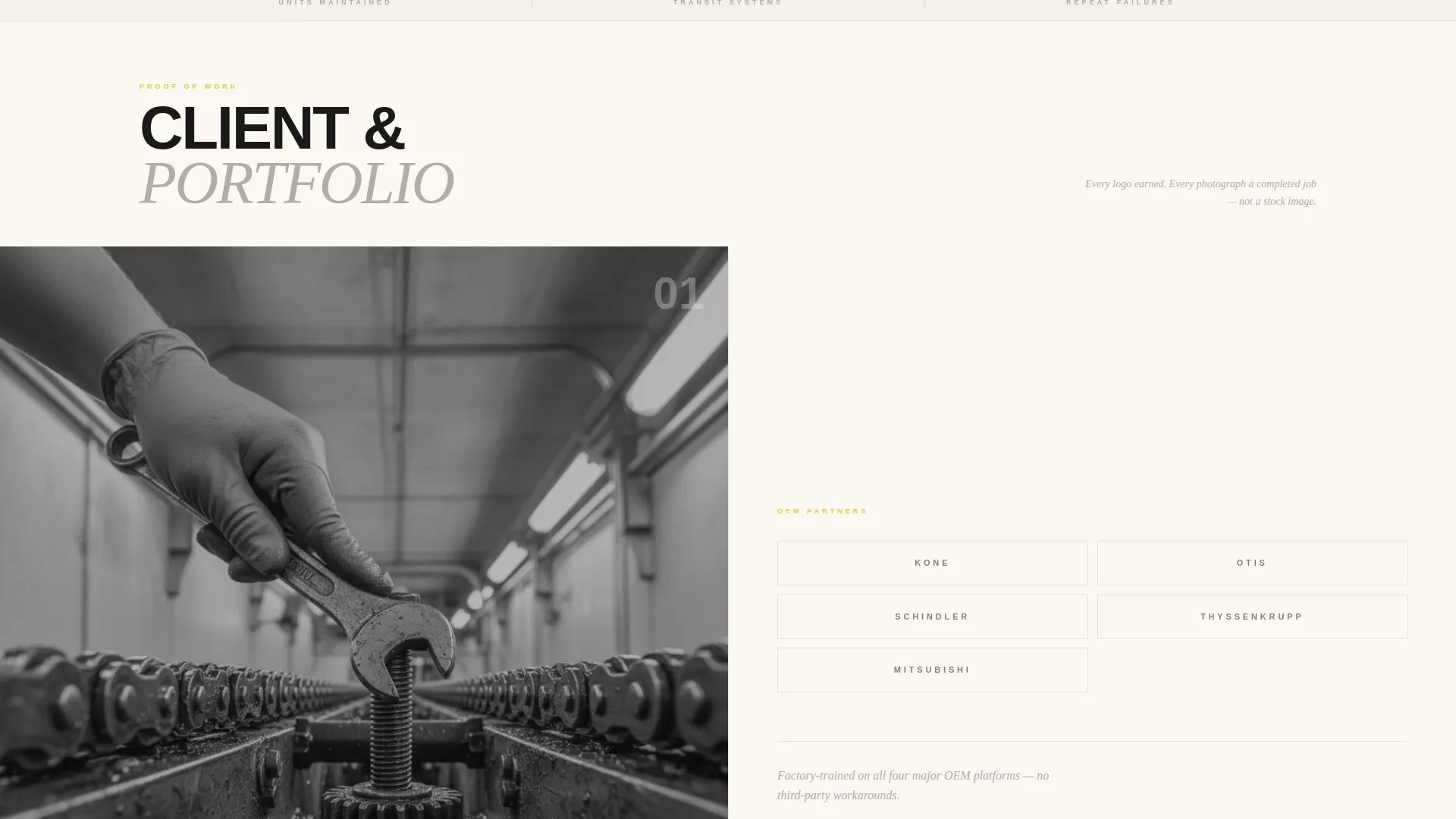
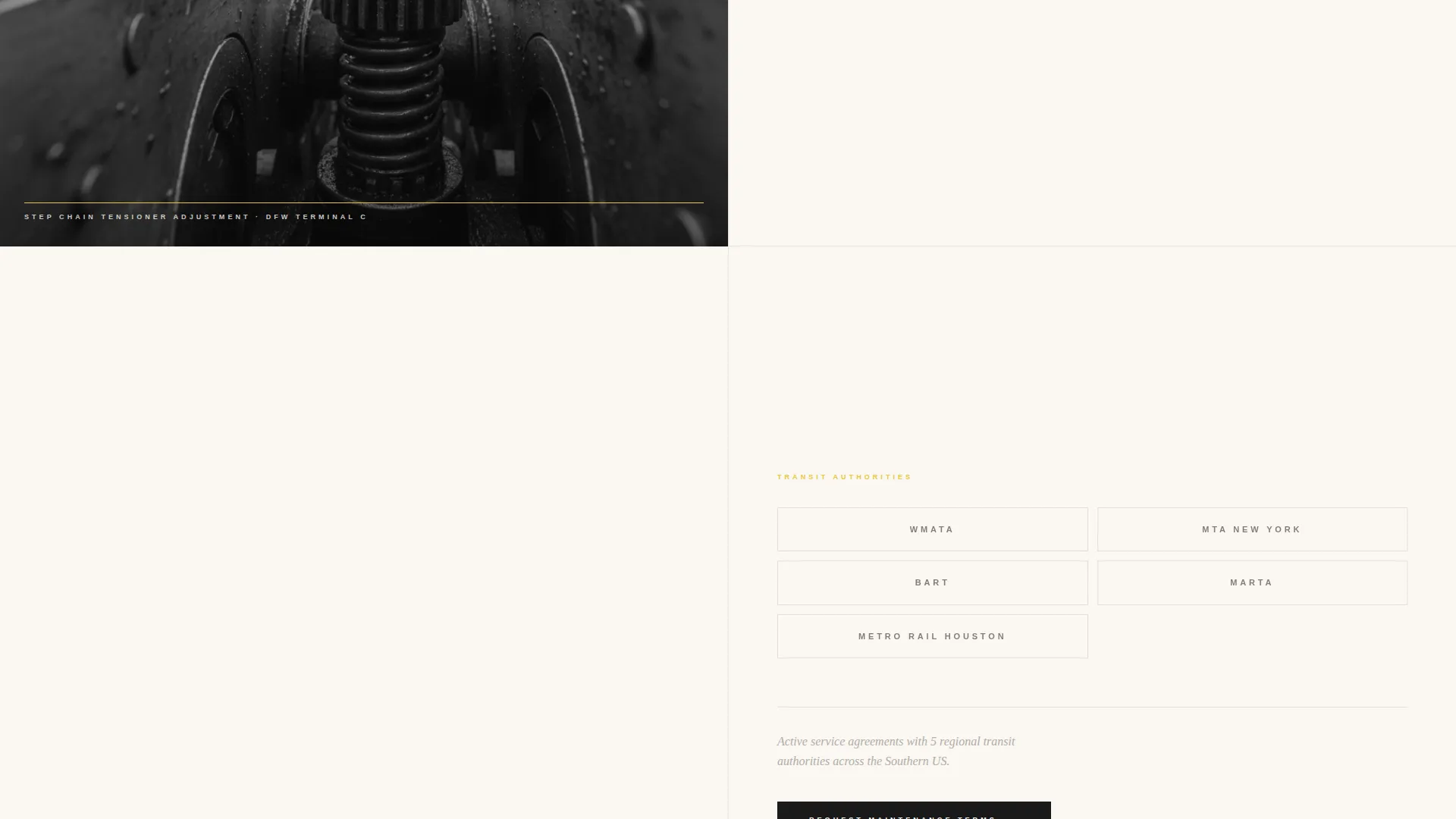
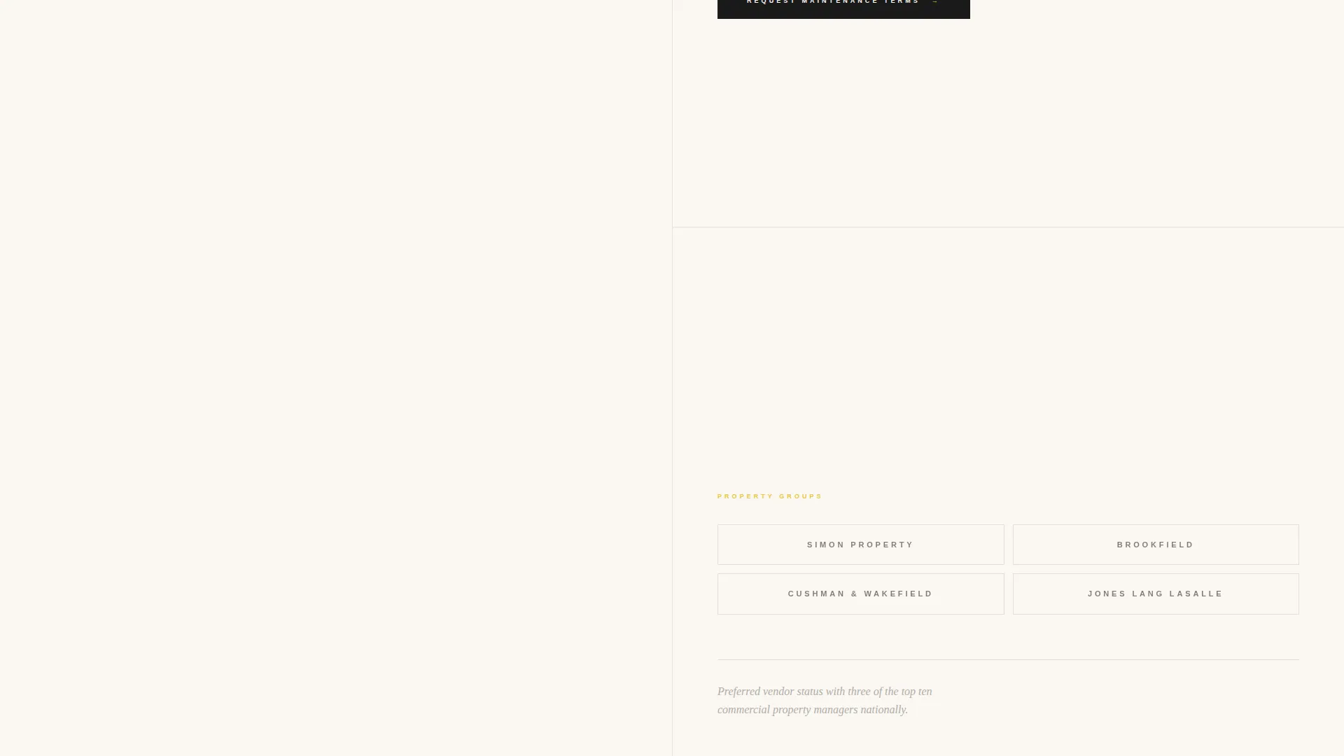
As the visitor scrolls, the left half of the screen displays a grid of client and partner logos. The right half cycles through full-bleed black-and-white photographs of completed escalator work. Each scroll increment pairs a new logo cluster with a new image, building layered proof of experience.
Dual Conversion Path Design
A primary call-to-action reading "Request Maintenance Terms" appears midpage beside the logo wall and again at the final section. A secondary path offers a downloadable PDF case study gated behind only an email field, giving cautious prospects a low-commitment entry point.
B2B Maintenance Request Form
The full contact form collects company name, number of units under management, escalator brands on-site via multi-select checkboxes, and a preferred contact method toggle between email and phone. This structure qualifies leads before a single conversation happens.
Editorial Ink and Paper Visual System
The color palette uses deep registration black, broadsheet warm white, marginal gray for secondary text and divider rules, and signal yellow reserved exclusively for interactive elements and accent strokes. The result is a visual identity that feels like a precision-printed industrial monograph.
Full-Bleed Portfolio Photography Layout
The gallery section is designed to let black-and-white project photography carry the narrative. Images of technical work, step chain tensioners, truss interiors, handrail entries, are presented at scale, without decorative interference, so the work speaks for itself.
Page sections overview
| Section | Purpose |
|---|---|
| Hero Headline | Establish authority with oversized editorial type and a single yellow rule |
| Scroll Cue | Guide the visitor below the fold with an italicized subline and downward indicator |
| Split-Screen Gallery | Pair logo clusters with project photography to build cumulative credibility |
| Midpage call to action | Present the primary maintenance request form beside the logo wall |
| Case Study Download | Offer a low-friction PDF lead magnet gated behind an email field |
| Final call to action Section | Repeat the primary call-to-action to close the page with a clear next step |
Design & branding system
The visual identity draws from editorial print design, built around the Ink and Paper color system. Every design choice reinforces the sense of precision and craft that a specialist technician needs to project.
- Color palette: deep registration black (#1A1A1A), broadsheet warm white (#FAF7F2), marginal gray (#B0ADA7) for secondary text and dividers, and signal yellow (#E8C840) used only for interactive elements and accent strokes
- Typography: condensed sans-serif set at editorial scale for headlines, with deliberate whitespace and italic sublines that control reading pace
- Photography direction: full-bleed black-and-white images of real technical work, scaled to fill the screen without decorative framing
Mobile & speed optimization
The split-screen layout is structured so it adapts cleanly across screen sizes. The editorial proportions and image-heavy sections are handled with layout decisions that preserve the visual weight of the design on smaller viewports.
- The 50/50 split-screen stacks vertically on mobile so both the logo wall and portfolio photography remain fully visible
- Form elements, including the multi-select checkbox group and contact method toggle, are designed to be operable on touch screens without crowding
- The typographic headline section retains its impact at mobile scale by maintaining relative proportions and whitespace
How this template helps you convert
Ascend is structured around two distinct visitor types: serious B2B prospects ready to discuss a maintenance contract, and cautious evaluators who need more evidence first. The layout routes each visitor toward the right next step.
- The scroll-driven logo and photography pairing builds cumulative proof before any form appears, so by the time a visitor reaches the primary call-to-action, trust has already been established through evidence rather than claims.
- The dual conversion path structure means no lead is lost to friction. The PDF case study download captures contacts who are not yet ready to fill out a full form, while the detailed maintenance request form qualifies serious partners efficiently.
Other information about this template
Ascend is part of the broader editorial template family and suits any high-skill solo operator in a technical services field. A few additional details worth noting:
- The downloadable case study referenced in the template is framed around a terminal retrofit project, giving the PDF lead magnet a concrete, credible context from day one
- The logo wall section is designed to accommodate transit authority marks, property group identities, and original equipment manufacturer partner logos within the same grid
- The template style is a 50/50 split screen, the theme is Editorial Magazine, and the creative direction is Logo Wall Authority, all working together toward Partnership and B2B engagement
- The header concept is Giant Headline Centered, which means the typographic statement at the top of the page functions as the primary visual element rather than a supporting element
Theme
Editorial Magazine
Creative direction
Logo Wall Authority
Color system
Ink & Paper
Style
Split Screen (50/50)
Direction
Partnership/B2B
Page Sections
Giant Editorial Headline Section
Scroll-driven Split-screen Gallery
Dual Conversion Path Structure
Qualified B2B Contact Form
Ink and Paper Color System
Related questions
Who is this landing page template designed for?
What are the two conversion paths included in this template?
Can I customize the logo wall and portfolio photography sections?
What does the split-screen layout look like on a mobile device?
Is this template suitable for a technician who specializes in one escalator brand?



