Elevator Installer Business Portfolio Website Template
Ascend is a split-screen landing page template built for licensed elevator installation businesses. It pairs embossed certification badges with shaft photography, then walks visitors through three scroll-triggered stat reveals, annotated system diagrams, and a project gallery. The goal is earned credibility that routes general contractors, property managers, and architects toward a detailed portfolio inquiry.
by Rocket studio
Quick summary
Ascend is a single-page, stats-first landing page template for elevator installation companies. It uses a 50/50 split-screen layout, an Ink and Paper color system, and scroll-triggered stat reveals to build technical credibility before asking for a click. The design feels like a field engineer's logbook brought to life on screen.
Who this template is for
This template is built for elevator installation and modernization businesses that serve commercial clients. It speaks the language of specs, certifications, and project timelines rather than consumer-facing pitch copy.
- General contractors managing mid-rise construction who need a reliable, code-compliant elevator subcontractor
- Property managers overseeing retrofits on aging towers who need proof of certification and minimal disruption
- Architects specifying custom glass or traction elevator systems for boutique hotels and specialty builds
What problem this template solves
Most elevator service businesses look identical online. A generic service page with a phone number does not communicate the technical depth, safety record, or project scale that a general contractor or property manager needs to feel confident awarding a contract.
- Visitors leave without understanding the difference between traction and hydraulic systems or why it matters for their build
- Certification badges and safety records get buried in text instead of leading the page where they can do real credibility work
- There is no clear path from curiosity to a qualified next step, so potential clients drift away before making contact
What you get with this template
You get a complete, desktop-first landing page built around a Stats-First Impact creative direction. Every scroll transition is designed to lead with a number that stops the reader before any explanation arrives.
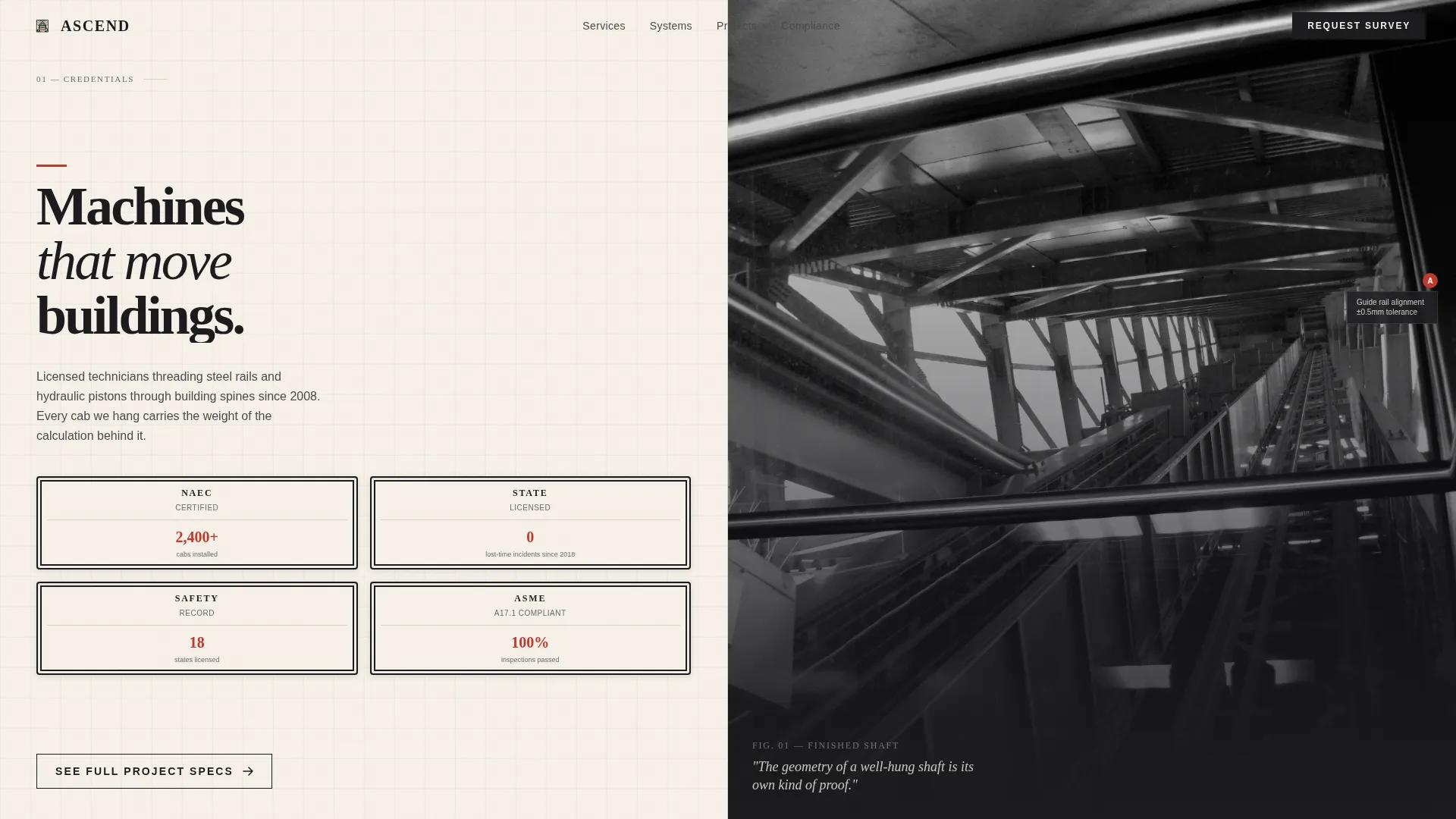
- A 50/50 split-screen hero with embossed badge stamps on the left and vanishing-point shaft photography on the right
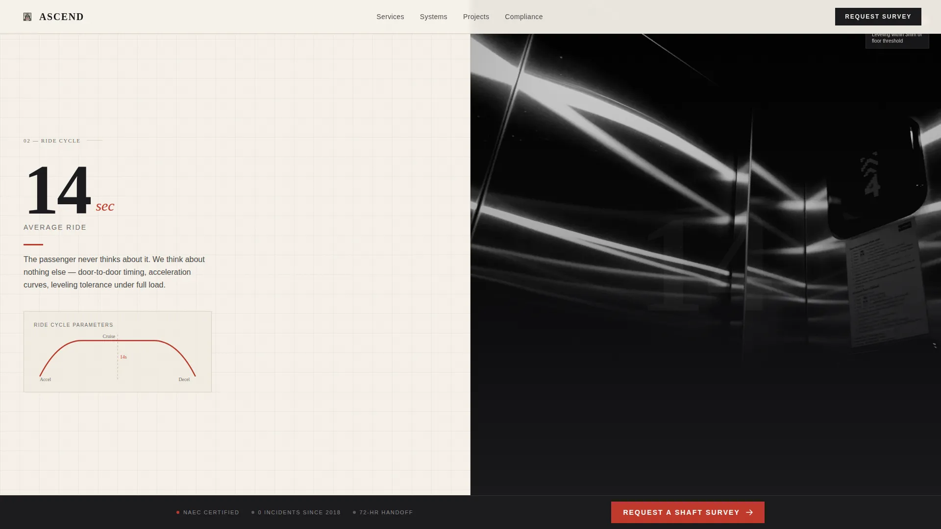
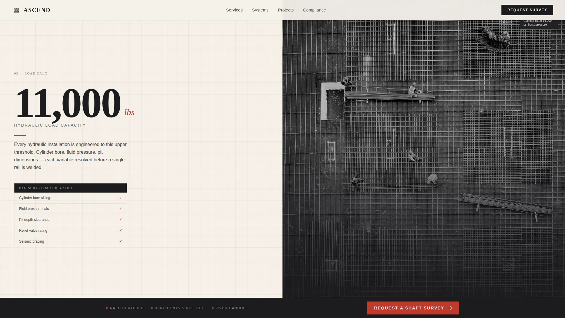
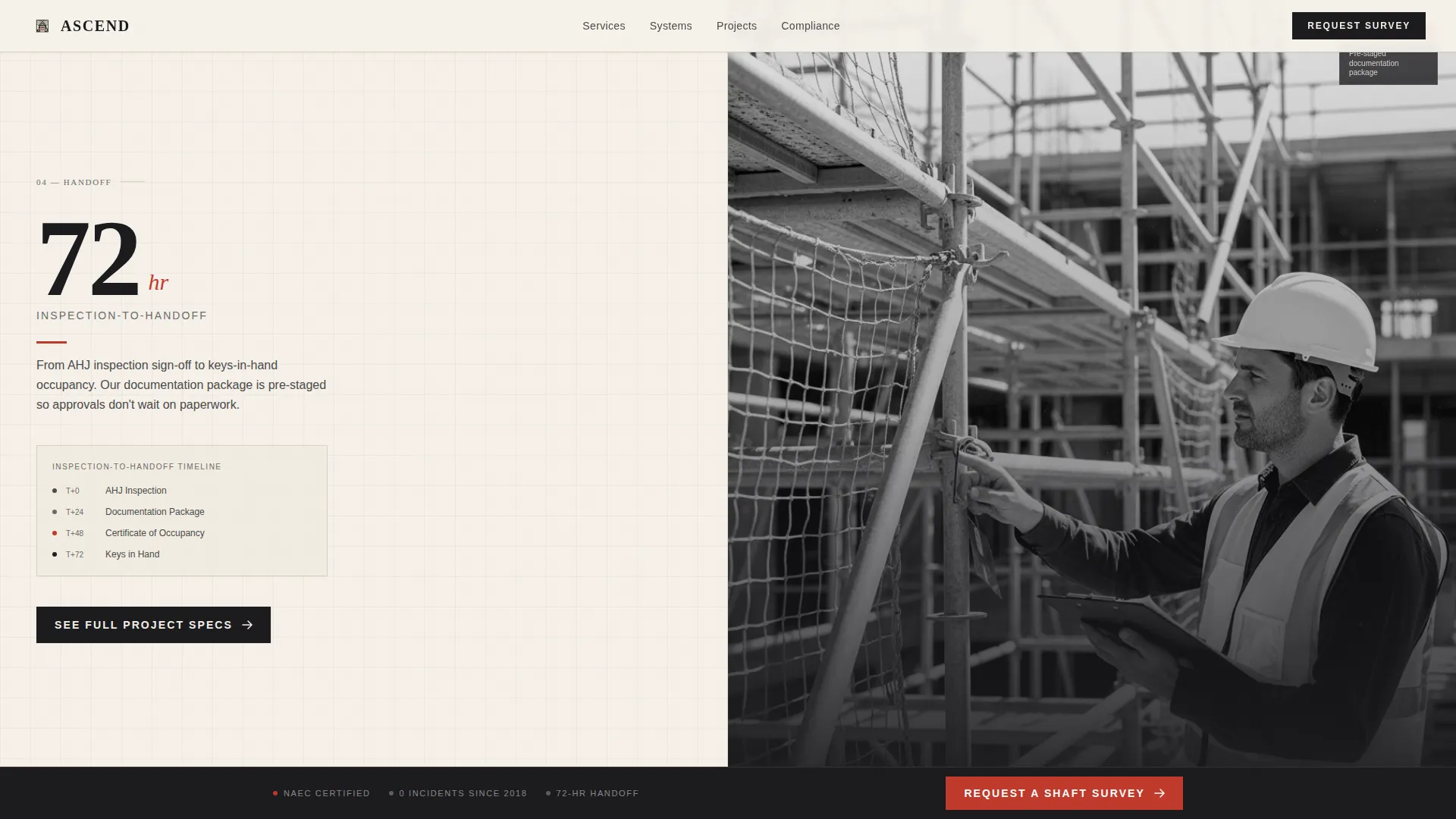
- Three sequential stat reveal sections (14 seconds, 11,000 lbs, 72-hour turnaround) with educational diagrams on the left panel and job-site photography on the right
- A systems education section comparing traction and hydraulic installations with annotated cross-section diagrams
- A project gallery grid with spec overlays, a primary call-to-action bridge, and a persistent bottom bar carrying a secondary red button
Feature list
This template is built around six core capabilities that work together to move a qualified visitor from first impression to portfolio click.
Embossed Award Badge Header
The left half of the hero stacks three to four certification badges rendered as tactile embossed stamps on parchment. Each badge carries a micro-statistic underneath, such as "2,400+ cabs installed" or "0 lost-time incidents since 2018," so credibility lands before the visitor reads a single line of body copy.
Scroll-Triggered Stat Reveals
Three large ink-weight numbers appear in sequence as the visitor scrolls: 14 seconds, 11,000 lbs, and 72 hours. Each reveal uses scroll-triggered counters and clip-in animations so the number arrives first and the explanation follows, creating a pacing rhythm that mirrors flipping through a technical manual.
Split-Screen Educational Panels
The left panel of each stat section presents annotated diagrams, code-compliance checklists, and system cross-sections. The right panel shows corresponding job-site photography or time-lapse sequences. The two panels work as a paired argument: here is the engineering logic, and here is the proof.
Traction versus. Hydraulic System Diagram
A dedicated systems education section breaks down the difference between traction and hydraulic elevator installations using precise annotated drawings. This section answers the technical question that architects and general contractors almost always have before specifying a system.
Project Gallery with Spec Overlays
A job-site photography grid displays completed projects with specification overlays directly on each image. This section functions as a portfolio preview designed to earn the click through to the full portfolio page rather than close the deal on its own.
Persistent Call-to-Action Bar
A fixed bottom bar stays visible throughout the entire scroll journey. It carries the secondary button, "Request a Shaft Survey," styled in safety-inspection red. The primary call-to-action button, "See Full Project Specs," appears after the third stat reveal and routes to the detailed portfolio page.
Page sections overview
| Section | Purpose |
|---|---|
| Hero Split Screen | Lead with badges and shaft photography |
| Stat Reveal One | Introduce the 14-second ride stat |
| Stat Reveal Two | Present the 11,000-lb load stat |
| Stat Reveal Three | Deliver the 72-hour turnaround stat |
| Systems Education | Compare traction and hydraulic diagrams |
| Project Gallery | Show completed builds with spec overlays |
| Call-to-Action Bridge | Route visitors to the full portfolio |
| Persistent Bottom Bar | Keep the shaft survey button always visible |
| Footer | Single-row linear contact and legal strip |
Design & branding system
The visual identity follows an Educational Guide theme built on an Ink and Paper color system. The palette feels like a field engineer's logbook: precise pencil diagrams on cream stock with red annotations circling the numbers that matter.
- Colors: deep manuscript black (#1B1B1E) for headlines and body, warm parchment (#F5F0E8) for backgrounds, technical-drawing graphite (#4A4A4A) for supporting text, and safety-inspection red (#C0392B) reserved for badges, callout numbers, and interactive buttons
- Typography: Fraunces editorial serif for large headline numbers and section titles, paired with DM Sans for technical body copy and diagram labels
- Visual style: embossed stamp textures, annotated cross-section drawings, black-and-white shaft photography with a vanishing-point perspective, and precise geometric layout that gives the page a controlled, vertigo-inducing depth
Mobile & speed optimization
The template is built desktop-first because its primary audience, general contractors and architects, reviews specifications at a desk. Mobile support is included and solid, so the page remains fully usable on smaller screens.
- Scroll-triggered animations use CSS-preferred techniques and Intersection Observer for stat counter reveals, keeping motion smooth without heavy scripting
- Static sections use Server Components, which reduces unnecessary client-side rendering load
- The parallax shaft depth effect and clip-in stat reveals are structured to degrade gracefully on devices where reduced-motion settings are active
How this template helps you convert
The conversion strategy is built on earned curiosity rather than a form or a hard sell. Each section adds one more layer of credibility until clicking through feels like the logical next step.
- The hero badges and micro-statistics establish authority in the first three seconds, before the visitor has scrolled at all, so trust is front-loaded rather than buried
- The three stat reveals create a rhythm of surprise and explanation that keeps visitors engaged through the full scroll, making the "See Full Project Specs" button feel like a reward rather than a request
- The persistent "Request a Shaft Survey" bar in safety-inspection red stays visible throughout, giving visitors a low-commitment action they can take at any moment without needing to reach the bottom of the page
Other information about this template
This template is structured around a B2B professional services use case for elevator installation and modernization companies operating in the United States. A few additional details worth knowing before you start customizing:
- The footer follows a Pattern 1 linear single-row layout, keeping the bottom of the page clean and uncluttered
- Localization defaults are set to English, USD pricing format, and US date conventions
- The hero photography placeholder is designed for a vertical shaft shot looking straight up, with rails converging toward a vanishing point; substituting a horizontal or exterior photograph will break the intended perspective effect
- National Association of Elevator Contractors (NAEC) certification badge slots and state license seal placeholders are included in the hero badge stack and can be swapped for your actual credentials
- The template does not include an on-page contact form by design; the call-to-action strategy routes visitors off-page to a portfolio or survey booking flow
- Animation intensity is set to high by default, including scroll-triggered stat counters, clip-in reveals, and a parallax shaft depth effect; these can be dialed back through the animation settings if a client environment requires a quieter experience
Theme
Educational Guide
Creative direction
Stats-First Impact
Color system
Ink & Paper
Style
Split Screen (50/50)
Direction
Click-Through
Page Sections
Embossed Award Badge Hero
Scroll-triggered Stat Counters
Split-screen Educational Panels
Traction Versus. Hydraulic Diagram Section
Project Gallery with Spec Overlays
Persistent Call-to-action Bar
Related questions
Does this template include an on-page contact form?
Can I replace the placeholder badges with my own certifications?
Is this template suitable for a hydraulic-only or traction-only elevator business?
How does the persistent bottom bar work?
Who is the primary audience this template is designed to reach?



