Premium Art Landing Page Template
Signal is a bento grid landing page built for an Asian-owned media company producing editorial, video, and branded content for the diaspora. The template features a Neo-Retro visual identity, interactive tile animations, a device mockup header, and an upsell-focused conversion flow designed to help retainer clients discover and upgrade to new studio capabilities.
by Rocket studio
Quick summary
Signal is a single-page bento grid landing page for a culturally grounded Asian-owned media studio. It combines a device mockup hero, staggered micro-animated tiles, and a persistent upsell bar into one cohesive experience. The design speaks directly to brand managers and marketing directors who want content that sounds authentic, not assembled.
Who this template is for
This template is built for creative studios and media companies that need to show range without losing identity. It works especially well when your existing clients are the audience you most want to upgrade.
- Brand managers at lifestyle and beauty companies seeking culturally fluent campaign partners
- Marketing directors at streaming platforms looking for editorial and video talent with a distinct voice
- Founders of Asian-owned startups who want launch content that tells a real story
What problem this template solves
Most agency pages look the same. They lead with credentials, bury the actual work, and pitch diversity without demonstrating it. Signal is built for studios tired of that pattern.
- Clients arrive already interested but unaware of the full scope of what the studio offers
- Existing retainer relationships stall because clients never see capabilities beyond their current package
- Generic portfolio layouts fail to communicate the cultural specificity and creative range that make this studio different
What you get with this template
The template delivers a fully structured, single-page layout built around interactive proof of capability. Every section is designed to reward exploration and move existing clients toward an upgrade.
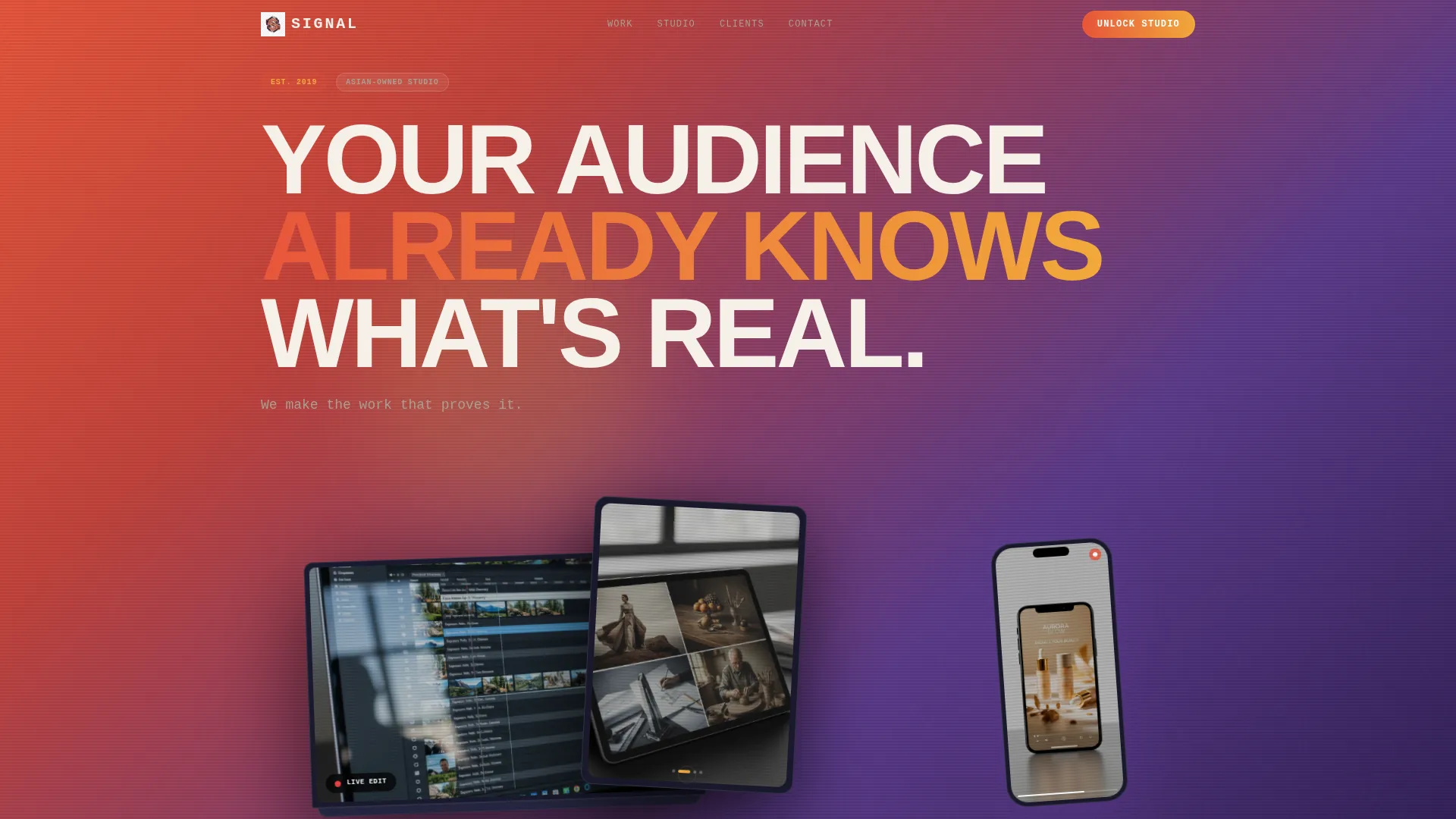
- A device mockup header showing a laptop, tablet, and phone in isometric perspective, each displaying different content formats
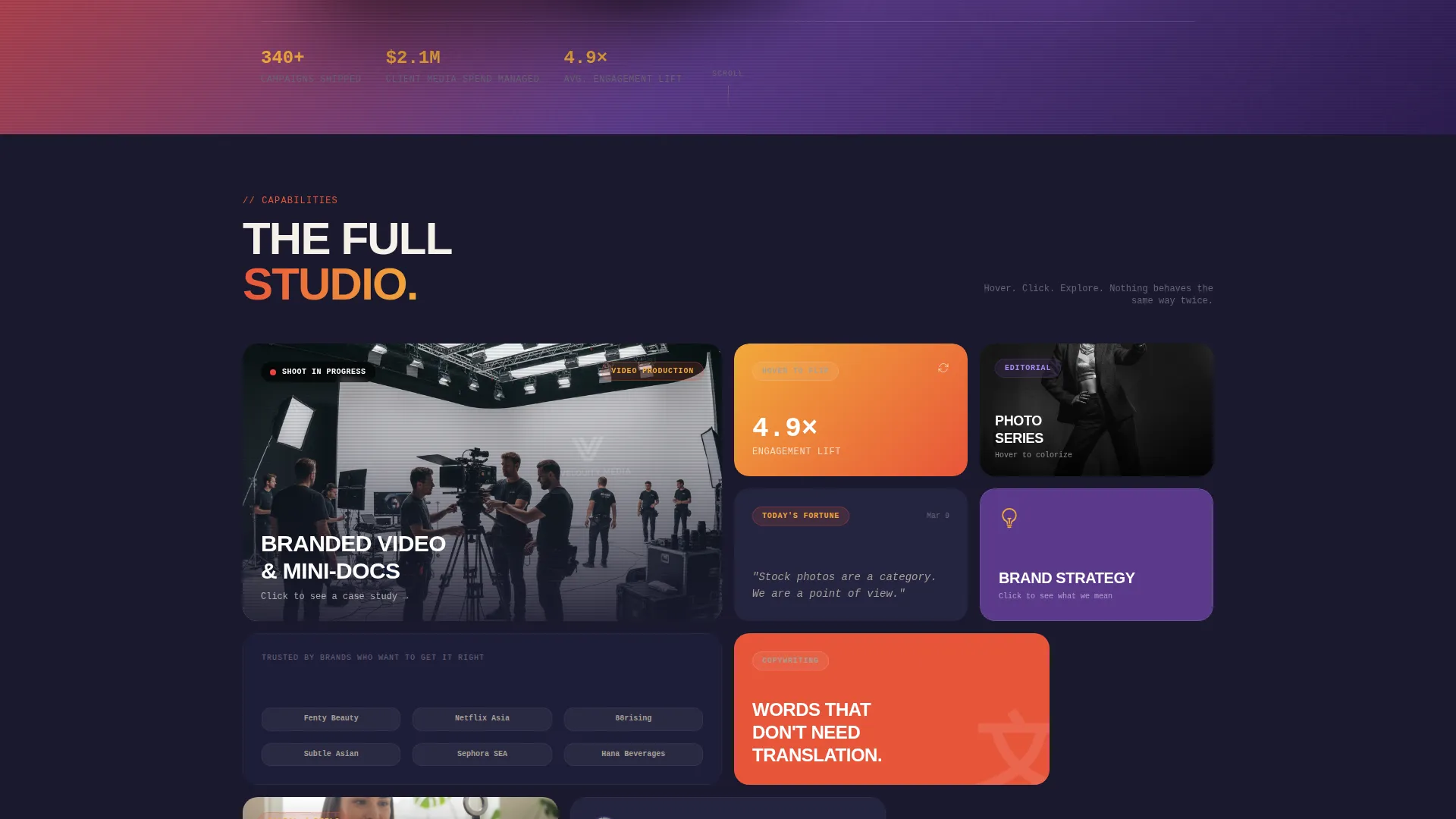
- A bento grid section with staggered tile animations, hover reveals, video loops, flip interactions, and expandable case studies
- A persistent bottom bar with a tiered upgrade modal and a secondary one-off project selector with a budget slider
Feature list
This section covers the core interactive and structural components built into the Signal template.
Isometric Device Mockup Header
The header features a laptop, tablet, and phone fanned out in isometric perspective. Each screen displays a different content format: a mini-documentary on the laptop, an editorial photo series on the tablet, and a vertical branded reel on the phone. The devices sit against a persimmon-to-violet gradient that responds to cursor movement.
Interactive Bento Grid
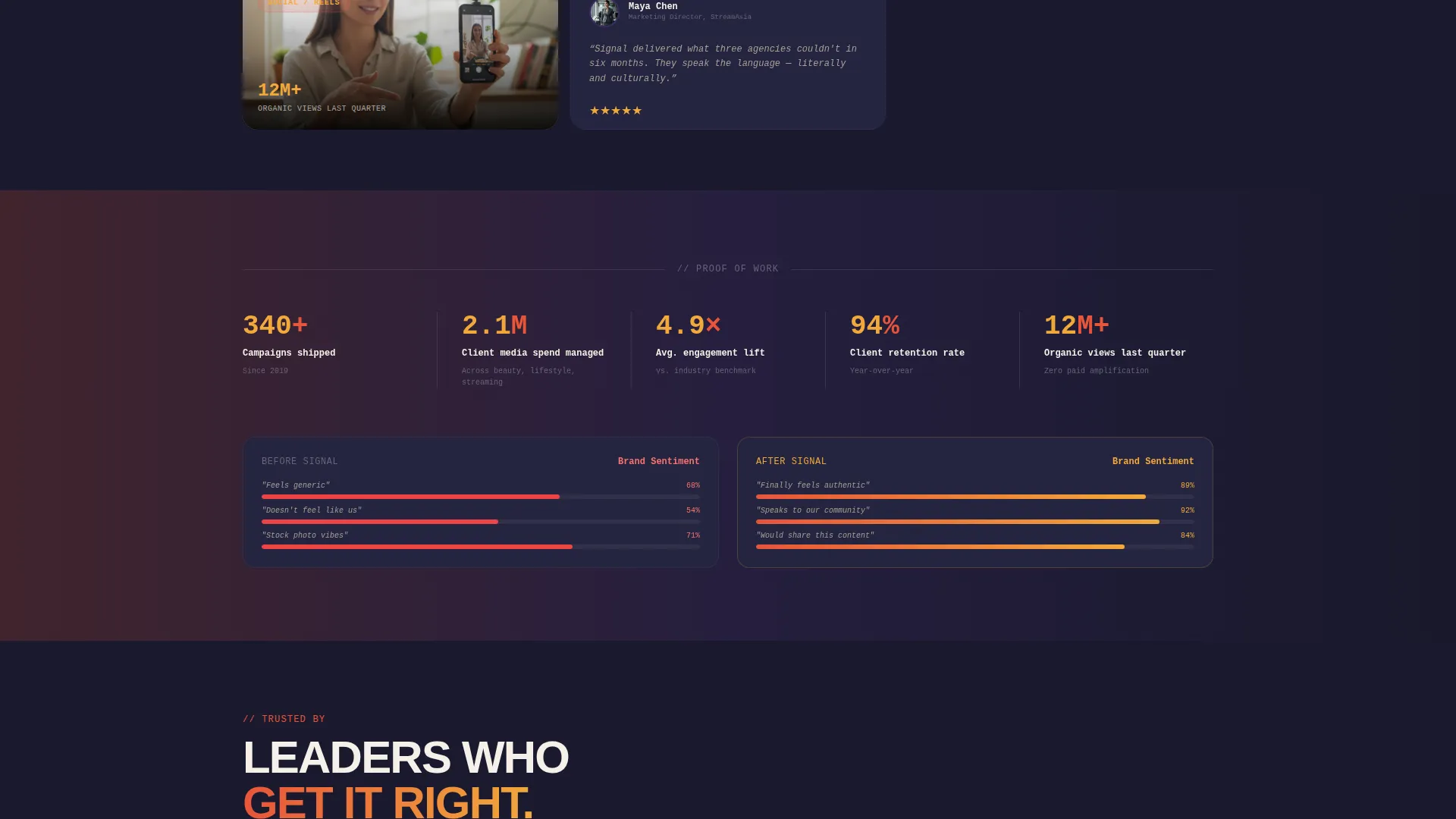
The bento grid is the heart of the layout. Tiles of unequal size animate in with staggered micro-animations on scroll. Individual tiles behave differently: some play short video loops, some flip on hover to reveal campaign metrics, and one expands on click into a mini case study with before-and-after brand sentiment data.
Surprise-and-Delight Tile Engine
Not every tile behaves the same way. Some vibrate gently, some reveal hidden quotes from creative directors, and one tile displays a fortune-cookie message that rotates daily. This layered interactivity trains visitors to explore the full grid before committing to any action.
Persistent Upsell Bottom Bar
A fixed bottom bar appears only after a visitor has interacted with three tiles. This timing ensures the call to action arrives after genuine engagement. The bar anchors the primary call to action and stays visible as the visitor continues scrolling.
Tiered Upgrade Comparison Modal
Clicking the primary call to action opens a modal that places the client's current package on the left and the expanded package on the right. The difference between the two is highlighted in amber so the value of upgrading is immediately visible without any explanation needed.
One-Off Project Quick-Select
A secondary conversion path lets clients add a single project without committing to a full package upgrade. A quick-select grid of content types and a budget range slider make the process fast and low-friction.
Page sections overview
| Section | Purpose |
|---|---|
| Device Mockup Header | Introduces studio range through three simultaneous content formats on fanned devices |
| Hero Headline Block | Delivers the core brand message in a chunky condensed typeface with a monospaced subline |
| Bento Grid Gallery | Showcases capabilities through interactive, animated tiles of unequal size |
| Video Loop Tile | Demonstrates active production energy with a two-second in-progress shoot loop |
| Metrics Flip Tile | Reveals campaign performance data on hover to validate studio outcomes |
| Case Study Tile | Expands on click into a mini case study with before-and-after brand sentiment detail |
| Rotating Fortune Tile | Adds a daily-changing message that rewards return visits and repeat interaction |
| Persistent Bottom Bar | Surfaces the primary call to action after three tile interactions are confirmed |
| Upgrade Comparison Modal | Presents current versus expanded packages side by side with amber-highlighted deltas |
| One-Off Project Selector | Lets clients scope and add a single content project using a quick-select grid and slider |
Design & branding system
The visual identity is built around a Neo-Retro theme that layers warmth, depth, and underground energy into a single cohesive palette. The result feels like a Chinatown neon sign reflected in wet asphalt at dusk.
- The color system uses deep persimmon (#E8553A) bleeding into golden amber (#F2A93B) for hero tiles and gradient dividers, twilight violet (#5B3A8C) for interactive states and hover reveals, and CRT-screen charcoal (#1A1A2E) as the typographic and spatial anchor
- Typography pairs a chunky condensed typeface for headlines with a monospaced font for sublines, reinforcing the remixed VHS-meets-internet-culture aesthetic throughout
Mobile & speed optimization
The bento grid layout and interactive tile behaviors are structured to translate across screen sizes without losing the layered visual energy that defines the template.
- Tile proportions and staggered animations are designed to reflow across device breakpoints so the grid remains navigable on smaller screens
- The device mockup header uses isometric framing that preserves visual hierarchy on both mobile and desktop viewports
How this template helps you convert
Signal is optimized specifically for the upsell and upgrade scenario, where the visitor already trusts the studio and needs a reason to go further.
- The bento grid shows work the client has never seen before, making unfamiliar capabilities feel tangible and real before any ask is made
- The persistent bottom bar withholds the primary call to action until three tiles have been clicked, so the upgrade offer arrives at peak curiosity rather than on page load
- The comparison modal removes friction from the upgrade decision by showing exactly what changes between packages, with the added value highlighted in amber at a glance
Other information about this template
Signal sits at the intersection of the Gallery and Detail template style with a Marketplace and Multi-use landing page direction. It is well suited for creative studios operating in the Asian-owned business and art gallery space who want a page that converts existing relationships into expanded engagements.
- The template is categorized under Retail and E-Commerce with a subcategory focus on Asian-owned businesses, making it relevant for studios that sell creative services to brand and retail clients
- The Neo-Retro theme and Sunset Gradient color system give the page a strong visual signature that stands apart from standard agency portfolio templates
- The Comparison Journey creative direction embedded in this template is designed specifically to move clients from awareness of a current package to desire for an expanded one
- The intersection niche of Asian-owned art gallery informs the editorial tone and grid-based presentation style, treating every tile as both a portfolio piece and a proof point
Theme
Neo-Retro
Creative direction
Comparison Journey
Color system
Obsidian & Gold
Style
Gallery + Detail
Direction
Marketplace/Multi
Page Sections
Isometric Device Mockup Header
Interactive Bento Grid Layout
Surprise-and-delight Tile Engine
Persistent Upsell Bottom Bar
Tiered Upgrade Comparison Modal
One-off Project Quick-select
Related questions
Who is this landing page template designed for?
Can the bento grid tiles be customized for different content types?
What triggers the persistent bottom bar to appear?
Does this template include a secondary path for smaller project inquiries?
What makes this template different from a standard portfolio layout?



