Diagnostic Lab & Blood Test Landing Page Template
Assay is a diagnostic lab landing page template built for pathology and blood test services. It combines a five-question quiz that guides visitors to the right test package, a side-by-side comparison table across five panels, animated performance stats, and a clean Arctic White visual identity, all designed to move patients, corporate HR teams, and referring doctors from question to booking.
by Rocket studio
Quick summary
Assay is a single-page template for a pathology and blood test lab. It opens with an animated line art hero, moves through hard-hitting accuracy and throughput stats, then lets visitors compare five test packages side by side. A five-question diagnostic quiz recommends the right panel and closes with a booking call to action. The design feels clinical, calm, and trustworthy.
Who this template is for
This template is built for diagnostic labs and blood testing services that need to communicate precision, speed, and variety of tests, all in one page. It works for practices serving individual patients, corporate wellness programs, and general practitioners who refer patients for routine or specialist panels.
- Diagnostic labs and pathology centres offering multiple test packages
- Corporate HR managers arranging bulk wellness screenings for staff
- General practitioners who need a clear, fast referral destination for patients
What problem this template solves
Most lab websites bury their test menus inside PDFs or multi-level navigation. Patients with a referral in hand, often anxious and time-pressed, cannot quickly find which test suits them or how long results take. This template solves that by putting critical information front and centre.
- Visitors cannot easily compare test packages without a structured table
- First-time patients do not know which panel matches their symptoms or referral
- Labs lose potential bookings when the path from "I need a test" to "Book now" is unclear
What you get with this template
You get a fully structured, single-page layout purpose-built for a diagnostic lab. Every section has a defined role, from the animated hero that sets the clinical tone to the quiz that personalises the recommendation. No placeholder filler, every component reflects a real lab use case.
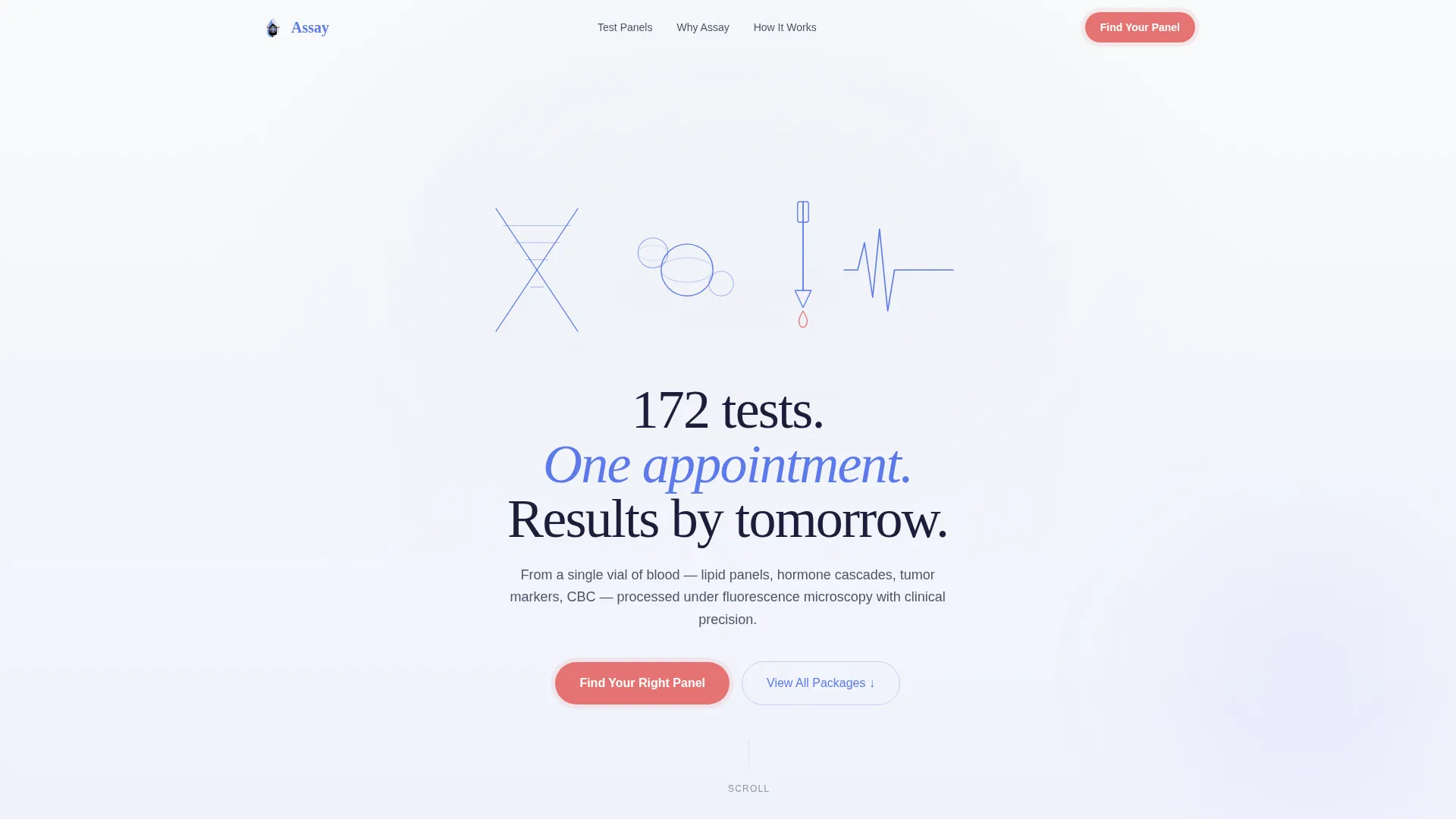
- Animated SVG line art hero with a headline and a primary "Find Your Right Panel" call to action
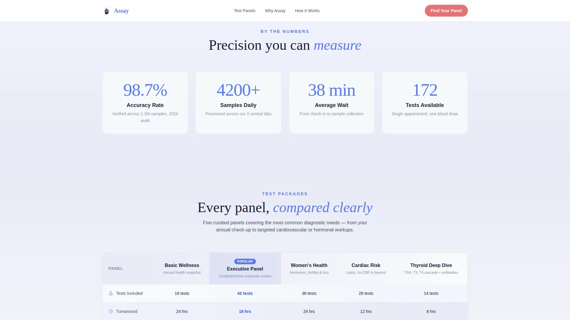
- Live counter stats section showing accuracy rate, daily sample volume, and average wait time
- A five-panel by five-attribute comparison table with alternating frost and lavender row gradients
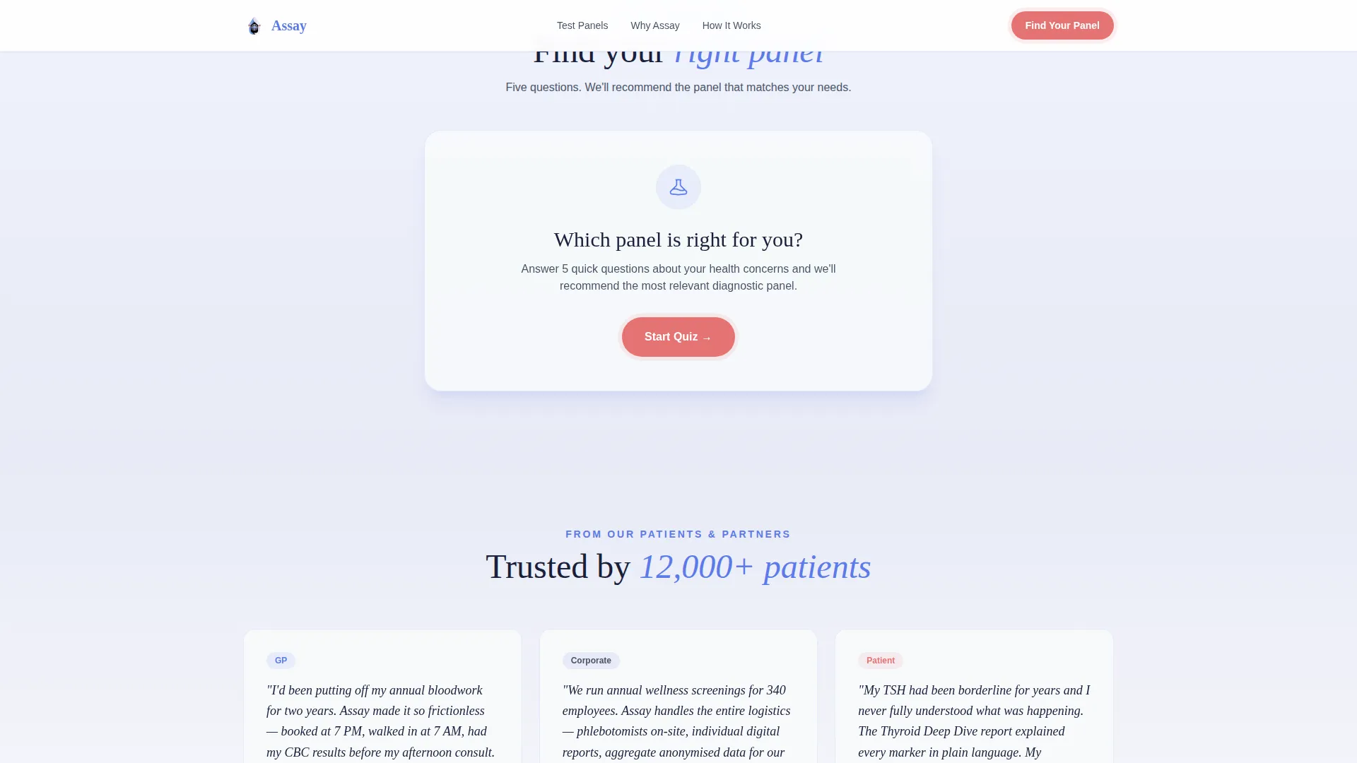
- A five-question sliding quiz that recommends a specific test package and offers a "Book This Panel" path
- Social proof section with patient testimonials and general practitioner endorsements
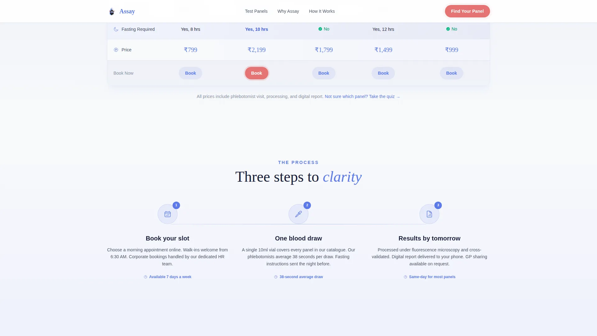
- A three-step "How It Works" process block and a clean single-row footer
Feature list
This template includes purpose-built components that work together as an information-to-conversion flow. Each feature listed below is present in the source design brief.
Animated SVG Line Art Hero
The header fills the full width with a capillary blue line art composition, a double helix, a blood cell cluster, a pipette, and a heartbeat rhythm line. Each element traces itself into existence over two seconds using SVG path animation. The main headline fades in after the illustration completes.
Stats Counter Section
Three headline metrics animate on scroll using soft counter transitions: a 98.7 percent accuracy rate, 4,200 samples processed daily, and a 38-minute average wait time. Each number lands cleanly before the visitor reads any explanatory text, building confidence through data first.
Test Package Comparison Table
Five test packages, Basic Wellness, Executive Panel, Women's Health, Cardiac Risk, and Thyroid Deep Dive, are compared across five columns: tests included, turnaround time, sample type, fasting requirement, and price in Indian Rupees. Rows use alternating frost-to-lavender gradient bands and include hover states for desktop users.
Five-Question Diagnostic Quiz
The quiz launches from the primary call to action. Questions slide horizontally one card at a time, covering symptoms or concerns, last blood work date, age range, existing conditions, and whether a doctor referred the visitor. A capillary blue progress bar tracks completion across the top.
Panel Recommendation with Dual Paths
After the quiz, visitors receive a specific test package recommendation with a "Book This Panel" button. A secondary option, "Download Sample Report", captures email addresses from visitors who want more information before committing.
Social Proof and Process Section
Patient testimonials and general practitioner endorsements are grouped with a three-step "How It Works" process block. This section shows what happens after the visitor books, reducing uncertainty at the most common drop-off point.
Page sections overview
| Section | Purpose |
|---|---|
| Hero with animation | Establish clinical tone and present primary call to action |
| Stats impact row | Build trust immediately with three key performance numbers |
| Test package table | Let visitors compare all five panels before deciding |
| Diagnostic quiz | Guide visitors to the right panel through five questions |
| Social proof block | Reinforce trust with testimonials and practitioner endorsements |
| How It Works steps | Explain the booking-to-results process in three clear steps |
| Single-row footer | Provide contact and navigation links without visual clutter |
Design & branding system
The visual identity follows a Soft Gradient theme built on an Arctic White colour system. Everything reads clean, cool, and clinical without feeling sterile or cold. The palette creates a sense of a freshly lit lab environment, diffused morning light through frosted glass.
- Four-colour palette: clinical frost white (#F8FAFB), pale lavender mist (#E8EAF6), capillary blue (#5C7AEA) for data and iconography, and specimen rose (#E57373) reserved strictly for alerts and call-to-action pulses
- Typography pairs DM Sans for body text with Fraunces display serif for headlines, giving precision copy a warm human voice
- Section backgrounds shift through barely perceptible white-to-lavender gradients, creating visual rhythm without distracting from data
Mobile & speed optimization
The template is designed desktop-first to support the comparison table layout, but it scales responsively to mobile viewports. The quiz card layout works naturally on smaller screens because each question occupies one full card at a time.
- Desktop-first layout ensures the five-column comparison table reads clearly without horizontal scrolling on standard screens
- Horizontal card slides in the quiz are touch-friendly and adapt to mobile swipe gestures
- Static sections use server-rendered components while the quiz and animations load as client components, separating heavy interactivity from initial page load
How this template helps you convert
The page is structured so that information does the persuading. Visitors are never pushed, they are guided by data, comparison, and personalisation until the right action feels obvious.
- The stats section leads with hard numbers before any marketing copy, so trust is established before the visitor reads a single claim
- The comparison table removes ambiguity, visitors see exactly what each package includes and at what price, reducing the need to ask questions before booking
- The quiz creates a personalised recommendation, making the call to action feel tailored rather than generic, which lowers resistance to the final "Book This Panel" step
Other information about this template
This template is intended for diagnostic labs operating in English-language markets with Indian Rupee pricing. All copy, labels, and currency references in the design follow that context. The template is built as a single landing page and does not include multi-page routing or an internal dashboard.
- Currency is set to INR, suited for Indian diagnostic lab and pathology centre contexts
- The "Download Sample Report" secondary path is designed to capture email addresses from visitors who are not yet ready to book
- The footer uses Pattern 1, a linear single-row layout, keeping the close of the page minimal and uncluttered
- Animation intensity is high across three interaction types: SVG path tracing in the hero, counter animations in the stats section, and horizontal card slides in the quiz
Theme
Soft Gradient
Creative direction
Stats-First Impact
Color system
Arctic White
Style
Comparison Table
Direction
Quiz/Assessment
Page Sections
Animated SVG Line Art Hero
Scroll-triggered Stats Counter
Five-panel Comparison Table
Five-question Diagnostic Quiz
Dual-path Panel Recommendation
Social Proof and How It Works
Related questions
Who is this landing page template designed for?
Can I change the test packages in the comparison table?
Does the diagnostic quiz handle live appointment bookings?
Is the comparison table readable on mobile devices?
What if a visitor is not ready to book after completing the quiz?



