Expert Home Inspection Landing Page Template
A precision-built landing page for independent environmental inspectors. This single-page template uses comparison tables, a split-header layout, and a step-by-step educational scroll to turn anxious homebuyers and property managers into confident, informed clients. The design is built to educate first and convert second, sending visitors to a booking page already sold on the method.
by Rocket studio
Quick summary
This template is a single-page, click-through landing page for a one-person environmental inspection business. It uses a Monochrome Steel palette, an Educational Guide theme, and comparison tables to demystify mold, asbestos, and lead inspections. Visitors scroll through a transparent process and leave with enough confidence to book or request a sample report.
Who this template is for
This template is built for independent environmental inspectors who work alone and need a professional online presence that matches the seriousness of their work. It speaks directly to the clients who need the most reassurance before they commit.
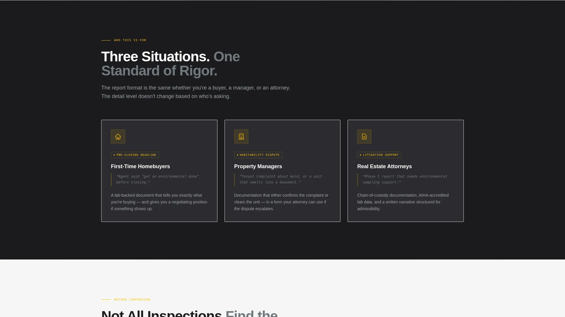
- First-time homebuyers who were told to "get an environmental done" and have no idea what that means
- Property managers fielding tenant complaints about mold or air quality
- Real estate attorneys who need Phase I reports that hold up in litigation
What problem this template solves
Most environmental inspector websites either bury the process in technical jargon or offer nothing more than a phone number and a logo. Neither approach earns trust from someone about to make one of the biggest financial decisions of their life.
- Visitors arrive nervous and uninformed, and generic sites do nothing to change that
- No clear explanation of what a certified inspection includes versus a hardware-store kit
- No obvious next step for people who want proof of rigor before they commit to booking
What you get with this template
You get a complete, ready-to-customize landing page that guides every visitor through the inspection process before asking them to act. Every section has a defined job, and nothing is decorative.
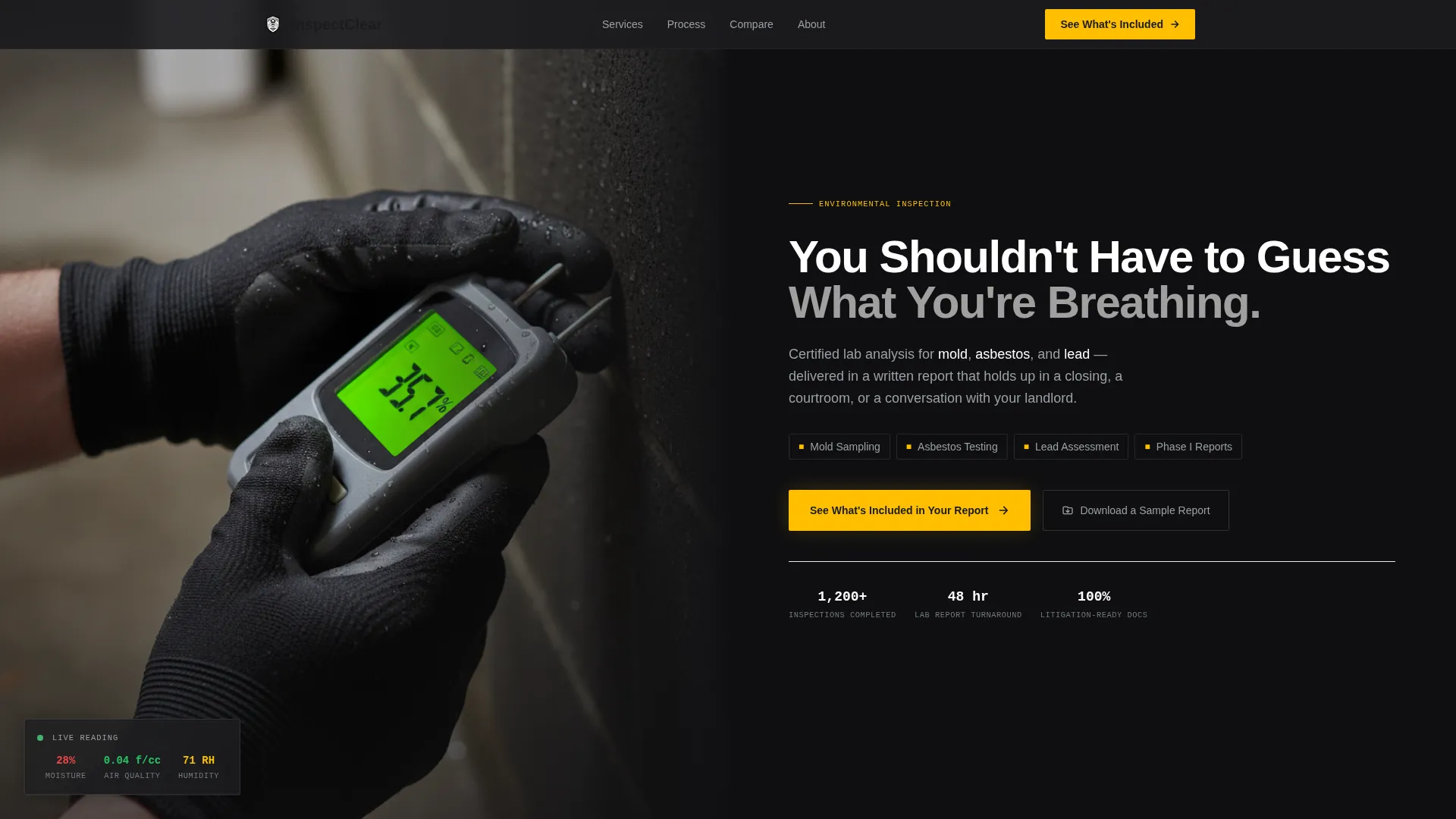
- A split-header with a photograph of gloved hands holding a moisture meter, paired with a direct headline and a three-service subline
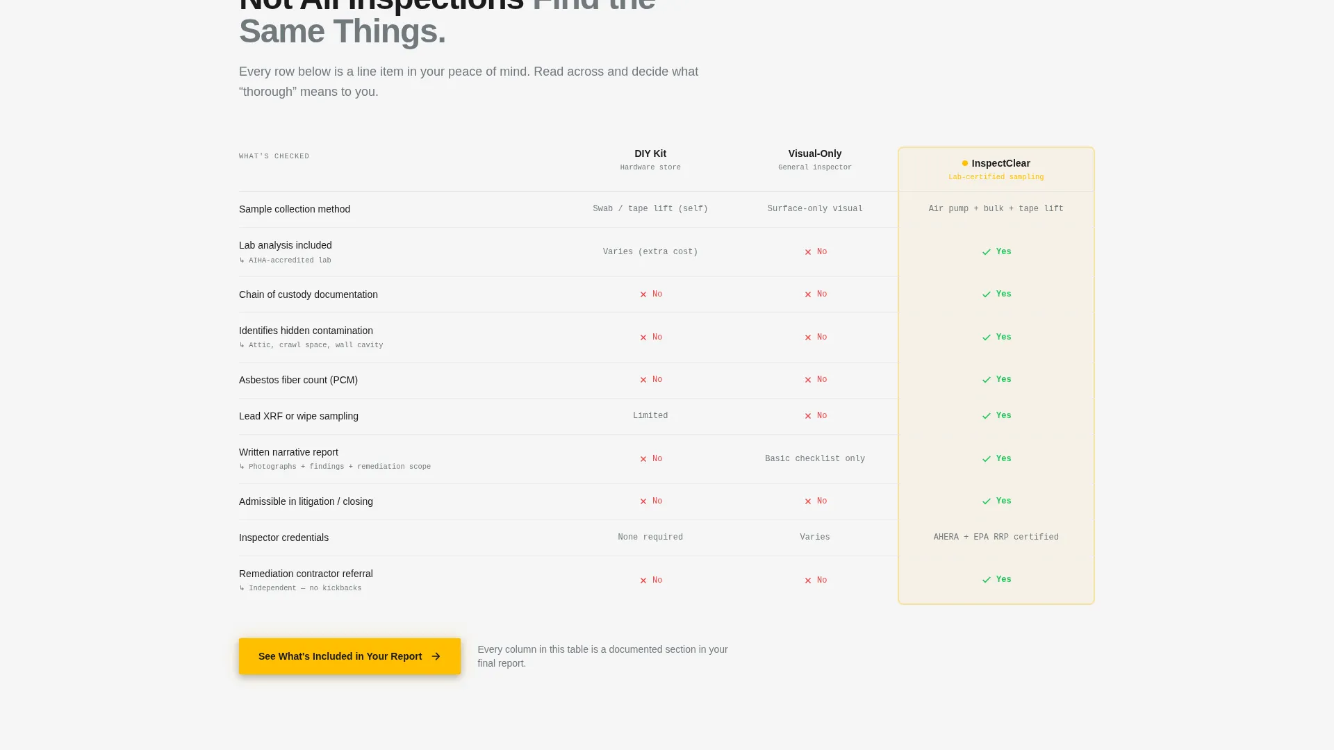
- Side-by-side comparison tables covering visual inspection versus lab-tested analysis, DIY kits versus certified sampling, and standard report contents versus what competitors leave out
- Three placements of the primary call to action and a secondary PDF gate for email lead capture
Feature list
This template includes a focused set of built-in components, each serving the educational conversion flow described in the brief.
Split-Header Photo and Text Layout
The header divides the screen between a tightly composed photograph and a bold headline. The left side shows gloved hands pressing a moisture meter to a basement wall, with the LCD screen glowing and condensation visible on the cinderblock. The right side carries the headline and a subline naming mold, asbestos, and lead as the three core services.
Structured Comparison Tables
Three comparison tables sit at the heart of the page. Each table makes a quiet argument for thoroughness by placing certified inspection methods next to inferior alternatives, row by row. Visitors finish the section understanding exactly why professional testing outperforms a DIY kit.
Three-Placement call to action System
The primary call to action, "See What's Included in Your Report," appears inside the header, again after the comparison tables, and a final time in a sticky bottom bar. The sticky bar activates after the visitor has scrolled forty percent of the page, targeting readers who are engaged but need one more nudge.
PDF Lead Capture Gate
A secondary conversion path offers a downloadable sample report. Visitors provide only an email address to access it. This captures leads who are not yet ready to book but want tangible proof of the inspection method before they decide.
Educational Scroll Sequence
Each section of the page peels back one layer of the inspection process. The scroll replaces anxiety with a numbered, plainly explained sequence. By the time a visitor reaches the booking call to action, they already feel like they understand what they are paying for.
Page sections overview
| Section | Purpose |
|---|---|
| Split Header | Establish credibility and introduce three core services |
| Process Walkthrough | Demystify each step of a certified inspection |
| Comparison Table Block | Contrast professional methods with DIY alternatives |
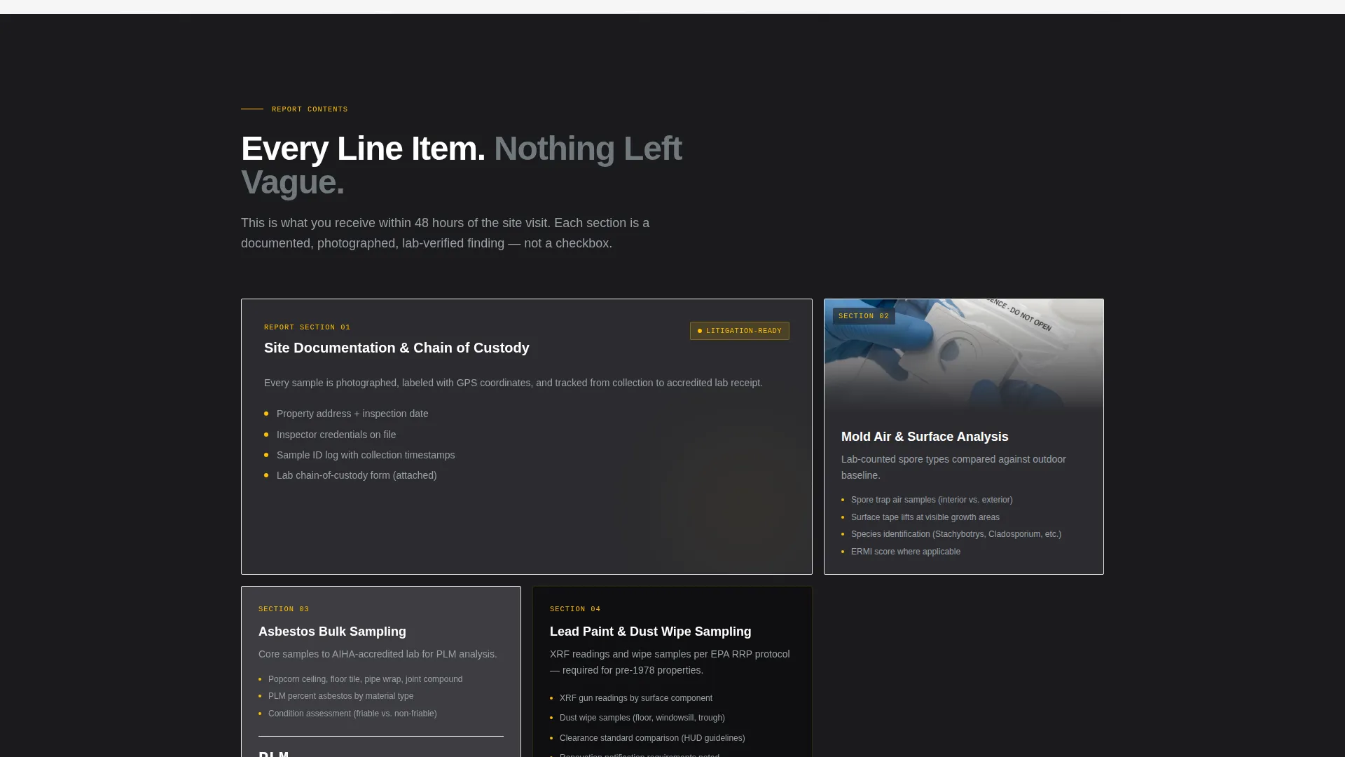
| Report Contents Table | Show exactly what is included in a standard report |
| Sample Report Gate | Capture leads with a PDF download requiring only an email |
| Sticky Bottom Bar | Persistent call to action visible after forty percent scroll depth |
Design & branding system
The visual identity follows an Educational Guide theme rendered entirely in Monochrome Steel. Every color in the palette has a functional role, and nothing is used for decoration alone.
- Forge-black (#1B1B1E) and brushed aluminum (#71797E) form the core palette, giving the page the feel of a calibrated professional instrument rather than a marketing brochure
- Inspection-form white (#F5F5F5) keeps body text and table backgrounds clean and easy to scan
- Caution-tape amber (#FFBF00) is reserved exclusively for calls to action and critical callouts, making every actionable element unmistakable without creating visual noise
Mobile & speed optimization
The template is structured to load cleanly and function on any screen size, which matters when a homebuyer is reviewing the page on a phone in a real estate agent's parking lot.
- The split-header collapses gracefully on smaller screens so the headline and photograph remain readable without cropping or overlap
- Comparison tables are designed to reformat for narrow viewports so every row stays legible on mobile devices
- The sticky bottom bar is sized and positioned to stay usable on touch screens without obstructing the main content
How this template helps you convert
This landing page is built around a single conversion philosophy: an educated visitor is a ready visitor. The page does not ask for a booking until it has already answered every reasonable question about the process.
- The comparison tables neutralize doubt by placing professional inspection methods next to DIY alternatives, making the value of certified testing self-evident before any price is mentioned
- The primary call to action links to a detailed service and pricing page rather than a form, so visitors arrive on the booking page already confident in the method and only need to choose a date
- The PDF gate creates a second conversion path for cautious visitors, capturing their email in exchange for a sample report and keeping them in the pipeline without requiring an immediate commitment
Other information about this template
This template is specifically designed for the environmental inspector business website context, where trust and method transparency matter more than visual flair. A few additional details worth noting:
- The no-form policy on the landing page is intentional: the goal is educated confidence, not friction at the point of first contact
- The template style is a comparison table layout, which is particularly effective for professional services where clients are comparing options before they choose a provider
- The page is built as a single landing page, not a multi-page website, so all sections are scrollable from one URL
- The Transparent Process creative direction means the copy and layout work together to demystify technical inspection language for non-expert visitors
- This template suits a one-person operation but can be adapted for a small environmental consulting firm with minimal changes to the copy
Theme
Educational Guide
Creative direction
Transparent Process
Color system
Monochrome Steel
Style
Comparison Table
Direction
Click-Through
Page Sections
Split-header Photo and Text Layout
Structured Comparison Tables
Three-placement Call to Action System
PDF Sample Report Gate
Educational Scroll Sequence
Related questions
Does this template include a contact or booking form?
What are the three comparison tables included in this template?
What does the sticky bottom bar do?
Can I adapt this template if I offer more than three services?
Who is the intended visitor for this landing page?



