Revenue & Tax Authority Professional Website Template
Assessed is a property tax consulting landing page template built for firms that challenge overvalued assessments on behalf of commercial landlords, estate executors, and small business owners. It uses a zigzag alternating layout, oversized statistics, animated assessment counters, and before-and-after result cards to build a persuasive, data-first case before ever asking for a click.
by Rocket studio
Quick summary
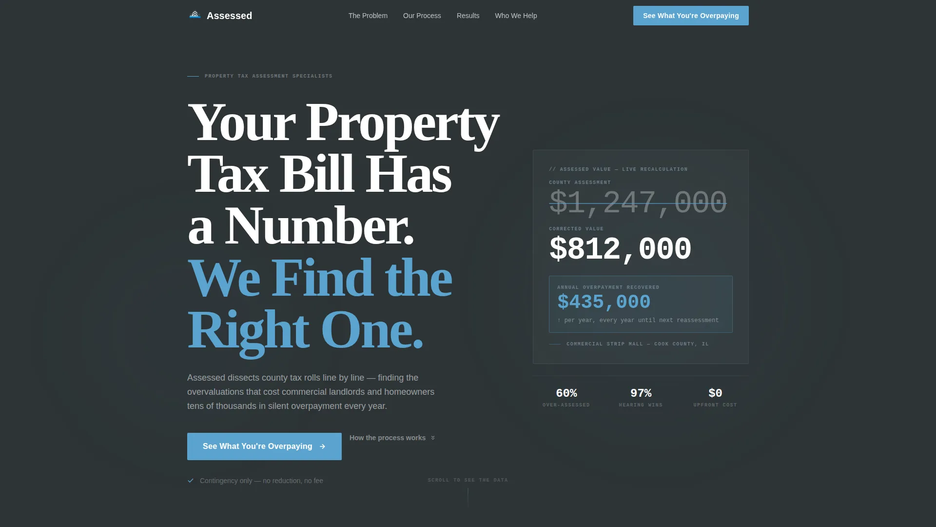
Assessed is a single-page template designed for property tax consulting firms. It opens with a giant headline and an animated counter showing an inflated assessment correcting in real time. The layout alternates section-by-section, front-loading hard data so visitors understand the scale of their overpayment before the first call to action appears.
Who this template is for
This template is built for property tax professionals who need to earn trust fast with a data-skeptical audience. It suits firms that handle formal assessment appeals for commercial and residential clients alike.
- Commercial property owners and strip-mall investors facing sudden reassessment notices
- Estate executors dealing with inherited properties that carry years of unchallenged valuations
- Small business owners on triple-net leases where an inflated tax bill lands directly on their desk
What problem this template solves
Most property owners do not know their assessment is wrong until they read a reassessment notice with a number that shocks them. A generic service page rarely convinces them to act. This template solves the credibility gap by presenting the systemic problem in undeniable statistics before making any service claim.
- Visitors arrive skeptical; the data-first structure disarms that skepticism before the pitch begins
- The zigzag rhythm breaks the page into digestible reveals, keeping attention through a topic that can feel dry or intimidating
- Repeat call-to-action placements at every section break mean no visitor has to scroll back up to take the next step
What you get with this template
You get a complete, structured landing page ready to customize for your firm's real reduction figures and process. Every section is purposeful and ordered to build conviction progressively.
- Hero section with a giant condensed headline and an animated assessment counter that ticks from an inflated value to a corrected one, with savings shown in sky blue
- Alternating zigzag stat sections, a plain-language process walkthrough, before-and-after assessment reduction cards, and a call-to-action break with a secondary email-capture offer
- A linear single-row footer rounding out the page
Feature list
This template includes six purpose-built components drawn directly from the project brief.
Animated Assessment Counter
The hero includes a live-counting animation that ticks an inflated assessment value down to a corrected figure. Accumulated savings display in sky blue beneath the counter, making the financial case visible before the visitor reads a single word of body copy.
Zigzag Alternating Section Layout
Each content section shifts left-to-right in alternating blocks. This layout resets the visitor's eye at every scroll step. It turns what could feel like a wall of data into a rhythmic sequence of individual, digestible reveals.
Stats-First Oversized Data Blocks
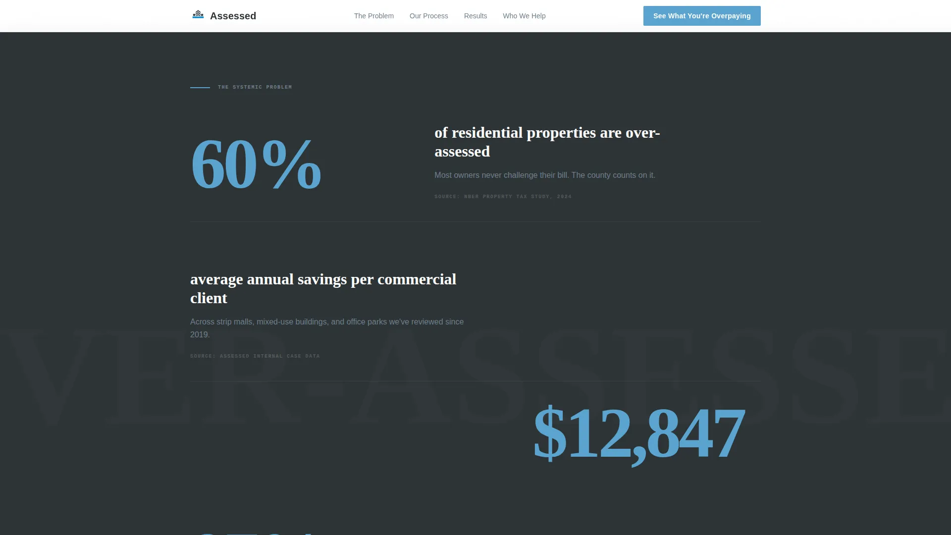
Every alternating section opens with a single oversized statistic before any explanation follows. Hard figures like overassessment rates, average annual savings, and hearing success rates are presented large and alone, giving each number space to land.
Before-and-After Assessment Cards
The results section displays assessment reduction outcomes as paired cards showing original versus corrected values. These cards give visitors a concrete reference for what a successful appeal looks like in real dollar terms.
Scroll-Triggered Reveals and Staggered Entries
Stat blocks and zigzag sections animate into view as the visitor scrolls. Staggered entry timing keeps each piece of information feeling like a new disclosure rather than a static page loading all at once.
Repeat Call-to-Action with Secondary Capture
The primary call-to-action button appears below the hero counter and repeats at every section break. A secondary text link offering a free downloadable assessment guide captures emails from visitors who are not yet ready to commit.
Page sections overview
| Section | Purpose |
|---|---|
| Hero Header | Headline and animated assessment counter establish the financial stakes immediately |
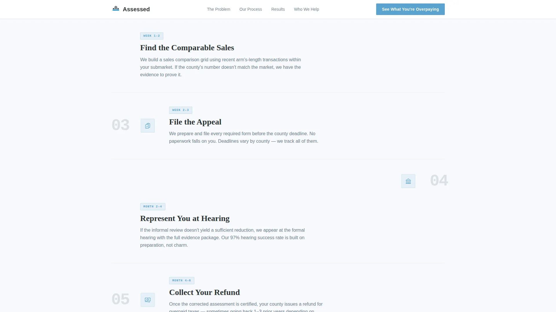
| Stats Impact Zigzag | Oversized statistics present the systemic overassessment problem in hard numbers |
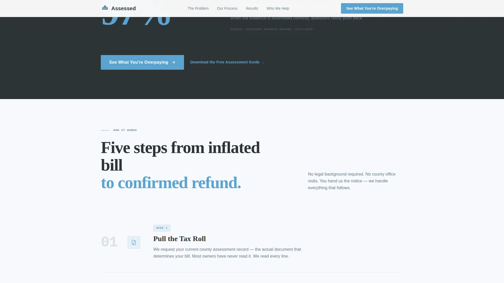
| Process Steps Zigzag | Plain-language walkthrough covers review, compare, file, hearing, and refund |
| Results Cards Zigzag | Before-and-after assessment cards show real reduction outcomes |
| Call-to-Action Break | Primary button and secondary guide download work together to capture intent at every level |
| Linear Footer | Single-row footer closes the page cleanly |
Design & branding system
The visual identity follows an Educational Guide theme. It pairs institutional authority with enough open clarity to keep visitors reading rather than closing the tab.
- Deep charcoal slate (#2D3436) anchors primary text and section backgrounds; courthouse gray (#6D7F8D) handles secondary copy and divider lines; open-sky blue (#5BA4CF) highlights every interactive element, data figure, and savings readout
- Filing-paper white (#F7F9FC) alternates section backgrounds throughout the zigzag layout, maintaining rhythm and visual breathing room
- Typography uses DM Sans for all body copy and a heavy condensed display face for headlines, keeping the editorial tone authoritative without feeling cold
Mobile & speed optimization
The template is designed desktop-first, reflecting the reality that commercial property owners typically review documents at a desk. Full mobile support is included so the page functions cleanly across all screen sizes.
- The animated counter and scroll-triggered reveals use a Client Component approach; static sections use Server Components to keep initial load light
- Staggered zigzag entry animations are built to degrade gracefully on smaller screens so the reading experience remains clear even without full motion support
How this template helps you convert
Every structural decision on this page is built to move a skeptical visitor toward a single action: entering their property address to see what they are overpaying.
- The hero counter shows a dollar-figure correction before any claim is made, giving the visitor a reason to keep reading before they have heard your pitch
- Each oversized statistic section adds another layer of evidence, so by the time the call-to-action button appears for the third time, the visitor already suspects their own bill is wrong
- The secondary guide download gives hesitant visitors a low-commitment action, keeping them in your funnel even if they are not ready to submit their address today
Other information about this template
This template is built specifically for the property tax consulting niche within the Government and Public services category. It reflects the Revenue and Tax Authority subcategory context, where trust and credibility must be established quickly with an audience that is financially cautious.
- The page uses United States localization throughout: dollar currency, county and property address input format, and standard US property tax terminology
- The FAQ accordion component is included for interactive question-and-answer handling directly on the page
- Hover states on all call-to-action buttons and interactive card reveals are included as part of the template's interactivity set
- The template style is classified as Zigzag/Alternating, making it straightforward to extend with additional alternating sections if your firm's process or case library requires more depth
Theme
Educational Guide
Creative direction
Stats-First Impact
Color system
Slate & Sky
Style
Zigzag/Alternating
Direction
Click-Through
Page Sections
Animated Assessment Counter Hero
Zigzag Alternating Layout
Stats-first Oversized Data Blocks
Before-and-after Assessment Cards
Scroll-triggered Staggered Reveals
Repeat Call to Action with Secondary Email Capture
Related questions
Who is this landing page template designed for?
Can I replace the statistics and reduction figures with my own data?
Does this template include a way to capture visitor emails?
How does the animated assessment counter work?
Is this template suitable for firms handling both residential and commercial appeals?