Art School Marketing Careers & Recruitment Website Template
Atelier is a split-screen landing page template built for art schools that need to prove their value before asking for enrollment. It leads with press validation, moves through outcome-driven case studies, and closes with two focused lead-capture forms. The design follows an Executive Suite visual theme, restrained, credentialed, and built to earn trust from skeptical parents, career-changers, and school counselors.
by Rocket studio
Quick summary
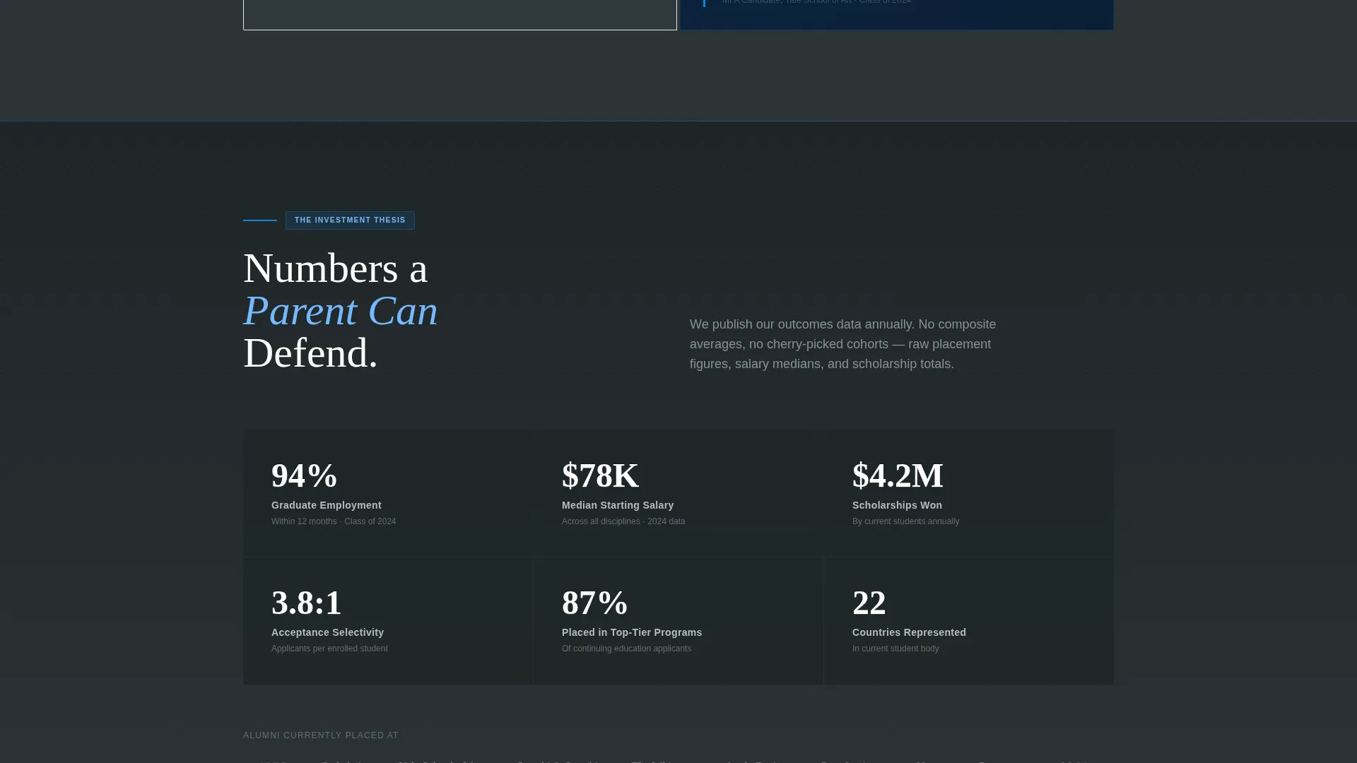
Atelier is a single-page, 50/50 split-screen landing page template designed for art school enrollment marketing. It replaces inspiration-based messaging with outcome evidence, acceptance rates, alumni placements, and scholarship totals. Two distinct calls to action serve warm and cold leads. The page is built to convert clicks from Facebook ads into booked portfolio reviews and downloaded outcome reports.
Who this template is for
This template serves art schools and enrollment marketing teams that need to speak to a skeptical, research-driven audience. It is built for campaigns where the audience needs proof before they will take action.
- Parents of talented teenagers comparing tuition costs against measurable return on investment
- Adult career-changers searching late at night for honest answers about whether art school is worth the commitment
- High school counselors building defensible recommendation lists for students and administrators
What problem this template solves
Most art school landing pages lead with beautiful student work and aspirational copy. That approach fails the audiences who are actually clicking art school Facebook ads. Those audiences want outcomes, not atmosphere.
- Visitors arrive skeptical and leave without converting because the page never speaks to cost, placement, or real-world results
- Parents and career-changers cannot justify an enrollment inquiry without structured evidence that the school delivers measurable outcomes
- Schools lose warm leads who scroll past an enrollment form that appears before trust is established
What you get with this template
You get a fully structured, section-led landing page that moves visitors through a deliberate trust-building sequence before asking them to act. Every layout decision supports the enrollment argument.
- A press mentions header that opens with third-party validation instead of campus photography
- Three escalating case study panels that show student "before" and "after" outcomes in a 50/50 split layout
- Two lead capture forms: a primary portfolio review request and a secondary outcomes report download
Feature list
This template is built around a clear set of purpose-driven layout components and design choices grounded in the source brief.
Split-Screen Case Study Layout
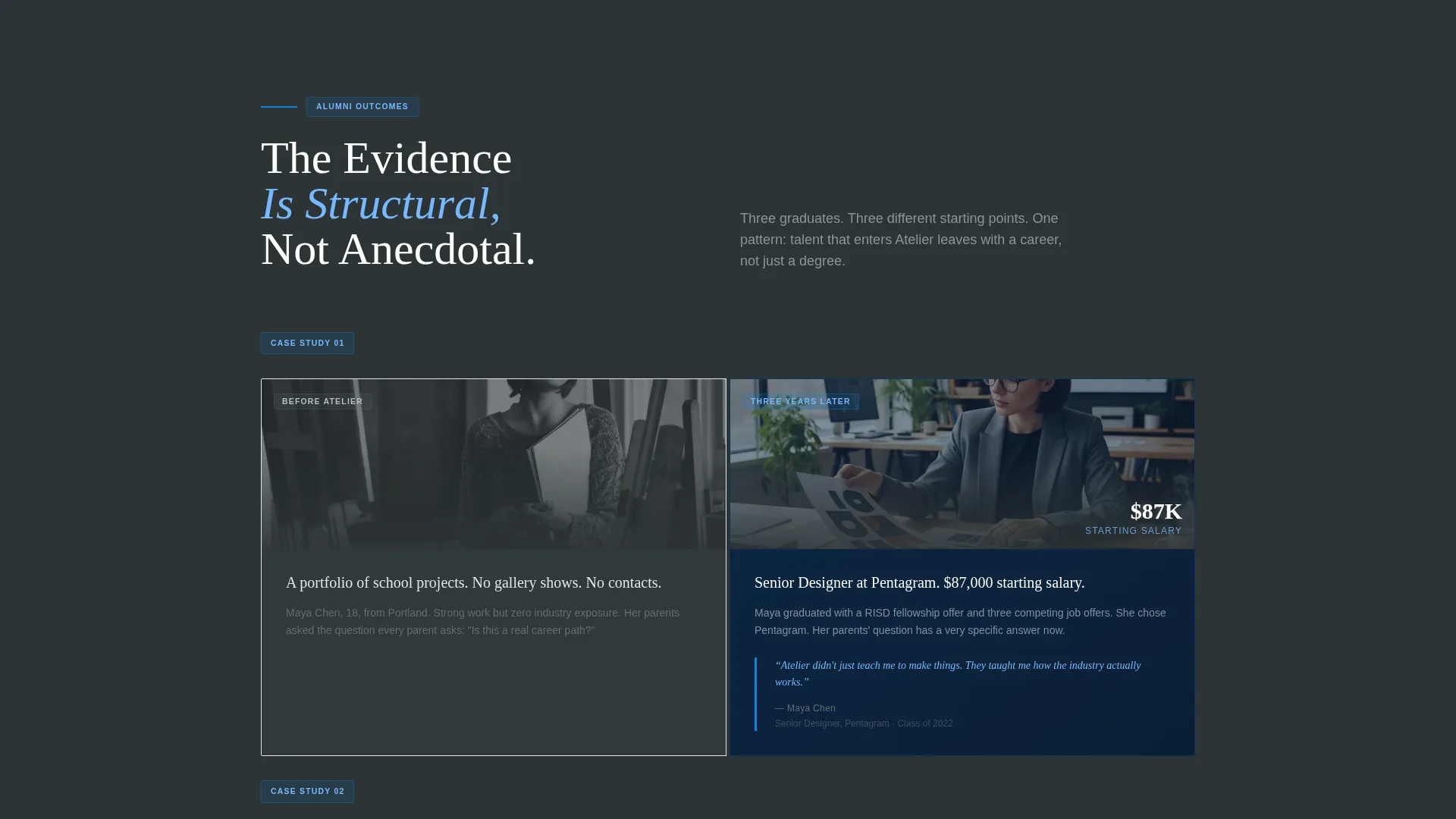
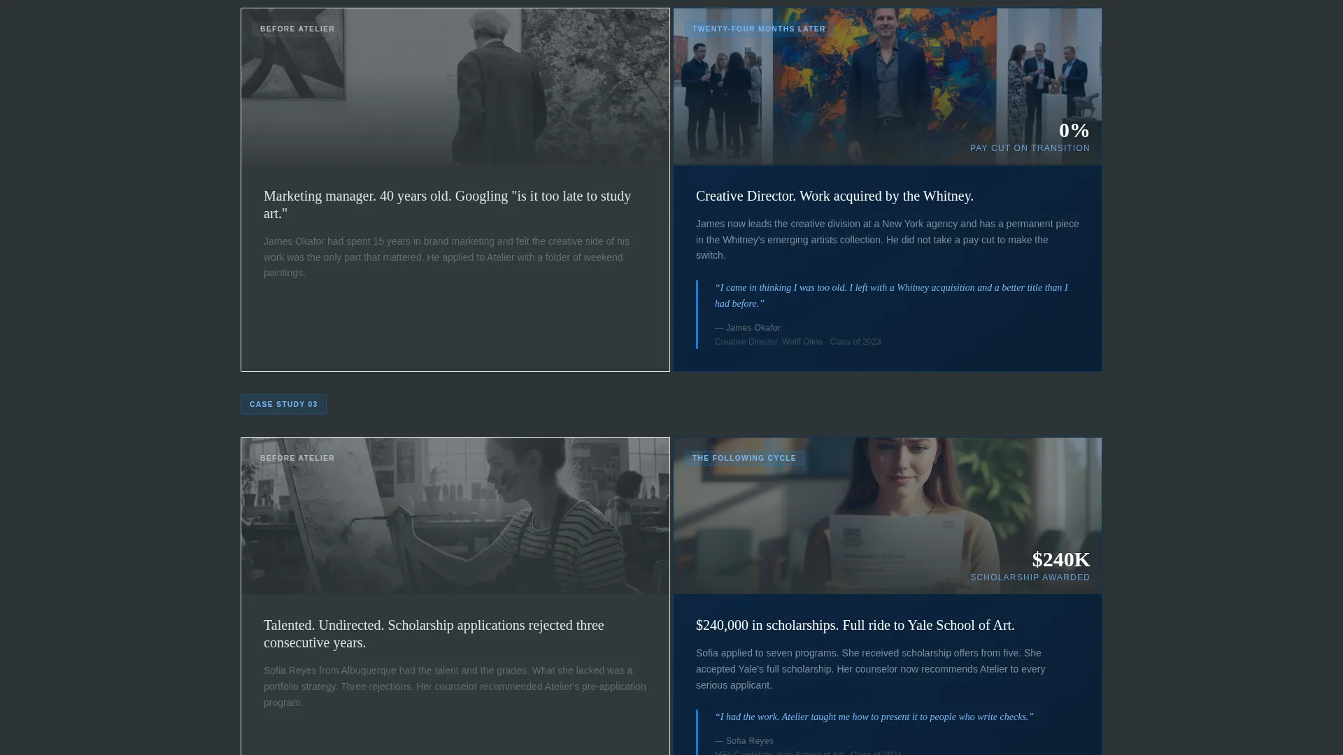
Each scroll section divides the screen into a left panel showing a student's starting point and a right panel showing their outcome. The sequence escalates from an eighteen-year-old first-time applicant to a forty-year-old career-changer to an alumnus with work in a permanent collection.
Press Mentions Header
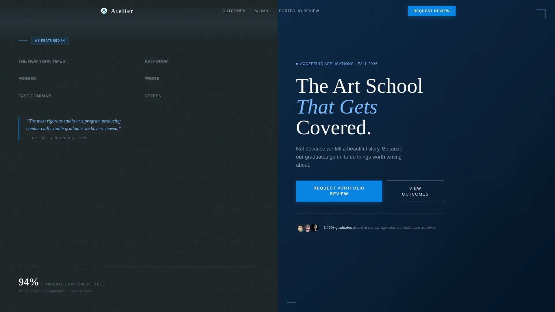
The opening section arranges publication and institution logos across the charcoal half of the split screen like a press wall at a gallery opening. The right half carries a single cloud-white headline over sky blue: "The Art School That Gets Covered." No campus photography is used.
Primary Lead Capture Form
Positioned after the second case study, once value has been demonstrated. The form collects first name, email, current skill level via a dropdown (beginner, intermediate, advanced), and an optional portfolio link. The call to action reads "Request Your Portfolio Review."
Secondary Lead Capture Form
A lighter form designed for colder visitors who are not yet ready to submit a portfolio. It captures only an email address and gates a downloadable PDF of placement statistics and salary data. The call to action reads "Download the Outcomes Report."
Executive Suite Color System
The palette uses boardroom charcoal (#2D3436), brushed slate (#636E72), open-sky blue (#74B9FF), and cloud white (#DFE6E9). Confident cerulean (#0984E3) is applied to buttons and pull-quotes. The result is a restrained, credentialed visual identity that feels authoritative rather than decorative.
Outcome-Driven Copywriting Structure
The page is structured as an investment thesis, not a dream pitch. Headlines reference acceptance rates, alumni job titles, scholarship dollar amounts, and gallery placements. The copy treats art school as a career decision with verifiable returns.
Page sections overview
| Section | Purpose |
|---|---|
| Press Mentions Header | Opens with third-party validation via publication logos |
| Headline Panel | Delivers the core credibility statement in cloud white |
| Case Study One | Introduces a shy eighteen-year-old applicant and their outcome |
| Case Study Two | Presents an adult career-changer's transformation story |
| Primary call to action Form | Captures warm leads with a portfolio review request |
| Case Study Three | Closes the narrative with an alumnus in a permanent collection |
| Secondary call to action Form | Captures colder leads with an outcomes report download |
Design & branding system
The visual identity follows an Executive Suite theme. Every color and layout choice reinforces credibility and restraint rather than creative energy. The palette works as a system, not a collection of accent colors.
- Boardroom charcoal (#2D3436) and brushed slate (#636E72) carry structural weight across left panels, headers, and dividers
- Open-sky blue (#74B9FF) and cloud white (#DFE6E9) provide breathing room on right panels and headline areas
- Confident cerulean (#0984E3) is reserved for buttons and pull-quotes to draw the eye toward action without competing with content
Mobile & speed optimization
The 50/50 split-screen layout is designed to reflow cleanly for smaller screens. The section-led single-page structure keeps load requirements predictable and contained.
- Split panels stack vertically on mobile so case study "before" and "after" content reads in logical sequence
- Forms remain accessible and compact on smaller viewports, with the dropdown skill-level field adapting to touch input
- The single-page structure avoids unnecessary navigation overhead, keeping the visitor focused on the enrollment argument
How this template helps you convert
The page is engineered around a specific conversion logic: prove value first, then ask. Every section earns the next interaction before requesting personal information.
- The press mentions header reframes visitor assumptions within the first scroll, replacing doubt with institutional credibility before a single word of enrollment copy appears.
- The escalating case study sequence builds a structural verdict across three distinct audience mirrors, the teenager, the career-changer, and the established alumnus, so each visitor type sees their own outcome reflected before reaching a form.
- Two tiered calls to action capture leads at different readiness levels, increasing total conversion volume without forcing cold visitors into a high-commitment form they are not ready to complete.
Other information about this template
This template is designed specifically for art school Facebook ads campaigns where the audience arrives with a mix of hope and skepticism. The layout and copy structure are suited to paid social traffic that needs immediate reassurance before engaging further.
- The template suits enrollment teams at independent art schools, portfolio programs, and professional arts training institutions running outcome-focused paid campaigns
- The investment-thesis framing works particularly well for adult learner programs and continuing education departments where cost justification is a primary objection
- The outcomes report secondary form can support list-building goals for schools that want to nurture colder leads over a longer decision cycle
- This template is built as a standalone landing page and is not designed as a multi-page website or a general school homepage replacement
Theme
Executive Suite
Creative direction
Case Study Narrative
Color system
Slate & Sky
Style
Split Screen (50/50)
Direction
Lead Generation
Page Sections
Split-screen Case Study Panels
Press Mentions Opening Header
Primary Portfolio Review Form
Secondary Outcomes Report Form
Executive Suite Color System
Outcome-led Copy Framework
Related questions
Who is the primary audience this landing page template targets?
Can I use both lead capture forms on the same page?
Does the template include placeholder copy and content structure?
What makes this template different from a general school homepage?
Is the split-screen layout usable on mobile devices?



