Atelier - Curated Artisan Landing Page Template
Atelier is a bento grid landing page template built for premium arts and crafts storefronts. It pairs a Neo-Retro visual identity with a warm Cloud Canvas palette to create an atmosphere of handcrafted quality. Device mockups, comparison tiles, and layered calls to action guide visitors toward the full collection with quiet confidence.
by Rocket studio
Quick summary
Atelier is a single-page, click-through landing page template for luxury arts and crafts retailers. The bento grid layout lets handcrafted products speak through texture and contrast. A Neo-Retro aesthetic, warm parchment tones, and carefully placed calls to action make the page feel like a curated shop floor rather than a digital storefront.
Who this template is for
This template suits any independent retailer or creative business that sells premium, handcrafted goods and wants its online presence to match the care put into every product.
- Independent makers and studio owners selling handcrafted ceramics, fine papers, and artist materials
- Interior designers and creative professionals sourcing one-of-a-kind pieces for clients
- Gift retailers and curators offering premium, thoughtfully packaged objects
What problem this template solves
Mass-market templates flatten the story behind handcrafted goods. They treat every product the same way, leaving no room for texture, provenance, or quiet ceremony. Atelier solves that problem by building visual contrast directly into its layout.
- Visitors often cannot feel the difference between artisan and mass-produced goods on a generic page
- Standard grid layouts give every product equal weight, removing the sense of curation
- Weak calls to action push visitors away before they are ready to browse
What you get with this template
You get a fully structured bento grid landing page designed for premium retail storytelling. Every section is pre-built and purposeful, so you can focus on placing your products rather than building from scratch.
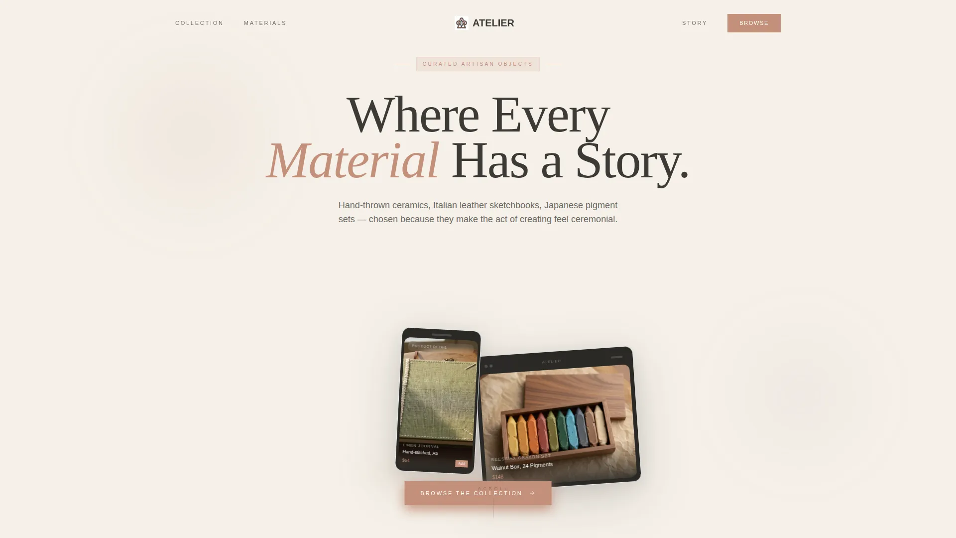
- A device mockup header with floating tablet and phone screens showing products mid-scroll
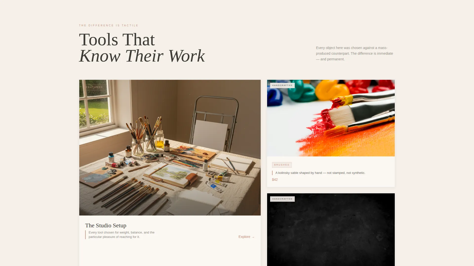
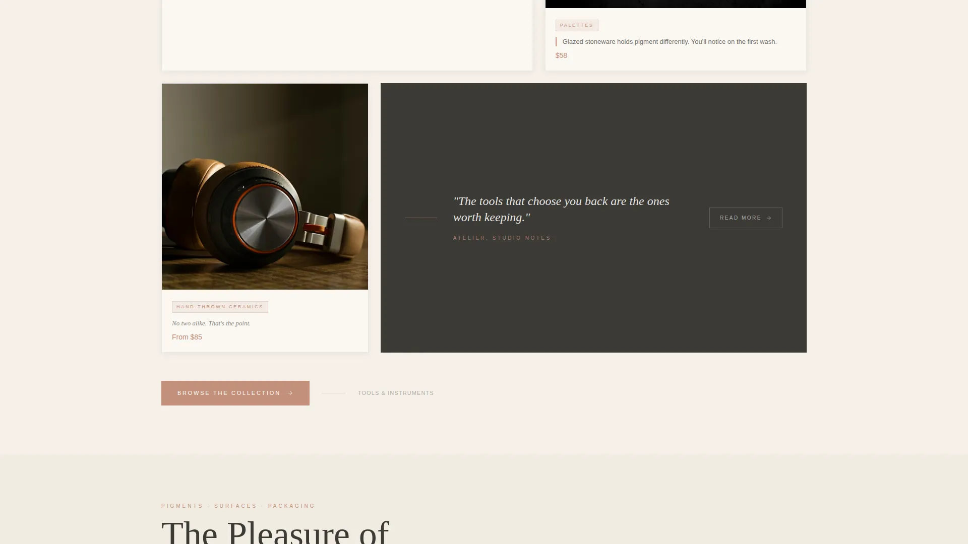
- An asymmetric bento grid with hero tile, stacked detail tiles, and close-up comparison blocks
- Two distinct call to action paths: a primary "Browse the Collection" button and a secondary seasonal edit link
Feature list
This template delivers a focused set of design and layout features drawn directly from its brief. Each one serves the goal of helping handcrafted products earn attention through presence rather than noise.
Device Mockup Header
A tablet and phone float at a gentle angle against a parchment background. The tablet shows a hand-poured beeswax crayon set in a walnut box. The phone displays a linen-bound journal product detail page with visible stitching. Subtle drop shadows lift the devices off the background like objects on a shelf.
Asymmetric Bento Grid Layout
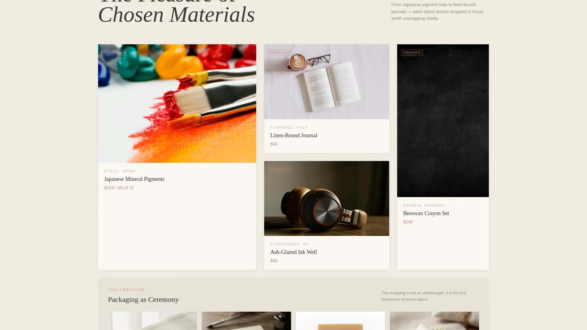
The grid breathes with intentional asymmetry: one large hero tile, two stacked detail tiles, and one square close-up per row. As visitors scroll, the grid moves through tools, pigments, surfaces, and packaging. Each shift builds a cumulative argument for quality through visual accumulation.
Handcrafted versus. Mass-Produced Comparison Tiles
Each bento tile pairs a factory-made item against its handcrafted counterpart. A stamped brush sits beside a hand-shaped kolinsky sable. A plastic palette faces a glazed stoneware mixing dish. Single-line captions name the difference without editorializing.
Dual Call-to-Action Architecture
The primary call to action, "Browse the Collection," appears as a charcoal-on-terracotta button. It sits first inside the header mockup as a floating overlay, then repeats at the close of each grid row. A secondary underlined text link, "See What's New This Month," routes to a curated seasonal edit.
Neo-Retro Serif Typography
Headlines use spaced uppercase serif type that nods to 1960s art catalog design. The typographic system reinforces the hand-made, considered quality of the products on display. The headline "Where Every Material Has a Story" anchors the page's core message.
Cloud Canvas Color System
The palette pairs warm parchment as the dominant background with muted charcoal for body type. Terracotta marks price points and category labels. Dusty lavender appears only on hover states and interactive tags, acting as a quiet reward for visitor curiosity.
Page sections overview
| Section | Purpose |
|---|---|
| Header Device Mockup | Introduces the store's atmosphere with floating product screens and the headline |
| Comparison Grid Row 1 | Contrasts tool quality through side-by-side bento tiles with captions |
| Comparison Grid Row 2 | Shifts focus to pigments and mixing surfaces to deepen the quality narrative |
| Comparison Grid Row 3 | Covers surfaces and packaging, completing the handcrafted argument |
| Primary call to action Block | Repeats "Browse the Collection" button at the close of each grid row |
| Seasonal Edit Link | Provides a secondary path to a curated monthly product selection |
Design & branding system
The visual identity follows a Neo-Retro theme that draws from mid-century art catalog aesthetics. The Cloud Canvas palette keeps the page warm and unhurried, letting product textures carry the visual weight.
- Warm parchment (#F5F0E8) dominates all backgrounds, creating an open, sun-filled atmosphere
- Muted charcoal (#3B3A36) anchors headlines and body type in a 1960s-influenced spaced serif
- Washed terracotta (#C4907A) marks price points, category labels, and primary call to action buttons
- Dusty lavender (#A8919B) appears only on hover and interactive tags, rewarding active curiosity
Mobile & speed optimization
The bento grid layout is designed to remain clear and readable at smaller screen sizes. Tile proportions and spacing adjust so the visual hierarchy survives the transition from desktop to mobile without losing the sense of curation.
- Asymmetric grid tiles restack cleanly on narrower viewports, preserving the comparison structure
- Device mockup angles and drop shadows remain intact at mobile scale for consistent atmosphere
- call to action buttons maintain their terracotta prominence across all screen widths
How this template helps you convert
Atelier earns clicks by letting the products build the case before the visitor reaches the first button. The page is structured so that trust accumulates through contrast and detail, not through pressure.
- The device mockup header places the visitor inside the store experience immediately, creating desire before any product pitch is made.
- The bento grid's comparison tiles make the quality argument visually and quietly, so by the third row, visitors are choosing what to browse rather than whether to browse.
- Repeating the primary call to action at the close of each grid row means a visitor ready to click is never more than one scroll away from acting.
Other information about this template
Atelier is built for the intersection of premium arts and crafts retail and editorial-quality design. It is a strong fit for anyone moving away from generic marketplace listings toward a branded, story-led shopping experience.
- Template style: Bento Grid single-page layout
- Landing page direction: Click-Through to a full storefront or collection page
- Theme: Neo-Retro with a Cloud Canvas color system
- Suitable for luxury arts and crafts e-commerce, independent studio shops, and high-end gift retailers
- The comparison tile structure can be adapted to highlight any handcrafted category, from ceramics to bookbinding materials
Theme
Neo-Retro
Creative direction
Flash Deal
Color system
Obsidian & Gold
Style
Bento Grid
Direction
Click-Through
Page Sections
Device Mockup Header with Product Screens
Asymmetric Bento Grid Layout
Comparison Tile System
Dual Call-to-action Architecture
Neo-retro Serif Typography System
Cloud Canvas Color System
Related questions
What kind of store is Atelier designed for?
Can I adapt the bento grid for a single product category?
How does the dual call to action system work?
Does the template include a way to highlight seasonal or new products?
Is the Cloud Canvas color system adjustable?



