Healthcare & Hospital Design Pre-Launch Website Template
Atelier is a waitlist landing page built for a hospital architecture firm. It uses an asymmetric 60/40 grid, a gallery-walk scroll structure, and an Obsidian and Gold visual identity to present spatial work with quiet authority. The page collects qualified intent from NHS estates directors, private healthcare groups, and university medical centres ahead of a full portfolio launch.
by Rocket studio
Quick summary
Atelier is a single-page waitlist template designed for a hospital architecture firm. It guides visitors through a curated gallery of spatial work before presenting a focused intent-capture form. The layout is asymmetric, the palette is deep and editorial, and every section is built to slow the visitor down and earn their attention before asking for anything.
Who this template is for
This template is built for architecture firms that work in healthcare environments and need to establish credibility before a full portfolio site goes live. It is particularly well suited to practices whose clients include estates commissioning directors and procurement decision-makers.
- Healthcare architecture firms preparing a pre-launch waitlist page
- Hospital design studios targeting NHS trust estates directors or private healthcare groups
- University medical centre architects replacing legacy buildings with patient-centred design
What problem this template solves
Most architecture firm landing pages either present too much at once or feel indistinguishable from a generic agency site. A firm working in hospital design needs a page that signals spatial thinking, not marketing copy. This template solves the problem of building trust and collecting qualified intent before the full portfolio is ready.
- Visitors leave too quickly when a page lacks visual authority and editorial restraint
- Pre-launch firms have no testimonials to rely on, so the design itself must carry credibility
- Generic waitlist forms collect noise; this template qualifies intent through its gallery structure and a targeted dropdown
What you get with this template
You get a fully structured single landing page with five distinct scroll sections, a pre-wired waitlist form, and a complete Obsidian and Gold design system. Every component is built around the gallery-walk creative direction described in the brief.
- A hero section with an SVG geometric abstraction that resolves into a hospital floor plan over three seconds
- Three gallery exhibit sections in an asymmetric 60/40 grid, each displaying a project at a different scale
- A scroll-linked word-by-word philosophy reveal and a pinned "Request Early Access" call to action with a minimal intent form
Feature list
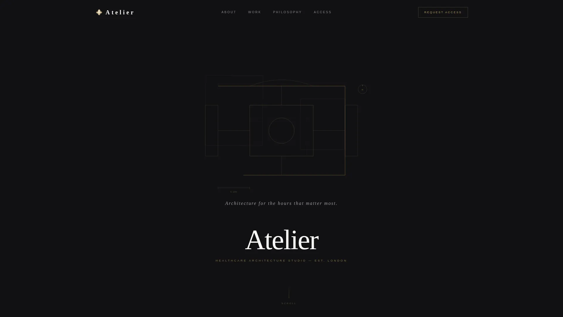
Animated SVG Hero with Floor Plan Reveal
The hero opens on a field of deep black. Intersecting planes, arcs, and grids animate over three seconds and resolve into the recognisable floor plan of a hospital atrium. No photography is used. The abstraction signals spatial intelligence before a single word is read.
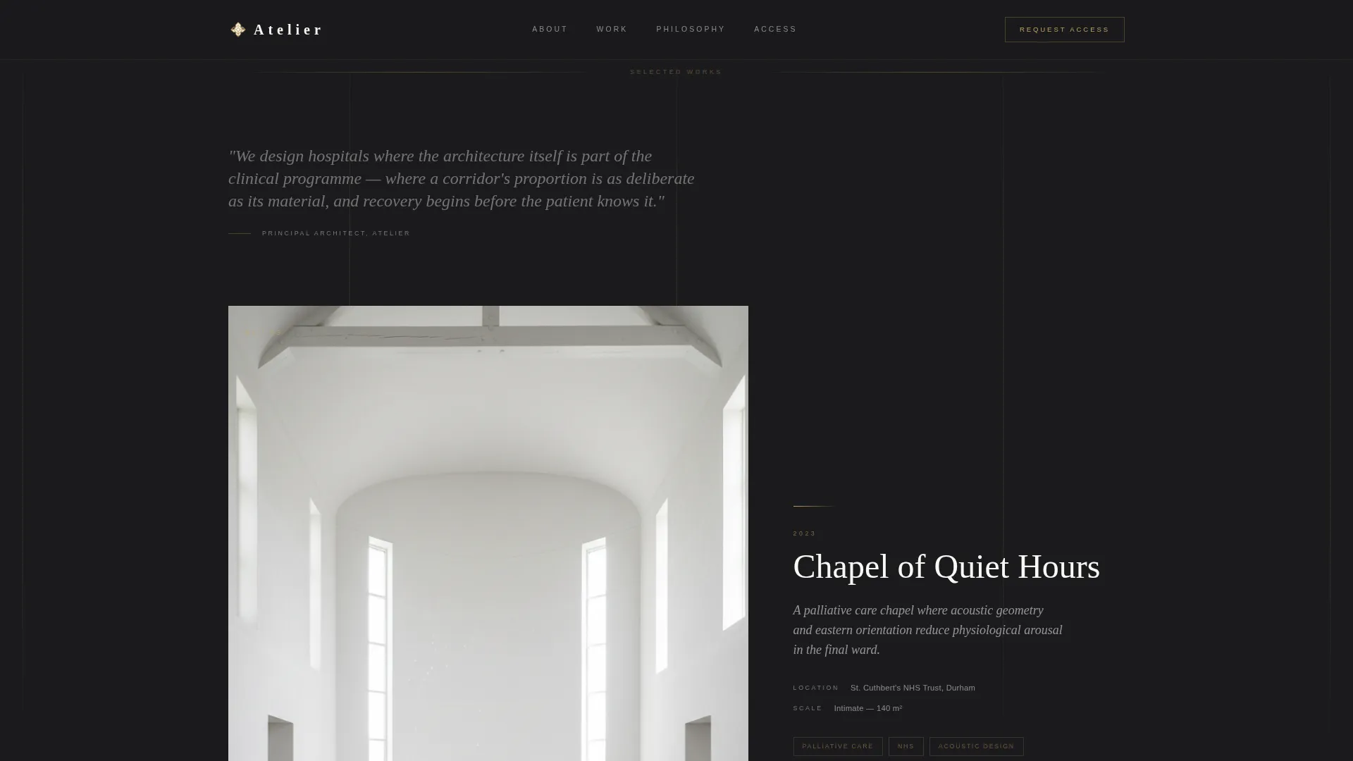
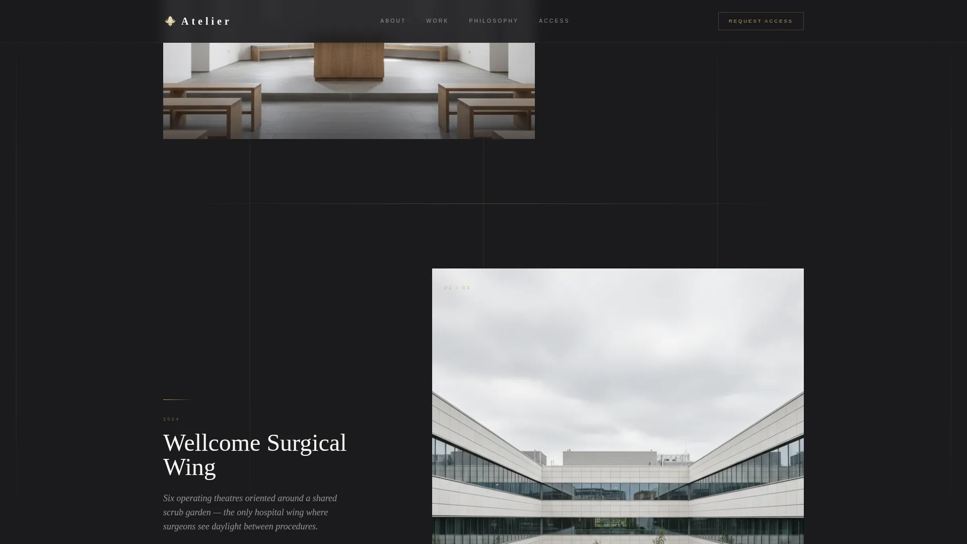
Asymmetric 60/40 Gallery Grid
Each gallery exhibit uses a 60/40 column split. The larger panel holds a single drawing or project image. The smaller panel holds a project title, a one-sentence thesis, and a year. The layout reverses direction between exhibits to keep the eye restless and engaged.
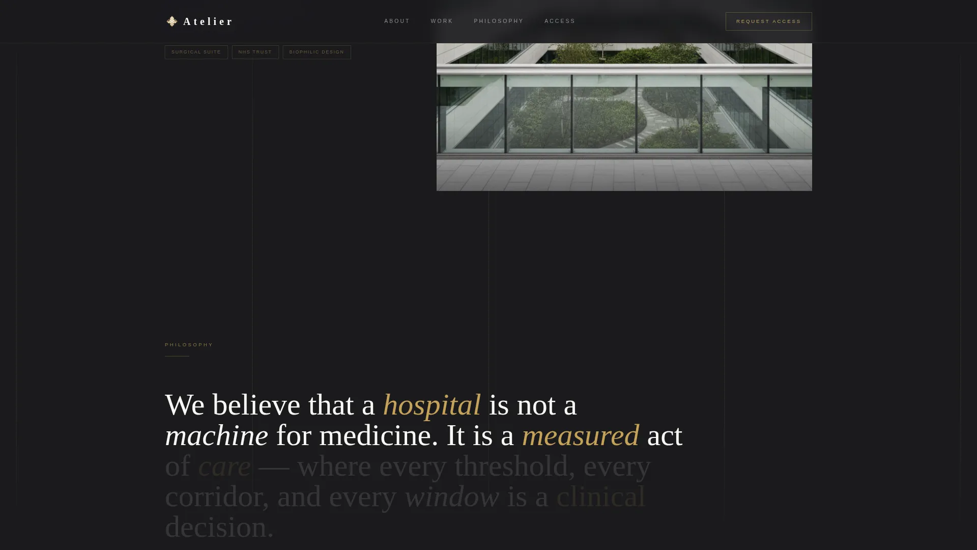
Scroll-Linked Philosophy Reveal
A dedicated scroll section reveals the firm's design philosophy word by word as the visitor scrolls. The effect slows reading pace deliberately and reinforces the studio's voice without requiring the visitor to commit to a long paragraph.
Qualified Intent Waitlist Form
The form asks for name, organisation, and a single dropdown that segments the visitor by role: healthcare estates director, project manager, fellow architect, or simply curious. A secondary line reads "Launching Spring 2025 - limited invitations" to signal scarcity without pressure.
Pinned Magnetic Call to Action
The "Request Early Access" call to action is rendered in brushed gold on black and pinned to the bottom right of the viewport. It appears only after the visitor has completed the gallery walk, so the ask arrives at the moment of highest engagement.
Gallery-Scale Progression
The three exhibit sections build from intimate to monumental. The first shows a chapel inside a palliative care ward. The second shows a regional hospital wing at civic scale. The third shows a 400-bed teaching hospital seen from above. The progression reveals the firm's range through scale alone.
Page sections overview
| Section | Purpose |
|---|---|
| Hero geometric abstraction | Opens on an animated SVG floor plan resolve with a serif tagline |
| Gallery Exhibit One | Displays the palliative care chapel at intimate scale |
| Philosophy scroll reveal | Reveals the firm's design thinking word by word on scroll |
| Gallery Exhibit Two | Shows a regional hospital wing at civic scale with reversed grid |
| Gallery Exhibit Three | Presents the teaching hospital aerial and hosts the waitlist form |
| Footer horizontal flow | Closes the page with a clean horizontal pattern strip |
Design & branding system
The visual identity follows an Atelier Studio theme using an Obsidian and Gold colour system. The palette is designed to feel like a private exhibition catalogue printed on uncoated stock, where gold catches light only when the page moves and black reads as considered restraint rather than void.
- Primary background is deep volcanic black (#1A1A1D); content panels use warm gallery white (#FAF8F5); gold (#C5A258) appears on hover states, dividing rules, and typographic accents; body text sits in muted graphite (#4A4A4F)
- Typography pairs Cormorant Garamond for serif headlines with DM Sans for body copy and labels
- Generous black negative space separates each gallery section, and gold horizontal rules signal the transition to the next exhibit
Mobile & speed optimization
The template is built desktop-first, reflecting the reality that NHS estates directors and procurement leads review architecture materials on large screens. Mobile responsiveness is maintained throughout so the page remains fully usable on smaller viewports.
- SVG animations use GPU-accelerated transforms only, keeping scroll performance smooth on high-resolution displays
- Intersection observer reveals trigger section animations only when elements enter the viewport, avoiding unnecessary processing on load
- The asymmetric grid adapts gracefully to narrower screens without collapsing the spatial hierarchy of each gallery exhibit
How this template helps you convert
The page is structured so that the conversion request arrives only after the visitor has already invested time in the work. The gallery earns the click; the form simply captures what the gallery created.
- The three-second SVG animation and editorial typography establish authority in the first viewport, giving estates directors an immediate signal that this firm thinks differently
- The gallery-walk structure means visitors spend roughly sixty seconds inside the work before reaching the form, arriving at the call to action already wanting to see more
- The role-segmentation dropdown qualifies every submission at the point of entry, so the firm receives organised, actionable intent data rather than an undifferentiated list
Other information about this template
This template is part of a broader set of intersection-matched designs that pair a specific creative direction, colour system, and header concept with a defined niche. The Atelier template specifically sits at the intersection of an Atelier Studio theme, a Gallery Walk creative direction, and an Abstract Geometric header concept within the healthcare and hospital design category.
- The colour system is Obsidian and Gold, a pairing chosen to feel like a premium printed catalogue rather than a digital product page
- The template style is an Asymmetric Grid (60/40), and the landing page direction is Waitlist and Coming Soon
- The footer uses a horizontal flow pattern consistent with clean editorial layouts
- This template is designed for English UK contexts, with NHS procurement language and a professional services tone that reflects the B2B nature of hospital architecture commissions
Theme
Atelier Studio
Creative direction
Gallery Walk
Color system
Obsidian & Gold
Style
Asymmetric Grid (60/40)
Direction
Waitlist/Coming Soon
Page Sections
Animated SVG Floor Plan Hero
Asymmetric 60/40 Gallery Grid
Scroll-linked Word Reveal
Role-segmented Waitlist Form
Pinned Gold Call to Action
Gallery-scale Progression Structure
Related questions
Can I use this template if my firm is not yet ready to launch a full portfolio site?
What kind of project visuals work best in the gallery sections?
Who is the primary audience this landing page is designed to reach?
Is the waitlist form ready to use out of the box?
Can the number of gallery exhibits be changed?


