Fashion Designer Portfolio Specialist Portfolio Website Template
Atelier is a bento grid fashion designer landing page built for creative professionals who need their portfolio to feel like a gallery walk, not a scroll. It pairs a Void & Violet color system with frosted-glass card surfaces, asymmetric grids, and slow motion transitions to showcase case studies with the weight and atmosphere they deserve.
by Rocket studio
Quick summary
Atelier is an immersive, single-page fashion designer portfolio template built on a bento grid layout. It uses a dark, glass-inspired visual identity to frame case studies as gallery-quality editorial moments. The template is designed for lead generation, drawing creative collaborators in through the work itself before presenting a focused, friction-free contact form.
Who this template is for
This template is made for fashion designers who present work to demanding, visually literate audiences. It fits practitioners whose clients want to feel the process, not just see the outcome.
- Independent fashion designers building a case study portfolio for editorial and luxury clients
- Emerging and established designers seeking collaboration inquiries from creative directors and curators
- Fashion professionals who need a portfolio that reads as both immersive editorial experience and direct business pitch
What problem this template solves
Most portfolio templates force designers into predictable grid rows with thumbnail previews and a contact button at the bottom. That structure flattens creative work and loses the attention of editors and creative directors who move quickly. Atelier solves the problem of looking like every other designer's site.
- It replaces passive image galleries with case study grids that shift layout as the visitor scrolls, keeping attention locked to each project
- It removes form-field friction by replacing dropdowns and checkboxes with a single open textarea built for people who think in briefs
- It holds back every conversion prompt until the visitor has moved through seven full case study grids, so the ask feels earned
What you get with this template
You receive a fully structured single-page layout with all major sections built and ready to populate with your own work. The design system, grid behavior, and interaction details are all defined in the template.
- A full-bleed editorial header with ultra-thin oversized type, a hero bento grid section, and seven scrollable case study grid blocks
- Two conversion paths: a fixed collaboration pill button and a full-width closing form section, plus a secondary lookbook download chip beneath each case study
- A cohesive Tech Glass design system with a Void & Violet palette, frosted-glass card surfaces, violet border highlights, and depth-of-field scroll transitions
Feature list
This section covers the core built-in capabilities that define the Atelier template experience.
Asymmetric Bento Grid Layout
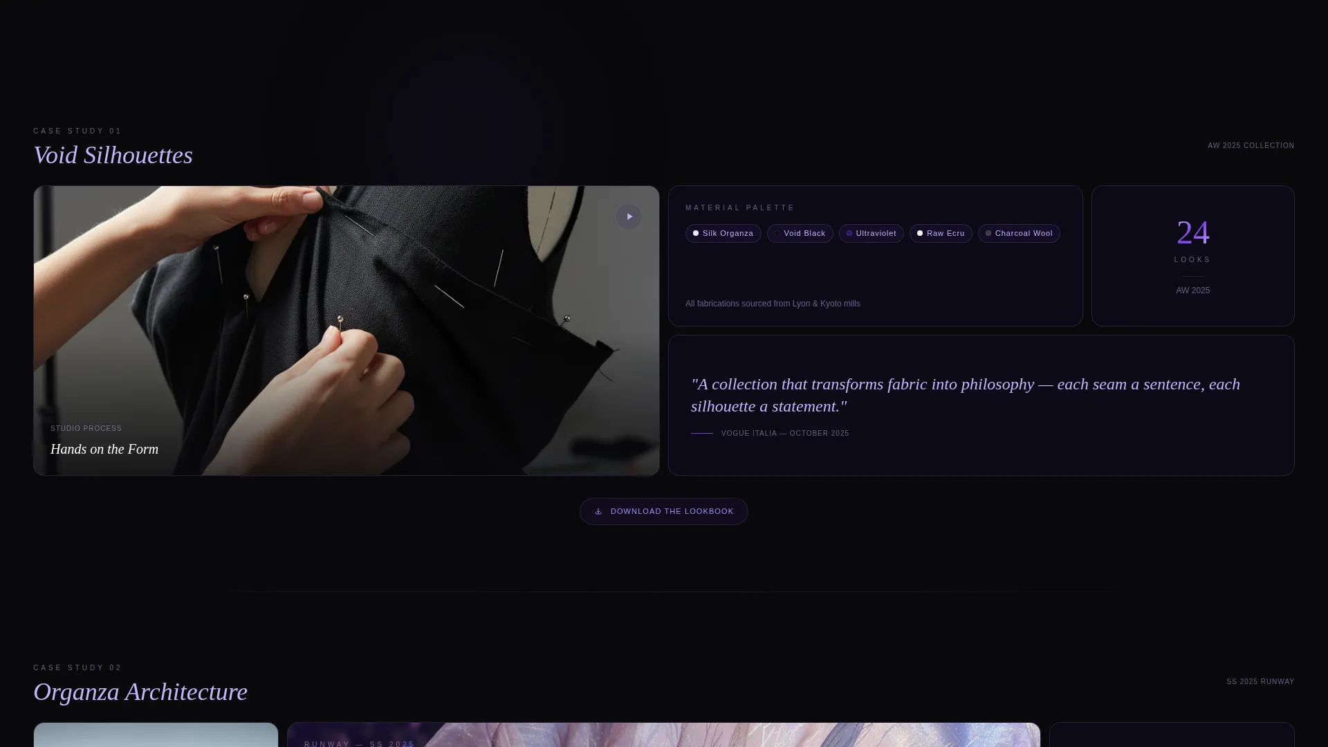
The first case study grid opens with six asymmetric cells arranged at different sizes. A hero video cell spans two rows. A square material palette cell sits beside it. A wide pull quote cell anchors the row below. Each subsequent case study rearranges the grid, so no two project sections feel the same.
Shifting Grid on Scroll
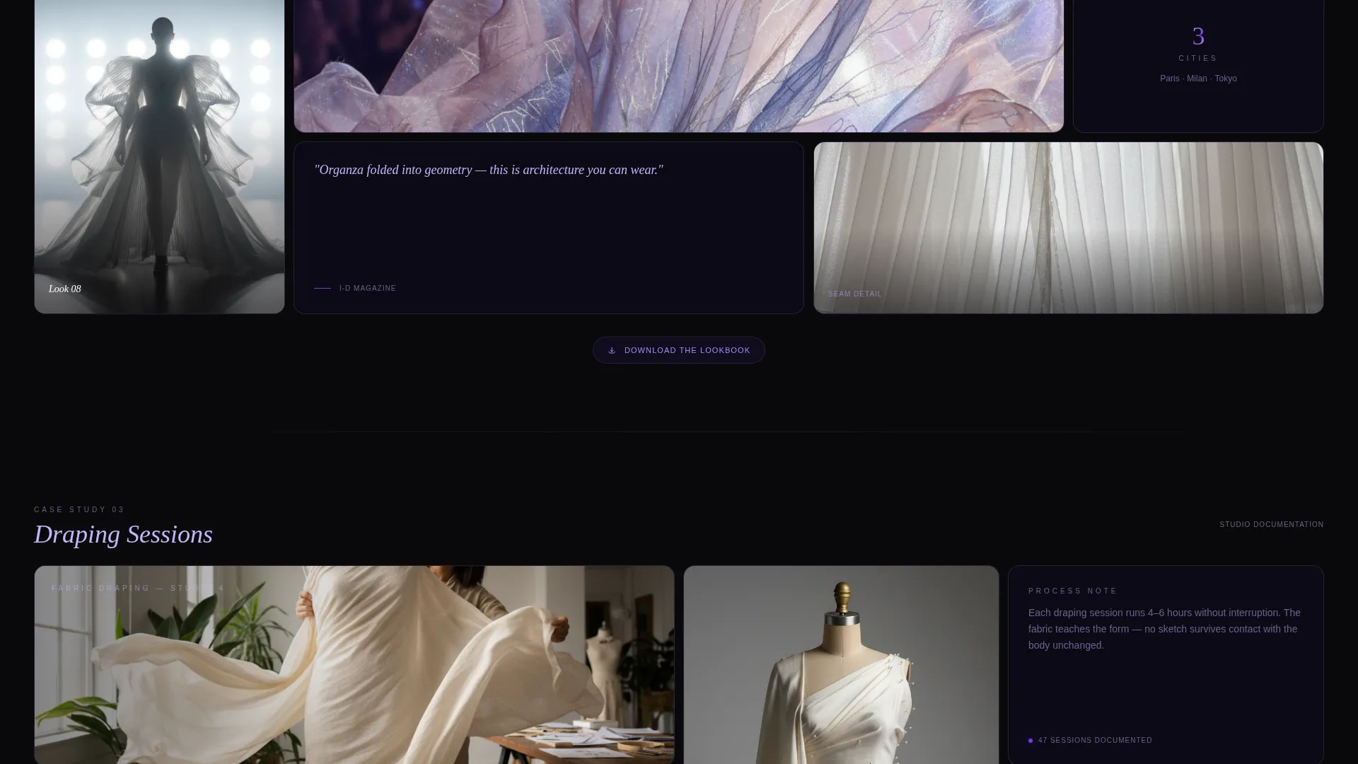
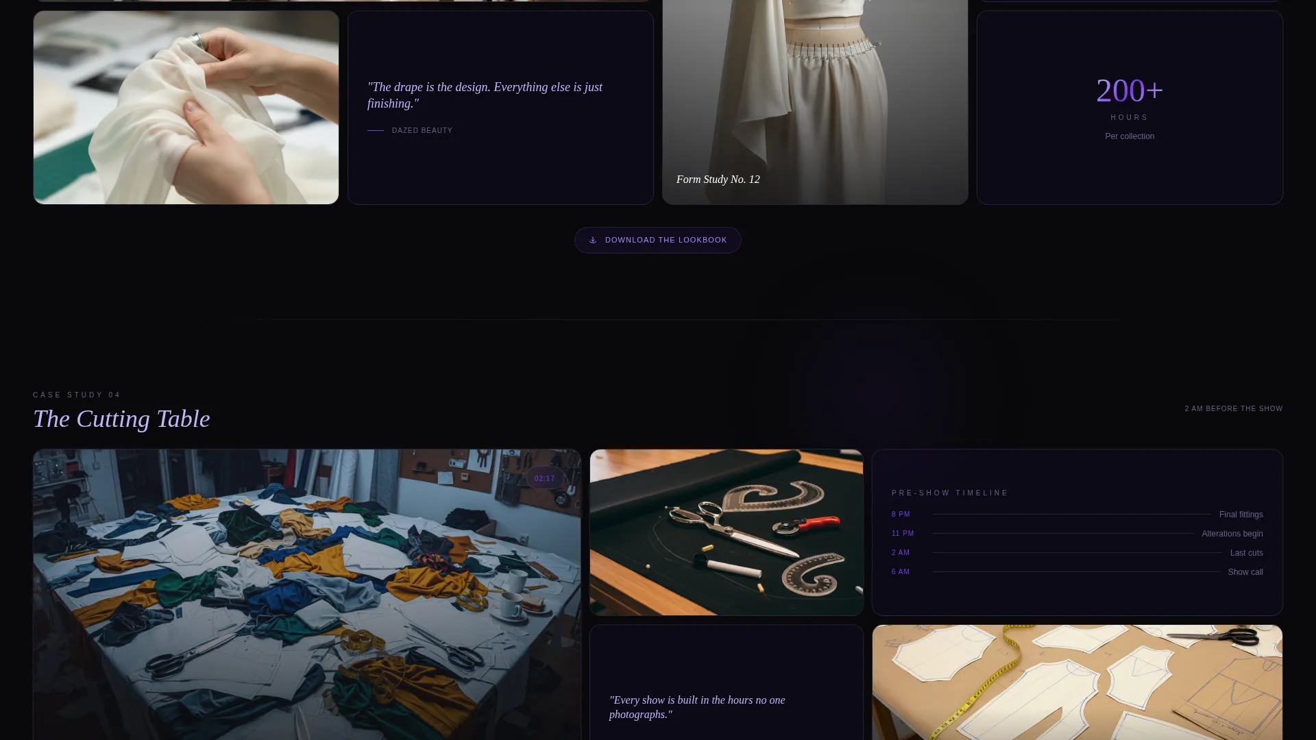
As the visitor scrolls through case studies, cells resize and images swap between studio, runway, and street style contexts. The violet glow migrates across the layout like stage lighting moving between acts, making the scroll feel spatial rather than linear.
Glass-Panel Scroll Transitions
Cells leaving the viewport exit through a depth-of-field blur effect. Transitions are slow and deliberate, referencing the pace of a gallery walk rather than the speed of a feed. This keeps the atmosphere consistent with the editorial tone of the content.
Dual Conversion Architecture
A fixed collaboration pill button appears in the top-right corner after the first scroll. A full-width closing section carries the primary contact form. Both paths lead to the same outcome through different moments in the visitor's journey.
Minimal Collaboration Form
The contact form asks only for name, organization, and an open textarea labeled "Describe your project or vision." No dropdowns, no checkboxes. The structure respects the way creative directors and editors actually communicate.
Lookbook Download Chip
A frosted-glass secondary call-to-action chip sits beneath each case study grid. It offers a lookbook download in exchange for an email address, creating a lower-commitment conversion option for visitors who are not yet ready to reach out directly.
Page sections overview
| Section | Purpose |
|---|---|
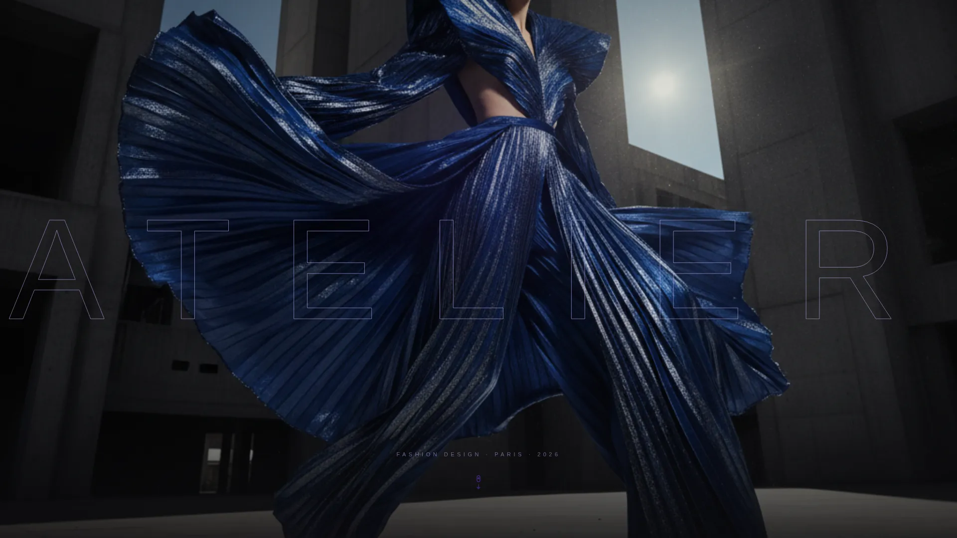
| Full-Bleed Header | Introduces the designer with an editorial photograph and oversized transparent type |
| Hero Bento Grid | Displays the first six-cell asymmetric case study with video, material palette, and pull quote |
| Case Study Grids (x7) | Presents seven scrollable project sections with shifting layouts and migrating violet accents |
| Lookbook Chips | Offers a secondary email capture beneath each case study grid |
| Fixed Collaboration Pill | Provides persistent top-right access to the primary collaboration form after scroll begins |
| Closing Form Section | Delivers the full-width lead generation form with name, organization, and project textarea |
Design & branding system
The visual identity uses a Tech Glass theme built on the Void & Violet color system. Every design decision reinforces the sense of something luminous seen through a dark pane of glass.
- Color palette: absolute black (#09090B) for backgrounds, deep ultraviolet (#2D1B69) for depth, frosted glass lilac (#C4B5FD) for body text, and electric violet (#7C3AED) for hover states and interactive borders
- Card surfaces carry a frosted-glass blur effect with a 1-pixel violet border that catches light as the visitor scrolls
- Typography uses an ultra-thin extended typeface set at 15vw in the header, with tracking blown wide and letterforms made partially transparent so the photograph beneath shows through
Mobile & speed optimization
The template is structured to maintain its visual character across device sizes while keeping the layout legible and navigable on smaller screens.
- Bento grid cells reflow for narrower viewports, preserving the asymmetric character of each case study without breaking the layout
- Motion effects and glass transitions are defined to remain smooth across the intended display contexts described in the brief
How this template helps you convert
The conversion strategy in Atelier is deliberate. It earns attention before it asks for anything, then provides two clear paths for visitors who are ready to act.
- The fixed collaboration pill button surfaces after the first scroll and stays visible throughout the entire page journey, so a ready visitor never has to search for a way to reach out
- Seven full case study grids run before the first hard conversion prompt appears, building trust and creative credibility before the ask is made
- The lookbook download chip beneath each case study provides a soft conversion option for visitors who want to stay connected without committing to a full collaboration brief
Other information about this template
Atelier is purpose-built for the fashion designer case study portfolio niche and reflects the intersection of immersive editorial presentation with practical lead generation goals.
- The template style is Bento Grid, the theme is Tech Glass, the creative direction is Immersive Visual, and the header concept is Type Over Image
- The color system is Void & Violet, and the landing page direction is Lead Generation
- This template is particularly well suited for designers presenting work to fashion editors, luxury brand creative directors, and gallery curators who treat a portfolio visit as an audition
Theme
Tech Glass
Creative direction
Immersive Visual
Color system
Void & Violet
Style
Bento Grid
Direction
Lead Generation
Page Sections
Asymmetric Bento Grid Layout
Shifting Grid on Scroll
Glass-panel Scroll Transitions
Dual Conversion Architecture
Minimal Collaboration Form
Lookbook Download Chip
Related questions
Who is this template designed for?
How does the lead generation flow work?
What makes this different from a standard portfolio grid template?
Can I use this template if I have fewer than seven case studies?
Is any navigation included in the header?



