Software Engineer Personal Brand Landing Page
Atelier is a single-page landing page for software engineers who want their work to speak for itself. It combines a scroll-jacked header, alternating project showcases, and a waitlist section into one intentional layout. The asymmetric 60/40 grid and analog-warm color palette make a personal brand feel crafted, not templated.
by Rocket studio
Quick summary
Atelier is a personal brand landing page built for engineers who ship real things. It uses an asymmetric 60/40 grid to give each project room to breathe, a scroll-jacked header that cycles through three vignettes, and a warm studio palette that feels handmade without sacrificing precision. The result is a page that earns trust before a visitor reads a single word.
Who this template is for
This template suits engineers who want a public-facing home for their work beyond a resume or a GitHub profile. It is designed for makers who have things worth showing.
- Software engineers building a personal brand around side projects and open-source contributions
- Technical writers or developer advocates who publish essays and want a living portfolio
- Speakers, contractors, or senior engineers who want a page that impresses hiring managers and conference organizers
What problem this template solves
Most engineer portfolios are either a plain list of links or an overdesigned site that buries the actual work. Neither one builds the quiet confidence a hiring manager or collaborator is looking for.
- There is no single place that holds projects, writing, and a direct way to follow future work
- Generic templates do not reflect the craft mindset that strong engineers actually have
- A scattered web presence makes it hard for visitors to understand what you build and why it matters
What you get with this template
You get a complete, fully structured landing page built around five distinct content zones. Each zone is designed to do a specific job, from first impression to follow-up capture.
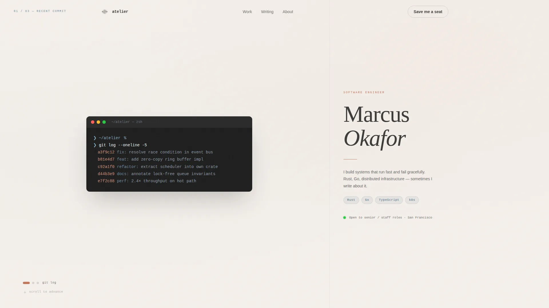
- A scroll-jacked header with three rotating vignettes: a live commit message, an inking architecture diagram, and a typed peer-review pull quote
- An alternating Creator Spotlight section where each project or essay gets a living embed paired with a first-person annotation
- A waitlist section with a live signup counter, a single email field, a "Save Me a Seat" call to action, and a direct GitHub repo star button
Feature list
This section describes the key capabilities built into the Atelier template.
Scroll-Jacked Three-Vignette Header
The viewport locks on load and the visitor's scroll becomes a dial. It rotates through three full-height vignettes: a blinking terminal commit message, a stroke-by-stroke architecture diagram, and a letter-by-letter typed pull quote. The engineer's name stays fixed on the 40-column side throughout, anchoring the experience.
Asymmetric 60/40 Grid Layout
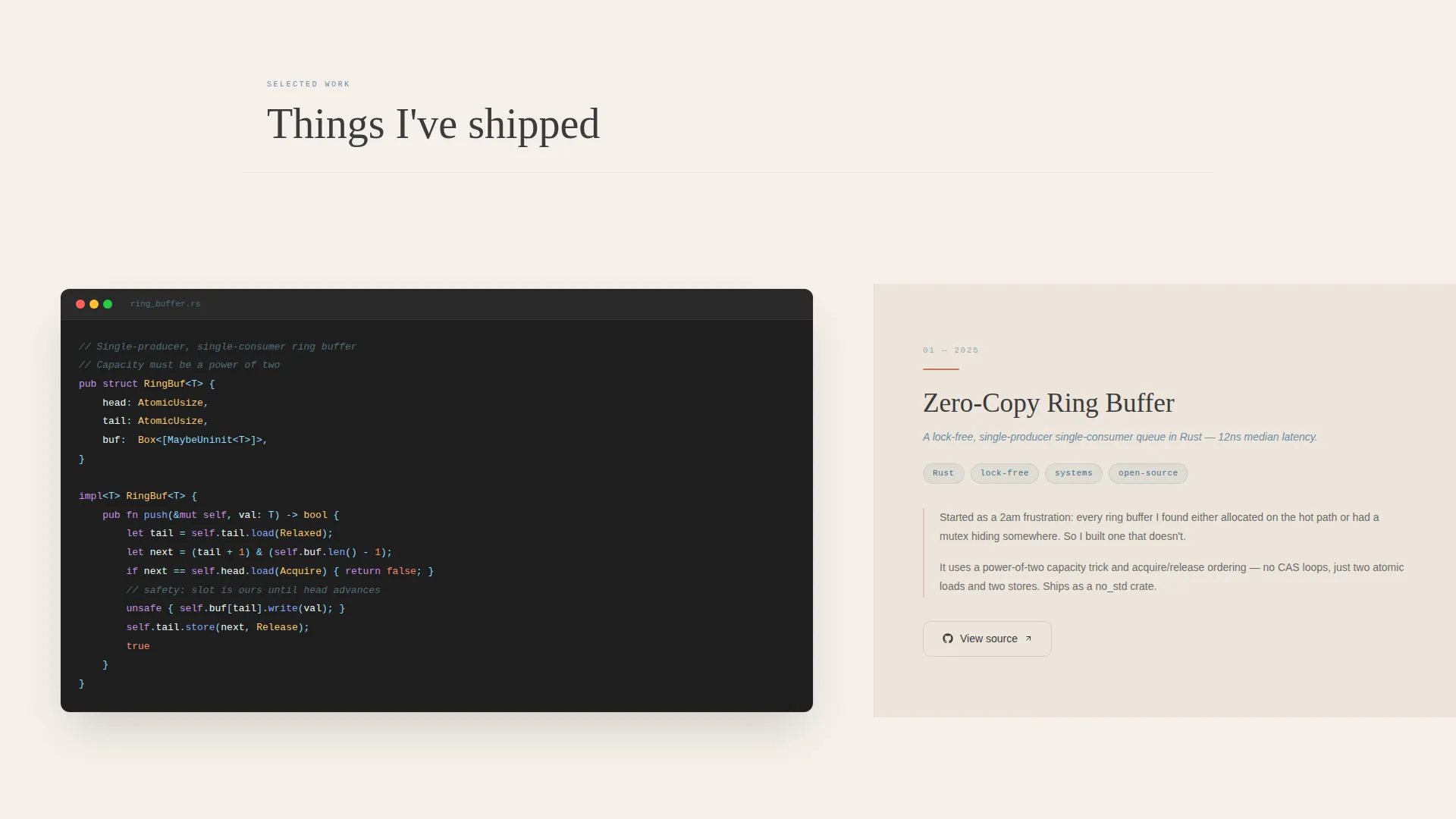
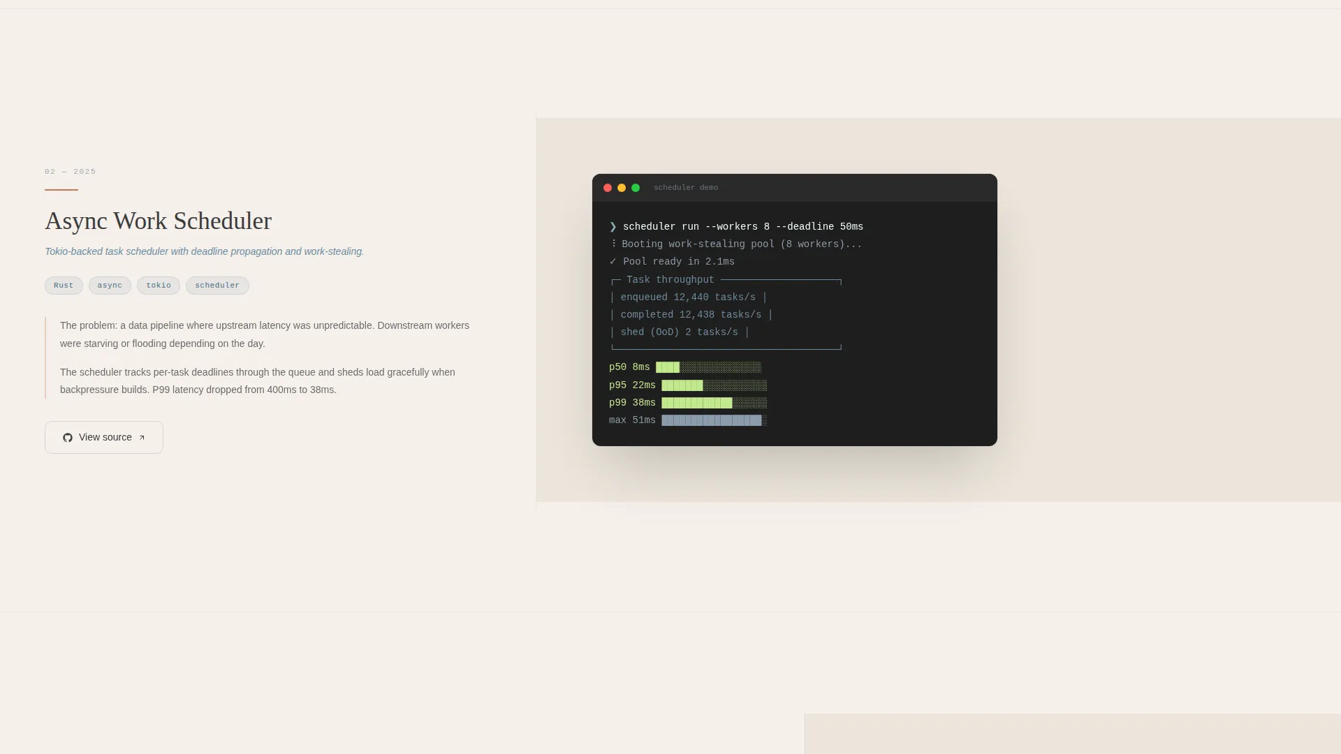
Every content section uses a deliberate 60/40 column split. The wider column holds the living content, such as a working CLI demo, an animated SVG diagram, or a syntax-highlighted code excerpt. The narrower column carries the first-person annotation. The grid alternates sides on each section so the eye keeps moving without feeling lost.
Living Project Embeds
Each project showcase supports a living embed. This means an interactive CLI demo, an animated diagram, or a highlighted code block sits directly in the layout rather than linking away. This keeps the visitor inside the page and shows the work in action.
First-Person Project Annotations
Every project on the 40-column margin carries a short, first-person note explaining why that piece matters. This annotation format feels like reading a creator's sketchbook, which builds credibility and personality at the same time.
Waitlist Section with Live Counter
The final section is built for capturing early interest. A live counter shows how many people have already joined. A one-sentence promise sets expectations clearly. The call-to-action button reads "Save Me a Seat" and a secondary link lets developers star the GitHub repo directly from the page.
Cross-Dissolve Section Transitions
Each scroll section transitions with a subtle cross-dissolve effect. The motion feels like turning a page rather than clicking a navigation link. It reinforces the analog-workshop tone of the whole design without adding visual noise.
Page sections overview
| Section | Purpose |
|---|---|
| Scroll-Jacked Header | Rotates three full-viewport vignettes before releasing scroll |
| Engineer Name Anchor | Holds the name fixed on the 40-column side during header rotation |
| Project Spotlight One | Showcases the first project with a living embed and annotation |
| Project Spotlight Two | Continues alternating grid with second project or essay |
| Project Spotlight Three | Builds stakes toward ambitious systems-level work |
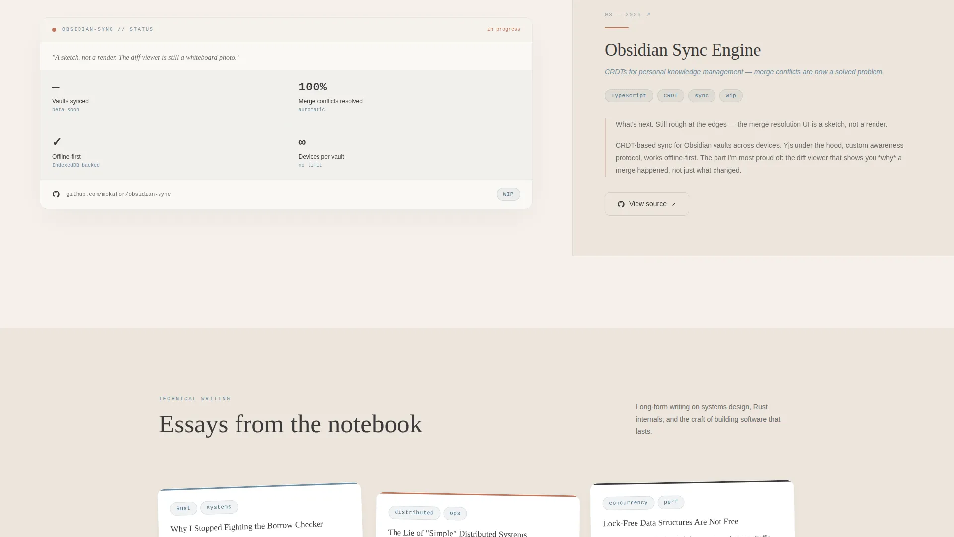
| "What I'm Building Next" | Teases an unfinished next project as a deliberate sketch |
| Waitlist Capture | Email field, live counter, call to action, and GitHub repo star link |
Design & branding system
The Atelier template uses the Cloud Canvas color system, which pairs analog warmth with typographic precision. Every color choice references the feeling of a physical workspace.
- Soft parchment white (#F5F0EB) as the page ground, pencil-sketch graphite (#3B3B3B) for all body text, and drafting-table blue (#6E8CA0) on interactive elements and code highlights
- Kiln-fired clay (#C2785C) activates on hover states and active links, giving interactions a warm, tactile response
- Typography uses a monospaced serif for the engineer's name and headline elements, reinforcing the studio-craft identity across every section
Mobile & speed optimization
The layout is designed to translate its studio feel to smaller screens without losing the intentional rhythm of the desktop experience.
- The asymmetric 60/40 grid reflows gracefully so project embeds and annotations stack cleanly on narrow viewports
- Scroll-jacked header behavior adapts to touch-based scrolling so the vignette sequence remains navigable on mobile devices
- Cross-dissolve transitions are kept subtle and lightweight so the page motion does not overwhelm smaller screens or slower connections
How this template helps you convert
The page is structured to move visitors toward two clear actions: joining the waitlist and starring the GitHub repository.
- The scroll-jacked header creates an immediate strong first impression that holds attention long enough for a visitor to form a genuine opinion before reaching the content sections.
- The Creator Spotlight rhythm builds credibility project by project. By the time a visitor reaches the waitlist section, they have seen real work with real context, which makes the "Save Me a Seat" ask feel earned rather than cold.
Other information about this template
This template works well as a starting point for any engineer who wants a personal brand presence that reflects genuine craft. A few additional details worth noting:
- The "what I'm building next" teaser section is intentionally left as a sketch rather than a finished pitch, which signals active momentum to hiring managers and collaborators
- The secondary GitHub star path in the waitlist section serves developers who trust code over email, offering a low-friction way to stay connected
- The Atelier Studio theme pairs especially well with engineers who write technical essays or maintain open-source projects, since the Creator Spotlight format was built for that kind of work
- This template is built for a single-page landing page format with section-led scroll navigation rather than a multi-page site structure
- The Cloud Canvas palette and Atelier Studio theme are designed to feel cohesive across both light viewing environments and late-night browsing sessions
Theme
Atelier Studio
Creative direction
Creator Spotlight
Color system
Cloud Canvas
Style
Asymmetric Grid (60/40)
Direction
Waitlist/Coming Soon
Page Sections
Scroll-jacked Three-vignette Header
Asymmetric 60/40 Grid Layout
Living Project Embeds
First-person Project Annotations
Waitlist Section with Live Counter
Cross-dissolve Section Transitions
Related questions
Who is this landing page template best suited for?
Can I use this template without a waitlist or email signup?
Does the scroll-jacked header work on mobile devices?
How many projects can I feature in the Creator Spotlight sections?
What makes this different from a standard portfolio template?



