Striking Architect Portfolio Landing Page Template
Atelier is a single-page architect portfolio landing page built on an asymmetric 60/40 grid. It pairs full-bleed project photography with restrained typographic columns, a Type Over Image header, and a minimal waitlist form. The Cloud Canvas color palette and slow parallax dissolve transitions create a gallery-like experience designed to impress competition juries, editorial scouts, and development clients.
by Rocket studio
Quick summary
Atelier is a striking single-page architect portfolio landing page. It uses an asymmetric 60/40 grid to balance immersive project photography against clean typographic columns. A Type Over Image header, Cloud Canvas palette, and slow parallax dissolve scrolling give the page the weight and deliberateness of a large-format print. The built-in waitlist form captures leads while the full portfolio site is in progress.
Who this template is for
This template is built for architects whose work has a clear visual argument. It suits practices at any scale that need to establish presence before a full site is ready.
- Architects entering competition cycles who need a portfolio page that can be shared quickly with juries
- Independent studios scouting editorial coverage from publications focused on architecture and design
- Practices in conversation with developers or clients who want to feel a signature style before committing
What problem this template solves
Most portfolio placeholders look like holding pages. They signal absence rather than intent. Atelier solves the gap between "site under construction" and "this practice is worth calling."
- Visitors scanning dozens of portfolios in an afternoon need a reason to stop; this page gives them one
- Without a curated lead-capture page, early inquiries from editorial directors or commissioning clients go unrecorded
- A generic coming-soon page undermines the credibility that built work has already earned
What you get with this template
You get a fully structured single-page layout ready to be filled with your own photography and project details. Every section is intentional and editable.
- An asymmetric 60/40 grid with a full-bleed image column and a restrained text column running in parallel
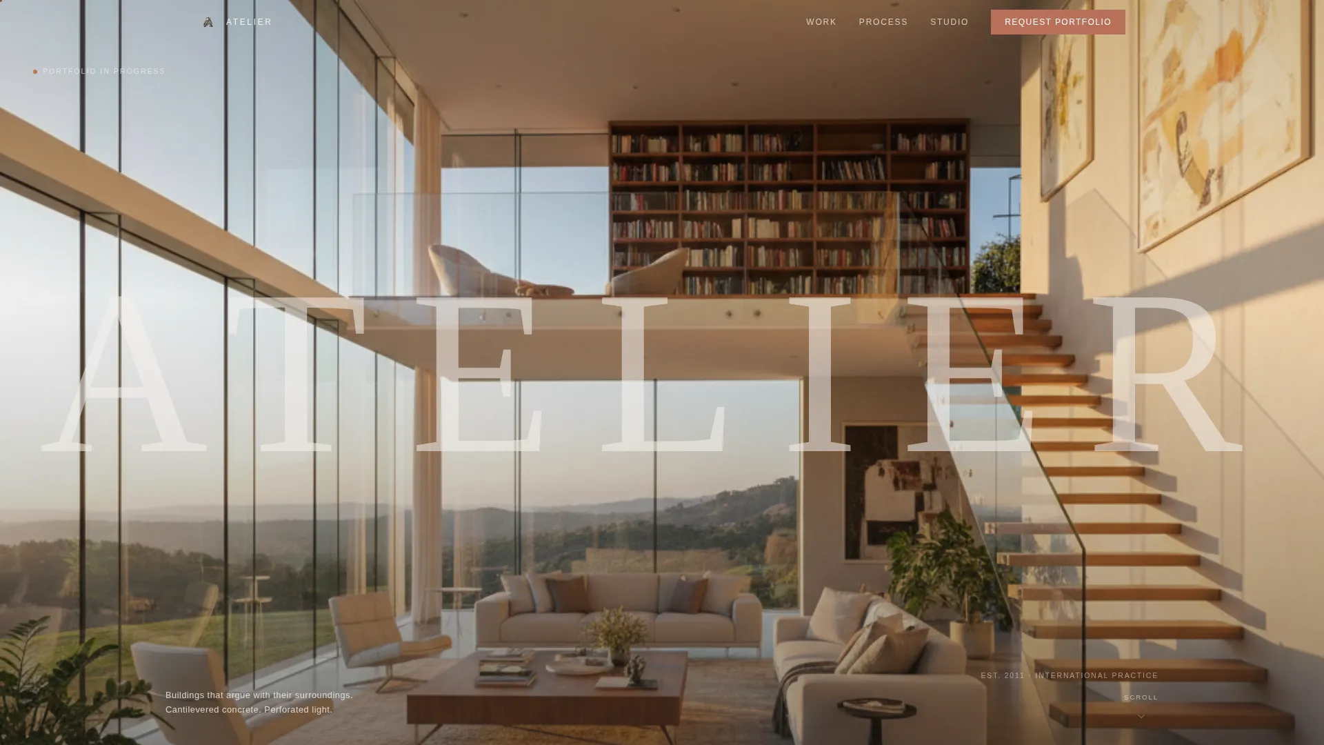
- A Type Over Image header featuring the architect's surname in large, thin-weight uppercase letters laid transparently over a wide-angle interior photograph
- Six project fragments displayed in a scroll-driven sequence moving from exterior to interior to detail, and from built work to unbuilt sketches and models
- A minimal two-field waitlist form (name and email) with a "Request the Full Portfolio" call to action and a secondary studio inquiry line
Feature list
This section covers the core built-in capabilities that define the Atelier template experience.
Asymmetric 60/40 Grid Layout
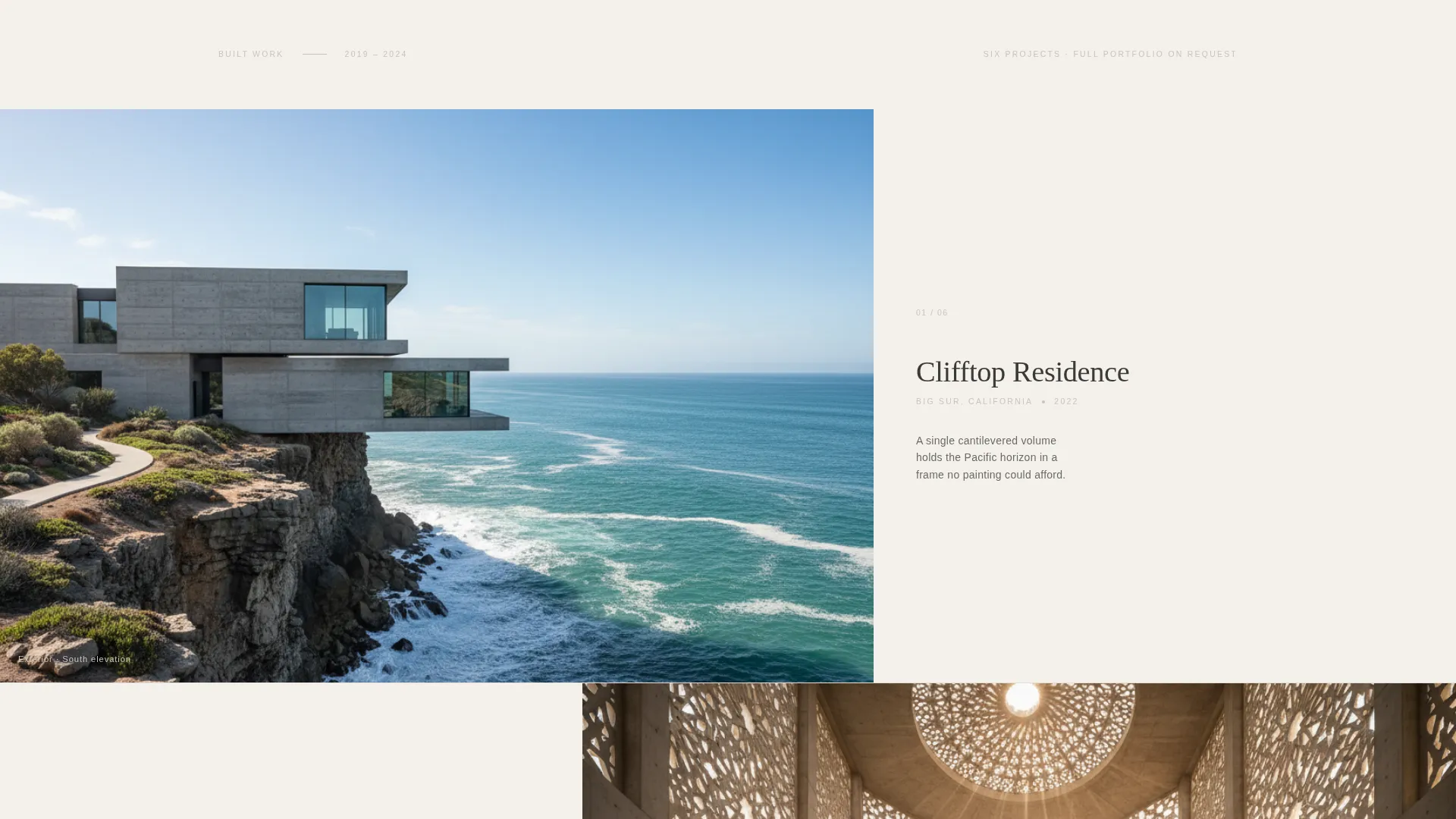
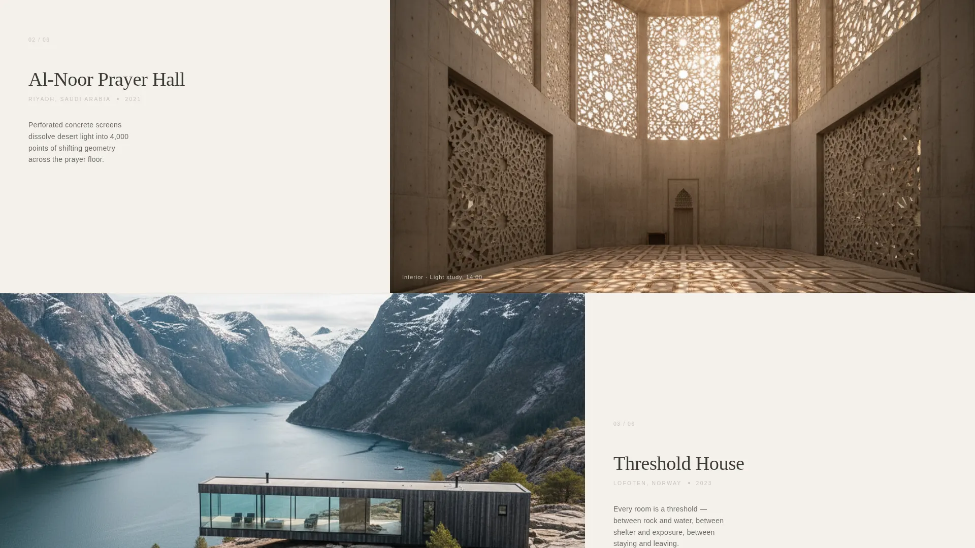
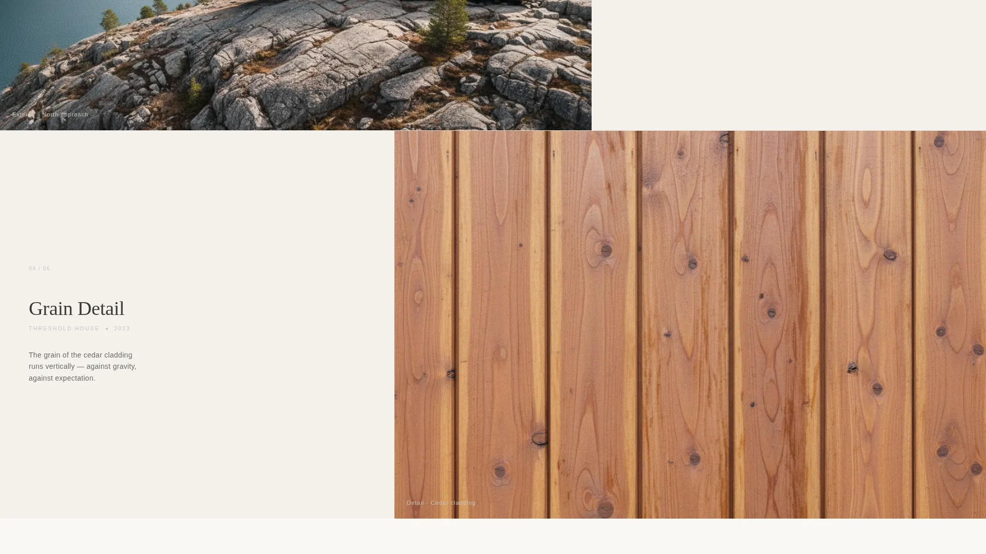
The 60-column carries full-bleed project photography edge to edge. The 40-column holds project name, location, and a single sentence of intent set in a restrained sans-serif against bare white. The contrast between density and breath is the layout's defining rhythm.
Type Over Image Header
The architect's surname is set in enormous, thin-weight uppercase letterforms placed directly over a wide-angle golden-hour interior shot. The type is semi-transparent so the architecture reads through it. The name inhabits the image rather than labeling it.
Scroll-Driven Parallax Dissolve
Each section transition uses a slow parallax dissolve rather than a hard cut. The effect feels like pulling focus on a camera. It keeps the visitor inside the visual world of the work rather than clicking through separate slides.
Curated Project Sequence
Six projects are shown in deliberate fragments. The image column moves from exterior to interior to material detail. The sequence ends with hand sketches, physical models, and sectional drawings, signaling that the most significant work is still ahead.
Waitlist Lead-Capture Form
A minimal two-field form sits in the 40-column gutter beneath the final sketch. Name and email stack vertically. A secondary line provides a direct studio inquiry address for visitors ready to commission without waiting.
Cloud Canvas Color System
The palette uses soft overcast white, warm graphite, haze gray, and a single muted terracotta accent reserved for hover states and the waitlist button. Every color choice reinforces the feeling of a concrete model photographed under diffused light.
Page sections overview
| Section | Purpose |
|---|---|
| Type Over Image Header | Establishes identity with transparent surname letterforms over a golden-hour interior photograph |
| Project Fragment One | Introduces the first built work through exterior photography and a single line of intent |
| Project Fragment Two | Shifts from exterior to interior view, deepening spatial immersion |
| Project Fragment Three | Moves to material detail, slowing the pace and rewarding close attention |
| Project Fragment Four | Continues the sequence toward threshold and boundary conditions |
| Project Fragment Five | Begins the transition from completed buildings to works in progress |
| Unbuilt Work Sequence | Closes with hand sketches, physical models, and sectional drawings |
| Waitlist Capture Form | Collects name and email beneath the final sketch with a studio inquiry fallback |
Design & branding system
The visual identity follows a Lens and Frame theme built around the Cloud Canvas color system. Every decision reads as considered, never decorative.
- Colors: soft overcast white (#F4F1EC) as the base, warm graphite (#3B3A36) for body text, haze gray (#C8C4BC) for supporting elements, and muted terracotta (#B8705A) used only on hover states and the primary call-to-action button
- Typography: a restrained sans-serif used at tight weight in the 40-column, with the header surname set at maximum scale in thin-weight uppercase to create contrast without competition
- Visual rhythm: the 60-column image alternates between landscape, threshold, and material-grain crops while the 40-column maintains consistent white space, producing a steady pulse of image density and typographic breath
Mobile & speed optimization
The layout is designed to translate the asymmetric desktop experience into a focused single-column flow on smaller screens without losing the visual weight that defines the template.
- Full-bleed images stack above their paired text columns on mobile, preserving the exterior-to-interior-to-detail narrative sequence
- The parallax dissolve transitions are designed to feel intentional on touch devices, keeping scroll behavior smooth and unhurried
- The two-field waitlist form remains compact and easy to complete on any screen size, reducing friction for visitors arriving from a shared portfolio link
How this template helps you convert
The page is built around strategic withholding. It shows enough to prove mastery and withholds enough to make the next step feel necessary.
- Six projects shown only in fragments create genuine curiosity; visitors cannot fully satisfy it without requesting the full portfolio, which is exactly what the form asks them to do
- The studio inquiry line below the form gives decisive visitors a direct path to commission, capturing high-intent leads who would otherwise leave without acting
- The unbuilt work sequence at the end reframes the waitlist as access to something not yet public, making the signup feel like an early invitation rather than a contact form
Other information about this template
Atelier is built for a specific professional context and works best when the photography used matches the deliberate, overcast quality of the Cloud Canvas palette.
- The template suits a Lens and Frame visual theme where light, weight, and materiality communicate the practice's sensibility
- Page type: single-page landing page with a Waitlist and Coming Soon direction, making it suitable as a pre-launch presence while a full multi-page site is developed
- The Immersive Visual creative direction means the template relies on high-quality architectural photography; placeholder or stock images will reduce the intended impact
- The template style is Asymmetric Grid (60/40), which creates strong visual contrast on widescreen displays while collapsing gracefully on narrower viewports
- It sits within the Portfolio and Agency category, specifically the Architect One-Page Portfolio niche, and is designed to serve that use case exclusively
Theme
Lens & Frame
Creative direction
Immersive Visual
Color system
Cloud Canvas
Style
Asymmetric Grid (60/40)
Direction
Waitlist/Coming Soon
Page Sections
Asymmetric 60/40 Grid Layout
Type Over Image Header
Scroll-driven Parallax Dissolve
Curated Project Sequence
Minimal Waitlist Lead-capture Form
Cloud Canvas Color System
Related questions
Who is this landing page template designed for?
Can I show more or fewer than six projects?
What does the waitlist form collect?
Do I need professional architectural photography to use this template?
Is this template suitable as a permanent portfolio page?