Interior Design Studio Pricing Website Template
Atelier is a single-page commercial interior design landing page template built for studios that transform workplaces, hospitality spaces, and headquarters. It leads with an interactive cost estimator, then unfolds three escalating case studies in a 60/40 asymmetric grid. The result is a page that earns trust by delivering real value before asking for anything.
by Rocket studio
Quick summary
Atelier is a conversion-focused landing page template for commercial interior design studios. It opens with a live cost estimator that gives visitors a real number before they read a single word of copy. Three magazine-style case studies follow, building proof across escalating project scales. The design runs a Charcoal and Amber palette that feels tactile, deliberate, and premium.
Who this template is for
This template is built for studios whose clients make considered, high-value decisions before ever picking up a phone. It fits professionals who need a page that does the qualifying for them.
- Commercial interior design studios pitching office fit-outs, hospitality renovations, and headquarters builds
- Independent designers and boutique firms targeting office managers, hospitality groups, and startup founders
- Studios that rely on proof of range and want case studies to carry the conversion weight
What problem this template solves
Most interior design pages look like portfolios with a contact form bolted on. They show finished rooms but never answer the question every client is silently asking: what will this actually cost me? Atelier solves that gap directly.
- Visitors leave other pages without a number, a timeline, or a reason to book a call
- Generic hero images fail to communicate the studio's process, scale, or material sensibility
- There is no guided path from curiosity to commitment on most design studio pages
What you get with this template
Atelier delivers a fully structured, single-page layout built around two core mechanics: an estimator that hooks attention and case studies that hold it. Every section has a defined role in moving a visitor toward a booked walkthrough.
- An interactive estimator section with space type selection, a draggable square footage slider, finish tier choices, and a live cost range display with amber number animations
- Three full case study narrative sequences, each spanning multiple scroll sections with quoted client briefs, desaturated before photography, scope and material detail panels, and full-color finished-space reveals
- Dual conversion paths: a primary "Book Your Walkthrough" call to action with a scheduling module and a secondary "Download Our Lookbook" path gated behind an email field
Feature list
This template is built around specific interactive and narrative components grounded in the source brief. Each one has a defined role in the page's conversion flow.
Interactive Cost Estimator
Visitors select a space type from office, hospitality, or retail, then drag a slider to input approximate square footage. They choose from three finish tiers: Essential, Signature, and Bespoke. A live cost range updates in real time on the 40-column side, with soft amber number animations. The single anchoring headline reads: "What does your space actually cost to transform?"
Asymmetric 60/40 Grid Layout
The page uses a deliberate asymmetric grid that divides content into a dominant 60-column and a supporting 40-column. This split gives the estimator tool and case study narratives visual hierarchy without relying on stock photography or a conventional hero image.
Case Study Narrative Sequences
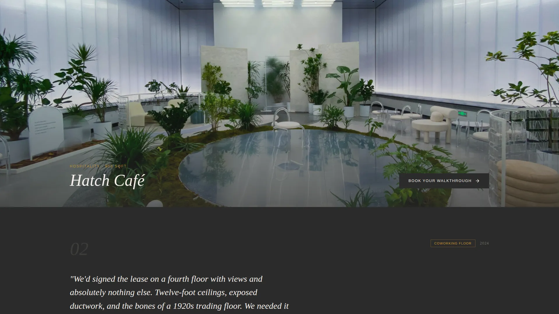
Three case studies unfold across multiple scroll sections like magazine features. Each begins with a quoted client brief set in italics against charcoal, moves through a desaturated before photograph paired with scope and material detail, and closes with a full-color finished-space image bleeding across the entire grid. Project scale escalates from a 900-square-foot café to a 22,000-square-foot hotel lobby.
Scheduling and Booking Module
The primary call to action, "Book Your Walkthrough," links to a scheduling module that includes date selection, a site address field, and a project urgency dropdown with three states: exploring, budgeted, and ready to start. This module appears first beneath the estimator result and again after each case study.
Gated Lookbook Download
A secondary conversion path offers a downloadable lookbook behind an email field. This captures visitors who are not yet ready to commit to a walkthrough, giving the studio a warm lead without losing the contact.
Charcoal and Amber Visual System
The entire page is built on a four-color palette: deep studio charcoal (#2B2B2B), warm plaster gray (#A89F91), raw amber (#D4952A) for accents and interactive states, and linen white (#F5F0EB) for negative space. Typography and layout decisions reinforce a tactile, deliberately unfinished studio aesthetic.
Page sections overview
| Section | Purpose |
|---|---|
| Estimator tool header | Opens the page with the interactive cost estimator as the primary hook |
| Live cost display | Shows the real-time cost range with amber animations on the 40-column |
| Primary call to action block | Places "Book Your Walkthrough" directly beneath the estimator result |
| Case study one | Presents the 900-square-foot café project across multiple scroll sections |
| Case study two | Presents the 4,000-square-foot coworking floor with scope and material detail |
| Case study three | Presents the 22,000-square-foot hotel lobby as the range-proving finale |
| Repeat call to action blocks | Reinforces the booking call to action after each case study |
| Lookbook download gate | Captures email leads from visitors not ready to book a walkthrough |
Design & branding system
The palette is built to feel like a moodboard pinned under a brass desk lamp. Every color choice reinforces the studio's confident, tactile identity rather than a generic luxury aesthetic.
- Four-color system: deep studio charcoal (#2B2B2B) as the base, warm plaster gray (#A89F91) as a secondary surface, raw amber (#D4952A) for all accents and interactive states, and linen white (#F5F0EB) for breathing room
- Typography and layout follow a Luxe Minimal theme, with italicized client quotes set against charcoal panels and desaturated photography in contrast with full-color finished-space reveals
- The Gallery and Detail template style organizes visual assets and narrative copy in a deliberate sequence, reinforcing the sense of walking through a showroom after hours
Mobile & speed optimization
The 60/40 asymmetric grid is designed to restack gracefully on smaller screens without losing the hierarchy between the estimator tool and its supporting cost display. The page avoids stock photography in its header section, which reduces early load weight.
- The draggable slider and live cost range are structured for touch interaction on mobile devices
- Case study image panels, including desaturated before photographs and full-color finished-space reveals, are laid out for sequential scrolling on narrow viewports
- The booking module fields, including date selection, site address, and urgency dropdown, are sized and spaced for comfortable mobile input
How this template helps you convert
Atelier is structured around a specific psychological sequence. Every section is placed to move a visitor from curiosity to a booked appointment without relying on aggressive copy or pushy tactics.
- The estimator gives real value first. Visitors see their own number before any pitch is made. That number creates a stake in the page and a reason to keep reading.
- The escalating case studies build proof in stages. Moving from a 900-square-foot café to a 22,000-square-foot hotel lobby shows range without claiming it. Each project is told in the client's own words first, which builds trust before the studio speaks.
- The dual call-to-action structure meets visitors where they are. Ready buyers land on "Book Your Walkthrough" with a scheduling module. Visitors still researching get a lookbook gated behind an email field, so no lead is lost.
Other information about this template
This template sits at the intersection of the Real Estate and Property category with an Interior Design Studio subcategory. The niche alignment points toward a Bohemian and Eclectic Design sensibility, which shows up in the deliberately unfinished material quality of the palette and the handwritten-notes aesthetic referenced in the brief. The creative direction follows a Stats-First Impact approach, where the estimator tool functions as the headline metric. The header concept is built around that interactive tool rather than a conventional image or tagline. The template style is Gallery and Detail, and the theme is Luxe Minimal, a combination that keeps the page visually restrained while letting the case study photography carry emotional weight. The landing-page direction is Direct Sales, meaning every structural decision serves a booked walkthrough or a captured email.
- Template category: Real Estate and Property, Interior Design Studio subcategory
- Theme and style: Luxe Minimal theme with a Gallery and Detail template style
- Creative direction: Stats-First Impact via the interactive estimator as the page hook
- Niche alignment: Bohemian and Eclectic Design sensibility expressed through palette and material language


Theme
Luxe Minimal
Creative direction
Stats-First Impact
Color system
Charcoal & Amber
Style
Gallery + Detail
Direction
Direct Sales
Page Sections
Interactive Cost Estimator with Live Output
Asymmetric 60/40 Grid Structure
Three Escalating Case Study Sequences
Walkthrough Booking Module
Gated Lookbook Download Path
Charcoal and Amber Palette with Tactile Identity
Related questions
Can I change the finish tier labels in the estimator?
Does the estimator calculate real pricing automatically?
Can I replace the included case studies with my own projects?
Is the booking module connected to a calendar system?
What happens when a visitor submits the lookbook email form?


