Interior Designer Portfolio Landing Page Template
Atelier is a masonry-style interior designer landing page template built around a dramatic Before/After Slider hero and a glass-morphism card grid. It combines portfolio projects and blog content in a single scrollable flow, captures leads through a structured intake modal, and wraps everything in a dark Void & Violet visual identity that feels like a high-end design showroom.
by Rocket studio
Quick summary
Atelier is a single-page interior designer portfolio and blog landing page. It pairs a full-viewport Before/After Slider header with an immersive masonry grid that interleaves finished projects, essays, and mood boards. A fixed frosted-glass call-to-action bar and a structured lead-capture modal turn passive visitors into qualified project enquiries.
Who this template is for
This template is built for design professionals who need their digital presence to match the quality of their physical work. It suits practitioners who blend editorial storytelling with client portfolio content.
- Interior designers building a combined portfolio and blog presence
- Boutique developers and creative directors scouting talent or sourcing set-design inspiration
- Design studios wanting to convert midnight-scroll visitors into booked consultations
What problem this template solves
Most portfolio templates force a choice: look impressive or capture leads. Atelier removes that trade-off. It presents work with gallery-level visual weight while quietly routing every engaged visitor toward a structured intake form.
- Visitors leave without enquiring because there is no clear, low-friction next step
- Portfolio grids feel static, showing finished work without conveying process or depth
- Generic contact forms collect little useful information before a first meeting
What you get with this template
You get a complete, section-led landing page that handles visual storytelling and lead generation in one flow. Every component described below is included and ready to customise.
- A full-viewport Before/After Slider header with a reveal animation and typographic entrance effect
- An interleaved masonry grid of portfolio cards and blog posts with hover Ken Burns zoom and violet drop-shadow lift
- A fixed frosted-glass call-to-action bar and a four-step lead-capture modal with project type selector, room checklist, inspiration upload dropzone, and email field
Feature list
This section details the key functional and visual components the template delivers.
Before/After Slider Header
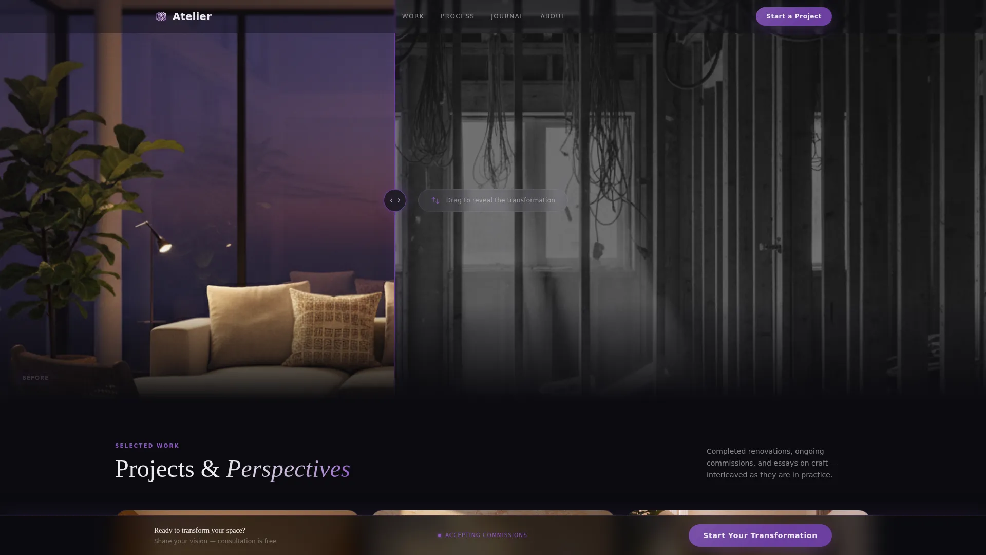
The header fills the full viewport with a split image: a desaturated gutted room on the left and a finished, richly coloured interior on the right. A thin violet slider handle lets visitors drag the reveal themselves. The headline "See what's possible" appears in spectral white, letter by letter, only after the slider is first touched.
Masonry Portfolio and Blog Grid
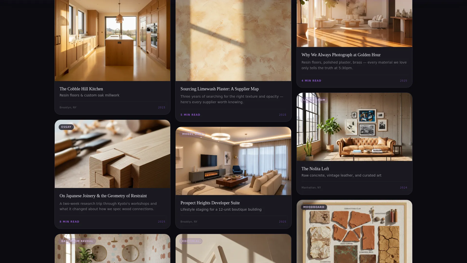
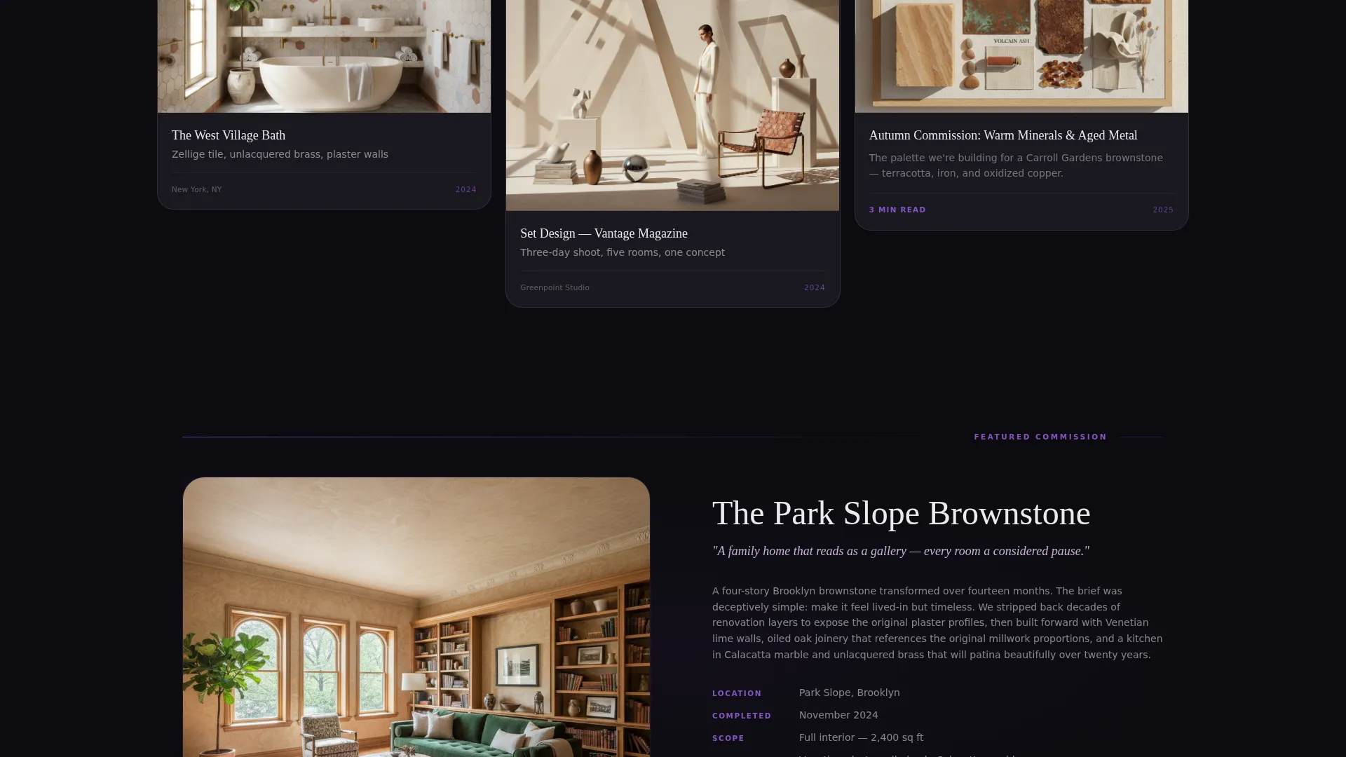
Cards are arranged in a Pinterest-style masonry layout below the fold. Projects and blog posts sit side by side, so a kitchen renovation can appear next to an essay on Japanese joinery. Hovering any card lifts it with a violet drop-shadow and triggers a slow Ken Burns zoom into the image.
Fixed Lead-Capture Bar
A frosted-glass bar is pinned to the bottom edge of the viewport. It becomes visible only after a visitor has scrolled past three rows of masonry content, so it appears when interest is already established rather than immediately on arrival.
Four-Step Intake Modal
Clicking the primary call-to-action opens a modal over the dark void background. Visitors move through project type selection, a room-by-room checklist, an inspiration photo upload dropzone, and an email field. The sequence mirrors a real designer intake conversation: vision first, logistics second.
Blog Post Soft Call-to-Action
Every blog post in the grid ends with the prompt "Want this for your space?" This secondary path catches visitors who arrived for written content and links them directly to the same intake modal, extending lead capture across the editorial layer.
Scroll-Driven Card Progression
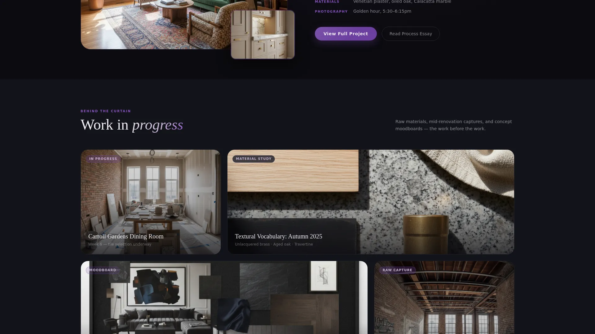
As visitors scroll deeper into the masonry grid, the content shifts gradually from polished completed projects toward in-progress work, raw material shots, and mood boards. The sequence pulls the viewer behind the scenes, creating a sense of collaboration rather than passive browsing.
Page sections overview
| Section | Purpose |
|---|---|
| Before/After Slider | Hero reveal and first impression |
| Slider Headline Reveal | Typographic entrance on interaction |
| Masonry Card Grid | Portfolio and blog interleaved |
| Fixed call to action Bar | Persistent low-friction entry point |
| Lead Capture Modal | Four-step structured project intake |
| Blog Soft call to action | Editorial-to-enquiry conversion path |
Design & branding system
The visual identity follows a Tech Glass theme built on the Void & Violet color system. Every surface is intentional: dark backgrounds make imagery pop, frosted glass adds depth without clutter, and violet accents carry the eye through the page.
- Core palette: absolute void black (#0B0B0F) for backgrounds, frosted glass lilac (#C4B1D4) for card surfaces and hover states, deep electric violet (#6C3FA0) for accent lines and active elements, and spectral white (#EDEAF0) for body and display typography
- Glass-morphism treatment: masonry cards carry a subtle blur and translucency that makes them appear to float above the void canvas
- Violet pulse details: borders, scroll indicators, and progress bars all use the electric violet accent, giving the page a consistent sense of energy and direction
Mobile & speed optimization
The layout is designed to adapt across screen sizes without losing its visual character. The masonry grid, modal, and fixed bar all reflow for smaller viewports.
- The masonry grid adjusts column count for tablet and mobile viewports, keeping cards legible and well-proportioned
- The fixed call-to-action bar remains accessible on touch devices and does not obscure primary content
- The Before/After Slider is touch-enabled, allowing mobile visitors to drag the reveal handle the same way desktop users do
How this template helps you convert
Every design and flow decision in Atelier is oriented toward turning a curious visitor into a project enquiry. The conversion path has three distinct moments.
- The Before/After Slider creates an immediate emotional response. Visitors experience the transformation first-hand before they read a single word about services.
- The masonry grid builds sustained engagement. Interleaved projects and essays keep visitors scrolling, and the scroll-driven progression from finished work to process content deepens trust over time.
- The fixed call-to-action bar and four-step modal provide a clear, structured next step. By the time a visitor reaches the modal, they have already self-qualified through the intake sequence.
Other information about this template
Atelier fits naturally into a creative professional's broader digital toolkit. The following points cover practical considerations for getting started and customising the template.
- The template is built as a single-page landing page, making it straightforward to deploy without managing a multi-page site structure
- All colour values are defined in a central palette, so rebranding to a different color system requires changing a small set of variables rather than editing every component individually
- The masonry grid supports both landscape and portrait images, accommodating the variety of aspect ratios common in interior and architectural photography
- The inspiration upload dropzone in the modal is designed for drag-and-drop interaction, matching the behaviour visitors already use on image-heavy platforms
Theme
Tech Glass
Creative direction
Immersive Visual
Color system
Void & Violet
Style
Masonry/Pinterest
Direction
Lead Generation
Page Sections
Before/after Slider Hero
Masonry Portfolio Grid
Scroll-driven Content Progression
Fixed Frosted-glass Call to Action Bar
Four-step Lead Intake Modal
Blog Soft Call to Action Integration
Related questions
Can I use this template for a commercial interior design portfolio?
Do I need a blog to make this template work?
How does the Before/After Slider work on mobile?
Can I adjust the intake modal fields to match my process?
Is Atelier suitable for a designer with a small portfolio?