Architects Co-Working Community Landing Page
Atelier is a single-page fundraising and membership landing page built for an architects co-working community. It uses a warm editorial card grid to guide visitors from the story of solo practice to a three-tier donation flow. The layout pairs a cinematic photo header with asymmetric modular sections, community stats, member quotes, and a sticky "Keep the Lights On" call to action.
by Rocket studio
Quick summary
Atelier is a donation-focused landing page template for an architects co-working community. It tells a clear Vision and Mission story, from the loneliness of solo practice to the warmth of a shared studio. A modular card grid, a sticky donation bar, and a three-tier giving modal work together to turn visitors into donors or members.
Who this template is for
This template is built for people running or launching a shared studio, co-working community, or membership-based space in the architecture world. It suits organizations that need to raise funds and recruit members at the same time.
- Independent architects running a co-working or shared studio community
- Graduate architects and small partnerships who need a professional desk outside a home office
- Community organizers and nonprofit teams in the architecture space seeking donor support
What problem this template solves
Solo architectural practice can feel isolating. Commercial lease costs are high, and the studio culture that once made architecture a communal discipline has largely disappeared for independent practitioners. This template gives a community space a clear, emotionally resonant way to tell that story online and collect support.
- Communicates the value of shared studio culture to visitors who may not know they need it
- Provides a structured donation flow so supporters can give in 60 seconds without friction
- Offers a secondary membership path so architects who arrive to donate can also sign up
What you get with this template
You get a fully structured, single-page layout that moves visitors through a complete fundraising narrative. Every section is pre-designed with the warm, editorial feel of a well-worn drafting table.
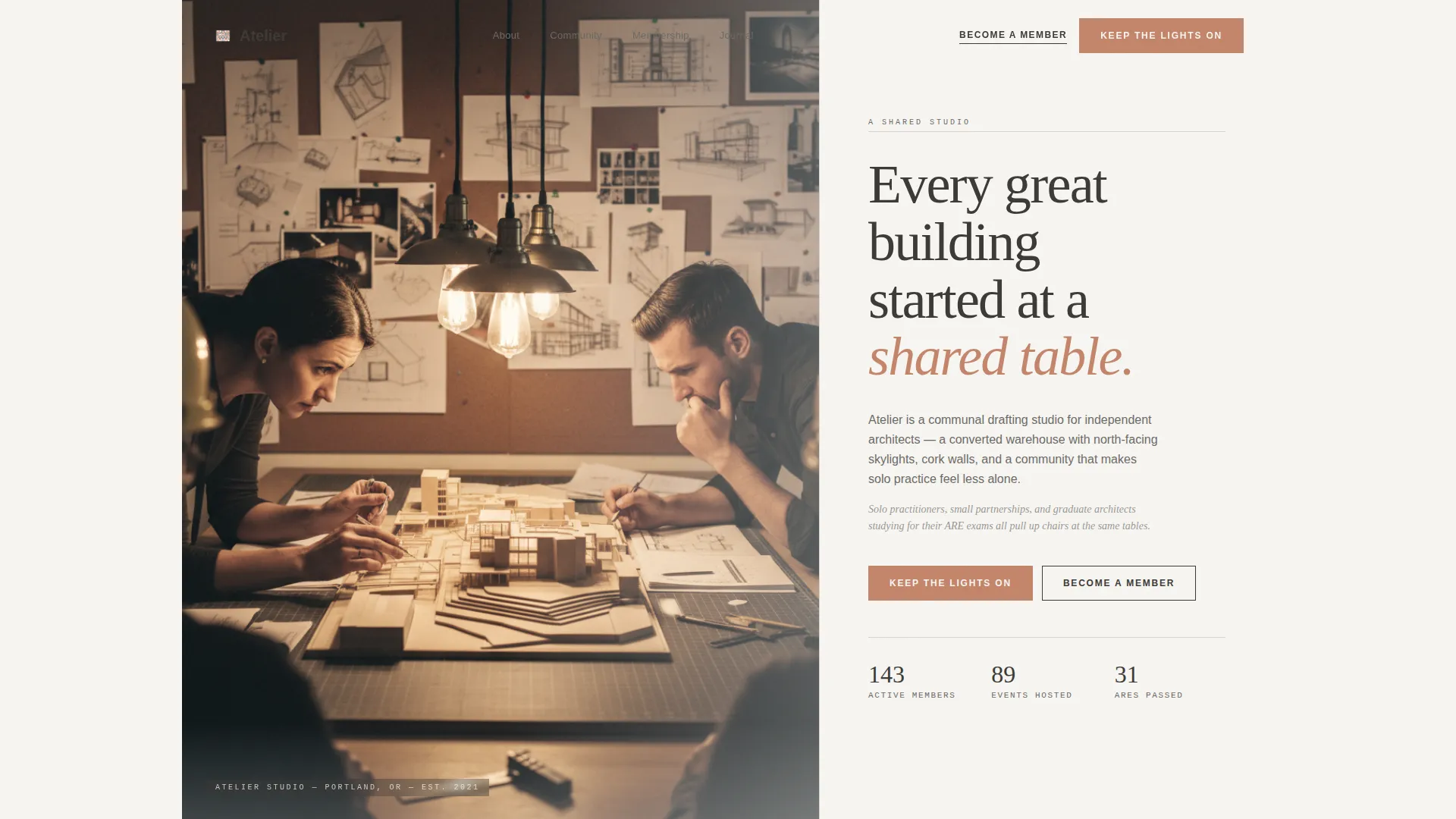
- A cinematic half-page photo header with a large serif headline and a terracotta call-to-action button above the fold
- A modular card grid covering mission, community stats, member quotes, donation tiers, and expansion vision
- A three-tier donation card modal and a sticky donation bar that appears after the midpoint scroll
Feature list
This template includes a focused set of built-in components designed for community fundraising and membership conversion.
Half-Page Photo and Text Header
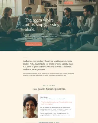
The header splits the viewport: a golden-hour warehouse photograph on the left and a generous serif headline on the right. The terracotta "Keep the Lights On" button appears above the fold so donors can act immediately.
Asymmetric Mission Card Cluster
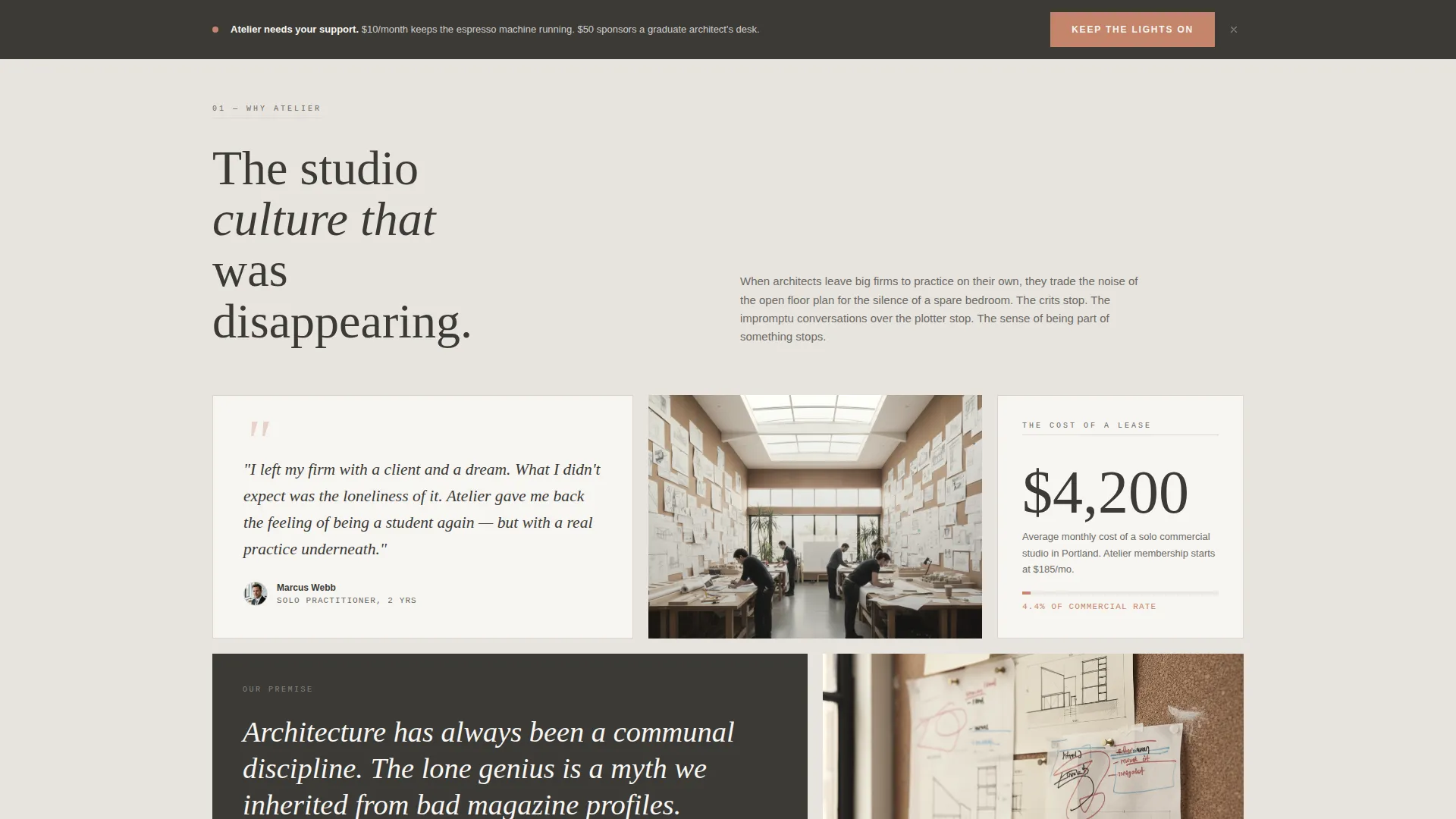
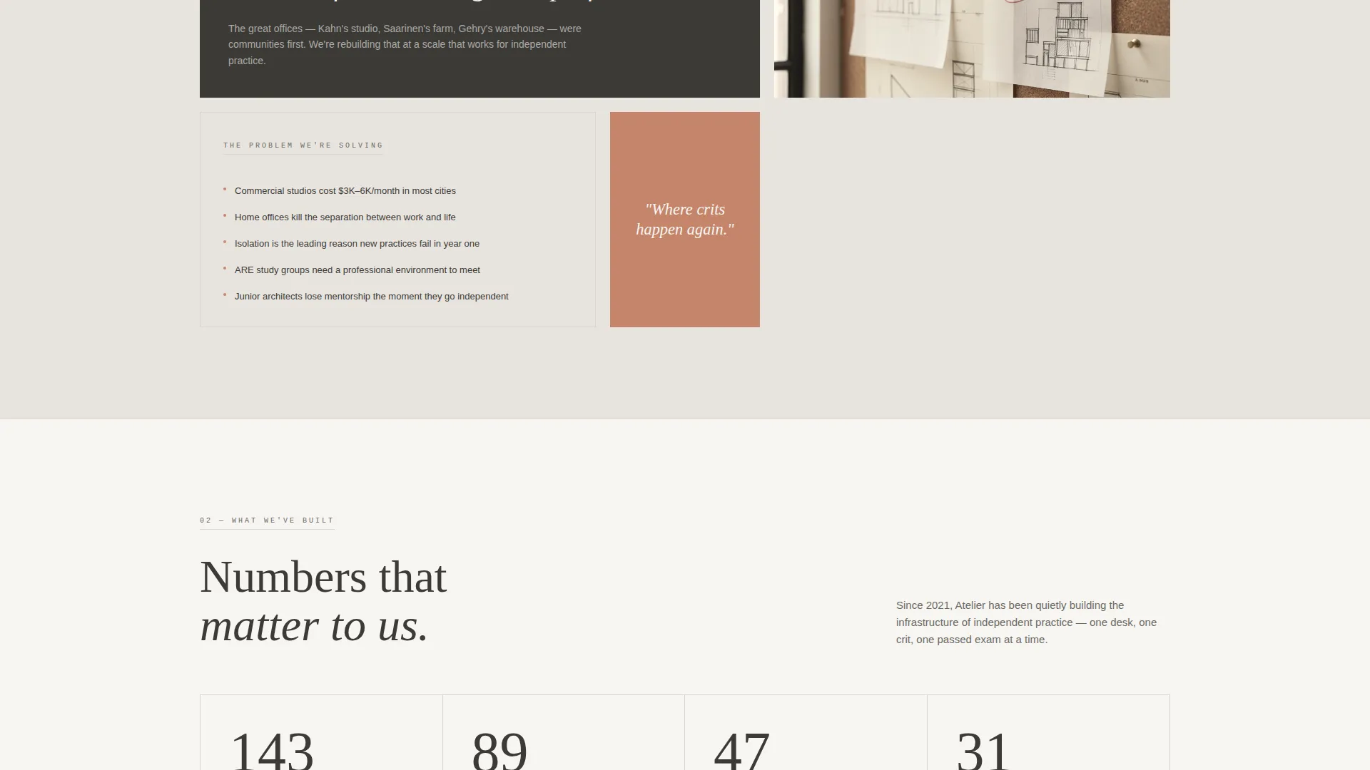
The "Why Atelier" section uses an asymmetric arrangement of modular cards. Each card holds a short paragraph, a statistic, a member quote, or a photograph. The layout feels curated rather than corporate.
Three-Tier Donation Modal
Clicking the primary call to action opens a card showing three giving levels: "Buy a Coffee" at $10 per month, "Sponsor a Desk" at $50 per month, and "Fund the Library" at $150 per month. Each tier names exactly what the contribution supports.
Sticky Donation Bar
After the visitor scrolls past the midpoint, a sticky bar locks to the bottom of the screen. It keeps the primary call to action visible without interrupting the reading flow.
Community Stats and Social Proof Grid
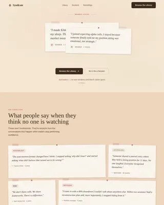
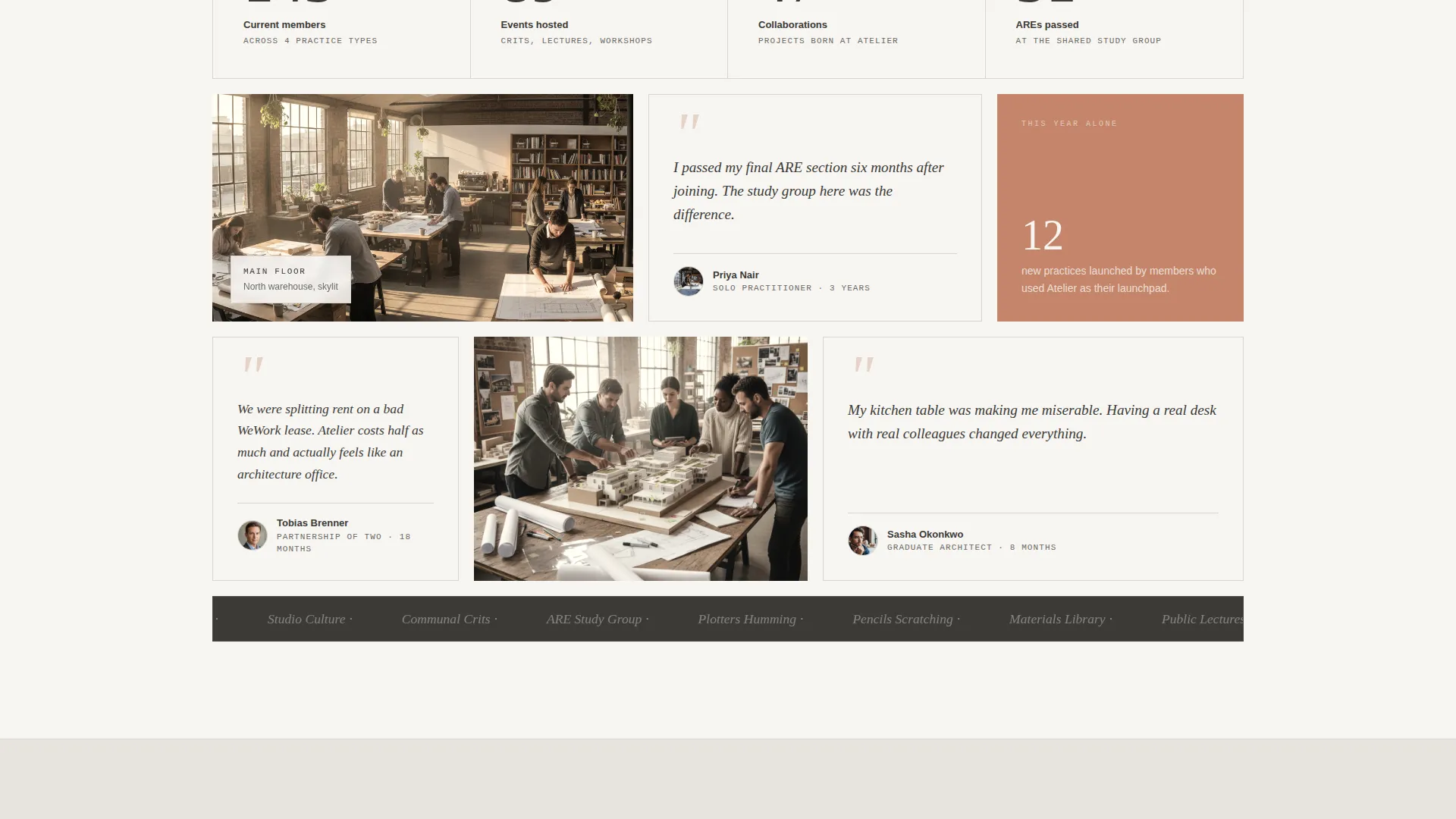
A bento-style grid displays member count, events hosted, collaborations formed, and licensure exams passed. Member quotes are placed alongside warm photography to build trust before the ask.
Membership Interest Form Path
A secondary "Become a Member" call to action links to a simple interest form. The form asks for name, practice type, and how the visitor heard about the community, capturing architects who want to join rather than donate.
Page sections overview
| Section | Purpose |
|---|---|
| Hero Header | Introduce the studio and surface the primary donation call to action above the fold |
| Why Atelier | Explain the mission through an asymmetric card cluster covering solo practice challenges |
| Community Built | Show social proof through member stats, quotes, and a warm photography grid |
| Donation Tiers | Present three giving levels with a modal and a sticky bar for ongoing visibility |
| Where We're Going | Share expansion plans and the materials library vision with a secondary membership path |
| Footer | Display logo, tagline, and navigation links in a single clean row |
Design & branding system
The visual identity follows a Community Hearth theme built on a Soft Mist color palette. The overall feeling is morning light diffusing through tracing paper, calm, warm, and tactile. Nothing shouts; every element breathes.
- Colors: warm fog gray (#E8E4DF), washed linen white (#F7F5F2), charcoal graphite (#3B3A36), and muted terracotta (#C4856A) reserved for buttons and highlighted cards
- Typography: Cormorant Garamond for serif display headlines, DM Sans for body text and interface labels
- Section backgrounds alternate between linen white and fog gray to separate card clusters visually
Mobile & speed optimization
This template is designed desktop-first, reflecting how architects typically work at large screens. A mobile fallback ensures the page remains usable on smaller devices without breaking the layout.
- Native CSS smooth scroll handles page navigation without heavy dependencies
- Server Components handle static content sections for leaner page delivery
- GSAP ScrollTrigger powers staggered card entrance animations and sticky bar behavior at medium intensity
How this template helps you convert
The page follows a deliberate narrative arc that moves visitors emotionally before asking them to act. Every layout decision is aimed at reducing hesitation and increasing the clarity of the offer.
- The header surfaces the donation button above the fold so high-intent visitors can give without scrolling, while the story sections below build trust for visitors who need more context.
- The sticky donation bar reintroduces the primary call to action after the midpoint, catching visitors who were engaged by the mission content and are ready to contribute.
- The dual conversion path, donate or become a member, means no interested visitor leaves without a clear next step matched to their intent.
Other information about this template
This template is built specifically for community and nonprofit use cases in the architecture sector. It works well for any shared workspace or co-working community that needs to tell a layered story and collect support online.
- Template style: Card Grid (Modular), suitable for asymmetric editorial layouts
- Theme: Community Hearth, designed for warm and mission-driven organizations
- Creative direction: Vision and Mission arc, moving from problem to proof to future
- Primary fundraising direction with a secondary membership capture path built in
- Localized for English-language audiences using USD pricing and US date formatting
- The footer uses a single-row Arc pattern: logo and tagline on the left, navigation links on the right
Theme
Community Hearth
Creative direction
Vision & Mission
Color system
Soft Mist
Style
Card Grid (Modular)
Direction
Donation/Fundraising
Page Sections
Half-page Photo and Text Header
Three-tier Donation Modal
Sticky Donation Bar
Asymmetric Mission Card Grid
Community Stats and Social Proof
Membership Interest Path
Related questions
Can I use this template without a co-working space context?
Do the donation tiers connect to a payment processor?
Can I remove the membership form path and keep only the donation flow?
Is the sticky donation bar always visible on the page?
How customizable are the card sections in this template?