Public Transportation FAQ Website Template
Transit is a split-screen landing page template built for metro and subway authorities. It pairs a dramatic tunnel photograph with an institutional search interface, then unfolds as a FAQ-driven content hub. Daily commuters, tourists, and accessibility advocates all find clear answers, a downloadable Rider's Guide, and a one-field station alert signup on one clean, authoritative page.
by Rocket studio
Quick summary
Transit is a single-page template designed for public transit authorities that need to answer rider questions with clarity and confidence. The 50/50 split-screen layout opens on a tunnel photograph and an institutional search bar, then guides visitors through layered FAQ pairs covering real-time service, fares, accessibility, and system expansion. The primary call to action is a downloadable Rider's Guide PDF.
Who this template is for
This template is built for civic and government organizations that operate or communicate on behalf of a metro or subway system. It suits teams that need to publish authoritative, rider-first information without relying on heavy content management overhead.
- Public transit authorities publishing service status and fare information
- Municipal communications teams managing rider-facing digital touchpoints
- Accessibility and rider advocacy offices that need a clear, structured information hub
What problem this template solves
Most transit websites bury answers inside multi-level navigation or outdated PDFs. Riders arrive with specific, time-sensitive questions and leave without clear answers. This template is structured around those questions directly, putting the most common rider needs front and center from the first scroll.
- Commuters cannot quickly find real-time line status without clicking through multiple pages
- Tourists and first-time riders struggle to locate fare structures and accessible route options
- Accessibility advocates have no reliable single source for current elevator and service status
What you get with this template
The template delivers a fully structured, single-page layout with every section pre-arranged for a transit authority context. All visual elements, typography choices, and interactive components are already configured inside the design system.
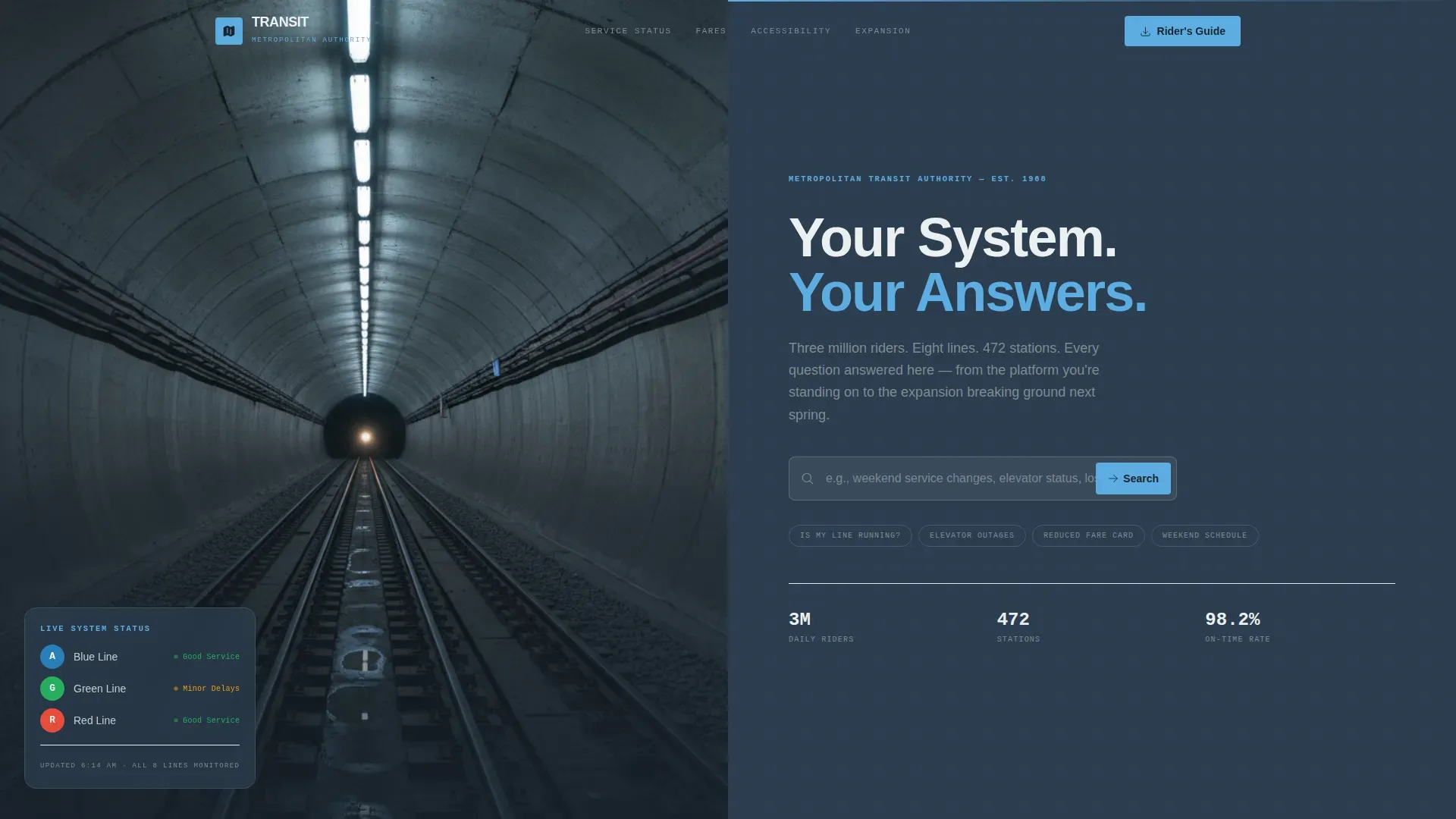
- A 50/50 split-screen hero with a tunnel photograph placeholder and an institutional search bar with ghost text
- A FAQ-driven scroll flow with six thematic sections covering service status, fares, accessibility, and expansion
- A sticky Rider's Guide PDF call to action in the right gutter and a one-field station alert signup form
Feature list
This template ships with a focused set of components built specifically for civic transit communication.
FAQ-Driven Scroll Architecture
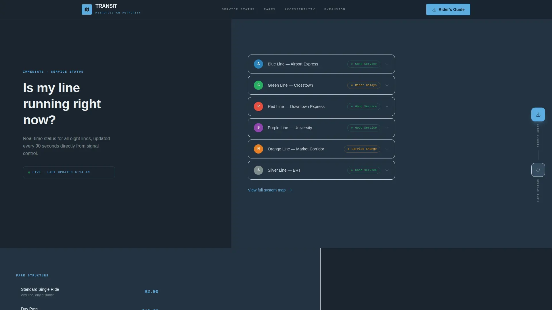
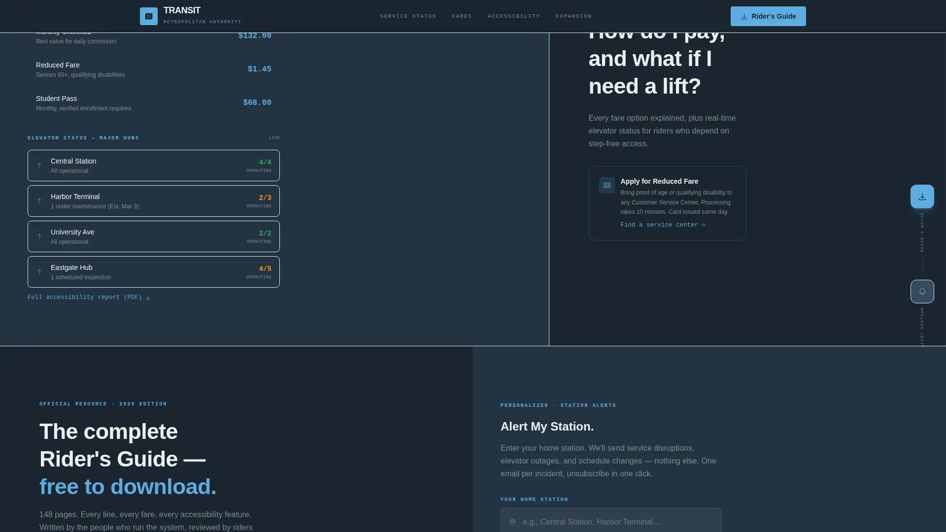
The page is structured as paired question-and-answer blocks rather than standard content sections. Each pair places the question in large wayfinding typography on the left and the answer with embedded context on the right. Categories escalate from immediate operational questions to structural system information.
Split-Screen Hero Layout
The header uses a precise 50/50 split. The left side holds a full-bleed tunnel photograph showing converging rails and a distant train headlight. The right side displays the transit authority wordmark, an institutional headline, and a pre-loaded search bar with ghost text covering common rider queries.
Sticky Rider's Guide Call to Action
After the first scroll, a pinned download prompt appears in the right gutter and stays visible as the visitor reads through FAQ content. This positions the Rider's Guide PDF as the natural next step once trust has been established through transparent answers.
Station Alert Signup Form
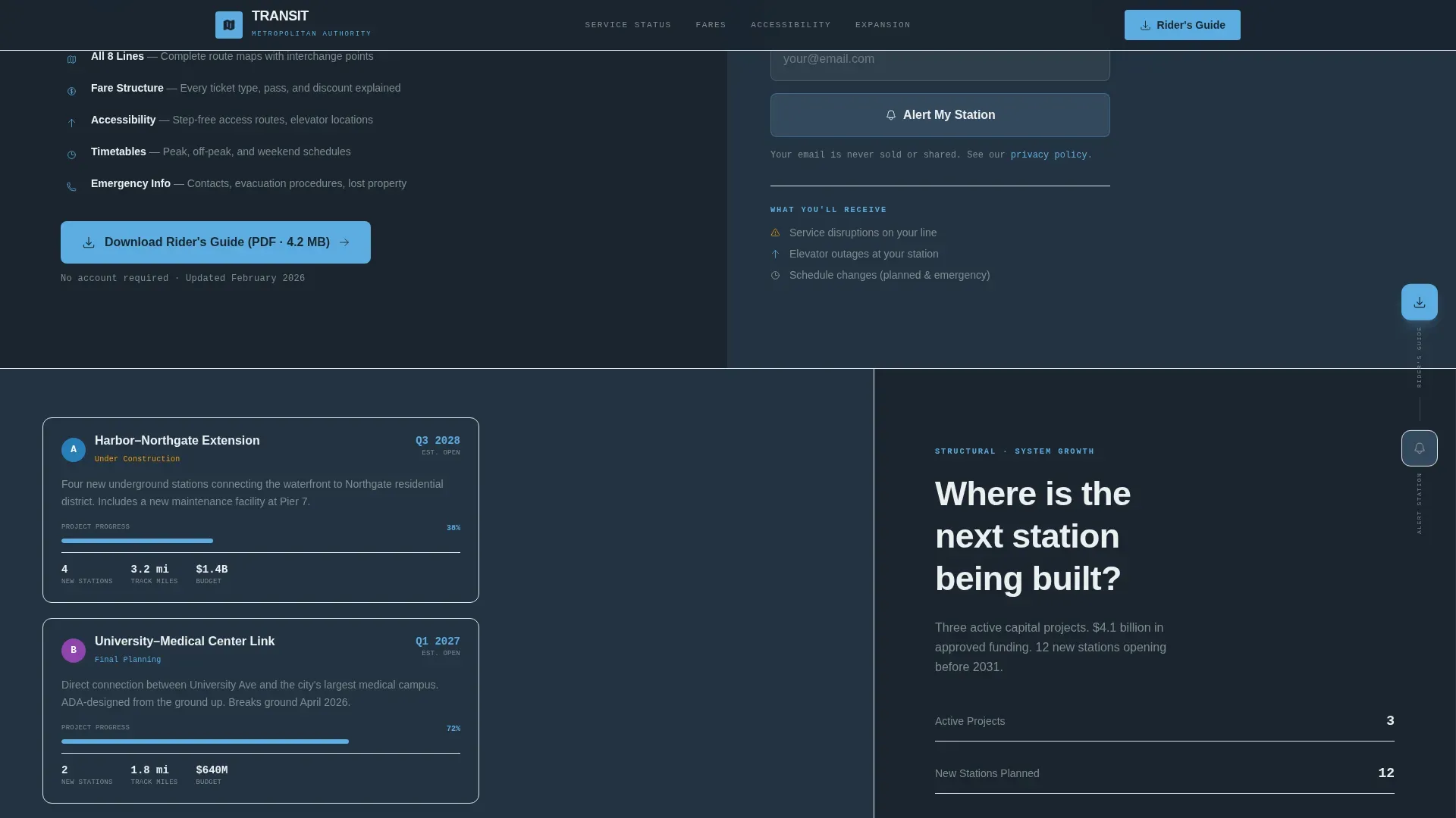
A secondary conversion path lets visitors type their home station name into a single input field and click "Alert My Station" to subscribe to personalized service alerts. The minimal one-field design reduces friction and keeps the page uncluttered.
Real-Time Status Badge Components
The real-time service status section includes visual badge components designed to display live line status. The badges use pulse animation to communicate active or disrupted service states at a glance.
Institutional Wayfinding Typography System
Two typefaces are configured throughout: DM Sans for all body and heading copy, and JetBrains Mono for route codes and numeric data. This pairing gives the page the legibility of physical transit signage translated into a screen environment.
Page sections overview
| Section | Purpose |
|---|---|
| Split-Screen Hero | Tunnel photo left, institutional search bar right |
| Real-Time Status FAQ | Live line-running status with pulsing service badges |
| Fares and Accessibility FAQ | Reduced fare cards, elevator status, accessible routes |
| Rider's Guide Call to Action | Pinned PDF download and station alert signup |
| System Expansion FAQ | Next build projects and embedded route maps |
| Footer Horizontal Flow | Social proof metrics, line count, and service years |
Design & branding system
The visual identity follows an Institutional Authority theme. The color system draws from transit infrastructure itself, moving from the weight of underground tile to the openness of sky above a station entrance.
- Deep transit slate (#2C3E50) dominates backgrounds and navigation; sky blue (#5DADE2) marks every interactive element and active state
- Platform concrete (#7F8C8D) carries body text; wayfinding white (#ECF0F1) renders signage-style labels and platform headers
- DM Sans handles all institutional body and heading copy; JetBrains Mono is reserved for route codes and numeric fare data
Mobile & speed optimization
The template is desktop-first, reflecting the primary use case of commuters checking service information at home or in the office before travel. Mobile layouts are fully considered for on-platform checks during a commute.
- Interactive components including FAQ toggles, the station alert form, and the sticky call to action are built as client-side components
- Static content sections use server component patterns for faster initial load on both desktop and mobile
- Scroll reveal and parallax animations are set to medium intensity, keeping motion purposeful without slowing the page
How this template helps you convert
The page earns trust before it asks for anything. Riders get real answers first, which makes the Rider's Guide download feel like a natural reward rather than a gatekeeping requirement.
- The FAQ-first structure demonstrates system transparency upfront, which builds the credibility needed for a visitor to download the Rider's Guide or share their station name for alerts.
- The sticky right-gutter placement of the Rider's Guide call to action keeps the primary conversion action visible without interrupting the reading flow.
- The single-field station alert form removes every possible barrier to secondary conversion, requiring only a station name and one click.
Other information about this template
This template is designed for the Government and Public category with a specific focus on the Public Transportation niche. It is well suited for metro and subway system contexts in the United States, where fare structures are expressed in USD, schedules use 12-hour time format, and copy follows an American English institutional voice.
- The footer uses a horizontal flow pattern and is pre-configured to display social proof metrics including daily ridership figures, total line count, station count, and years of service
- Counter animations are included for ridership statistics, giving the footer numbers a live, data-driven quality appropriate for civic infrastructure communication
- The Slate and Sky color system and the Institutional Authority theme are matched to the intersection of the Government and Public category with the Metro and Subway System niche, giving the template strong contextual alignment out of the box
Theme
Institutional Authority
Creative direction
FAQ-Driven
Color system
Slate & Sky
Style
Split Screen (50/50)
Direction
Content/Resource
Page Sections
Faq-driven Scroll Architecture
Split-screen Hero with Search Bar
Sticky Rider's Guide Download
One-field Station Alert Signup
Pulsing Real-time Status Badges
Institutional Wayfinding Typography
Related questions
What type of organization is this template designed for?
Can the FAQ sections be edited to match our actual service lines and routes?
What is the Rider's Guide call to action connected to?
Does the station alert form send emails automatically?
Is this template suitable for mobile users checking service on the platform?