Concierge Medicine Landing Page Template
Attune is a split-screen landing page template built for concierge medicine practices. It pairs an architectural Stacked Type Tower hero with a step-by-step membership journey, a warm organic-flow design system, and two conversion paths: a private consultation request form and a downloadable membership guide. The result is a page that feels unhurried, premium, and deeply personal.
by Rocket studio
Quick summary
Attune is a single-page, lead-generation template designed for concierge medicine and direct primary care practices. It opens with a bold 50/50 split-screen hero, guides visitors through a scroll-driven membership journey, and closes with two clear conversion options. The design is warm, clinical, and confident, built to earn the trust of high-discernment audiences before they ever fill out a form.
Who this template is for
This template is designed for healthcare providers who offer a genuinely different level of care. It speaks directly to practices where the physician-patient relationship is the product, and where the page must reflect that standard.
- Concierge medicine and direct primary care physicians ready to attract high-value memberships
- Private practice owners serving executives, busy families, or adult children coordinating care for aging parents
- Healthcare marketers building a premium landing page that converts on first impression
What problem this template solves
Most medical practice pages look like every other clinic website. They lead with a scheduling portal, a stock photo of a stethoscope, and a generic "we care about your health" headline. That approach loses the audience this template is built for.
- Executives and professionals have no patience for pages that waste their time or feel impersonal
- Families coordinating complex care need to feel confident in one trusted voice before they reach out
- A standard template cannot communicate the unhurried, continuous, direct-access nature of concierge medicine
What you get with this template
You get a fully structured, single-page layout that does the heavy lifting of positioning, storytelling, and conversion. Every section is intentional and tied directly to the way this type of practice earns trust.
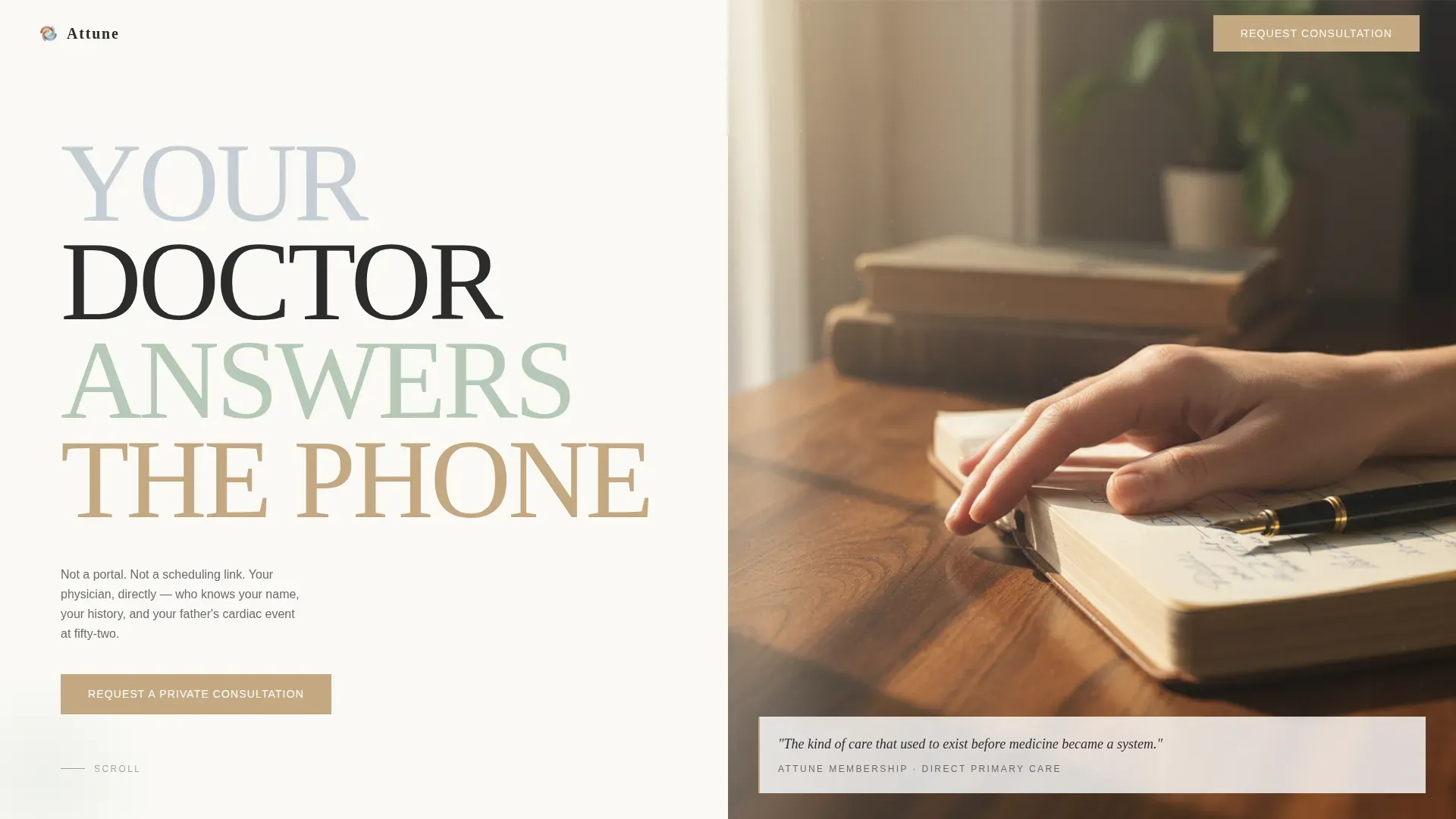
- A 50/50 split-screen hero with the Stacked Type Tower headline and a curated physician photograph placement
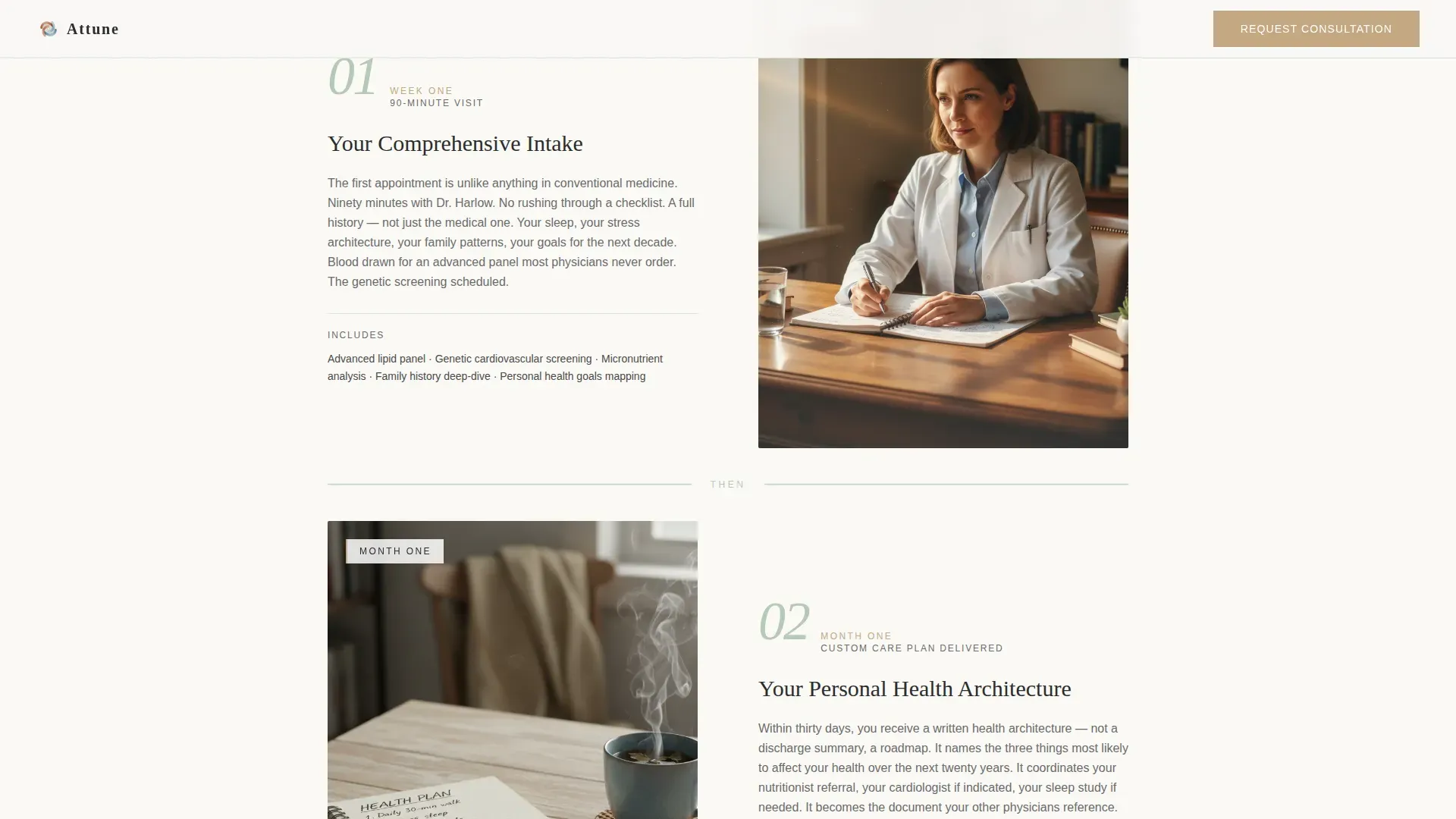
- A scroll-driven step-by-step membership journey covering the intake visit, the personal health architecture, and ongoing care
- Two conversion paths: a private consultation request form and a secondary membership guide download
Feature list
This template is built around a small set of high-impact components, each designed to work together as one continuous experience.
Stacked Type Tower Hero
The left half of the viewport holds a tall, architectural serif column with each word of the headline on its own line. The type is enormous and sculptural, setting a tone of confidence and calm from the first scroll position.
Split-Screen Section Layout
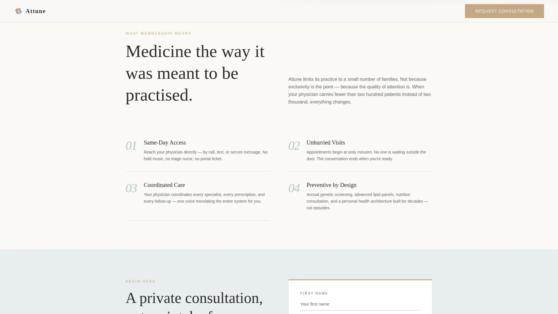
The 50/50 split format is used throughout the hero and key content sections. Text and visual elements face each other across a clean vertical axis, creating visual tension that holds attention without relying on clutter.
Step-by-Step Membership Journey
A numbered scroll sequence walks the visitor through what membership actually looks like: the ninety-minute Week One intake, the Month One personal health architecture, and the ongoing care touchpoints that traditional medicine skips.
Dual Conversion Path Forms
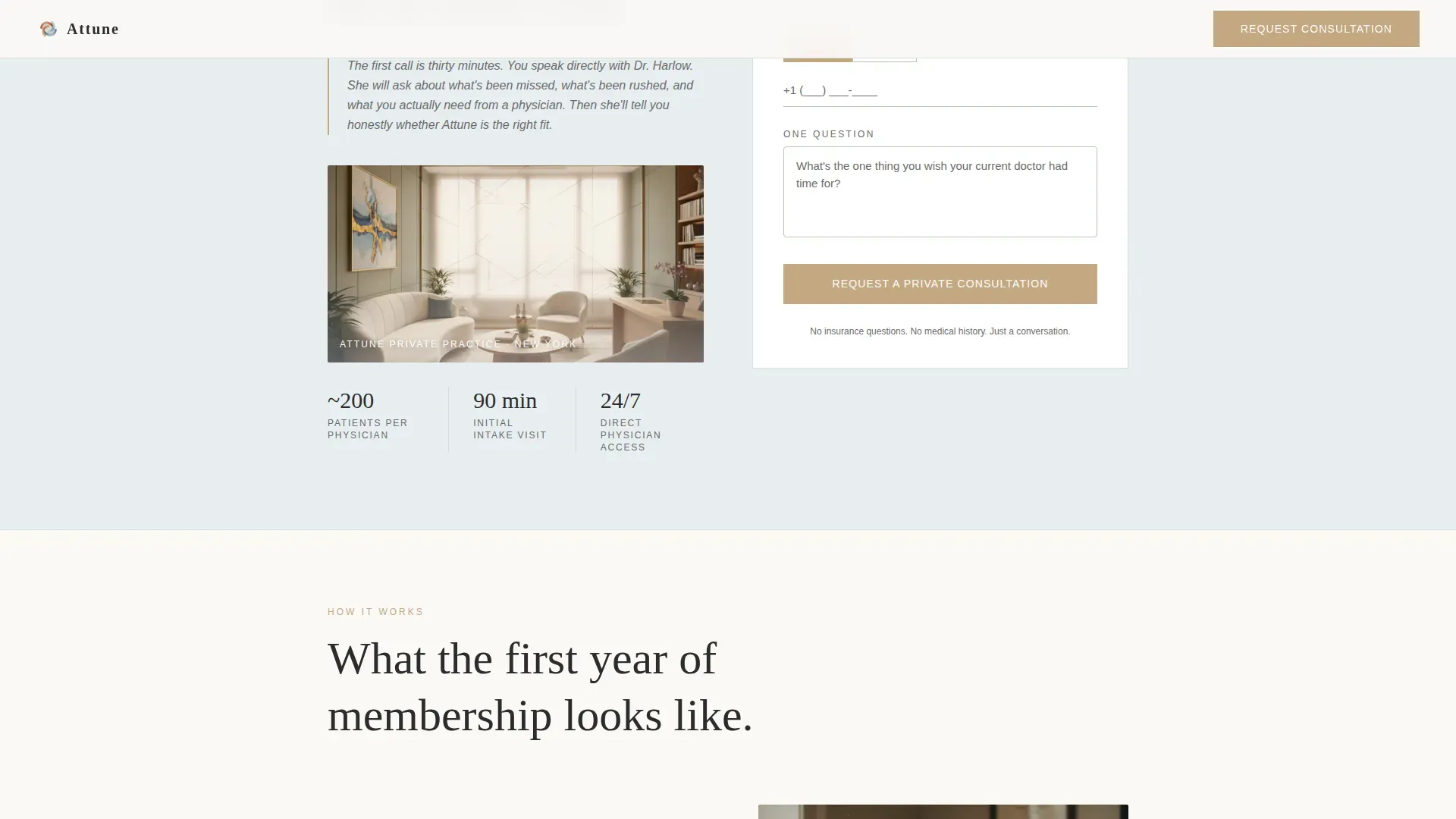
The primary form asks for a first name, a preferred contact method via phone or email toggle, and one open question. The secondary path offers a membership guide download in exchange for an email address. Both feel like the start of a conversation, not a clipboard.
Organic Flow Section Transitions
Sections ease into each other using generous whitespace and soft parallax on the sage dividers. Scroll-linked fade reveals and staggered type entrance animations give the page a sense of calm momentum rather than abrupt page-jumping.
Warm Clinical Design System
The palette, typography pairing, and spacing are all calibrated together. The result is a page that reads as medically credible and personally warm at the same time, without leaning too far in either direction.
Page sections overview
| Section | Purpose |
|---|---|
| Split-Screen Hero | Introduces the practice with the Stacked Type Tower headline and a photograph of a physician's hand at rest |
| Membership Overview | Summarizes the membership offer and presents the first "Request a Private Consultation" call to action |
| Step-by-Step Journey | Walks visitors through Week One intake and Month One health architecture in a numbered scroll flow |
| Why Attune | Asymmetric layout contrasting what traditional medicine skips against what this practice provides |
| Final Call to Action | Anchors the consultation form and offers the "Download the Membership Guide" secondary conversion path |
| Minimal Footer | Horizontal flow footer with essential links and practice identity |
Design & branding system
The visual identity follows an Organic Flow theme built on an Arctic White color system. Every color and typeface choice reinforces the feeling of a private, unhurried medical environment.
- Color palette: linen background (#FAF9F6), pale glacier blue (#E8EEF1), quiet sage (#B7C9B7) for section transitions, charcoal (#2C2C2C) for body text, and muted terracotta (#C4A882) reserved for buttons, hover states, and the progress indicator
- Typography: Fraunces serif for the hero tower and all headings; DM Sans for body text and interface elements
- Spacing and motion: generous whitespace throughout, parallax on sage dividers, scroll-linked fade reveals, and staggered type entrance animations at medium intensity
Mobile & speed optimization
Although this template is designed desktop-first for an executive audience making longer-form decisions, it is built with full mobile support across all section layouts.
- The 50/50 split-screen hero stacks gracefully on smaller viewports without losing the visual hierarchy of the Stacked Type Tower
- Static-first construction with optimized images and smooth CSS scroll behavior keeps the experience fluid across device types
- All interactive elements, including the phone/email toggle and both conversion forms, are fully functional on mobile
How this template helps you convert
Every design and copy decision in this template is oriented toward one outcome: giving the right visitor enough confidence to take the next step.
- The hero creates immediate positioning clarity. Visitors know within seconds that this is not a standard medical practice page, and that distinction earns attention from the audience most likely to become members.
- The step-by-step journey deepens commitment progressively. Each scroll section reveals a new layer of specificity, from the ninety-minute intake visit to the Saturday morning text check-in, replacing skepticism with recognition.
- The dual conversion path removes friction for visitors at different stages of readiness. Those ready to speak can request a consultation. Those still deciding can download the guide and stay in the relationship.
Other information about this template
This template is purpose-built for the concierge medicine and direct primary care niche, where the standard rules of medical marketing do not apply. A few additional details worth knowing before you build:
- The membership guide download is designed as a secondary conversion asset that extends the step-by-step narrative off-page, keeping the practice relationship alive after the visit
- The consultation form deliberately avoids insurance questions and medical history fields, keeping the first touchpoint feeling like a personal conversation
- The footer follows a horizontal flow pattern with minimal links, keeping the visual weight of the page clean and the exit paths intentional
- This template is well-suited for practices operating in the high-net-worth individual space, including those serving corporate executives, multigenerational families, and clients coordinating specialist and prescription management for aging parents
Theme
Organic Flow
Creative direction
Step-by-Step Guide
Color system
Arctic White
Style
Split Screen (50/50)
Direction
Lead Generation
Page Sections
Stacked Type Tower Hero
Split-screen Section Layout
Scroll-driven Membership Journey
Dual Conversion Forms
Organic Flow Transitions
Warm Clinical Design System
Related questions
Can I customize the color palette and typefaces?
Do I need design experience to use this template?
How does the dual conversion path work?
Is this template suitable for a solo physician practice?
Can the step-by-step journey sections be edited or reordered?



