Serene Psychologist Portfolio Landing Page Template
Attune is a serene psychologist landing page template built for solo practitioners offering deep therapeutic partnership. It pairs an oversized centered headline with layered, translucent iridescent panels, an interactive modalities explorer, and a curated reading library. The design earns trust before asking for anything, guiding visitors naturally toward booking a consultation.
by Rocket studio
Quick summary
Attune is a single-page psychologist portfolio template with a quiet, unhurried aesthetic. It opens on a giant centered headline, layers translucent iridescent panels for depth, and lets visitors explore therapy approaches and articles at their own pace. A persistent booking bar sits at the bottom edge, never interrupting, always available.
Who this template is for
This template is built for independent psychologists who want their online presence to feel as considered as their practice. It suits practitioners who work with adults, value written communication, and prefer to earn a client's trust through content rather than a hard sell.
- Solo psychologists and private practice therapists
- Clinicians who write, reflect, or publish articles for their clients
- Practitioners whose clients include adults navigating life transitions, anxiety, or identity questions
What problem this template solves
Most therapist websites feel either clinical and cold or overly soft and generic. Neither builds the particular kind of trust that therapy requires. Attune solves this by making the page itself a demonstration of the practitioner's thinking style: generous, precise, and patient.
- Generic portfolio pages fail to communicate a therapist's actual approach or voice
- Heavy intake forms and early calls to action push visitors away before trust is built
- Static pages leave visitors passive, while Attune's interactive structure invites them to explore at their own pace
What you get with this template
You get a fully structured overlap and layered landing page designed around therapeutic communication. Every section is purposeful, every interaction is optional, and the visual system is cohesive from the headline down to the booking bar.
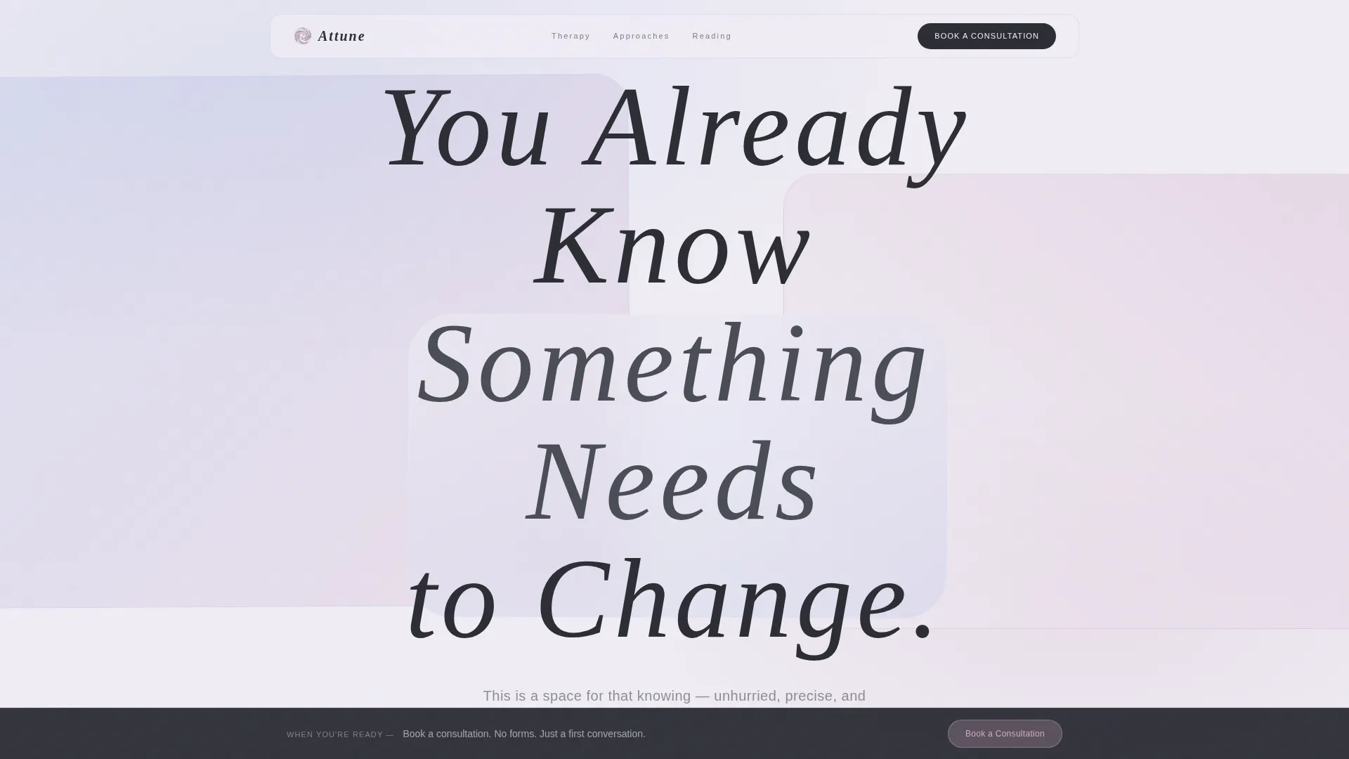
- A giant centered headline section with layered parallax panels in pearl and lavender
- An interactive modalities explorer covering cognitive behavioral therapy (CBT), psychodynamic, and somatic approaches
- A filterable article library, a persistent consultation bar, and a minimal open-ended booking form
Feature list
This section describes the core functional components included in the Attune template.
Giant Centered Headline Section
The header opens on an oversized airy serif headline set to roughly eighty percent of the viewport width. Translucent panels in pearl white and lavender drift behind it with a subtle parallax effect. No image, no portrait: just typographic architecture and shifting light.
Interactive Modalities Explorer
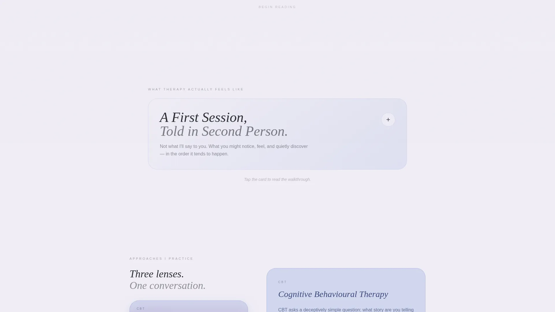
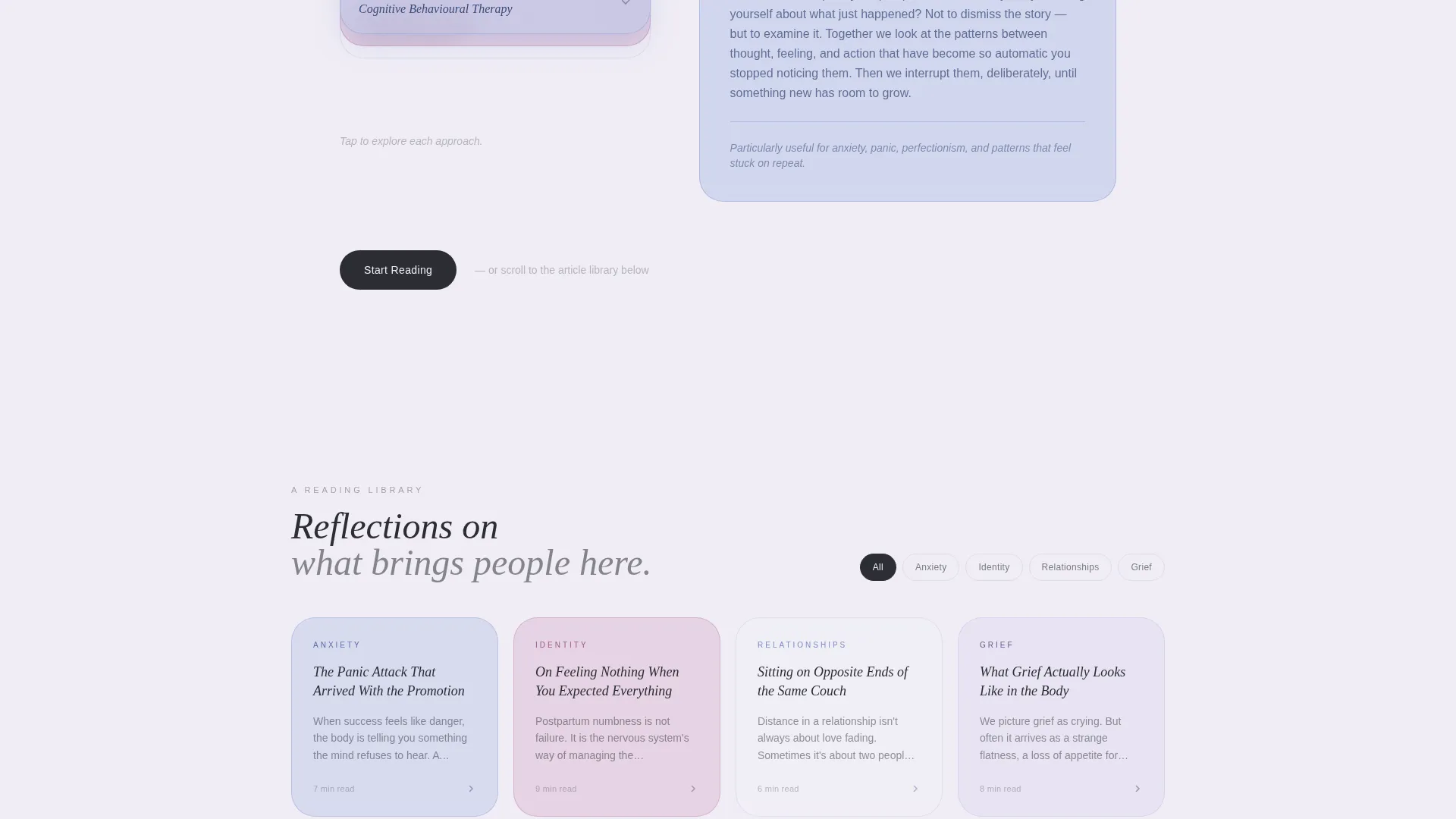
Visitors can tap into three therapy approaches presented as overlapping transparent panels. Cognitive behavioral therapy, psychodynamic, and somatic modalities stack and unstack on interaction. Each panel reveals a short description, letting the reader understand the practitioner's thinking without committing to anything.
Layered Card Sections
Each content section is designed as a layered card that visitors can open or expand. "What Therapy Actually Feels Like" delivers a first-session walkthrough in second person. The card metaphor keeps depth optional and the visitor in control throughout.
Filterable Article Library
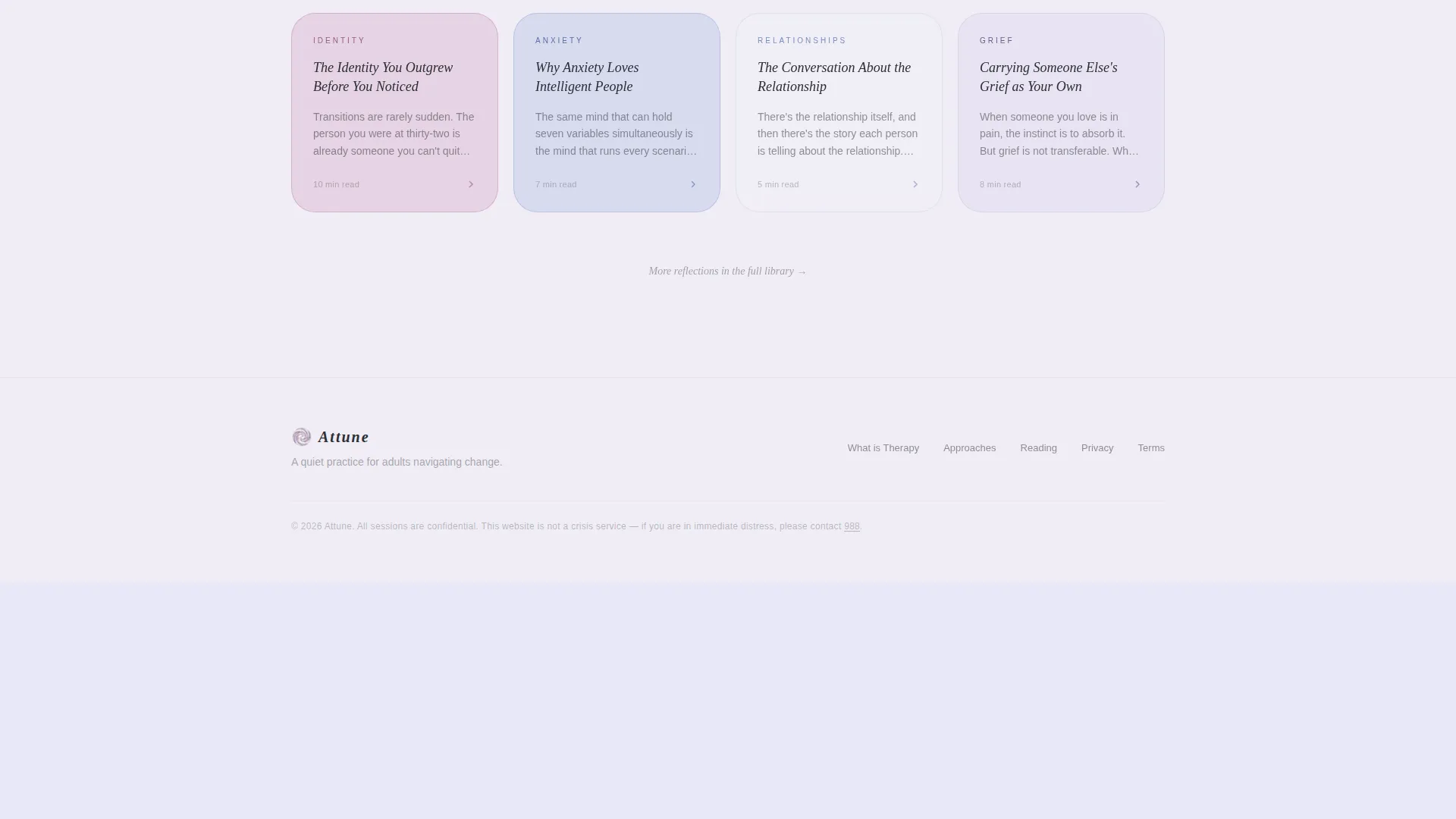
A curated reading library fans out like index cards on a desk. Visitors can filter articles and reflections by theme, including grief, identity, relationships, and anxiety. Nothing auto-plays; the visitor sets the pace.
Persistent Consultation Bar
A bottom-edge booking bar in deep graphite stays visible as visitors scroll. It requires only a first name, an email address, and one open-ended field asking what brings the visitor here. There are no dropdown menus and no lengthy intake forms.
Iridescent Overlap Panel System
Panels use translucency so colors blend softly at their edges. The pearl white, lavender blue, and muted holographic rose palette shifts like light through a prism. Hover states activate the rose accent, giving the page a living quality without any clinical or technological feel.
Page sections overview
| Section | Purpose |
|---|---|
| Giant headline header | Sets tone, establishes trust with one centered statement |
| Parallax panel layer | Creates depth and visual calm behind the headline |
| Therapy feels like | Walks visitors through a first session in second person |
| Modalities explorer | Lets visitors interact with CBT, psychodynamic, somatic panels |
| Reading library | Provides filterable articles organized by theme |
| Primary call to action block | Directs engaged visitors to the full article library |
| Persistent booking bar | Keeps consultation access available without interrupting scroll |
Design & branding system
The visual identity follows an Atelier Studio sensibility expressed through an iridescent color palette. Colors bleed into one another like watercolor on wet paper, and the translucent panel system creates shimmer without noise. Body text in deep graphite reads as considered and unhurried even in a sans-serif face.
- Soft pearl white (#F0EDF5) as the primary page ground, shifting lavender blue (#B8C4E8) for layered panel fills
- Muted holographic rose (#D4A9C7) on hover states and interactive accents, deep graphite (#2B2D33) for all body text
- Oversized airy serif for the headline, with wide letter spacing; translucent panel overlaps create iridescent color mixing at edges
Mobile & speed optimization
The overlap and layered structure is designed to translate cleanly to smaller screens. Parallax effects and expandable card sections are built to function without requiring a large display. The booking bar remains accessible at the bottom edge on mobile as well as desktop.
- Layered panel sections reflow for narrow viewports without losing the translucent color system
- Interactive card sections collapse gracefully so mobile visitors can still open and expand content at their own pace
- The persistent booking bar stays anchored to the bottom edge across screen sizes, keeping consultation access consistent
How this template helps you convert
Attune converts through demonstrated trust rather than pressure. The page shows how the psychologist thinks before it asks for anything, making the final booking step feel like a natural continuation rather than a transaction.
- The interactive modalities explorer and article library let visitors spend time with the practitioner's ideas, building familiarity and confidence before the consultation request appears.
- The persistent booking bar uses a single open-ended question instead of a formal intake form, lowering the barrier to first contact significantly.
- The primary call to action, "Start Reading," directs visitors deeper into the content first, so the secondary "Book a Consultation" prompt arrives only after genuine engagement has already happened.
Other information about this template
Attune is built within the Overlap and Layered template style, which means sections are not hard-separated by dividers. Instead, they bleed into each other visually, reinforcing the therapeutic metaphor of continuity and presence. The template sits in the Personal and Resume category under the Psychologist Profile subcategory, making it specifically suited to solo practitioners rather than group practices or clinics.
- The Creative Direction is Interactive Explorer: scroll behavior invites rather than lectures, and every depth layer is optional
- The header concept is Giant Headline Centered, meaning the first thing a visitor reads is a full-viewport statement, not a navigation menu or portrait
- The landing page direction is Content and Resource, positioning the psychologist as a thoughtful guide rather than a service vendor
Theme
Atelier Studio
Creative direction
Interactive Explorer
Color system
AI Iridescent
Style
Overlap/Layered
Direction
Content/Resource
Page Sections
Giant Viewport Headline Header
Interactive Modalities Explorer
Filterable Article and Reading Library
Expandable Layered Card Sections
Persistent Minimal Booking Bar
Iridescent Overlap Color System
Related questions
Can I edit the headline and article content to match my own practice?
Do I need to publish real articles to use the reading library section?
Is the booking bar form connected to any scheduling tool?
Who is the ideal visitor this template is designed to attract?
Can I simplify the modalities explorer if I only practice one approach?



