Specialist Coach & Mentor Pre-Launch & Coming Soon Website Template
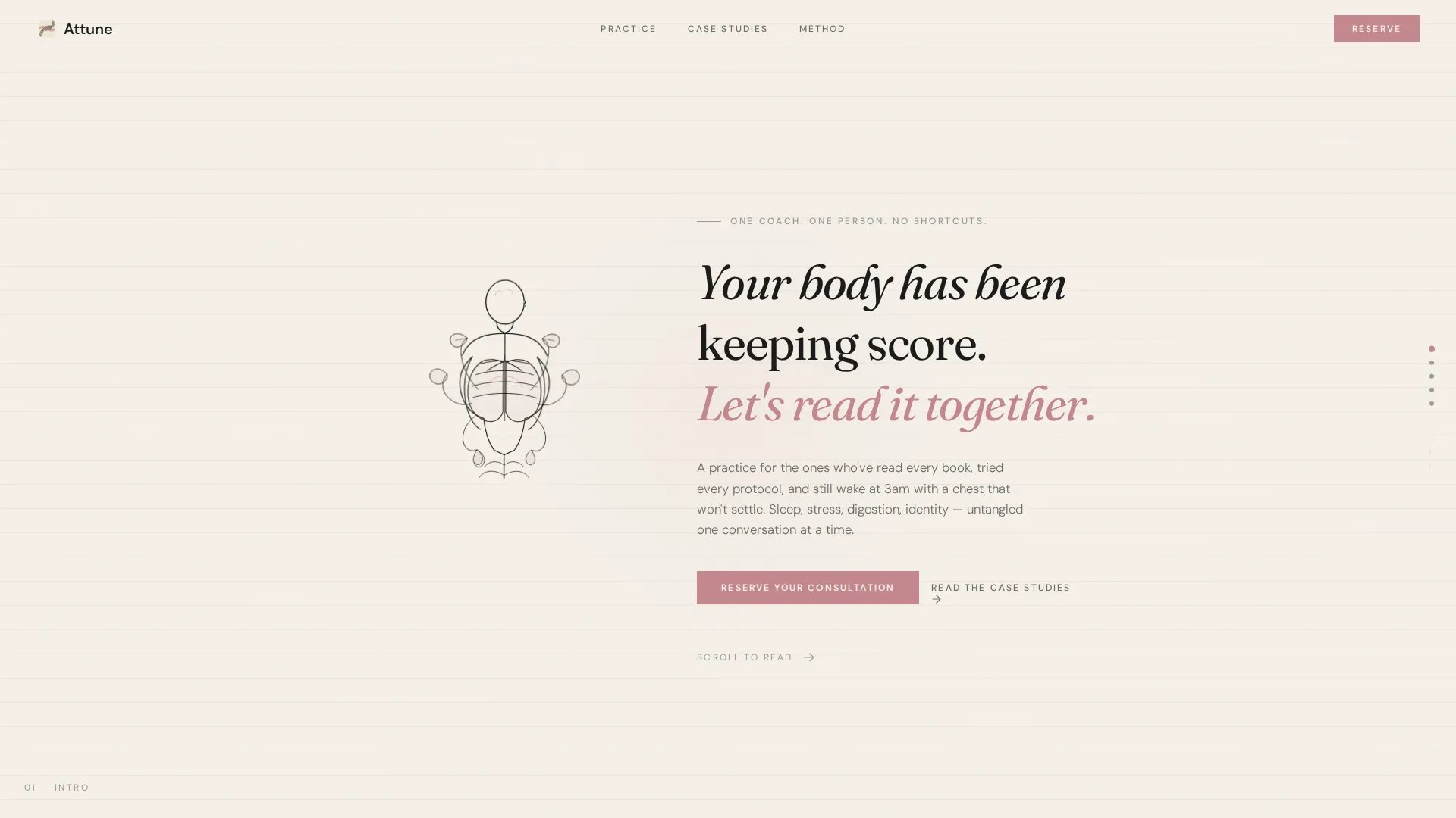
Attune is a horizontal scroll landing page template built for intimate, one-on-one health and wellness coaching practices. It combines an animated ink illustration header, case study narrative panels, and a minimal waitlist form into a single cohesive experience. The Atelier Studio aesthetic uses warm parchment tones and dried-rose accents to create a page that feels personal, deliberate, and quietly compelling.
by Rocket studio
Quick summary
Attune is a single-page horizontal scroll landing page template designed for a solo health and wellness coach launching a waitlist. It opens with a hand-drawn animated illustration, moves through three client case study panels, and closes with a minimal reservation form. The Ink and Paper color system keeps the mood warm, grounded, and focused on one action: booking a consultation.
Who this template is for
This template is built for solo practitioners who work closely with a small number of clients at a time. It suits coaches whose offer is personal, precise, and not for everyone.
- Health and wellness coaches opening limited practice spots
- Solo practitioners working with burned-out professionals, postpartum clients, or adults navigating early health concerns
- Coaches who want their page to feel like a curated experience rather than a general service listing
What problem this template solves
Most wellness coach pages look like every other coaching page. They list credentials, stack testimonials, and push a generic call to action. That approach does not build the kind of trust a deeply personal practice requires.
- Generic templates fail to communicate the intimacy or specificity of one-on-one coaching
- Standard layouts treat social proof as a grid of quotes rather than a narrative that builds real connection
- Visitors leave before they feel understood, so the waitlist never fills
What you get with this template
You get a fully structured horizontal scroll landing page that guides visitors through a thoughtful, story-driven journey from first impression to waitlist signup. Every panel has a clear job, and the layout does the persuading before the form ever appears.
- An animated ink illustration header with a self-writing headline
- Three horizontal case study panels, each narrating a client transformation from arrival to outcome
- A waitlist panel with a minimal two-field form, a spot counter, and a dried-rose call-to-action button
Feature list
This section describes the core built-in components of the Attune landing page template.
Animated Ink Illustration Header
The header opens with hand-drawn ink lines that sketch themselves into existence as the page loads. A human figure mid-breath takes shape alongside botanical elements growing from the lungs, styled as a vintage anatomical study. The animation moves at the pace of a real hand drawing, with intentionally imperfect, slightly trembling lines. A serif headline writes itself beneath the illustration: "Your body has been keeping score. Let's read it together."
Horizontal Scroll Case Study Panels
The page moves left to right through three client transformation stories. Each story spans three sub-panels: an arrival state in the client's own raw language, a method panel with hand-drawn protocol diagrams, and an outcome panel showing specific measured results. The horizontal motion mimics turning pages in a journal, making each swipe feel like revealing the next chapter.
Waitlist Reservation Form
The waitlist panel includes a minimal form that asks only for a first name and one open question: "What's the one thing your body has been trying to tell you?" This single text field acts as both an intake filter and an emotional commitment device. A small spot counter sits near the form to signal scarcity without pressure.
Dried-Rose Call-to-Action System
The dried-rose accent color (#C4878E) appears exclusively on interactive elements. The "Reserve Your Consultation" button uses this color against the parchment background, making every clickable moment feel deliberate. No other element competes for that visual attention.
Hand-Drawn Diagram Components
Method panels inside each case study use hand-drawn illustrations of protocols and body rhythms. These replace stock photography entirely. The result is a visual language that feels specific to this practice rather than borrowed from a generic wellness stock library.
Ink and Paper Color System
The full palette uses warm parchment (#F5F0E8) for backgrounds, brushstroke black (#1A1A1A) for headlines, graphite sketch gray (#6B6B6B) for body text, and dried rose (#C4878E) as a single accent. The system is internally consistent and requires no customization to achieve the intended mood.
Page sections overview
| Section | Purpose |
|---|---|
| Animated header panel | Introduces the practice with a self-drawing ink illustration and serif headline |
| Case study: arrival | Shows the client's starting state in their own unfiltered language |
| Case study: method | Illustrates the coaching protocol with hand-drawn diagrams |
| Case study: outcome | Presents specific, measured transformation results |
| Second case study | Repeats the three-panel story arc for a different client profile |
| Third case study | Completes the narrative triptych with a third distinct client journey |
| Waitlist reservation panel | Hosts the minimal form, spot counter, and dried-rose call to action button |
Design & branding system
The visual identity follows an Atelier Studio theme that feels like a calligrapher's desk at golden hour. There is no photography and no stock imagery anywhere in the template. Every visual element is ink on paper.
- Typefaces are serif for headlines and neutral for body text, reinforcing the hand-crafted editorial tone
- The four-color Ink and Paper palette is fixed and purposeful: parchment backgrounds, ink headlines, graphite body text, and rose for action only
- Botanical and anatomical hand-drawn motifs appear across the header and method panels, creating a consistent illustrative language throughout the page
Mobile & speed optimization
The horizontal scroll layout is designed to translate naturally to touch-based navigation on smaller screens. Swipe gestures feel intuitive on mobile, matching the page-turning metaphor built into the creative direction.
- Each panel is self-contained, so the layout adapts without breaking the narrative sequence
- The absence of photography and stock imagery keeps the visual load lean across all devices
- Text sizing and spacing are set to remain readable at smaller viewport widths without manual adjustment
How this template helps you convert
The page is structured so that the waitlist form only appears after the visitor has moved through three complete client stories. By the time they reach the reservation panel, the template has already done the trust-building work.
- The animated header creates an immediate emotional tone that signals this practice is different from a standard coaching service, encouraging the visitor to keep scrolling.
- The three case study panels each feature a client profile that mirrors a distinct target audience segment, so most visitors will recognize themselves in at least one story before reaching the form.
- The single-question form lowers the barrier to entry while the spot counter adds gentle urgency, making the act of reserving feel both easy and meaningful.
Other information about this template
This template is categorized under Personal and Resume, specifically within the Coach and Mentor subcategory for the Health and Wellness Coach niche. It is built as a single-page horizontal scroll layout and is well suited for a coming-soon or waitlist launch strategy.
- The template is designed for a solo practice model, not a multi-coach agency or group program
- It works as a standalone waitlist page and does not require additional pages to complete the visitor journey
- The Atelier Studio theme and Ink and Paper color system are matched specifically to this template's creative direction and are not interchangeable with other theme styles without visual reworking



Theme
Atelier Studio
Creative direction
Case Study Narrative
Color system
Ink & Paper
Style
Horizontal Scroll
Direction
Waitlist/Coming Soon
Page Sections
Animated Ink Illustration Header
Horizontal Scroll Case Study Panels
Minimal Waitlist Reservation Form
Dried-rose Interactive Accent System
Hand-drawn Diagram Components
Ink and Paper Color System
Related questions
Who is this landing page template designed for?
Can I use this template for a practice that is already open, not just a waitlist?
Does this template use photography or stock images?
How many case studies are included in the template?
What information does the waitlist form collect?



