Benefits Consulting | Free Website Template | Rocket
A zigzag landing page built for tech and software benefits consultants. It opens with a five-step assessment form already visible above the fold, then walks visitors through animated diagrams that reflect their own benefits stack back at them. Every section adds evidence, and every scroll step builds urgency to complete the audit and share their work email.
by Rocket studio
Quick summary
This landing page template is designed for consultancies that audit and rebuild employee benefits software stacks. It opens with a live multi-step assessment form, then uses a zigzag scroll narrative to show visitors their own inefficiencies in real time. Six structured sections, animated data visuals, and a quiz-driven conversion model work together to turn complex problems into a clear call to action.
Who this template is for
This template suits consultancies that work at the intersection of human resources operations and software spending decisions. It speaks directly to buyers who own both the budget and the headache of a bloated benefits platform.
- VP-level People Operations leaders at Series B through Series D startups dealing with redundant wellness tools
- Chief Technology Officers at mid-market firms managing inherited, post-acquisition benefits stacks
- Human Resources Directors at professional services firms who need to prove return on investment on perks
What problem this template solves
Many consultancies in this space struggle to communicate abstract problems in a format that motivates action. A generic hero image and a contact form do not make a VP of People Operations feel understood. This template replaces passive browsing with active self-diagnosis.
- Visitors arrive skeptical and busy; a form question above the fold immediately signals relevance
- Without visual evidence, the cost of a broken benefits stack stays theoretical and easy to ignore
- Standard landing pages ask for commitment too early; this structure earns the email by showing value first
What you get with this template
The template delivers a complete, single-page layout with six content sections and a multi-step form experience built into the header. Every visual and layout decision supports the consultancy's core message: complexity can be made legible.
- A five-step quiz form with a progress bar, radio button inputs, and a dropdown pain-point selector
- Six zigzag sections with alternating left-text/right-graphic and right-text/left-graphic layouts
- A sticky bottom call-to-action bar that activates after the visitor scrolls past the third section
- A secondary conversion path offering a downloadable Benefits Stack Audit Checklist gated behind a single email field
Feature list
This template comes with a focused set of functional and visual components, each tied directly to the consultancy's conversion model.
Five-Step Assessment Form
The header is the form. Step one is visible above the fold with a progress bar showing all five steps. Each step collects one piece of information: tool count, company size, estimated annual spend, biggest pain point via dropdown, and work email last. Email is collected at the end to reduce early friction.
Zigzag Narrative Scroll
Six sections alternate between left-text/right-graphic and right-text/left-graphic layouts. Each section corresponds to one assessment step and uses scroll-reveal animations powered by GSAP to introduce content as the visitor moves down the page.
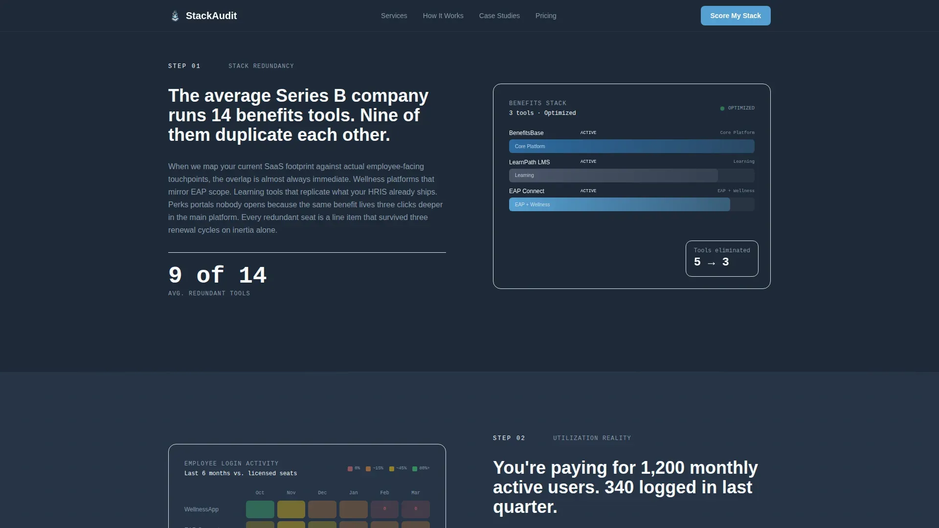
Animated Data Visualizations
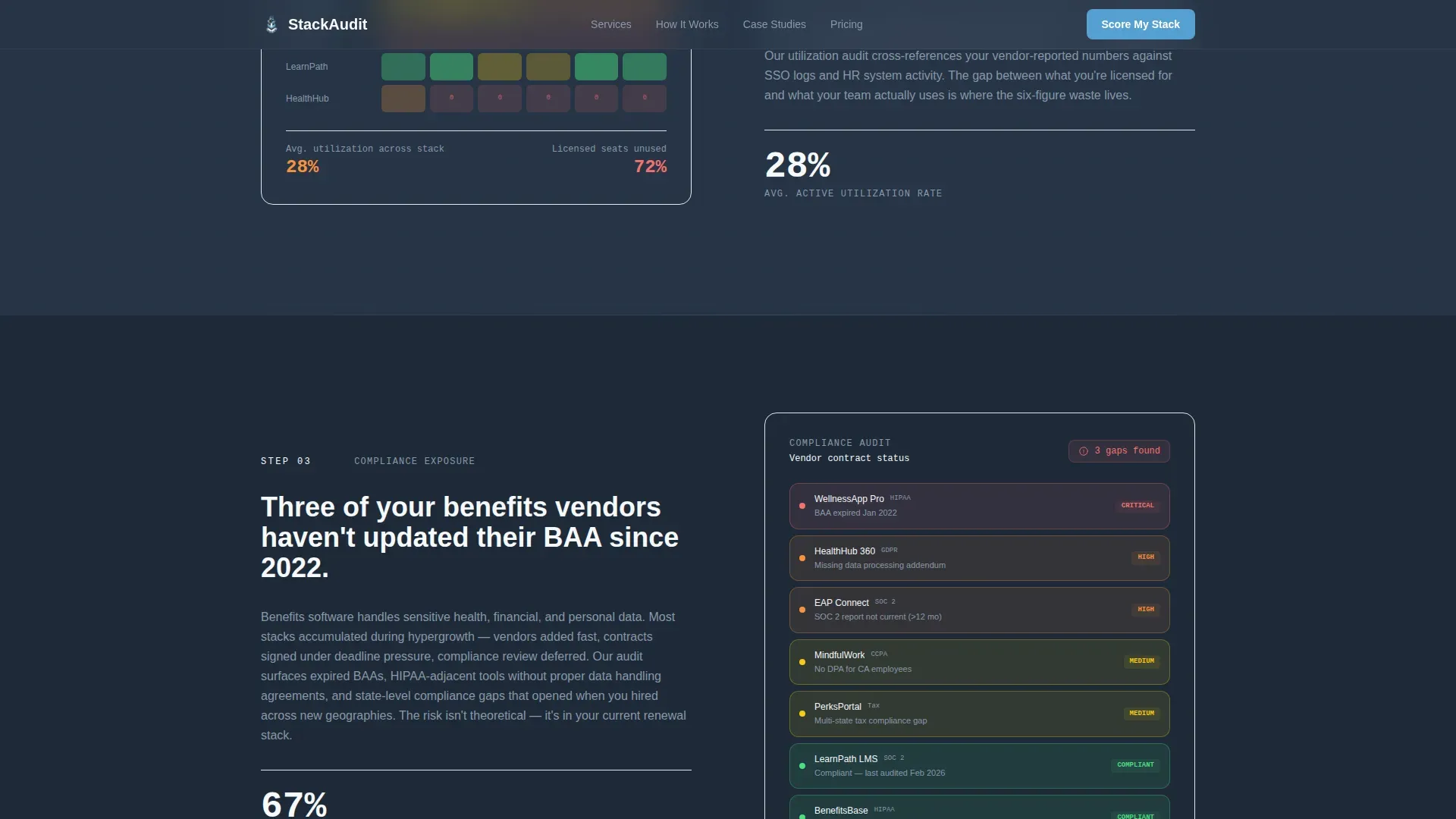
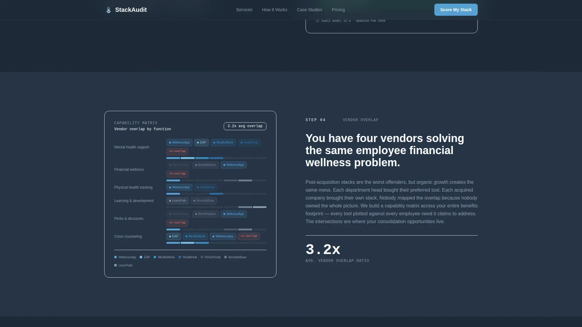
Five distinct visuals are embedded across the zigzag sections: a collapsing stack diagram for tool redundancy, a utilization heat map comparing logins to licenses, a compliance gap risk view, a vendor overlap map, and a projected savings visualization.
Sticky Conversion Bar
After the visitor scrolls past the third zigzag section, a persistent bottom bar appears with the primary call to action: "Score My Benefits Stack." It stays visible without blocking the main content, keeping the next step always reachable.
Mid-Flow Fallback Conversion
Visitors who abandon the main quiz mid-flow see an alternative offer: a downloadable Benefits Stack Audit Checklist in PDF format, gated behind a single email field. This path captures intent without requiring quiz completion.
Corporate Precision Design System
Typography uses Plus Jakarta Sans for all headings and body copy, with JetBrains Mono reserved for data labels and code-style callouts. The Slate and Sky color palette applies deep charcoal as the dominant background, sky blue as the action accent, and cloud white panels to break up the dense layout rhythm.
Page sections overview
| Section | Purpose |
|---|---|
| Multi-Step Form Header | Opens mid-conversation with step one of the benefits stack assessment above the fold |
| SaaS Stack Collapse | Animated redundancy diagram showing why tool count matters |
| Utilization Heat Map | Visual comparison of actual employee logins versus licenses purchased |
| Compliance Gap Finder | Risk visualization illustrating where gaps live in the current stack |
| Vendor Overlap Map | Redundancy mapping that names duplicate function across vendors |
| Projected Savings View | Return-on-investment visualization paired with sticky call-to-action trigger |
| Linear Footer | Single-row footer following Pattern 1 layout |
Design & branding system
The visual identity follows a Corporate Precision theme intended to feel like a well-lit server room at dawn. Cool tones dominate. Every color serves a role and appears only where it earns its place.
- Deep charcoal slate (#1E2A38) covers primary backgrounds; mid-tone gunmetal (#4A5568) handles secondary surfaces; open-sky blue (#56A0D3) marks every action point; cloud white (#F7F9FC) panels alternate in to prevent visual density fatigue across the zigzag rhythm
- Plus Jakarta Sans handles all headings and body text for clean readability; JetBrains Mono is used exclusively for data labels and code-style callouts to reinforce a precision-data aesthetic
- GSAP drives form step transitions and scroll-reveal animations on zigzag sections; animated diagrams for the heat map and stack visualizations bring the data to life without overwhelming the layout
Mobile & speed optimization
The template is designed desktop-first, reflecting the research habits of its primary audience. VP-level and CTO buyers typically evaluate vendors on desktop during working hours. Mobile parity is maintained so the experience holds up on any device.
- Server Components handle all static layout sections to keep rendering efficient; Client Components are scoped to the interactive multi-step form logic
- The sticky call-to-action bar and multi-step form are both optimized for touch interaction, so mobile visitors can complete the quiz and reach the conversion point without friction
- Animation complexity is set to medium-high; GSAP transitions are applied to form steps and section reveals, keeping motion purposeful rather than decorative
How this template helps you convert
The conversion model is built around the idea that a visitor should feel the cost of their own problem before they are asked to act. Every design and copy decision in this template builds toward that moment.
- The five-step form starts the assessment before the visitor has read a single paragraph, anchoring them in their own data from the first second on the page
- Each zigzag section adds a new dimension of evidence, making the problem more concrete with every scroll step so that by section four the cost of not finishing feels higher than the cost of sharing a work email
- The sticky call-to-action bar and the mid-flow checklist fallback create two parallel paths to conversion, catching both committed visitors and those who need a lower-commitment first step
Other information about this template
This template is localized for United States-based consultancies by default, using English copy, USD currency, and MM/DD/YYYY date formatting throughout. It is built with a high interactivity budget that includes a multi-step form with progress tracking, a sticky call-to-action bar, an FAQ accordion, and a pricing toggle component.
- Social proof is structured for client outcome metrics and named case studies with company stage and savings figures, giving the consultancy space to present real evidence alongside the assessment narrative
- The footer follows a linear single-row pattern (Pattern 1) that keeps the page exit clean and focused without pulling attention toward secondary navigation
- The template is purpose-built for the tech and software benefits consultant niche within the broader HR and hiring category, and the layout logic applies equally well to adjacent People Operations advisory practices or HR technology audit services

Theme
Corporate Precision
Creative direction
Step-by-Step Guide
Color system
Slate & Sky
Style
Zigzag/Alternating
Direction
Quiz/Assessment
Page Sections
Five-step Assessment Form Header
Zigzag Scroll Narrative
Animated Data Visualizations
Sticky Call-to-action Bar
Mid-flow Fallback Conversion Path
Corporate Precision Design System
Related questions
Who is the primary audience for this landing page template?
Does the multi-step form collect all visitor information in one step?
What happens when a visitor abandons the quiz before finishing?
Can this template display client case studies and outcome metrics?
What typography and color system does this template use?


