Financial Services | Free Website Template | Rocket
A split-screen landing page built for financial services benefits consultants who lead with data and convert with credibility. The template combines a live three-step diagnostic form, scrolling benchmarking stats, and a persistent audit call to action into one high-pressure, high-trust page. It is designed to make CFOs, HR directors, and mid-market CEOs feel the cost of inaction before they ever type their email.
by Rocket studio
Quick summary
This is a split-screen landing page template for a financial services benefits consultancy. It leads every section with a hard number, then earns the visitor's contact details through a three-step diagnostic form. The layout is built around a Stats-First Impact creative direction, pairing benchmarking data on the left with contextual proof on the right throughout the entire scroll.
Who this template is for
This template is built for consultants who sell rigor, not reassurance. It works best for practices that need to win trust quickly with a financially literate audience that is already skeptical.
- Benefits consultants targeting CFOs and HR directors at mid-market companies
- Financial services advisors who lead client conversations with benchmarking data
- Consultancies offering employer benefits audits, stop-loss analysis, or renewal pricing reviews
What problem this template solves
Most benefits consultant pages look like every other professional services site. They use vague language, generic testimonials, and a contact form that asks for everything upfront. That approach fails completely with buyers who live inside spreadsheets.
- Visitors leave before engaging because the page offers no immediate proof of insight
- Generic forms demand personal details before delivering any value, killing conversion
- Undifferentiated design fails to signal analytical authority to a finance-minded audience
What you get with this template
You get a fully structured single-page layout that moves a skeptical buyer from curiosity to committed action. Every section is designed to raise the financial stakes before lowering the friction to act.
- A live three-step diagnostic form that recalculates a personalized overspend projection as the visitor responds
- A scrolling stats panel cycling real benchmarking figures with paired case study thumbnails
- A persistent bottom-bar call to action and a secondary gated PDF capture path for visitors at different readiness levels
Feature list
This template ships with six purpose-built components, each designed to match the analytical expectations of a CFO-level audience.
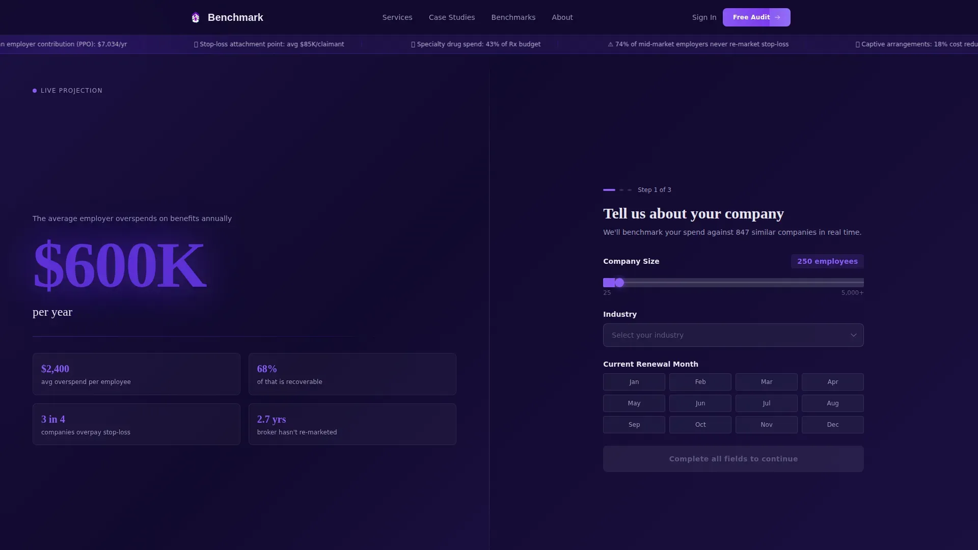
Live Recalculating Header Form
The header splits the viewport cleanly. The left side shows a bold 120-pixel stat in indigo type stating the average employer overspends $2,400 per employee per year on benefits. A counter ticks upward based on company size inputs. The right side runs a three-step diagnostic. Each answer recalculates the left panel's projection in real time, making the form feel like a financial instrument rather than a lead capture tool.
Three-Step Progressive Diagnostic
Step 1 collects company size via slider, industry via dropdown, and current renewal month. Step 2 asks for the current medical carrier and funding type, distinguishing fully insured from self-funded arrangements. Step 3 requests only a work email and first name, deliberately saving personal details for last. This sequence builds investment before asking for identification.
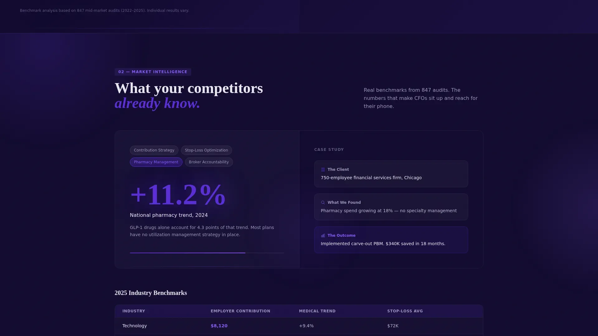
Scrolling Benchmarking Stats Panel
Below the header, the left panel cycles through industry-specific figures: median employer contribution by sector, average stop-loss attachment points, and pharmacy trend percentages. The right panel pairs each stat with one explanatory sentence and a mini case study thumbnail. The rhythm is consistent: shock with the metric, explain with the context, prove with the outcome.
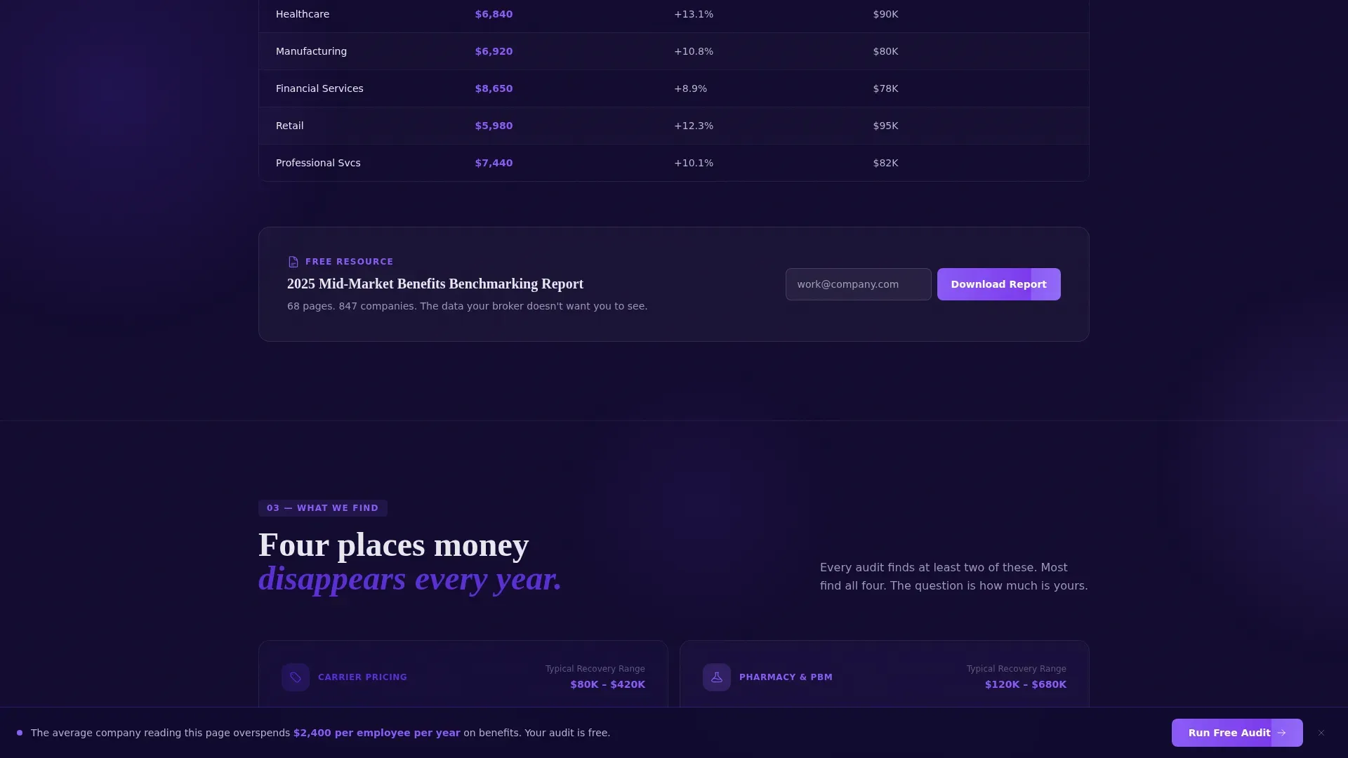
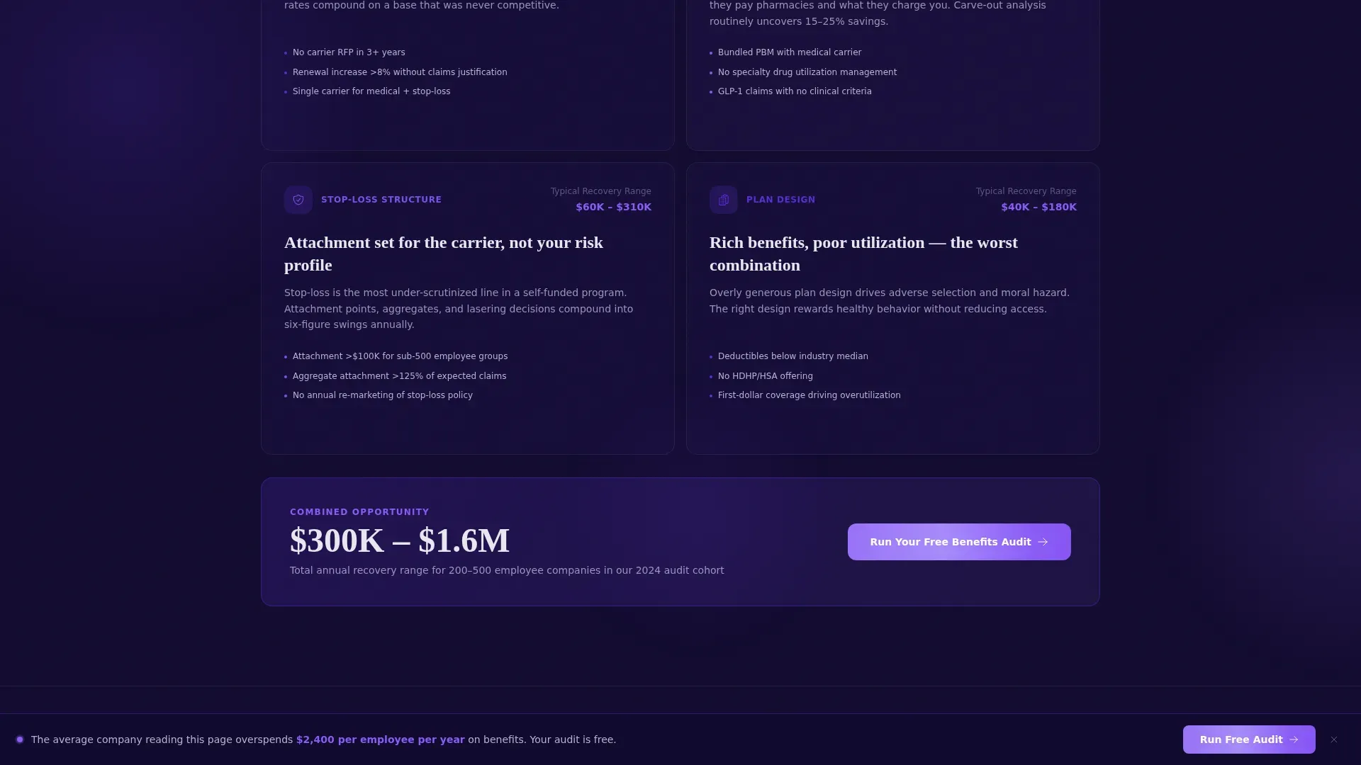
Persistent Bottom-Bar call to action
After the visitor scrolls past 40 percent of the page, a fixed bottom bar appears carrying the primary call to action: "Run Your Free Benefits Audit." This keeps the conversion path visible without interrupting the data narrative above it.
Gated PDF Secondary Capture
An inline single-field email form embedded inside the stats section offers the 2025 Benchmarking Report as a downloadable PDF. This secondary path captures visitors who are not yet ready for a direct audit conversation, giving the consultancy two conversion points on one page.
Electric Indigo Visual System
The design uses a four-color palette calibrated for data-heavy financial content. Deep digital navy anchors all backgrounds. Vivid indigo highlights active states and data callouts. Cool platinum surfaces cards and secondary text fields. Sharp electric violet is reserved exclusively for calls to action and live metric highlights, creating instant visual hierarchy that guides the eye without distraction.
Page sections overview
| Section | Purpose |
|---|---|
| Split-Screen Header | Introduces the bold overspend stat and launches the three-step diagnostic form |
| Step 1 Diagnostic | Captures company size, industry, and renewal month; triggers the first live projection |
| Step 2 Diagnostic | Collects medical carrier and funding type to refine the personalized estimate |
| Step 3 Diagnostic | Requests work email and first name; surfaces the primary audit call to action |
| Benchmarking Stats Panel | Cycles industry metrics with paired context sentences and case study thumbnails |
| Gated PDF Capture | Offers the 2025 Benchmarking Report via a single inline email field |
| Persistent Bottom Bar | Keeps the audit call to action visible after 40 percent scroll depth |
Design & branding system
The visual identity follows a Directory and Discovery theme executed through the Electric Indigo color system. The palette is designed to feel like a Bloomberg terminal at early morning: authoritative, slightly urgent, and visually distinct from typical HR vendor pages.
- Deep digital navy (#1A1040) anchors all background surfaces; vivid indigo (#5B2FD4) marks active states and data highlights; cool platinum (#E8E6F0) lifts card surfaces and secondary text
- Sharp electric violet (#8B5CF6) is used exclusively for call to action buttons and live metric callouts, creating a reliable visual signal that is never diluted by decorative use
- The header stat is set in 120-pixel indigo type to establish immediate visual weight before the visitor reads a single word of body copy
Mobile & speed optimization
The split-screen layout is structured to adapt cleanly across viewport sizes without losing the data-forward impact that defines the desktop experience.
- The 50/50 split stacks vertically on smaller screens so the bold stat headline appears first, followed immediately by the diagnostic form steps
- The persistent bottom-bar call to action remains anchored at the foot of the screen on mobile, keeping the conversion path accessible throughout the full scroll
- Lightweight inline form fields and image thumbnails in the stats panel are sized to load and respond quickly within the page's overall structure
How this template helps you convert
This template is engineered around the principle that a financial audience will not act until they have already seen something valuable. Every layout decision serves that conversion logic.
- The recalculating header form gives visitors a personalized overspend number before asking for their name, creating emotional investment in the diagnostic outcome before Step 3 is reached.
- The scrolling benchmarking stats section escalates stakes progressively, moving from overpayment data to competitor benchmarks to candidate-rejection implications, so each scroll adds urgency without feeling like a sales pitch.
- The dual call to action structure, a primary audit path and a secondary PDF download, means visitors at different stages of readiness both have a clear next step, reducing the chance that undecided buyers simply leave.
Other information about this template
This template is built specifically for the financial services benefits consulting niche, where the buyer's default posture is skepticism and data is the only credible currency of persuasion.
- The page structure supports two distinct buyer journeys: one for decision-makers ready for a direct audit conversation, and one for researchers who want proof before committing
- The template's Directory and Discovery theme means the layout communicates organized expertise, similar to a well-structured audit report, rather than a promotional brochure
- The Split Screen (50/50) format is particularly effective in this category because it lets the consultancy show data and context simultaneously, matching the way a financially trained reader naturally processes information
Theme
Directory & Discovery
Creative direction
Stats-First Impact
Color system
Electric Indigo
Style
Split Screen (50/50)
Direction
Freemium/Trial
Page Sections
Live Recalculating Header Stat
Three-step Progressive Diagnostic Form
Scrolling Benchmarking Stats Panel
Persistent Bottom-bar Call to Action
Gated PDF Secondary Capture
Electric Indigo Four-color System
Related questions
Who is this landing page template designed for?
How does the three-step diagnostic form work?
What are the two conversion paths built into this template?
What makes the Stats-First Impact layout effective for this audience?
Can I adapt this template for my own benchmarking data and industry focus?


