Dog Pre-Launch Website Template
The Aussie Trusted Shepherd landing page template is built for Australian Shepherd breeders running a family operation. It uses a warm, earthy visual identity and a modular card grid layout to tell your story through real photos, family testimonials, and dog profiles. The primary goal is a single, confident action: getting serious buyers onto your waitlist.
by Rocket studio
Quick summary
This is a single-page, click-through landing page template designed for Australian Shepherd breeders. It combines a Photo Grid Mosaic header with a scrolling Testimonial Mosaic card grid. Every section is built to build trust, show real dogs in real life, and guide the right buyers toward one clear action: joining your waitlist.
Who this template is for
This template is made for small, family-run Australian Shepherd breeding programs. It speaks to breeders who care deeply about their dogs and want buyers who feel the same way.
- Australian Shepherd breeders running a pasture-based or working-dog program
- Hobby farmers and homesteaders who breed dogs with a herding purpose
- Family operations that rely on reputation, word of mouth, and a waitlist model
What problem this template solves
Most breeder websites look like generic pet store listings. They lead with price, skip the story, and lose the buyers who would have been the best fit. This template solves that problem by putting social proof and genuine character first.
- Buyers scroll past cold catalogs; this template offers a warm, story-led experience instead
- Without a clear waitlist flow, serious buyers drop off before committing; this template keeps them moving toward a single action
- Generic layouts make every breeder look the same; this template gives your program a distinct, trustworthy identity
What you get with this template
You get a complete, ready-to-customize landing page laid out as a modular card grid. Every component is designed to carry weight in the story you are telling.
- A nine-tile Photo Grid Mosaic header with a handwritten-style headline overlay
- A scrolling Testimonial Mosaic section that alternates dog profile cards and buyer story cards
- A sticky "Join Our Waitlist" call-to-action button that persists as visitors scroll
Feature list
This template includes purpose-built sections and visual components drawn directly from the source brief. Each one serves the click-through goal.
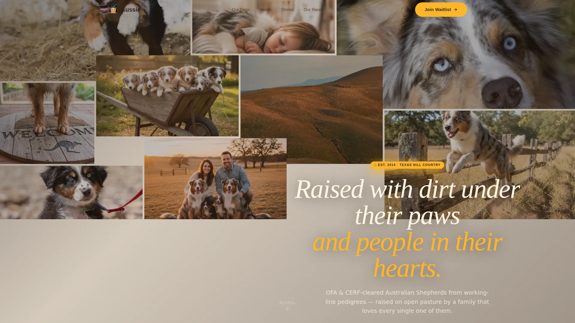
Nine-Tile Photo Grid Mosaic Header
The header fills the viewport with nine unevenly sized image tiles. Each tile holds a candid, golden-hour moment: a mid-leap merle, muddy paws, a sleeping child on a dog's belly. A handwritten-style headline floats across the grid to set the emotional tone immediately.
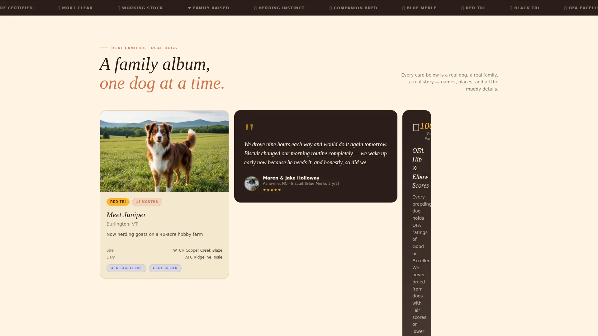
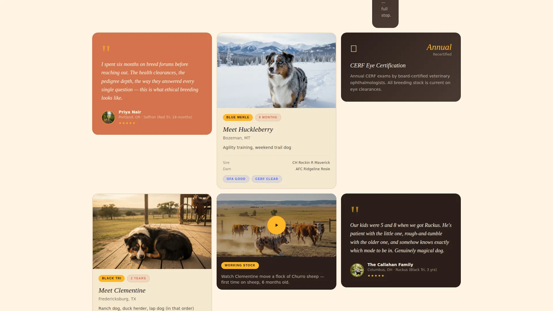
Alternating Testimonial Mosaic Card Grid
The main scroll section uses a modular card grid that alternates between dog profile cards and buyer story cards. The rhythm keeps readers engaged without feeling like a catalog. Cards can include family quotes, dog names, locations, health clearance notes, and short video clips.
Sticky Waitlist Call-to-Action Button
A marigold-colored "Join Our Waitlist" button appears first beneath the header mosaic. It then reappears as a sticky button during scroll and surfaces a third time deeper in the page content. The repetition is intentional and timed to feel natural.
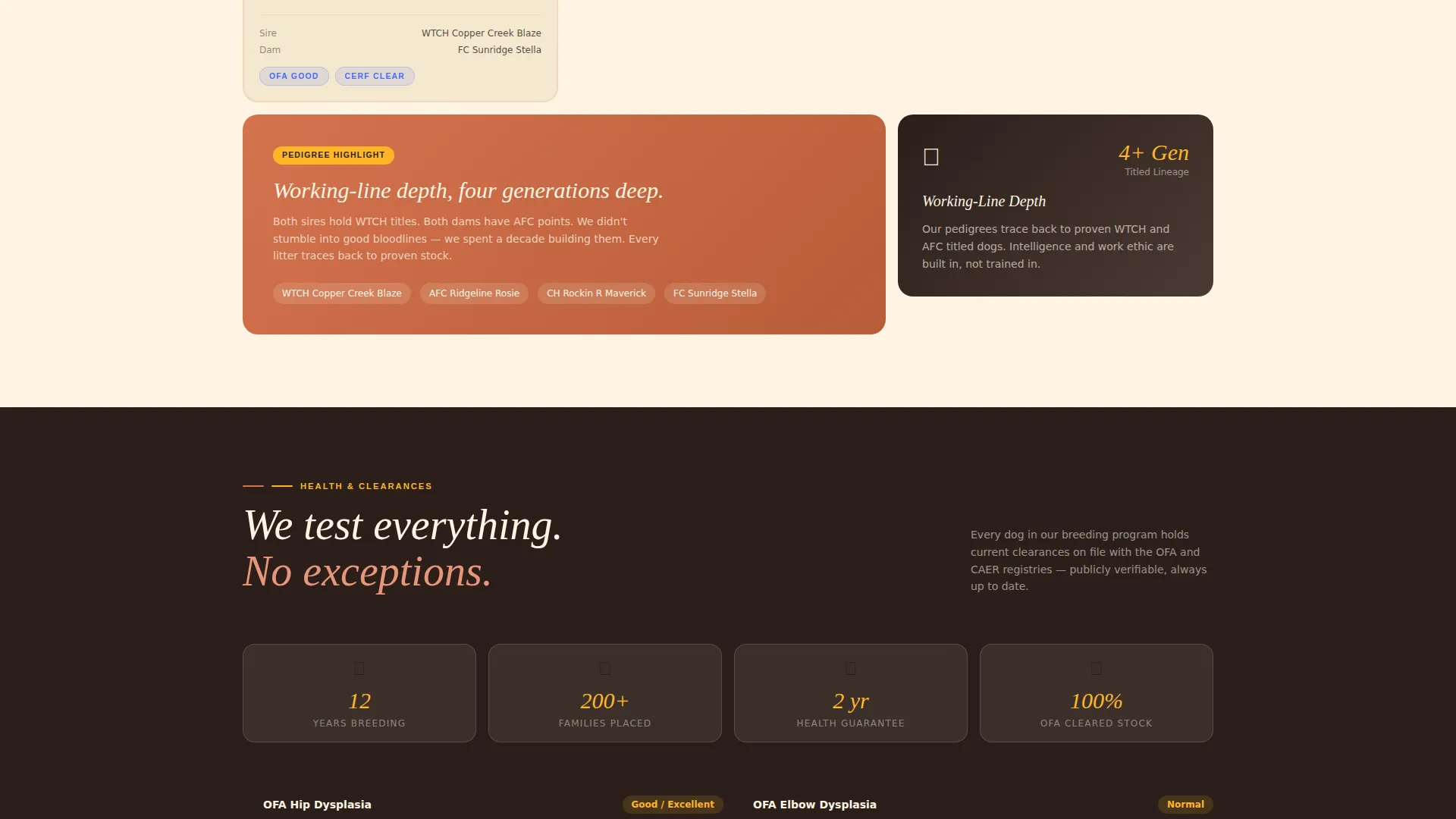
Health and Pedigree Highlight Cards
Dedicated cards inside the mosaic grid are reserved for health clearances and pedigree highlights. These cards speak directly to informed buyers who already know what OFA (Orthopedic Foundation for Animals) and CERF (Canine Eye Registry Foundation) scores mean.
Warm Artisan Visual Identity System
The full color palette, typography choices, and card styling follow a Warm Artisan theme with a Dopamine Pop color system. Sun-bleached cream, terracotta clay, electric lupine blue, deep loam, and happy marigold work together as one cohesive visual system.
Click-Through to Waitlist Application
The landing page is purpose-built as a click-through page. All roads lead to one destination: a detailed waitlist application form on a separate page. The landing page earns the click before it asks for it.
Page sections overview
| Section | Purpose |
|---|---|
| Photo Grid Mosaic | Opens with nine candid dog-and-family image tiles and a headline |
| Waitlist call to action Block | First appearance of the "Join Our Waitlist" button below the header |
| Testimonial Mosaic Grid | Alternating dog profiles and buyer story cards with health and video cards |
| Sticky call to action Button | Persistent waitlist button that follows the visitor during scroll |
| Health Clearance Cards | Dedicated mosaic cards highlighting OFA and CERF results |
| Final call to action Placement | Third appearance of the waitlist button, nestled in the story flow |
Design & branding system
The visual identity follows a Warm Artisan theme built on a Dopamine Pop color system. The result feels handcrafted, honest, and alive without being rough or unpolished.
- Color palette: sun-bleached cream (#FFF5E4), terracotta clay (#D4734E), electric lupine blue (#4A6CF7), deep loam (#2B1F1A), and happy marigold (#FFB627) for buttons and badges
- Typography uses a handwritten-style headline treatment for the header overlay, paired with clean body text across all cards
- Card styling, image framing, and color choices all reinforce the golden-hour, real-family aesthetic described in the brief
Mobile & speed optimization
The modular card grid layout is designed to reflow cleanly at smaller screen sizes. Every component in the template is built with a mobile visitor in mind.
- The Photo Grid Mosaic tiles resize and restack on smaller screens without losing their candid, unposed feel
- The sticky "Join Our Waitlist" button remains accessible throughout the scroll on both desktop and mobile viewports
- Card grid columns adjust to the available screen width so text, images, and video clip placeholders remain readable at any size
How this template helps you convert
This template is structured as a click-through landing page with one goal: getting the right buyer to submit a waitlist application. Every design and content decision supports that goal.
- Social proof loads first. Real family stories, real dog names, and real locations appear before any call to action, so trust is built before commitment is requested.
- The waitlist button appears three times at natural decision points: after the header, as a persistent sticky element, and again deep in the mosaic after a health guarantee card.
- Informed buyers are met with the language they already use. Health clearance cards and pedigree highlights speak directly to buyers who have done their research, reducing hesitation at the final step.
Other information about this template
This template is part of a broader category of niche pet and animal service landing pages. A few additional details worth noting before you customize and launch.
- The page is designed as a single landing page with a click-through flow to a separate waitlist application form page; the application form itself is not included in this template
- Short video clip placeholders are included in the mosaic grid layout to support working-dog footage, though actual video hosting is managed separately by the user
- The template fits the Australian Shepherd breeder niche specifically, but the layout and card system can support other herding or working-dog breeding programs with minimal copy changes
- The Warm Artisan theme and Dopamine Pop color system are part of the matched design intersection for this template, ensuring the visual direction is consistent with the niche and audience
Theme
Warm Artisan
Creative direction
Testimonial Mosaic
Color system
Dopamine Pop
Style
Card Grid (Modular)
Direction
Click-Through
Page Sections
Nine-tile Photo Grid Mosaic Header
Alternating Testimonial Mosaic Card Grid
Sticky Waitlist Call-to-action Button
Health and Pedigree Highlight Cards
Warm Artisan Visual Identity System
Click-through Page Architecture
Related questions
Does this template include the waitlist application form?
Can I replace the placeholder photos with my own images?
Is this template suitable for a herding breed other than Australian Shepherds?
How does the health clearance information appear on the page?
What happens when a visitor clicks the Join Our Waitlist button?


