Grant Writer Service Area Landing Page Template
Awarded is a sidebar companion landing page template built for grant writing consultancies. It combines a Giant Headline Left header, a persistent credentials sidebar, and a Logo Wall Authority layout to stack social proof and drive click-through. The Monochrome Steel color system projects restrained authority, making every section feel like a winning proposal already in print.
by Rocket studio
Quick summary
Awarded is a single-page template designed for grant writing consultancies targeting specific service areas and locations. It leads with oversized headline figures, builds trust through a funder and client logo wall, and channels visitors toward one clear action: requesting a proposal review. The design is deliberate, authoritative, and built entirely around evidence.
Who this template is for
This template is built for professional grant writing consultancies that serve a defined geographic region or sector. It speaks directly to service providers who work with high-stakes clients and need their online presence to match their track record.
- Nonprofit-focused grant writers serving executive directors facing tight Notice of Funding Opportunity deadlines
- Municipal and public-sector consultants pursuing federal and state hazard mitigation programs
- Academic grant professionals supporting department chairs with federal research proposal submissions
What problem this template solves
Grant writing is a credibility-first industry. Potential clients need to trust your win rate before they pick up the phone. Most service pages bury the evidence or force visitors to hunt for proof that the consultancy has delivered before.
- Funders and award names get lost in walls of text rather than displayed as visual proof
- Service-area expertise is rarely communicated clearly, leaving regional clients unsure you understand their funding landscape
- There is no persistent reminder of credentials as visitors scroll, causing authority to fade before the call to action lands
What you get with this template
You get a fully structured sidebar companion landing page that leads with data and closes with a focused call to action. Every section is purposefully ordered to build trust before asking for commitment.
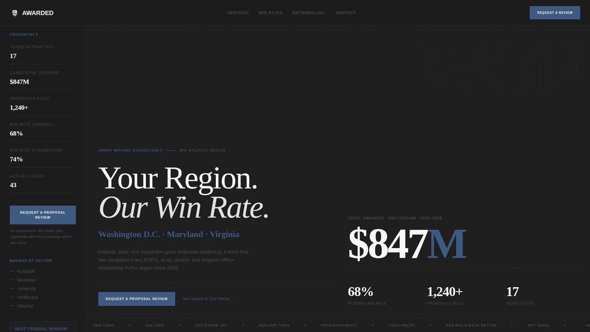
- A Giant Headline Left header pairing an oversized service-area tagline with a cumulative dollars-awarded figure
- A scrollable main content area moving from logo wall through win rates, named grant programs, and methodology
- A persistent sidebar displaying years in practice, total dollars secured, and proposal count throughout the entire scroll
Feature list
A brief note on what powers this template: every design decision serves one purpose, making hesitation feel irrational by the time a visitor reaches the call to action.
Giant Headline Left Header
The header sets authority in the first two seconds. An oversized serif headline reads flush-left with a service-area name highlighted in boardroom blue. The right half displays a single cumulative dollars-awarded stat in a typeface large enough to read from across a room. No image, no illustration. The numbers carry the visual weight.
Persistent Credentials Sidebar
The sidebar stays fixed throughout the scroll, displaying a condensed credentials panel covering years in practice, cumulative dollars secured, and total proposal count. It holds in charcoal throughout, acting as a constant, steady presence beside the main content. The primary call to action, "Request a Proposal Review," lives here first.
Logo Wall Authority Section
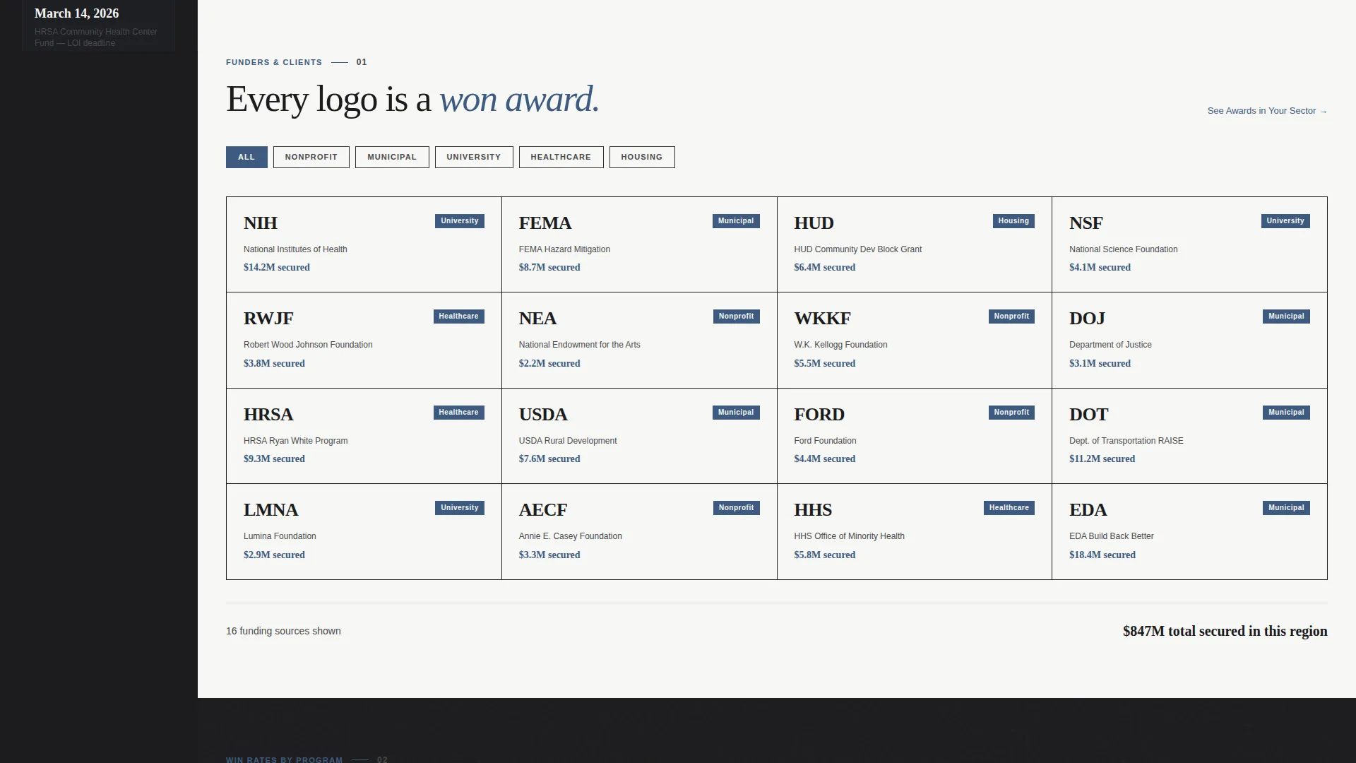
Immediately below the header, a grid of funder and client logos appears as evidence rather than decoration. Each mark represents a won award. A secondary text link, "See Awards in Your Sector," lets visitors filter the logo wall by category, encouraging engagement before any commitment is required.
Service-Area Win Rate Sections
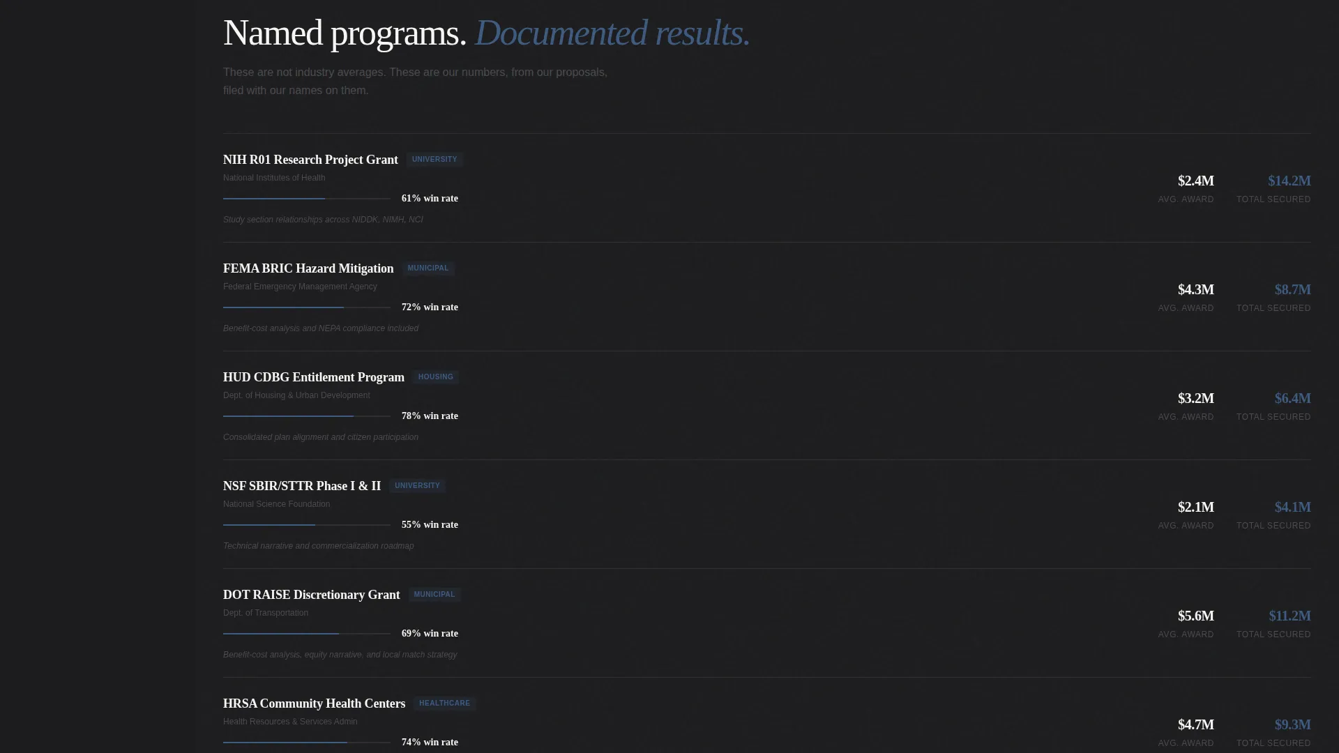
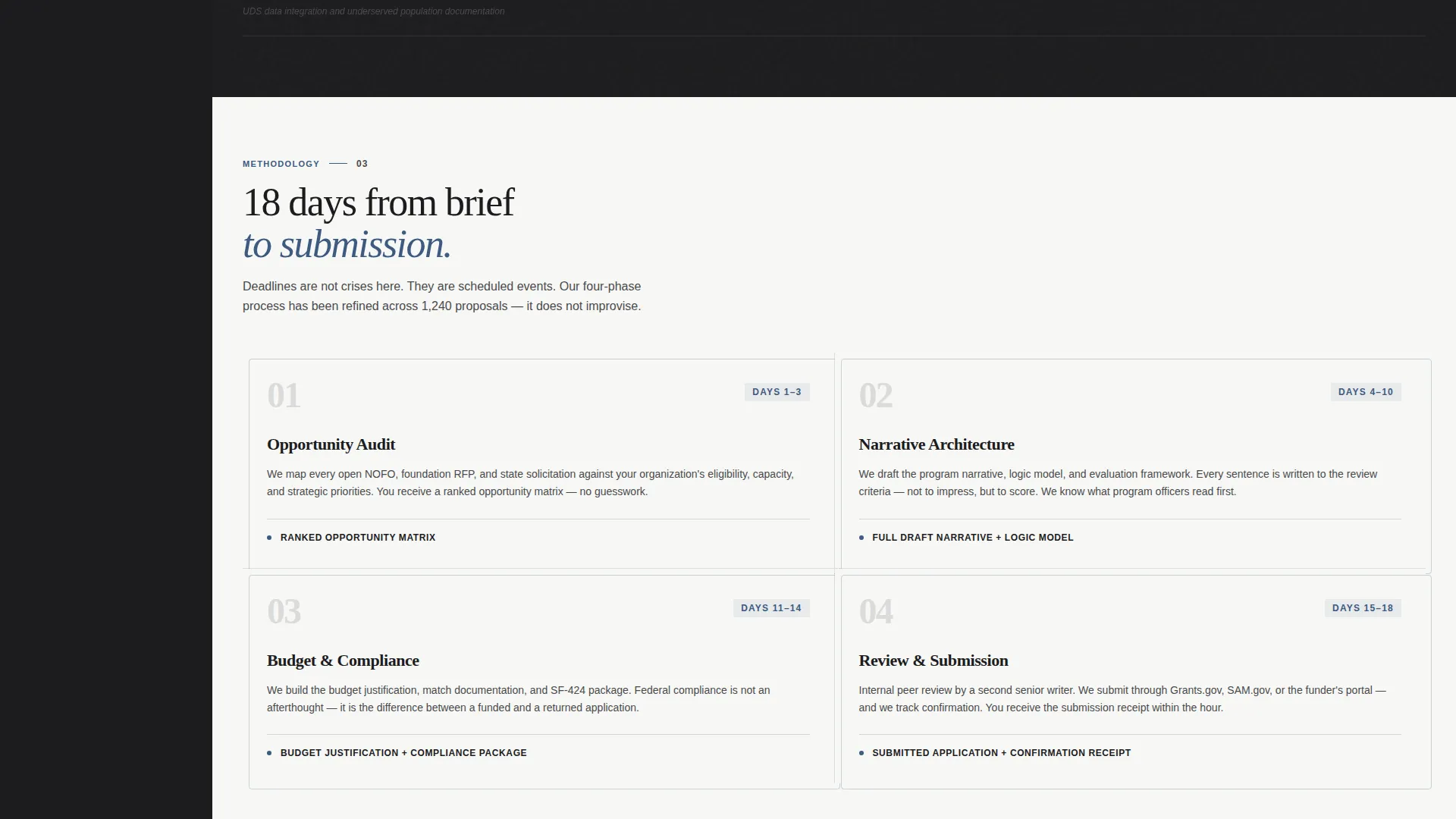
The main content unfolds like a case file. Dedicated sections present win rates specific to the service area, named grant programs relevant to that location, and methodology. The sequence moves from social proof to process to local expertise, deepening authority with each scroll.
Full-Width Call-to-Action Bar
After the methodology section, a full-width boardroom blue bar repeats the primary call to action. Clicking routes visitors to a dedicated intake page. No form lives on this page, keeping the layout clean and the commitment threshold low.
Horizontal Rule Visual System
A thin gunmetal horizontal rule sits beneath the main headline, drawing the eye downward like the underline on a signed contract. This detail reinforces the Executive Suite aesthetic and signals that structured, serious content follows.
Page sections overview
| Section | Purpose |
|---|---|
| Giant Headline Left | Opens with service-area tagline and cumulative dollars awarded |
| Gunmetal Rule Divider | Draws the eye down and signals structured content below |
| Logo Wall Grid | Displays funder and client logos as evidence of won awards |
| Sector Filter Link | Lets visitors filter logos by category before committing |
| Win Rate Breakdown | Presents service-area-specific success rates and named programs |
| Methodology Content | Details the consultancy approach and local grant expertise |
| Full-Width call to action Bar | Repeats the primary call to action after the methodology section |
| Persistent Credentials Sidebar | Shows years in practice, dollars secured, and proposal count throughout scroll |
Design & branding system
The Monochrome Steel color system is built to feel like a freshly bound proposal sitting on a conference table. Every color choice reinforces restraint and authority rather than decoration.
- Carbon charcoal (#1C1C1E) and bond-paper white (#F7F7F5) alternate as background tones, with gunmetal (#4A4A4D) carrying body text on light sections and paper-white on dark sections
- Boardroom blue (#3D5A80) appears exclusively on links and calls to action, including the service-area name in the headline and the "Request a Proposal Review" button
- The sidebar holds steady in charcoal throughout the scroll, and the header uses oversized serif typography set flush-left to project authority without relying on imagery
Mobile & speed optimization
The layout is structured with a clear content hierarchy that adapts across screen sizes. The sidebar companion format translates to a stacked single-column view on smaller screens without losing the credential visibility that drives trust.
- The persistent sidebar credentials panel repositions gracefully for mobile readers, keeping key figures visible near the call to action
- Typography sizing for the headline stat remains impactful at smaller viewports, preserving the data-as-visual approach on every device
How this template helps you convert
Every section of this template is sequenced to reduce hesitation and make the next step feel obvious. The click-through direction is built into the page architecture itself.
- The header leads with a dollars-awarded figure that immediately answers the visitor's first question: has this consultancy actually delivered results in my region?
- The logo wall and sector filter give visitors a reason to engage and explore before they are asked to commit, building familiarity and lowering resistance.
- The persistent sidebar keeps the "Request a Proposal Review" call to action visible at all times, so when the visitor is ready, the path forward requires no searching.
Other information about this template
This template is part of a broader set of professionally themed service-area and location page designs suited to high-trust consulting categories. A few additional points worth noting:
- The template style is classified as Sidebar Companion, making it well-suited for consultancies that serve multiple regions and want a consistent, repeatable page format for each location
- The Executive Suite theme and Monochrome Steel system are intentionally sector-neutral within professional services, meaning the visual language works for grant writing, legal, financial advisory, and similar authority-driven fields
- The Click-Through landing page direction means no contact form appears on the page itself; all lead capture happens on the dedicated intake page that the call to action links to
- The Logo Wall Authority creative direction is designed to be populated with real client and funder marks, so the template performs best when the consultancy has genuine awards and recognitions to display
Theme
Executive Suite
Creative direction
Logo Wall Authority
Color system
Monochrome Steel
Style
Sidebar Companion
Direction
Click-Through
Page Sections
Giant Headline Left Header
Persistent Credentials Sidebar
Logo Wall Authority Layout
Service-area Win Rate Sections
Full-width Call-to-action Bar
Related questions
Does this template include a contact form?
Can I use this template for multiple service areas or locations?
What kind of logos should go in the logo wall section?
Is this template suitable for a consultancy that works with federal grant programs?
Do I need design experience to customize this template?



