Grant Writer Booking Website Template
The Awarded Navy Authority Grant Strategy landing page template is built for solo grant writers who need to prove results before a visitor ever clicks "book." It combines an animated $47.2M counter headline, before-and-after client comparison tables, a sticky booking bar, and a dual-path lead capture form into one editorial-quality, conversion-focused landing page layout.
by Rocket studio
Quick summary
This template gives a professional grant writer one authoritative page to convert skeptical nonprofit leaders and startup founders into booked strategy calls. The layout opens with a data-driven hero, moves through client proof tables, and closes with two lead capture paths. Every section serves as supporting documentation for the writer's track record, built in a deep navy editorial format that commands immediate trust.
Who this template is for
This landing page is designed for one specific professional: the independent grant writer who has real results and needs a page that reports those results with precision. It suits practitioners who work with government-adjacent clients and need a format that reflects federal-level authority.
- Solo grant writers with a track record of funded awards who want to submit a polished, credible online presence to prospective clients
- Freelance grant consultants who support nonprofits, startups, and research organizations pursuing federal or foundation funds
- Experienced proposal writers ready to advance beyond referrals and direct inbound leads from executive directors, development coordinators, and SBIR-curious founders
What problem this template solves
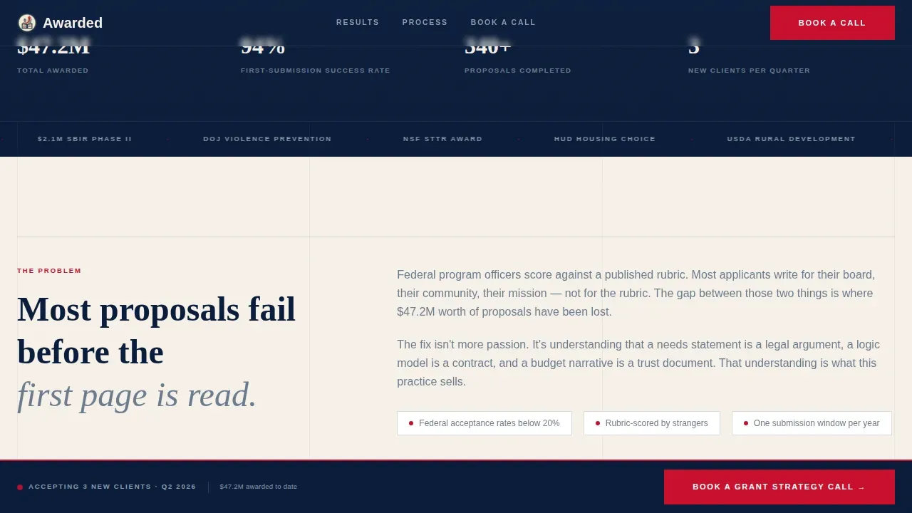
Most grant writers rely on word of mouth. When an executive director lands on a generic portfolio page, there is nothing to report that builds real confidence. The visitor cannot see the before-and-after difference this person makes. They see a bio, maybe a list of clients, and a contact form. That is not enough to book a strategy call with someone they are about to trust with a six-figure federal contract pursuit.
- No visible proof: visitors cannot see how this writer's effort changes proposal performance, reviewer scores, or funds secured
- No clear path to book: there is no sticky call-to-action, no intake form that captures organization type or grant type sought, and no lead magnet for visitors who need more time before they commit
- No editorial authority: generic templates do not carry the policy-brief weight that makes a program-officer-minded client trust the page on first scroll
What you get with this template
You get a complete, single-page layout structured to move a skeptical visitor from curiosity to commitment. Every section is built around the grant writer's core value proposition: measurable improvement in proposal performance, proven by named client data. The page is designed desktop-first, with a strong mobile fallback for development coordinators reviewing on their phones during a Thursday-night proposal crunch.
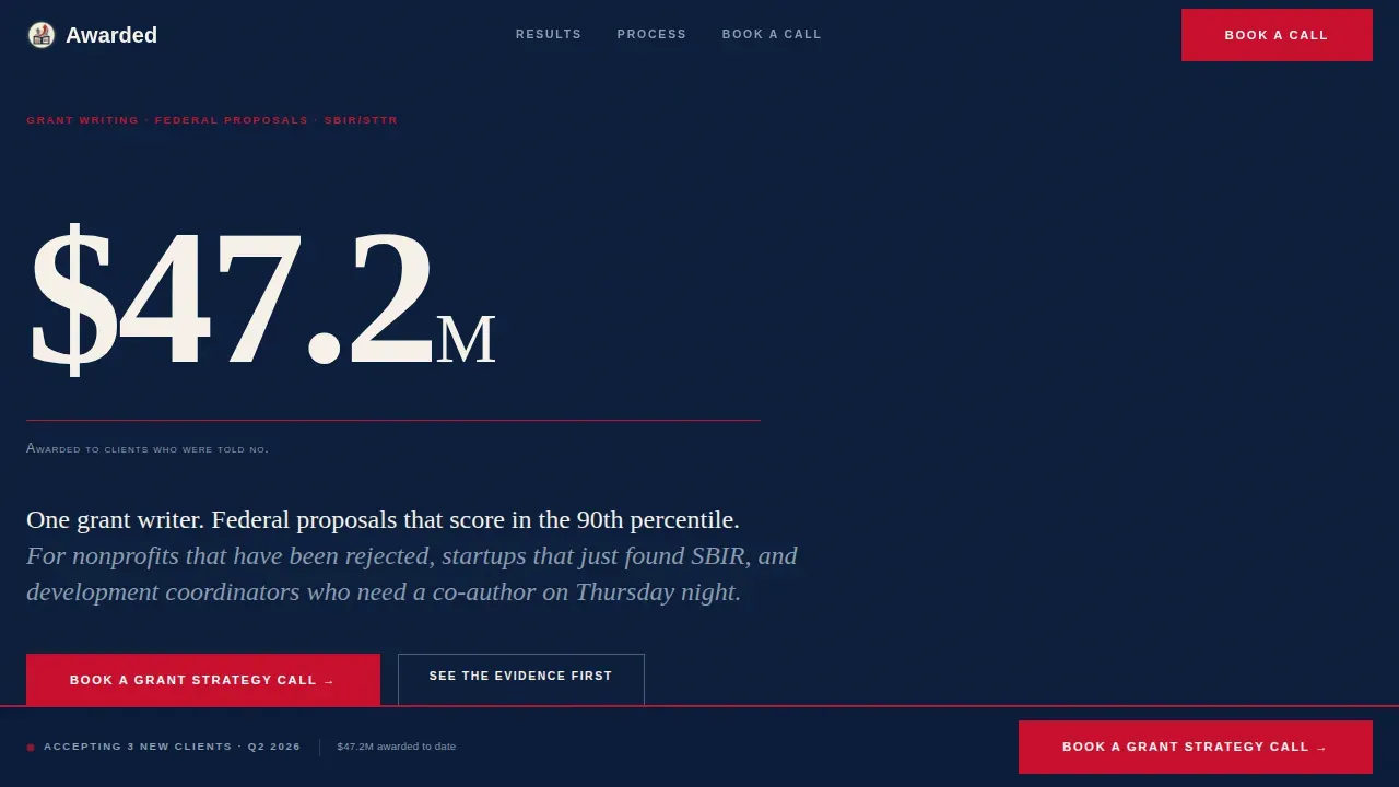
- A hero section with an animated counter that reports the total award value secured for clients, set in oversized editorial serif type against deep navy, with a vermillion rule and small-caps caption below
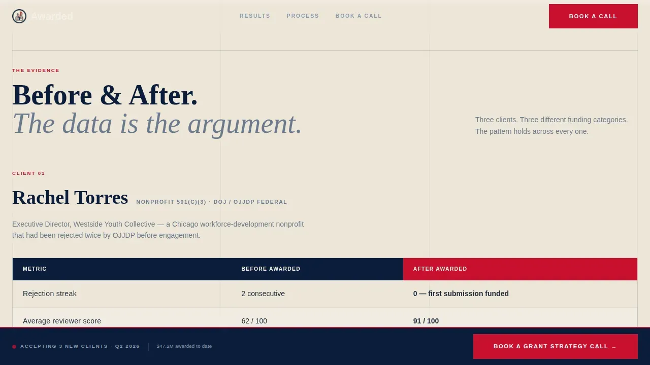
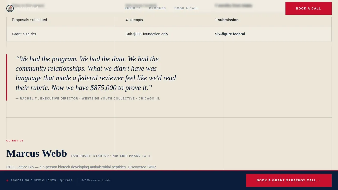
- Three before-and-after client comparison tables, each paired with a pull-quote set in large italic serif, alternating between dense data and breathing space to build a rhythm of trust
- A sticky booking bar that appears after the second proof table, a three-question intake form for qualified lead capture, and an email-gated lead magnet PDF offer as a secondary conversion path
Feature list
This section describes what the template delivers as a designed, functional system. Each feature is grounded directly in the source brief.
Animated Counter Hero
The hero opens with a GSAP-powered counter that ticks upward from $0 to $47.2M, rendered in oversized editorial serif type. This is not decorative. It is the first piece of evidence a visitor sees, and it sets the standard for everything that follows. A thin vermillion rule and a small-caps caption anchor the number with editorial authority.
Before-and-After Comparison Tables
Three client proof tables are built directly into the page layout. Each table shows proposal metrics before and after engagement: rejection rate, average reviewer score, and total funds secured. Named nonprofit leaders and their missions provide human context for each set of numbers. This format gives visitors the following information at a glance: what changed, by how much, and for whom.
Sticky Booking Bar with Intake Form
A slim navy bar locks to the viewport after the visitor scrolls past the second comparison table. It carries the primary call to action: "Book a Grant Strategy Call." The intake form inside asks three sequential questions covering organization type, grant type sought, and the largest grant previously applied for. This sequence filters for the most qualified prospects and sets the writer's office up for a productive first call.
Lead Magnet Secondary Path
A free downloadable PDF titled "The 12 Reasons Your Last Proposal Was Rejected" is gated behind an email field. This secondary path captures visitors who are not yet ready to book a strategy call but are ready to engage with the writer's knowledge. It extends the writer's ability to build trust beyond the page itself.
Editorial Pull-Quote Grid
Between each comparison table, a large italic serif pull-quote breaks the page grid like a magazine callout. The rhythm of person, problem, proof repeats across the scroll, training the visitor to expect evidence and receive it. This is the page's core persuasion system.
Three-Phase Process Section
A "How It Works" section presents the writer's engagement model as a three-phase editorial process rather than a numbered timeline. This format reinforces the journal-quality identity of the brand while giving visitors a clear description of what happens after they submit a booking request.
Page sections overview
| Section | Purpose |
|---|---|
| Hero Counter | Report total awarded grant value with animated editorial authority |
| Client Proof Tables | Show before-and-after proposal performance per named client |
| Sticky Booking Bar | Trigger primary call to action after sufficient proof |
| How It Works | Describe three-phase engagement process in editorial format |
| Lead Magnet Form | Capture emails via gated PDF for visitors not yet ready to book |
| Footer Linear Row | Close page with contact point and essential supporting links |
Design & branding system
The visual identity follows an Editorial Magazine theme built on a Navy Authority color system. The design feels like a freshly printed policy brief on heavy cotton stock. Every typographic and color decision advances a single message: this person knows the language of government funding and takes it seriously.
- Color system: deep editorial navy (#0B1D3A) as the dominant field, warm parchment (#F5F0E8) as breathing space between dense information, steel rule gray (#6B7B8D) for secondary labels and rule lines, and a decisive vermillion (#C8102E) reserved exclusively for data callouts and call-to-action buttons
- Typography: Fraunces as the editorial serif for headlines, pull-quotes, and counter display; DM Sans as the body and user interface typeface for forms, labels, and navigation
- Layout principles: magazine-cover minimalism, deliberate margins, no imagery in the hero, enormous whitespace, and a grid that alternates between dense data tables and open pull-quote fields
Mobile & speed optimization
The template is designed desktop-first, reflecting the primary audience of executive directors reviewing in their office. A strong mobile fallback ensures that development coordinators and startup founders can complete the same experience on any device without loss of critical information.
- Scroll reveal animations and the GSAP counter are implemented as client-side components, while static sections use server-rendered components to keep initial load lean
- Comparison tables reflow cleanly for narrow viewports, and the sticky booking bar remains accessible at all scroll positions on mobile without covering critical content
How this template helps you convert
The page is built around a single conversion philosophy: proof before ask. Visitors do not encounter a call to action until they have seen enough evidence to trust the person behind the page.
- The animated counter opens the page with an undeniable data point. Before a visitor reads a single word of copy, they see $47.2M in awarded funds. That number does the first persuasion work and advances the visitor's confidence immediately.
- The before-and-after comparison tables complete the argument. Each table is structured evidence, not a testimonial. Rejection rates, reviewer scores, and secured funds are the kind of report data that a program-officer-minded client recognizes and respects. By the time the sticky booking bar appears, the visitor has already seen three rounds of proof.
Other information about this template
This template is classified as the awarded navy authority grant strategy landing page template in the platform's professional services category, under the grant writer online presence subcategory. Its design and content system are built with specific awareness of the federal grant context in which its clients operate.
- A Navy authority grant is a legal instrument used by the Department of Defense to transfer funds to a recipient to carry out a public purpose of support or stimulation. The template's comparison tables are designed to report precisely this kind of award outcome, giving visitors a clear picture of the writer's impact on funds secured.
- Recipients of Navy authority grants can include universities, non-profit organizations, and commercial entities. The intake form's organization type dropdown reflects this range, covering nonprofit, startup, and municipal applicants.
- Navy authority grant recipients must adhere to federal regulations, including reporting requirements such as financial statements and technical reports. The template's content system is built to speak the language of clients who are already familiar with these obligations and who need a writer who is equally fluent in them.
- The procurement integrated enterprise environment and related government systems form the administrative backdrop for many of the contract and cooperative agreement processes the writer's clients navigate. This template's design signals familiarity with that world without oversimplifying it.
- Prior approval requirements, property management obligations, award date tracking, and end date compliance are all part of the federal grant lifecycle. The writer's page positions her as the person who understands these constraints and helps clients meet every obligation on time.
- Reporting requirements under federal awards often include the submission of a final report within 120 calendar days after the end date of the award. The template's proof tables implicitly address this discipline by showing clients that their writer tracks performance through the complete period of performance, not just at the proposal stage.
- The Office of Naval Research (ONR) requires annual online submission of interim Research Performance Progress Reports (RPPRs) as part of naval research award management. Clients pursuing naval research funds will recognize this language and trust a writer whose page demonstrates awareness of these cycles.
- The procurement integrated enterprise environment connects government agencies, contractors, and recipients across defense and naval research programs. Visitors who work within these systems will feel at home on a page that reflects the same standards of precision and accountability.
- Supporting documentation, prior approval requests, and compliance with applicable federal codes are recurring responsibilities for grant recipients. The template's page structure mirrors this discipline: every claim is backed by a table, every table is backed by a named client, and every conversion path requires the visitor to submit qualifying information before a contact is made.
- The page's dual-path lead capture system reflects a practical understanding of the grant development cycle: some visitors are ready to advance immediately, while others need to register interest and build confidence first. Both paths are designed to be accountable to the visitor's actual readiness, not to push a premature commitment.
- Defense-focused and naval research-adjacent clients will recognize the policy-brief aesthetic of the design system. Using navy blue as the dominant color evokes the reliability and authority that government-aligned clients expect from a professional they are considering hiring.
- The template's format is intentionally editorial rather than promotional. This is a deliberate design determination: grant writers who work with government-funded organizations must conduct themselves with the same rigor their clients apply to program compliance. The page reflects that standard in every typographic and structural choice.
Theme
Editorial Magazine
Creative direction
Team & People
Color system
Navy Authority
Style
Comparison Table
Direction
Lead Generation
Page Sections
Animated $47.2m Grant Counter Hero
Before-and-after Comparison Tables
Sticky Booking Bar with Intake Form
Email-gated Lead Magnet PDF
Three-phase Editorial Process Section
Navy Authority Editorial Design System
Related questions
Who is this landing page template designed for?
What sections come included in this template?
Is this template suited for writers whose clients pursue government or naval research funding?
How does the dual-path lead capture system work?
Do I need to update the placeholder data before publishing?



